Design
12 minute read
15 of the Best B2B Websites, and What Makes Them Great.
LAST UPDATED:
August 15, 2023


Designing websites for business audiences is a unique challenge. Your B2B website has to keep in mind all the nuances, from longer sales cycles to different modes of persuasions, that selling to business buyers requires.
Get it right, though, and your business can reap the rewards.
In today’s B2B environment, your website can determine the success or failure of your marketing efforts. It’s a credibility builder, information hub, and lead conversion machine. That is, as long as you get the design right.
What Makes the Best B2B Websites Unique
Most obviously, B2B websites are special because of their audience. You’re not selling to consumers, who are randomly browsing your Amazon store.
Instead, you’re selling to business customers, often buying teams, who are performing extensive research pulling the trigger.
That’s why B2B businesses typically have longer sales cycles. It’s also why the website becomes such an important piece of generating qualified leads for further follow-ups and nurturing.
All of that is reflected in the best B2B website designs. They’re not just engaging, but offer large amounts of relevant information, and natural lead conversion opportunities. All of this is done through the means of your website doing a great job of marketing and positioning themselves as one of the top B2B companies to their target audience.
How We’ve Ranked Our Top 15 B2B Sites
It’s simple: we went by experience. After all, we have our own portfolio of B2B website designs, which has given our team plenty of real-life experience in this unique and nuanced field.
Take Extensis HR as an example. In redesigning its website for a friendlier approach without losing credibility and streamlining the information flow, Huemor was able to reduce bounce rates by 85% while increasing qualified leads by more than 130%.
That experience has guided our rankings of the top 15 B2B sites below. In fact, each ranking is guided specifically by our team members, who shared their favorite parts and pieces. Let’s dive in!
1. Moo
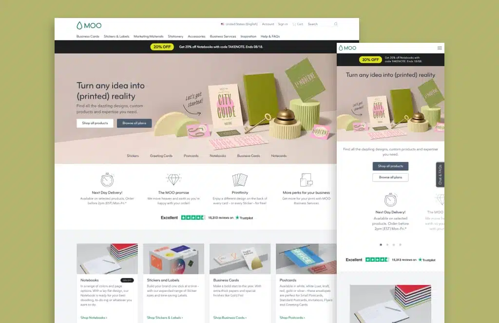
A company that focuses on stationary and business card printing better get its website design right.
Fortunately, that’s exactly what Moo does.
The homepage design especially sticks out immediately. While clean and straightforward, it still brings out a unique brand personality while subtly showing off just what Moo can do in terms of design.
A clean, professional font only helps to convince a business audience of this brand’s credibility.
Including customer reviews is another nice touch that builds instant audience trust. The volume of reviews shared (more than 1,500 at the time of this writing) removes any doubt about the quality of its products.
2. Fooda
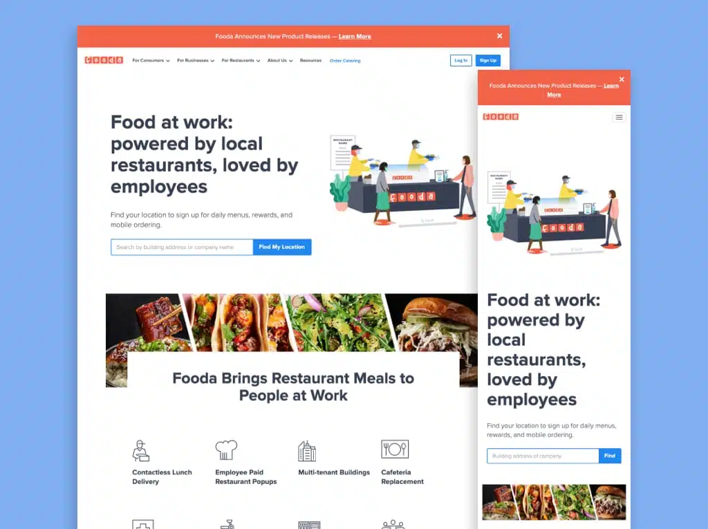
Fooda provides a basic need: providing meals to businesses through office lunch services. That type of niche can make for a difficult website to build, as it’s not easy to explain immediately.
But Fooda’s website is up to the task. Its homepage illustrations are not just a nice visual but immediately communicate the service and value proposition. That includes subtly communicating safety assurances by showing Fooda employees masked in light of the COVID-19 pandemic.
The same approach carries through the symbols in the homepage navigation, easily distinguishing between the types of clients this company serves. For even more in-depth information, case studies linked straight from the homepage provide in-depth social proof.
It doesn’t end there, either. Linking recent blog posts at the bottom of the homepage gives readers a natural next step to take to gather more information.
Finally, its service pages are clean, straightforward, and link right to lead generation forms with an option to talk about the details of a potential partnership.
Protip
Lead generation is a big part of B2B companies’ websites, but finding the time for lead generation can be tricky! Check out our article for great resources that could help your business generate leads.
3. Targit
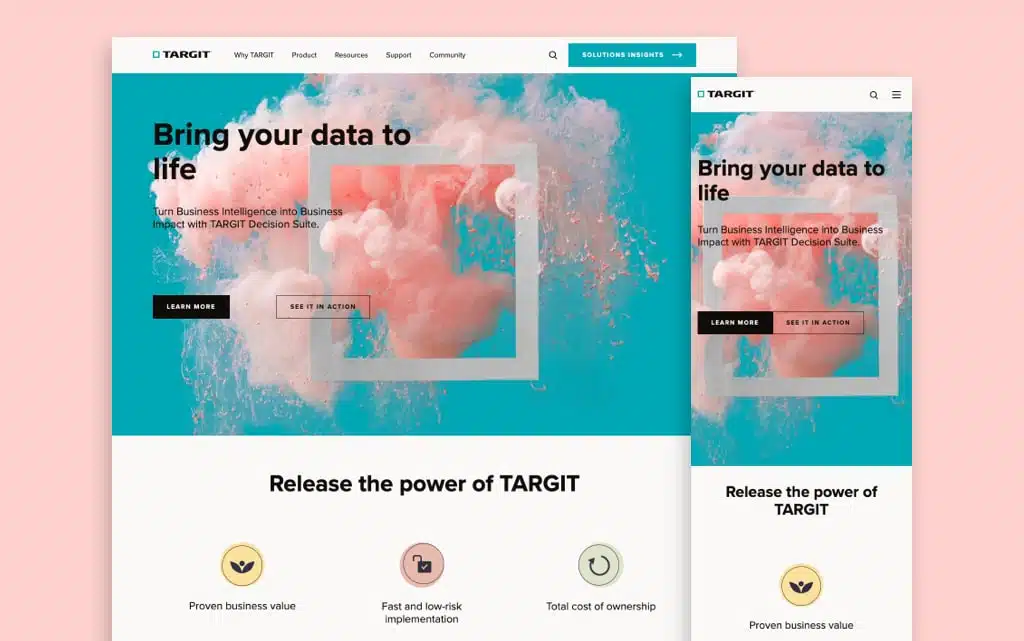
Business intelligence can be a complex and difficult topic to communicate. The term has become a buzzword, making it difficult for real experts to distinguish themselves.
Enter Targit, a business intelligence suite that’s not afraid to showcase its expertise.
That starts with the hero image, whose vibrant colors catch the eye and immediately draw in the user. That contrasts nicely with the clean and simple design of the rest of the homepage, whose muted colors make a conscious effort to put information and content first.
Speaking of content: Targit has clearly identified case studies as a central way towards credibility, and it shows through the success stories of current and past clients highlighted prominently on its website.
Finally, we have to talk about the Resource Center. Through guides, webinars, videos, and other media, Targit has built a constant stream of free content any business can leverage. By the time the user finishes browsing through them, the brand almost naturally emerges as a go-to business intelligence partner.
4. Extensis
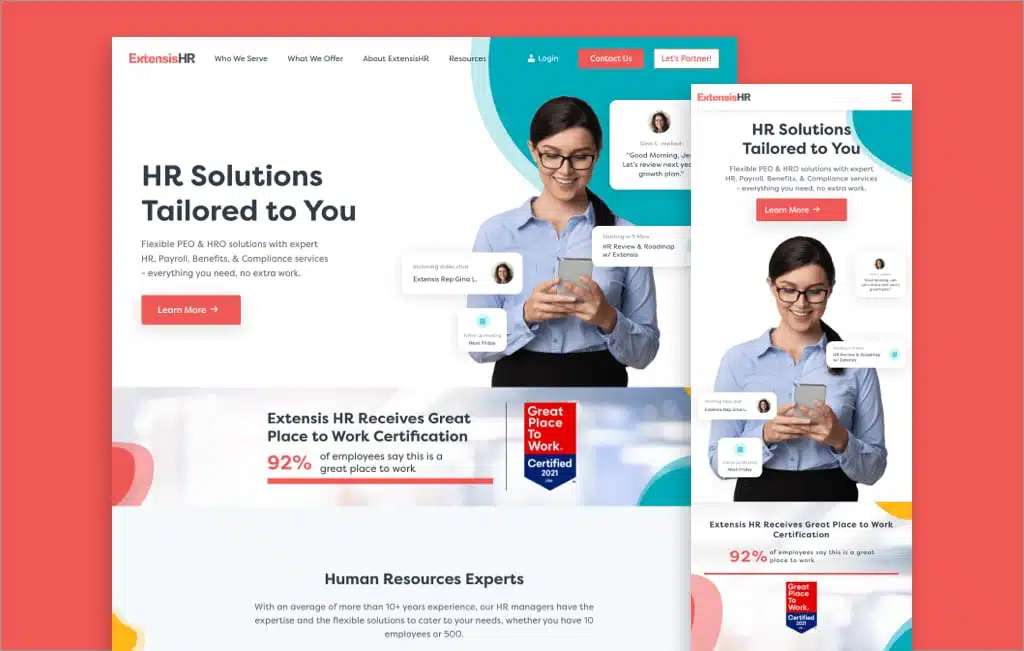
As mentioned in the intro, this brand’s redesigned website is one of ours. Allow us to explain just why we like it so much.
First, it’s about approachability. HR can be a relatively dry topic, but animations alongside playful curves and shapes make the brand much more approachable than many of its competitors.
It also adds dimensions, allowing design elements to seemingly pop off the page while browsing.
That concept is perhaps best exemplified through chat bubbles, which pop up across the entire page to highlight user stories, use cases, and more. Clear service categorization based on business size allows for more streamlined decision-making for buyers.
Are we bragging a bit? Maybe. But when you’re able to take steps like turning your own About Us page design best practices into a site that converts significantly more leads, you earn that right.
Protip
Shameless plug! Check out our case study on how we helped Extensis create an awesome website.
5. Rocka
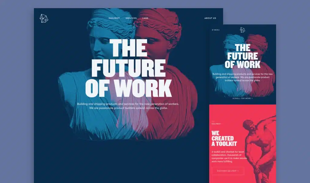
The transition to remote work has received plenty of attention over the past 18 months. Brands like Rocka are able to leverage that attention through their business-focused websites.
Traditional B2B marketers may not think of targeting businesses as bold, but that’s exactly what this website does. Bold colors, bold fonts, and bold statements all span across the entire screen.
It doesn’t hurt that the Greek elements throughout the page offer both a subtle contrast to its future-oriented value proposition and a fitting tribute to the movement on the entire site.
Scrolling here is simply a pleasure, subtle animations make the transitions from one section to the next seem seamless, and that look and feel carry through the entire website.
It actually allows the homepage to be more minimalist than initial impressions suggest, trusting that information can be presented more linearly than might be the case with other, less-bold websites.
6. Stripe
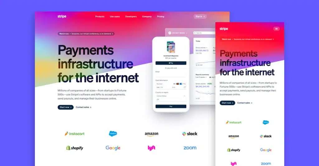
Stripe processes business payments, so its website has to communicate credibility. The fact that its partners, from Amazon to Google, are displayed so prominently on the homepage suggests that the brand knows exactly what it has to accomplish.
That’s not all, though. Our team was especially impressed by the design of this page for a few reasons.
Start with the subtle vertical lines that aren’t even noticeable at first, but suggest scrolling down without seeming obtrusive. Once you do, slanted lines, motion graphics, and animated icons are sure to catch and keep your attention.
The site also takes an interesting approach to colors. Blues and navy colors remain the focus, but others are brought in as subtle highlights to keep things interesting.
7. Grammarly
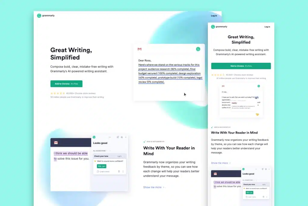
Granted, helping websites and writers improve their grammar is not an exciting topic. It does suggest a need to be straightforward and clean, though.
So that’s exactly what Grammarly does. The design is clean and simple, and the colors match the overall aesthetic and value proposition. Through plenty of whitespace, the website seems open, and each word is given more weight.
And then, of course, there’s the value proposition. Grammarly is not afraid to show off real grammar edits on its homepage, showing exactly what its services can do for a business through simple animations.
Keeping things simple, the only navigation is in the website’s footer design, with all other homepage links leading directly to conversion opportunities. Talk about a streamlined experience.
8. Netbase Quid
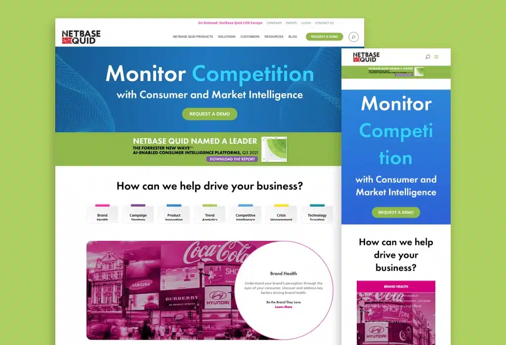
Another business intelligence solution, this one takes a more traditional approach than the Targit example above. It’s similarly effective, though.
From the start, Netbase Quid puts its homepage design focus on information. But despite its breadth, the brand avoids crossing the line to information overload by tying the individual sections together nicely.
Well-placed imagery and graphics break up what could be overkill in other cases. One example: each service area is color-coded, directing the user’s eye towards exactly the thing they’re looking for.
Finally, Netbase Quid shows off social proof in a dominant, but unobtrusive way. Brand logos like Walmart and the New York Times speak for themselves, while links to further case studies help to convince buying teams to trust this brand with their data.
9. Dropbox Business
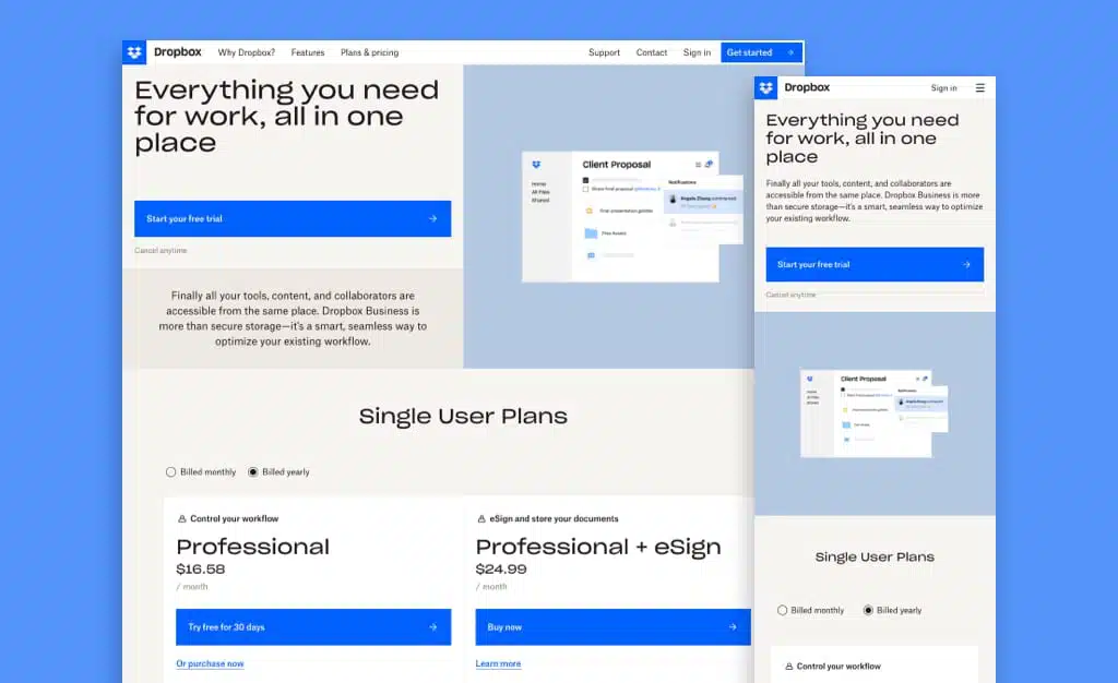
It’s tough to distinguish yourself in the cloud storage space alongside players like Microsoft, Google, and Apple. But Dropbox Business sure makes a strong play for superiority.
First, let’s talk about the fact that this website starts with pricing information. It doesn’t pretend to showcase anything else, because, in a competitive niche like this, that’s crucial information to potential buyers. Showcasing plans side-by-side makes for easy comparisons depending on business needs.
Beyond that, the website maintains a clean and professional feel, thanks in large part to a simple color scheme of black and white with a touch of royal blue. There is nothing complicating the experience.
Keep scrolling, and you come to a few more unique features. A customer carousel allows you to consume social proof at your own pace, while a FAQ section (not typical for homepages) gets through some of the most important information. Finally, the time-delayed chat feature ensures that no block is left unturned for potential users and business partners.
10. Loop Returns
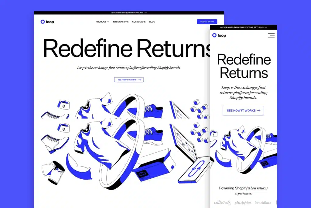
It might be the biggest headline of any site we’ve reviewed, followed by the boldest hero. And yet, Loop Returns makes it work.
Users realize quickly that this company is all about streamlining the returns process for retailers and e-commerce merchants. And they’ll keep reading while they do, thanks to bold colors, fonts, and animations.
As one of our reviewers put it so aptly, “the design just jumps in your face.”
It’s not just about flashy designs, though. The animations actually contribute to the user experience, while fonts are used intentionally to draw the reader’s eye to what matters.
Loop Returns realizes that its services may not be obvious to everyone. So the website features a See How it Works page, which shows its service in action and flows naturally through the entire process. Here, design boldness doesn’t overshadow, but enhances the site’s functionality.
11. Swell
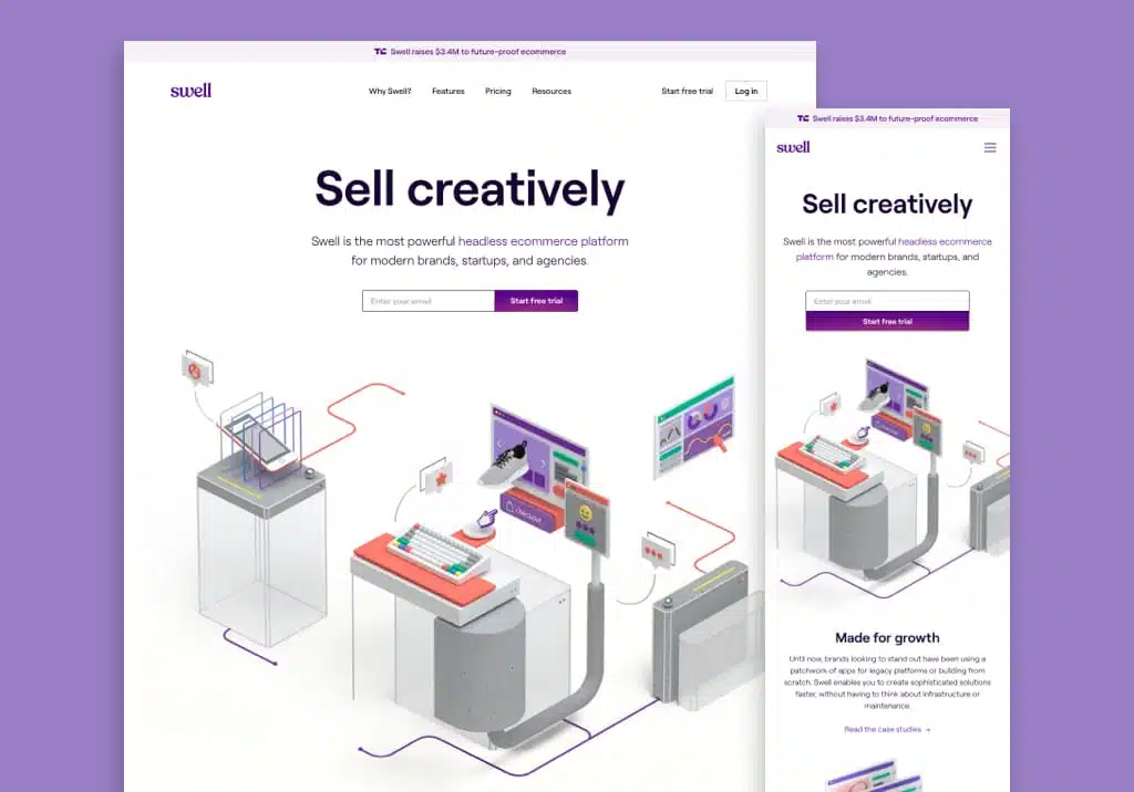
As an e-commerce SaaS platform, Swell competes against the likes of Shopify, Magento, and BigCommerce. Simply put, its website has to stand out for the service to have a shot.
Fortunately, it does. Illustrations are designed with a glorious amount of detail, and animated to bring motion and a 3D feel to the site. The use of uncommon design elements in this space, like the color purple as both an accent and subtle background, immediately distinguishes Swell from its competition.
Speaking of which: this brand doesn’t shy away from its big-name competitors but compares itself to them right on the homepage.
Beyond the homepage, the Features page stands out. The information presented is short and succinct, with a sidebar menu allowing users to find exactly what they’re looking for within seconds.
12. Nektar
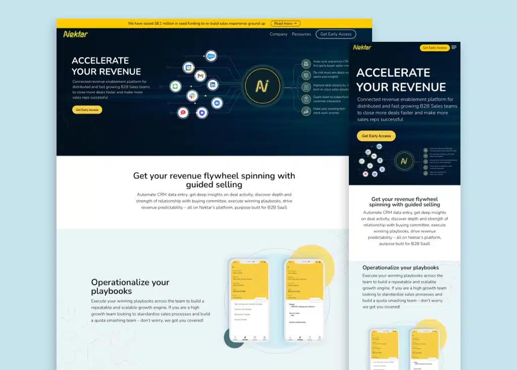
As far as B2B data and business intelligence platforms go, Nektar is not necessarily innovative. That doesn’t make it less appealing, though.
A clean and simple design keeps the focus on the most important pieces of content. Meanwhile, the color palette frames the information intentionally without being intrusive or boring.
Beyond the color, intentionally designed sections split the information into easily digestible chunks. Tasteful illustrations show what the actual platform looks like on mobile phones and desktops.
But the showstopper of the site is its animation. The hero image, with dots moving through lines in a way that looks almost like an electrical grid, shows exactly what the service offers. Scroll down, and tasteful animations, intentionally kept in the background, add a degree of dynamism that keeps visitors from getting bored or distracted.
13. Evernote
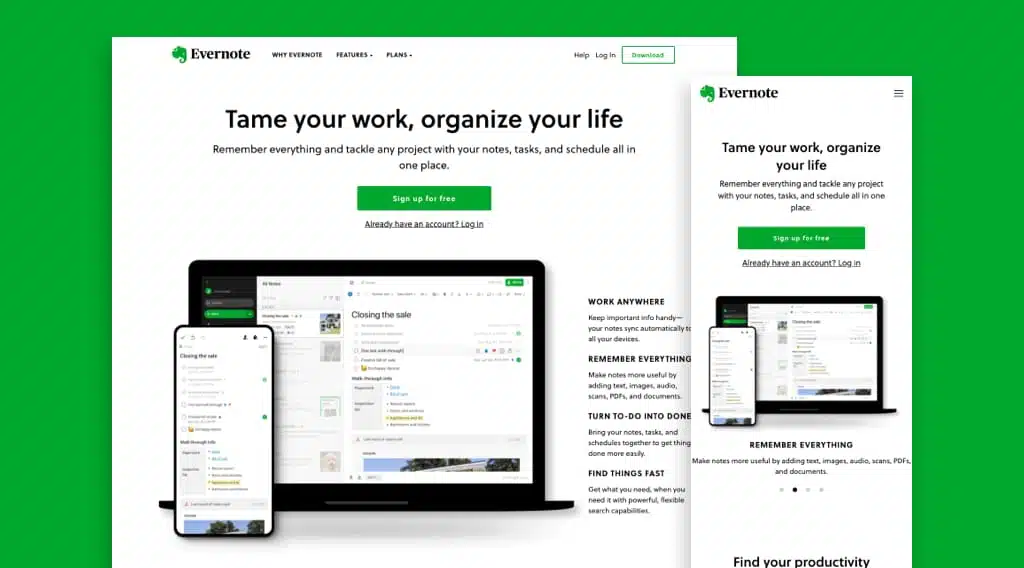
The popular note-taking app has both personal and more comprehensive business benefits. Its website reflects that exact audience and benefit split, with an equal focus but the clean separation between both sides of the coin. It even carries through its pricing plans, displayed prominently on the website.
Every user of Evernote immediately recognizes its shade of green, so it’s no surprise that the same green is used effectively as an accent color throughout the site. It adds a pop that keeps the clean design from getting boring.
Evernote truly shines in its organization and functionality, though.
The navigation makes finding information easy and straightforward, a perfect match with its value proposition of simplifying note-taking. Finally, actionable visuals of desktop and mobile interfaces show the user exactly what they can expect once they sign up.
Protip
Think it’s time for an update to your B2B website? We have the perfect solution in our article “The Ultimate Website Redesign Project Plan and Worksheet“.
14. Atlassian
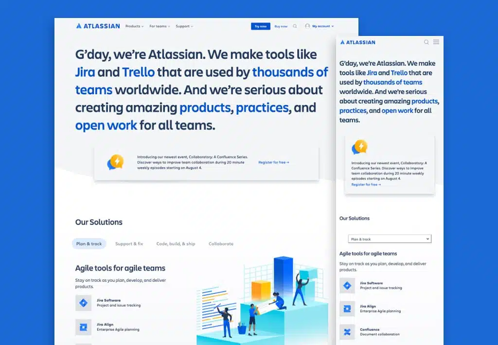
That hero image is nothing if not unique. It also communicates immediate personality, which is a feat for a large company responsible for software like Jira and Trello.
There’s a lot of content on this B2B website. The good news is that it never quite feels like a lot. A well-organized footer and top-page navigation, along with tabbed lists of solutions and plenty of links to more information in relevant spots, always let the user know exactly where to go.
Atlassian’s brand blue is used intentionally. Throughout the homepage, it highlights key text and links, streamlining the user experience. Meanwhile, each image is functional, showcasing exactly what the company can provide for businesses.
15. Input Output HK
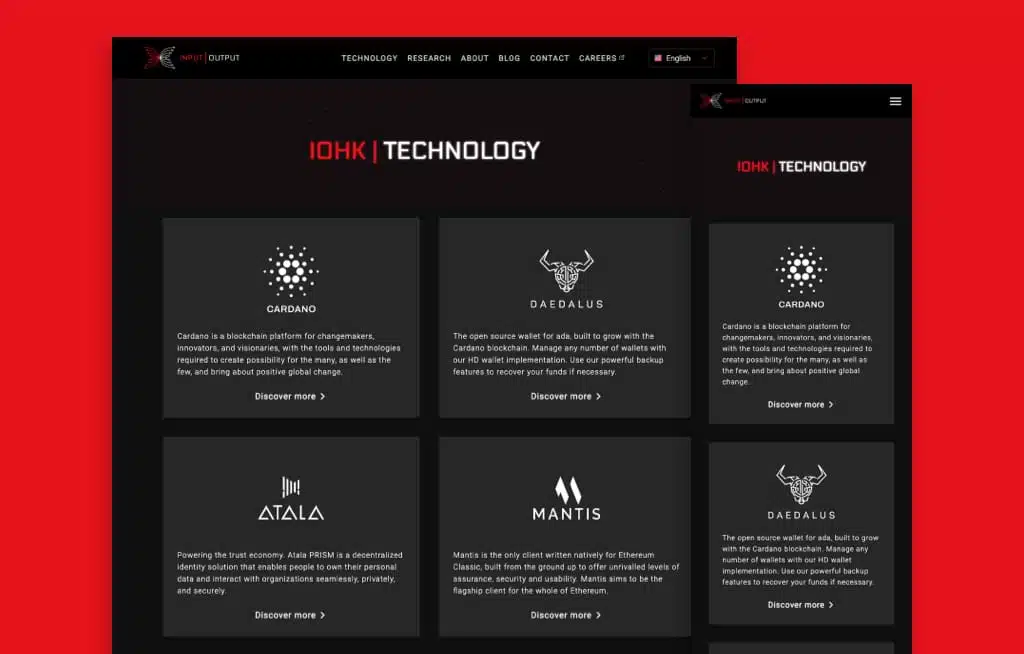
Now here’s a unique experience. More a portfolio than a traditional B2B website, IOHK looks to impress with its visuals. That starts with a seemingly empty black homepage, lit up by the colorful trail the cursor leaves.
It’s undoubtedly fun to play with, but also has a surprisingly calming effect that shows off what the company can do. Beyond that, it’s all about a simple, straightforward layout and navigation.
The top navigation is the gateway to all the substantial information about IOHK. From there, Technology and Research are simply designed and straightforward, which is especially important given the complexity of the work this brand does.
It’s all tied together with a footer that gets you to the right information at the right time. The unique visual intro may not seem that way, but this is actually one of the easiest websites to understand and navigate we’ve come across.
Wrapping it Up
These top examples make it clear: there is no blueprint to the best B2B websites. Instead, there are multiple pathways to achieve core business goals, from generating brand awareness to leads and competitive advantages.
Of course, these are just a few of the countless examples out there. We’ve shared our favorites; what are yours? Have you found any websites that B2B marketers just have to know about? Let us know your thoughts in the comments below.
Additional Reading
We recommend the following handy resources and guides as you navigate the world of web design and development!
We Develop Websites for Your Business
How to Create a Website Using Wordpress
The Huemor Way of Doing Website Design
Examples of Top SaaS Websites For Your Reference
A Step-by-Step Process for Building a Website
Why Innovative Website Design Matters
Get Memorable Insights.
Sign up to receive actionable web design advice directly in your inbox monthly.
Get Memorable Insights.
Sign up to receive actionable web design advice directly in your inbox monthly.

Jeff Gapinski
President of Huemor
Jeff Gapinski is the President of Huemor where he helps plan the long-term strategic growth of the agency. Jeff is passionate about UI/UX, demand generation, and digital strategy.
What Do You Think?
Have feedback? Maybe some questions? Whatever it is, we'd love to hear from you.
Leave a Comment
![Website Design Standards We Follow [That You Should Too!]](https://huemordev.b-cdn.net/wp-content/uploads/2021/12/2023.04.04.Website-Design-Standards-We-Follow-That-You-Should-Too.jpg.webp)
No comments found