Design
5 minute read
The Apple Website Evolution: 1995-Today.
LAST UPDATED:
June 11, 2024


While Apple Inc. is one of the most famous companies in the world, it wasn’t always a household name. Since the company was founded by Steve Jobs and Steve Wozniak, their products and their website have gone through a number of evolutions to become what it is today. Now, they’re not only applauded for their innovative products but for their minimalist, elegant web design, as well.
What Makes The Apple Website Great?
As a web design agency, we can’t help but admire all of the elements that made Apple’s website so revolutionary.
Stunning Assets

Apple’s dedication to high-quality visuals set a new standard in web design. Every aspect of the Apple website is specifically created to engage the audience visually while maintaining a simple user interface and experience.
The attention to detail on their website is unmatched, whether it’s the quality of a product shot or the way the product is creatively presented. The Apple logo, for example, featured in the horizontal navigation bar, serves as a stunning, minimalist visual element and a functional homepage button. This approach to a beautiful, minimalist aesthetic while keeping the functionality simple is essential to their immersive user experience.
Motion
Dynamic elements and subtle animations bring life to the Apple website. From smooth transitions between pages to interactive elements, motion is used strategically to increase user engagement without distracting from the products, which are the stars of the show.
When you scroll through the website, elements smoothly appear and disappear, guiding the user’s attention effortlessly. Hover effects and micro-interactions add depth and dimension to the user experience, making interactions feel intuitive and engaging.
Interactive product demos allow users to explore products from every angle. The Apple Watch, for example, is showcased with interactive product demos that highlight its features and customization options. In this way, motion becomes an essential part of the user interface.
UI/UX
At the core of Apple’s website design philosophy is simplicity. Their website is clean and uncluttered, with a minimalist aesthetic that puts the focus solely on the products. Every aspect serves a purpose, ensuring there are no distractions to take away from the user experience.
Navigation is seamless, with intuitive menus that help users find what they’re looking for quickly and with ease. Whether you’re on desktop or mobile, the website adapts smoothly to different screen sizes and resolutions for a consistent experience across devices.
But simplicity doesn’t mean sacrificing depth. Apple’s website has features and functionality that cater to their users’ needs. Every aspect of the user experience is thoughtfully designed, from personalized recommendations based on browsing history to interactive tools for product customization
History of The Apple Website
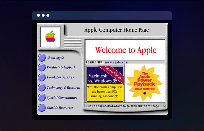
1995
1995 was the beginning of the Apple Inc. website during the early days of the internet. The website debuted with a basic design that was functional but lacking in sophistication, similar to the early Apple computers like the Apple II.
Pages were static, graphics were minimal, and navigation was basic. However, the website still successfully served as a digital option for the company’s Apple stores. It provided essential information about their products and services to their growing online audience.
1997
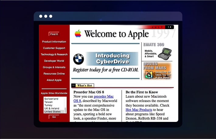
When Steve Jobs returned to Apple in 1997, he brought with him a new era of innovation for the company. Under Steve Jobs’ leadership, Apple went through a massive rebranding with a renewed focus on simplicity and elegance.
The website’s design was completely overhauled, replaced with a cleaner and more minimalist aesthetic that represented Apple’s design philosophy. The cluttered layouts and outdated graphics of the past were gone. They were updated with sleek typography, strategic white space, catchy copy, and visually stunning imagery.
1998
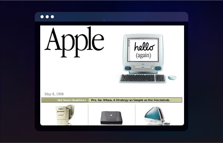
In 1998, the iMac, a groundbreaking Apple computer that redefined the company’s image and influenced its website’s design, was introduced. With its iconic translucent shell and bright colors, the iMac added a dash of fun and personality to Apple’s product lineup.
The Apple website embraced this spirit of creativity, including bold colors and dynamic graphics to showcase the iMac and their other innovative products in a visually striking way.
2000-2006
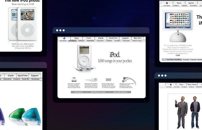
The period from 2000 to 2006 saw improvements in the design of the website as the company continued to expand their line of Apple products. During this time, the Power Mac G4 was introduced, as well as some other iconic new products like the iPod, MacBook, and iTunes. The website evolved to accommodate these new additions.
Navigation was streamlined, product pages utilized richer content and multimedia elements, and the overall user experience was optimized to better meet the needs of their customers. This period of time laid the groundwork for Apple’s future success, as the company confirmed their position as an unstoppable force in the tech industry.
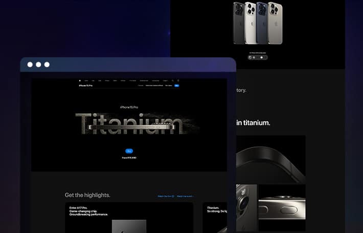
2007
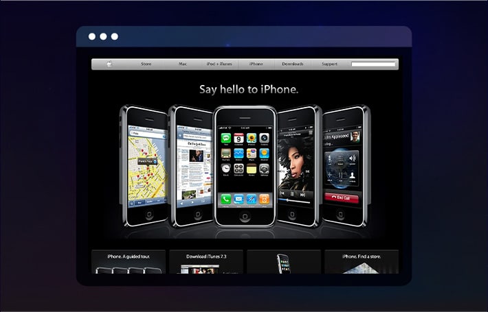
The introduction of the iPhone in 2007 revolutionized both the smartphone industry and Apple’s website design. With mobile browsing on the rise, the Apple website had to transform to adapt to this new format. The introduction of Apple TV also played a crucial role in influencing the website’s design, as it required an integration of multimedia content. The design became more responsive and mobile-friendly, with layouts and content optimized for smaller screens.
This shift towards mobile-first design reflected Apple’s commitment to accessibility, ensuring that customers could access the website across all devices. The iPhone’s success continued to elevate Apple’s brand image.
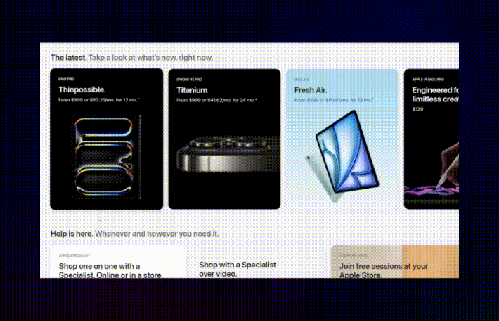
2014-Today
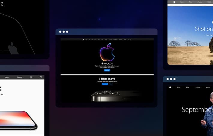
From 2014 to today, the Apple website has not made many drastic changes to its aesthetic or structure, but it did embrace adding new technologies. With an emphasis on responsive design, accessibility, and integration with other Apple services, the website has become more dynamic and interconnected than ever before. Features like Apple Pay, Apple Music, and iCloud were integrated into the website to offer a cohesive user experience across their platforms.
FAQ’s About Apple
How Did Apple Design Their Website?
Apple’s evolution from a computer company to a leading tech company is clear in their website design, which reflects their commitment to simplicity, elegance, and user-centricity. The design process involved collaboration between designers, developers, and marketers, all focused on creating a visually appealing and intuitive user experience.
When Did the Apple Website Start?
The Apple website, which debuted in 1995, showcased the company’s early personal computers, including the Apple I. This was when the website’s design was in its most rudimentary form.
How is Apple’s Website So Good?
Apple’s website succeeds so well because of its combination of stunning visuals, intuitive navigation, and seamless integration with their products and services.
How Many Sites Does Apple Have?
Apple operates multiple websites that cater to different regions and languages for users around the world.
What is Apple’s Main Browser?
While Apple does not have their own web browser, their products, like Mac computers and iOS devices, come pre-installed with Safari.
How Do You Look at Old Apple Websites?
Archive.org‘s Wayback Machine allows users to access archived versions of websites, including past versions of the Apple website.
Get Memorable Insights.
Sign up to receive actionable web design advice directly in your inbox monthly.
Get Memorable Insights.
Sign up to receive actionable web design advice directly in your inbox monthly.

Jeff Gapinski
President of Huemor
Jeff Gapinski is the President of Huemor where he helps plan the long-term strategic growth of the agency. Jeff is passionate about UI/UX, demand generation, and digital strategy.
What Do You Think?
Have feedback? Maybe some questions? Whatever it is, we'd love to hear from you.
Leave a Comment


No comments found