-
Design
-
The Best SaaS Website Design Examples (And Why They Work)
Let’s be honest, most SaaS websites look the part but fail to perform. They’ve got sleek design, a modern logo, maybe even a clever headline. But when it comes to clarity, trust, and conversion? They fall flat.
The truth is, great SaaS websites are doing something very different. They’re not just digital brochures or feature lists dressed up in gradients. They’re strategic tools built to earn attention, build confidence, and drive real results.
The best SaaS websites also show how their platform works to deliver value, making their core processes and benefits clear to users.
So what exactly separates the top performers from everyone else?
In this article, we break down the key principles the best SaaS websites follow, including how they demonstrate how their features work together to create a seamless experience, and how they use them to turn visitors into customers, fast. We’ll also highlight a good example of how top SaaS websites structure their pages.
Whether you’re refining your current site or building from the ground up, these are the moves that matter. Let's get into it.
A Brief Introduction to SaaS Websites

A SaaS (Software as a Service) website is more than just a digital storefront, it’s the heart of any SaaS company’s online presence.
In today’s competitive landscape, where so many SaaS websites are vying for attention, your website is often the first and most important touchpoint for potential customers.
The best SaaS websites don’t just showcase a product; they create an intuitive user experience that guides visitors from curiosity to conversion.
A great SaaS website is designed with the target audience in mind, making it easy for users to understand the value of the SaaS product and take the next step.
Whether you’re a startup or an established SaaS company, your website is your platform to build trust, communicate your unique value, and set your business apart from the competition.
By focusing on clarity, usability, and customer-centric messaging, the best SaaS sites help companies grow, attract more customers, and establish themselves as leaders in their industry. In short, a well-crafted SaaS website is a powerful engine for business success.
The Best SaaS Website Examples
Let’s face it: most SaaS websites blur together.
Bland. Forgettable. Filled with jargon no one asked for.
But not these. These SaaS websites?
They're the ones that make you pause, scroll slower, and actually want to sign up.
We’ve rounded up some of the sharpest, smartest, most scroll-stopping SaaS sites out there—designed to convert, not just exist. Get ready to take notes (and maybe rethink your homepage).
AI Led SaaS Website Examples
Attentive
Attentive is an AI-enabled SaaS company that helps e-commerce brands drive revenue through personalized SMS and email marketing.
Homepage Design
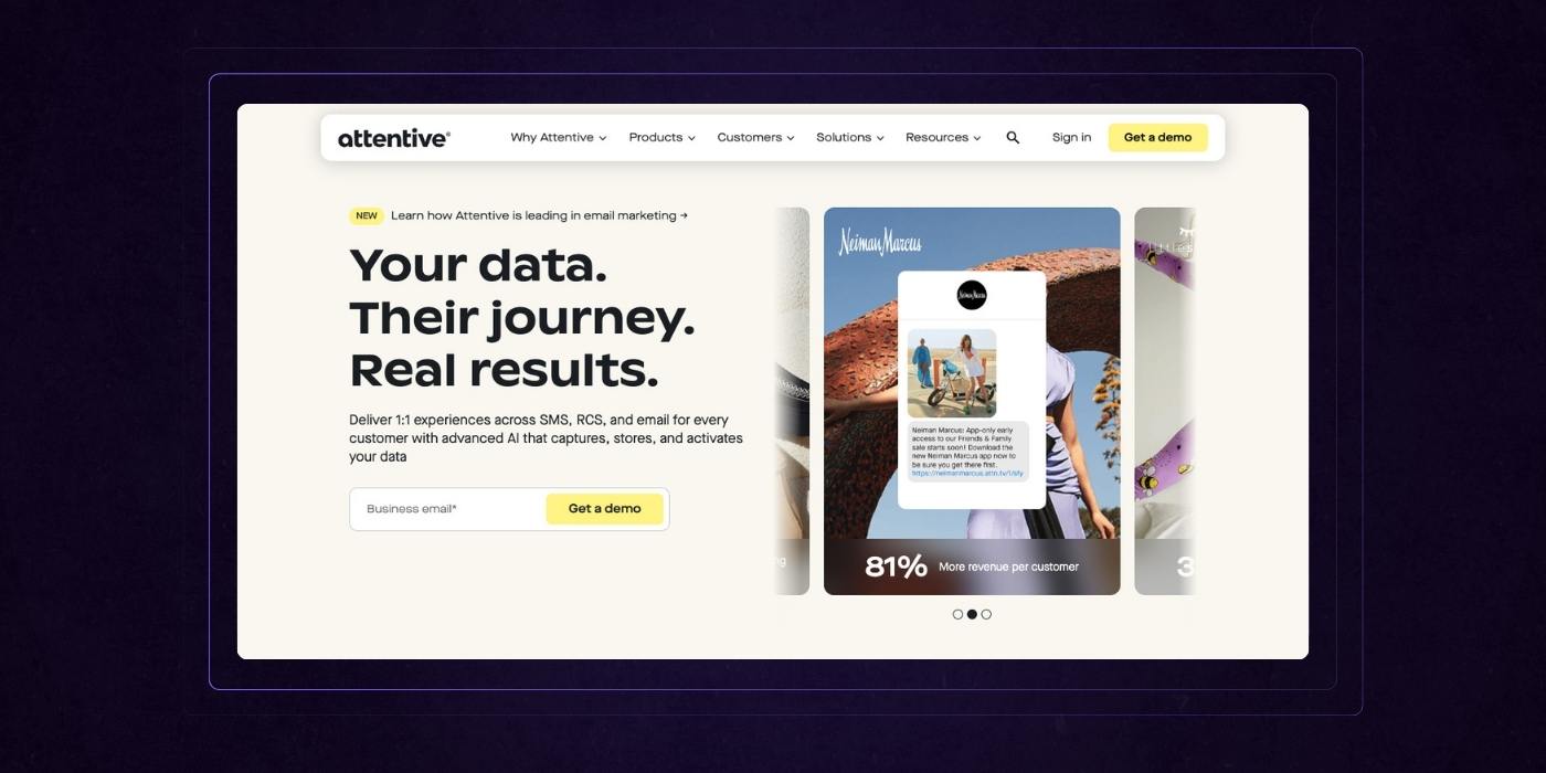
Attentive’s homepage delivers a seamless narrative that immediately answers the “why” with clarity and confidence.
The hero section leads with strong customer-centric messaging: “Your data. Their journey. Real results.”, paired with a visual of real-world results, setting a tone of trust and performance.
The use of logos, stats, and customer examples quickly builds credibility without overwhelming the user.
Scroll depth is rewarded with purposeful sections that showcase features, outcomes, and differentiators, all laid out in a clean, modular design that feels light but loaded with value. Clean typography is used throughout to enhance readability and visual clarity.
The yellow accent color draws your eye to CTAs and key takeaways without ever feeling aggressive, and bright colors are used to highlight key actions and important information.
What really works is the natural flow: it guides prospects from understanding the product, to seeing proof, to exploring how it fits their needs and invites them to act. It’s thoughtful, on-brand, and designed for decision-makers under pressure to perform.
Product Page Design
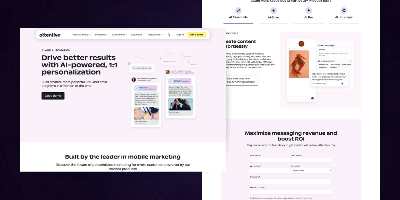
Attentive’s product page strikes the right balance between clarity, authority, and ease of use, making it an excellent example of conversion-focused UI/UX.
From the start, the bold headline puts a results-driven benefit front and center, backed by social proof and real use cases that feel relatable, not fluffy.
The clean visual hierarchy makes it easy to skim, while strategically placed CTAs (“Get a demo”) eliminate friction. Subtle gradients and product visuals elevate the experience without distracting from the content.
The alternating background colors clearly segment the story, and a white background is used to improve clarity and focus on content. The form is intuitive with minimal fields, ideal for maximizing completions. It’s confident, not cocky, polished, not over-designed. Most importantly, every section reinforces a simple message: this product drives real, measurable outcomes.
Jasper
Jasper is an SaaS based AI content platform that helps marketing teams create high-quality, on-brand content faster. Here’s what we love about their website:
Homepage Design
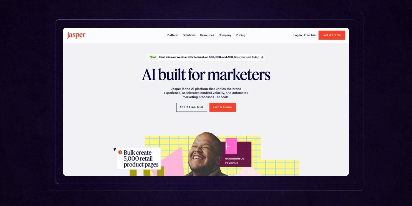
Jasper’s homepage delivers a vibrant, differentiated identity paired with a structured, benefit-driven experience.
From the start, the headline “AI built for marketers” clearly defines the audience and value.
The page builds trust through client logos, testimonials, and real-world use cases that prove credibility.
Visually, the use of color and grid-based design creates energy while maintaining a clean, organized flow. Each section answers a key question—from what the product does, to how it fits into team workflows, to the measurable outcomes it drives.
A live demo thumbnail is featured, and the homepage also leverages interactive demos to engage visitors and quickly showcase key features.
Strong calls to action are present throughout, with a sticky CTA bar that makes it easy to convert at any point. The result is a site that feels both polished and approachable, perfectly tuned for marketing leaders making high-stakes decisions.
Smart visuals and minimal copy are used, with product screenshots included to demonstrate the platform's interface and core functionalities.
Pricing Page Design
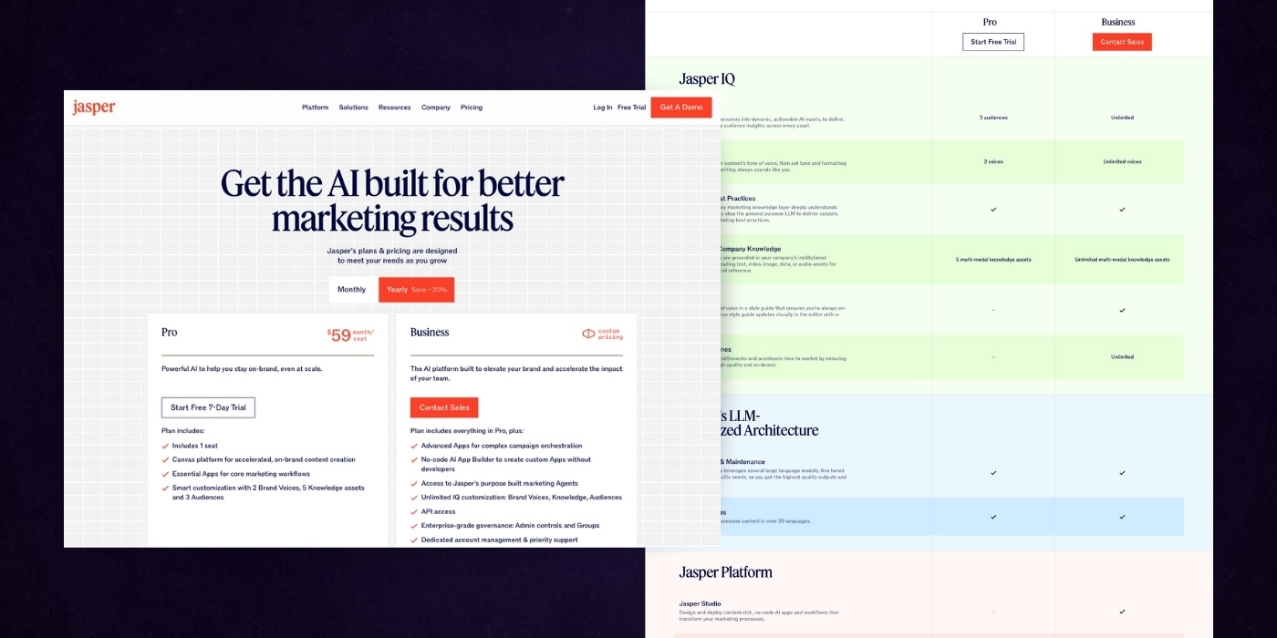
Jasper’s pricing page does an excellent job of combining clarity with depth. It opens with a simple headline and direct CTA that reinforces the value, “better marketing results through AI”.
Pricing options are presented side by side with strong contrast and clear benefit callouts, making it easy for users to compare and choose.
The tiered feature breakdown that follows is long but thoughtfully structured, using soft color blocks and sticky navigation to maintain orientation and avoid overwhelm. Product images are used to help users compare options visually and understand the differences between plans.
Each category focuses on practical outcomes, not just technical jargon, which helps build trust with marketing leaders who want results, not complexity.
The supporting sections on security, FAQs, and support reassure prospects at every stage. This page is informative without feeling heavy and feels engineered to convert both curious leads and serious buyers.
Krisp
Krisp is a noise-cancellation app that removes background sounds from calls for clearer, distraction-free communication. Here’s where their website excels:
Homepage Design
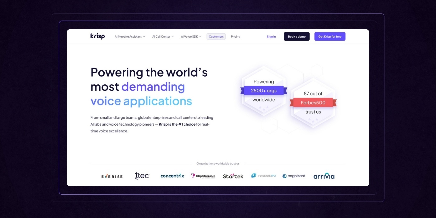
Krisp’s homepage is a strong example of how to communicate technical innovation in a way that feels human and useful.
The hero headline immediately highlights a clear differentiator, “#1 noise cancellation”, paired with a sharp visual that showcases the product in action.
Throughout the page, benefits are prioritized over features, making it easy to see how Krisp fits into a real-world workflow.
The layout is modular and digestible, guiding the user through in-meeting, post-meeting, and pre-meeting use cases without ever feeling repetitive, while highlighting key elements for clarity, such as core messages, navigation, and feature highlights.
Trust is reinforced with partner logos, G2 reviews, and security credentials that speak directly to decision-makers.
Visually, the contrast between deep blues and soft neutrals gives the brand a modern and professional feel. This is a well-structured, intuitive page that reflects product excellence and is clearly built to convert busy professionals looking for reliable AI tools.
Customer Success Page
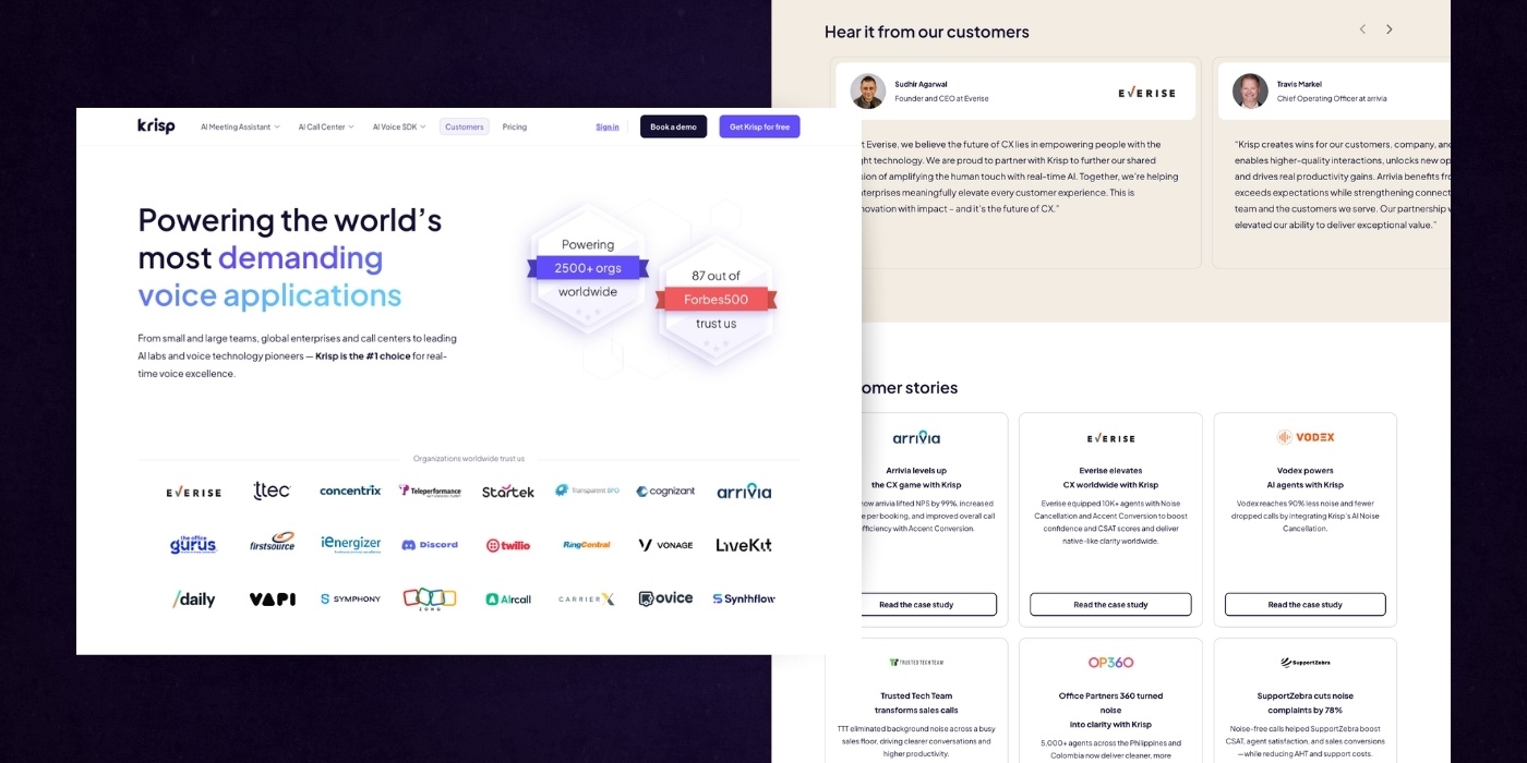
Krisp’s customer success page is a compelling blend of proof, personality, and performance.
The headline instantly conveys credibility by highlighting scale: 2,500+ organizations, 87 out of Forbes 500, while positioning Krisp as the trusted choice for high-demand voice applications.
This is followed by a strong roster of logos that reinforces legitimacy without slowing the scroll. The page thrives on storytelling, with a clean layout of testimonials, case studies, user quotes, and dedicated case pages showcasing specific customer success stories.
Every element is focused on what matters to enterprise buyers: clarity, quality, and impact. Smart use of visual variety and contrast keeps engagement high, and the design further fosters user engagement by encouraging visitors to explore success stories and interact with the content. The final CTA, “Your success story starts here,” brings the narrative full circle with a confident nudge to take action.
It’s persuasive, human, and laser-focused on conversion.
Examples of SaaS Websites for Business
Docusign
DocuSign enables individuals and businesses to securely sign, send, and manage digital documents from anywhere. Here’s what makes their SaaS website a leader in the space:
Homepage Design
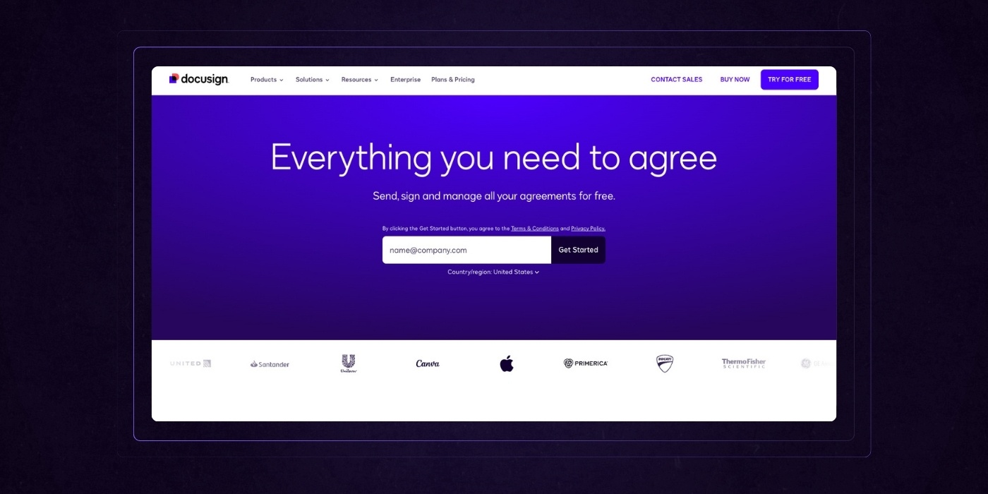
DocuSign’s homepage delivers a polished, enterprise-grade experience that makes complex agreement workflows feel approachable and actionable.
The hero section is bold and benefit-driven, offering immediate clarity on the platform’s purpose with a clean input form for fast engagement.
From there, the page flows into well-defined sections that highlight features, use cases, and integrations, with dedicated landing pages used to target specific user needs. Navigation is enhanced by a drop down menu, making it easy for users to find product features, resources, and other key sections.
Trust is built through brand logos, stats, and recognizable names that reinforce DocuSign’s global footprint.
What really works is the focus on outcomes: streamlining processes, boosting compliance, and reducing time to close.
The layout is structured and scannable, and the visuals strike a balance between sleek and practical. Every section feels purposeful, guiding visitors toward a clear understanding of value while maintaining forward momentum toward a demo or trial.
It’s enterprise UX done right; efficient, credible, and conversion-ready.
Blog Section
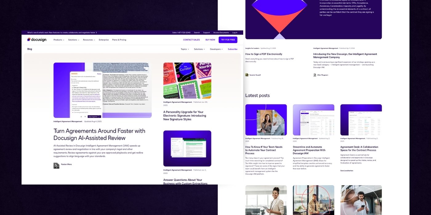
DocuSign’s blog page is a strong blend of editorial polish and UX clarity.
It leads with featured content that immediately signals relevance and value, followed by a well-organized layout that balances visual appeal with content density to engage website visitors.
Articles are grouped by popularity and freshness, which helps readers find high-performing and timely insights quickly.
Card designs are clean and scannable, with bold headlines, short descriptions, and supportive imagery that makes browsing feel effortless.
The variety of content, from product updates to strategic thought leadership, reinforces DocuSign’s authority in the agreement space.
Smart CTAs at the bottom invite readers to subscribe or explore the platform, creating a natural path from content consumption to deeper engagement. This is how a blog should function: as both a resource and a funnel that builds trust and drives action.
Protip: The best SaaS websites use their about pages as an opportunity to humanize their brand. These pages highlight leadership, the team, accomplishments, and outings. Our about us page design article describes how to craft an about us page that places your brand in the best possible light.
Loom
Loom is a SaaS product that lets users record and share quick, asynchronous video messages to communicate ideas faster and more personally than email. Here’s what makes their website effective:

Homepage Design
Loom’s homepage delivers a sharp, intuitive experience that perfectly reflects its core value, clarity through video.
The hero section lands with impact, combining a concise headline, a live demo thumbnail, and two focused CTAs that push users into action fast, with call to action buttons strategically placed for maximum visibility and engagement.
Social proof is immediately visible, with a strong emphasis on scale and adoption across industries. As you scroll,
Loom shifts from a single-feature perception to a complete communication platform. Each section leans into real-world use cases, supported by smart visuals and minimal copy that gets straight to the point. Different landing pages are used to address specific use cases and audience segments, each with tailored navigation and calls to action.
The page design is clean and modern, with generous white space and just enough motion to keep things lively.
Enterprise-readiness, security, and feature depth are addressed without bogging down the flow. The result is a homepage that feels effortless to explore while steadily building product confidence from start to finish.
Solutions Page
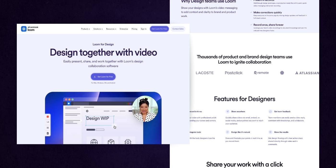
Loom’s solutions page for design teams is a focused, high-impact experience that speaks directly to the needs of creative collaborators.
The headline sets the tone with a clear value proposition, “Design together with video”, while the video demo immediately shows, rather than tells, how Loom fits into daily workflows.
The structure is simple but effective: explain why design teams use Loom, show off the features that matter most, and support it all with recognizable brands and social proof.
Each section highlights a pain point, like too many meetings or a lack of clarity, and shows how Loom addresses it in seconds.
Design tool integrations are prominently displayed, reinforcing Loom’s flexibility. Loom also connects to multiple data sources, enabling teams to gather and utilize information from various platforms for enhanced collaboration.
The copy is concise, the visuals are clean, and the tone remains confident without feeling pushy. It’s a page built for fast-moving teams who want better collaboration without more complexity.
Stripe
Stripe provides a suite of APIs that power online payment processing and financial operations for businesses of all sizes. Here’s why their website is top-notch:
Homepage Design
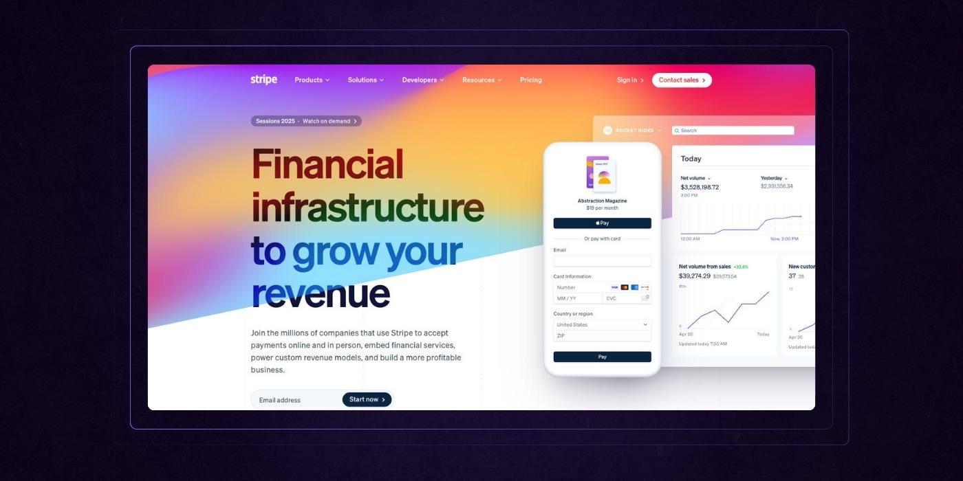
Stripe’s homepage is a masterclass in modern B2B UX, clean, confident, and built for scale.
The headline immediately establishes value, tying financial infrastructure to revenue growth. Above the fold, product visuals and logos from iconic brands like Shopify and Amazon build instant trust. As you scroll, the modular layout breaks complex offerings into digestible sections—Stripe has created a seamless user experience that feels effortless. This is supported by subtle animations and smart use of white space, along with carefully chosen design elements such as color schemes, typography, and interactive features that guide users through the content.
Every callout focuses on outcomes: speed, automation, growth, not just features.
Interactive elements like the solutions slider and floating CTAs keep engagement high without overwhelming the user.
The visual language is sleek but serious, ideal for a technical audience making high-stakes decisions. Stripe doesn’t just tell you it’s built for the future—it shows you, with clarity and precision at every step. The entire website is optimized for user engagement and conversion, ensuring a cohesive experience from landing to action.
Navigation
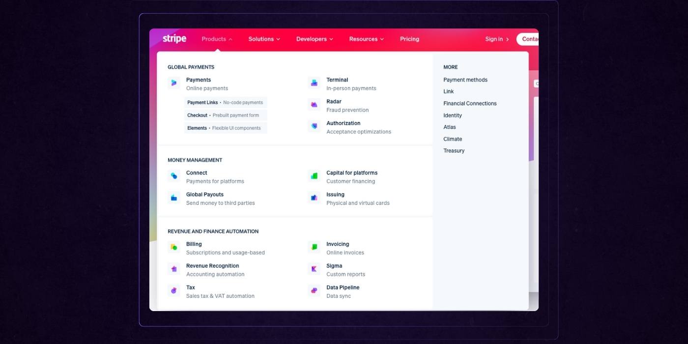
Stripe’s mega navigation menu is a standout example of UX clarity at scale.
Despite the depth and variety of its product suite, the layout feels digestible thanks to intuitive grouping, concise labels, and minimalist icons that add just enough visual hierarchy without clutter.
Each section like Global Payments, Money Management, Revenue and Finance Automation is clearly titled, with helpful sub-descriptors that speak in plain language.
This not only reduces friction for first-time users but also helps returning visitors quickly locate what they need. The addition of a “More” column keeps the overflow organized without diluting focus.
It’s a thoughtful, scalable design that respects the user’s time and decision-making process.
Enterprise SaaS Website Examples
Lattice
Lattice is a people management platform that helps companies align, engage, and grow their teams through performance reviews, goal tracking, and employee development tools. Here’s what they got right with their website:
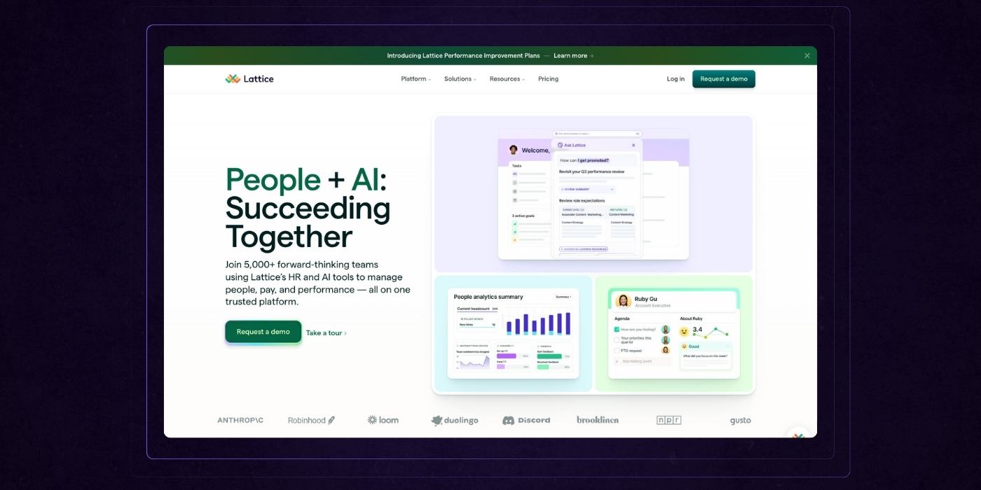
Homepage Design
Lattice’s homepage delivers a polished, people-first experience that communicates enterprise value without losing warmth.
The hero message is clear and current, “People + AI: Succeeding Together”, instantly positioning the platform as modern, relevant, and built for collaboration.
The visual hierarchy is clean and approachable, making it easy to understand the benefits of the Lattice ecosystem at a glance.
Each section flows logically from product capabilities to outcomes, supported by customer logos, human-centric photography, and well-organized feature blocks.
The balance between functional clarity and emotional resonance is spot-on, appealing to both strategic decision-makers and operational users.
Strong CTAs are repeated without being pushy, and integrations are shown visually, reinforcing how easily Lattice fits into an existing tech stack.
Overall, it’s a confident, human-centered homepage that reflects the evolving role of HR. Using a leading website builder can help achieve this level of visually stunning, user-friendly design quality and ensure the site stands out in a competitive market.
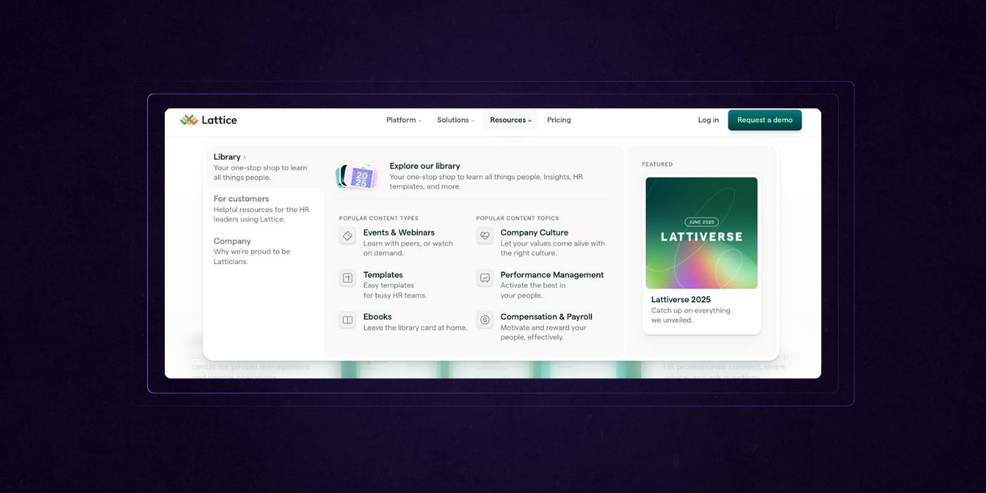
Resource Dropdown
Lattice’s resource dropdown menu is a thoughtful blend of utility and brand personality.
The layout is clean, well-structured, and makes it easy for busy HR leaders to find what they need quickly, whether it’s an event, a template, or an ebook.
By organizing content types and topics side by side, it supports both how users think and what they’re trying to solve. The subtle use of icons adds visual orientation without distraction.
Highlighting the latest feature, like “Lattiverse 2025,” keeps the menu feeling current and active. It’s not just a dropdown, it’s a curated gateway to value, built for engagement and discovery.
Ramp
Ramp is a finance automation platform that helps businesses manage expenses, control spending, and streamline accounting with smart corporate cards and software. Heres where this financial SaaS website excels:
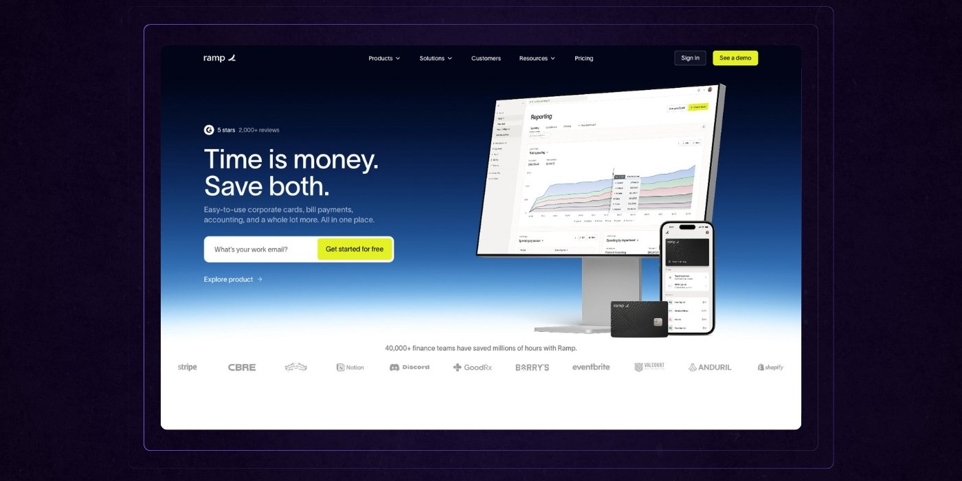
Homepage
Ramp’s homepage is a sharp, efficient expression of its core value: saving time and money. The hero section is clean and direct, pairing a bold headline with real product visuals that immediately establish credibility.
What follows is a mix of social proof, customer outcomes, and product benefits presented in bite-sized, scroll-friendly sections. The messaging is tight and user-focused, making it easy to grasp not just what Ramp does, but why it matters.
Alternating color blocks and use-case examples keep the flow dynamic without overwhelming the viewer.
The page blends enterprise trust with startup energy, appealing to a wide audience while still feeling tailored.
It’s a great example of how clarity and restraint can drive conversion—every section earns its place and points back to a single goal: helping businesses do more with less.
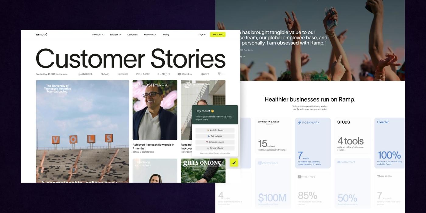
Success Stories
Ramp’s customer stories page turns social proof into a selling engine.
The layout leads with highly visual, editorial-style stories that feel authentic and specific, not templated. Scrolling down, the shift to quantified snapshots like “7 months to close the cash flow gap”, or “$100M saved”, adds punch and immediacy for results-focused buyers.
The variety of industries and business sizes shown reinforces Ramp’s broad appeal without diluting relevance.
Smart use of filters, clean UI, and consistent structure make browsing intuitive and engaging.
Most importantly, the narrative isn't just about happy customers, it’s about real operational transformation. This is what trust-building at scale looks like.
Zendesk
Zendesk is a customer service platform that helps businesses manage support tickets, improve customer interactions, and deliver better service experiences across channels. Here's where their website excels:
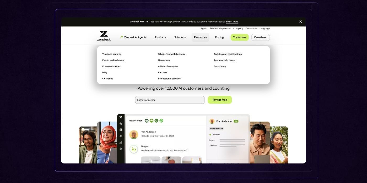
Homepage Design
Zendesk’s homepage does a great job of combining enterprise credibility with an inviting, user-focused tone. The navigation is streamlined and smartly layered, giving visitors direct access to solutions without overwhelming them.
The hero section is clean and emotionally grounded, with inclusive visuals and product UI that feels modern and accessible.
Case studies, partner logos, and third-party badges add instant trust, while the Zendesk Relate block introduces deeper value without veering into jargon.
Strategic CTAs are woven throughout, and the consistent use of Zendesk’s green palette helps anchor the experience.
The layout is flexible and modular, letting the content shine without clutter. This site was built to speak to both decision-makers and frontline users. It is clear, trustworthy, and focused on what matters most: delivering exceptional support.
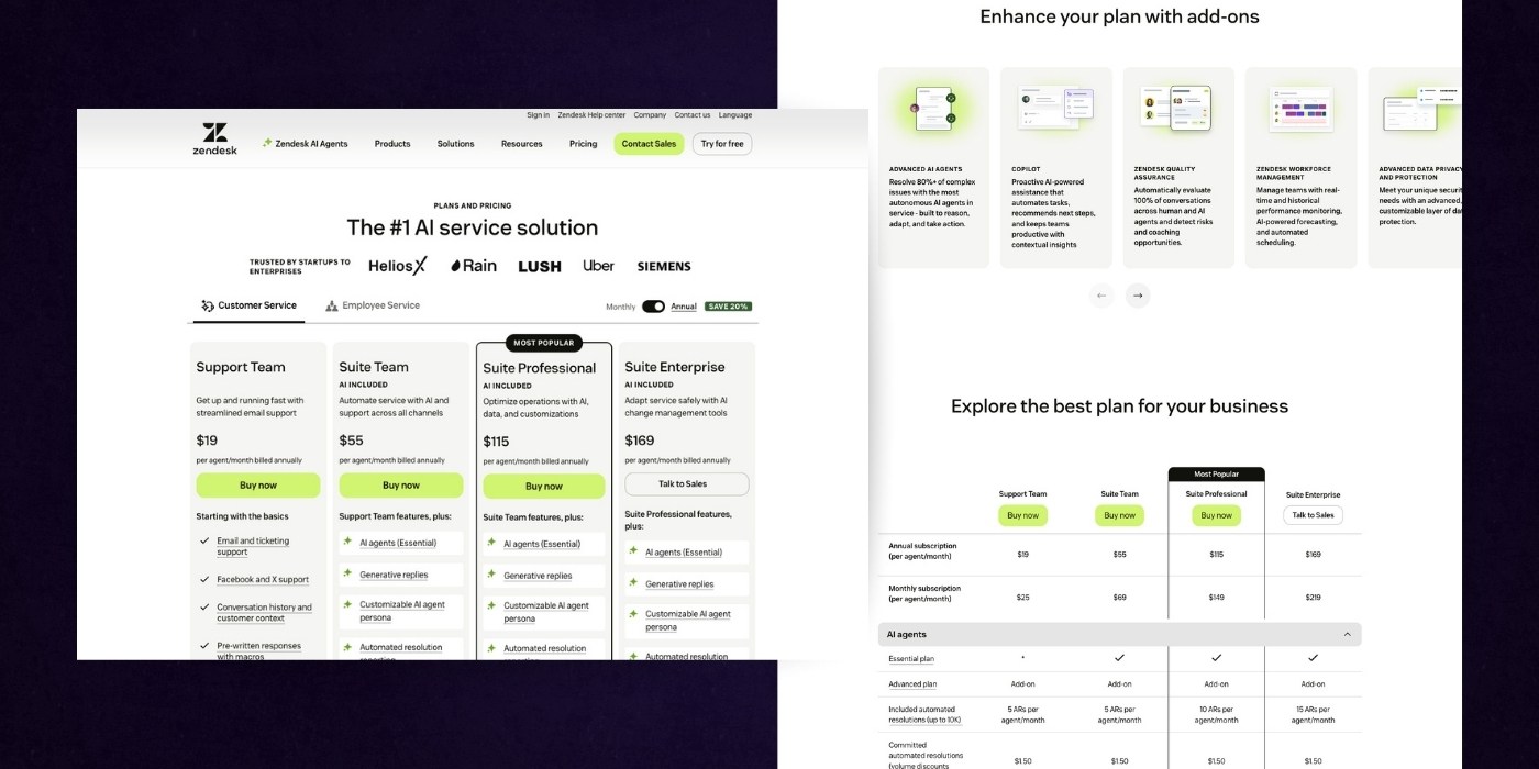
Pricing Page
Zendesk’s pricing page does a solid job of organizing a high volume of information without sacrificing clarity. The pricing tiers are clearly defined at the top, each with a crisp summary of who it's for and what’s included.
The sticky navigation and compact comparison table that follows allow users to explore details at their own pace, whether they're scanning for a quick answer or digging deep into specific features.
Visual consistency and use of whitespace keep the dense chart from feeling overwhelming. Supporting content below the fold, like product modules and FAQs, adds depth without distracting from the primary goal. It’s a page designed for evaluation, helping buyers feel confident, informed, and in control.
PLG SaaS Website Examples
Canva
Canva is an online design platform that empowers anyone to create professional-quality graphics, presentations, and content with easy-to-use tools and templates. As part of its versatile offerings, Canva also enables users to create online courses, making it a valuable resource for educators and course creators. Here’s how their website stacks up:
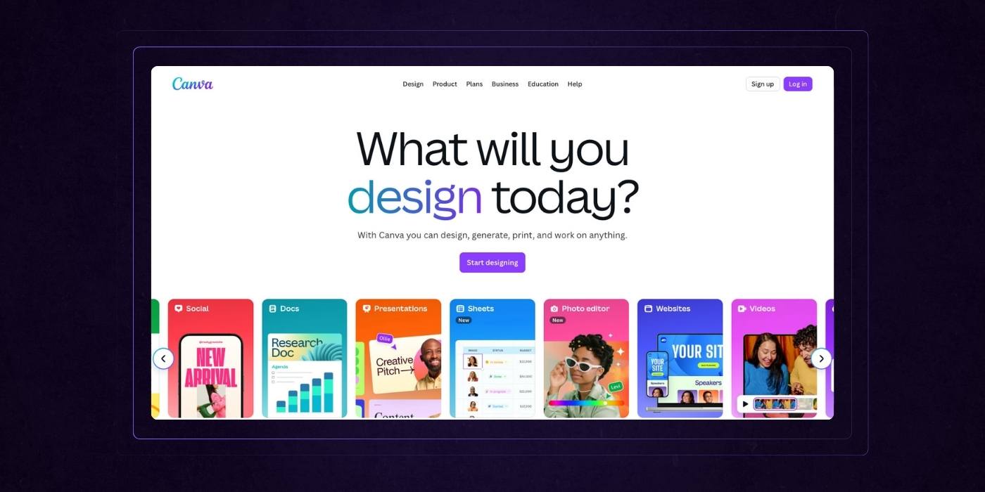
Homepage Design
Canva’s homepage is a vibrant, user-friendly showcase of product versatility and creative empowerment. The headline is simple and inviting: “What will you design today?” This immediately reframes the experience as open-ended and accessible.
Visual storytelling takes the lead throughout the page, with colorful templates, animated previews, and real UI that highlights ease of use.
The structure is modular and easy to skim, guiding users from AI-assisted design to collaboration tools to print services, all without heavy technical explanation. Each section reinforces the idea that Canva is built for everyone, from beginners to professionals.
Trust badges, smart CTAs, and a wide range of use cases make the value feel both broad and personal. It is a joyful, conversion-focused page that lowers the barrier to design while still communicating depth and power.
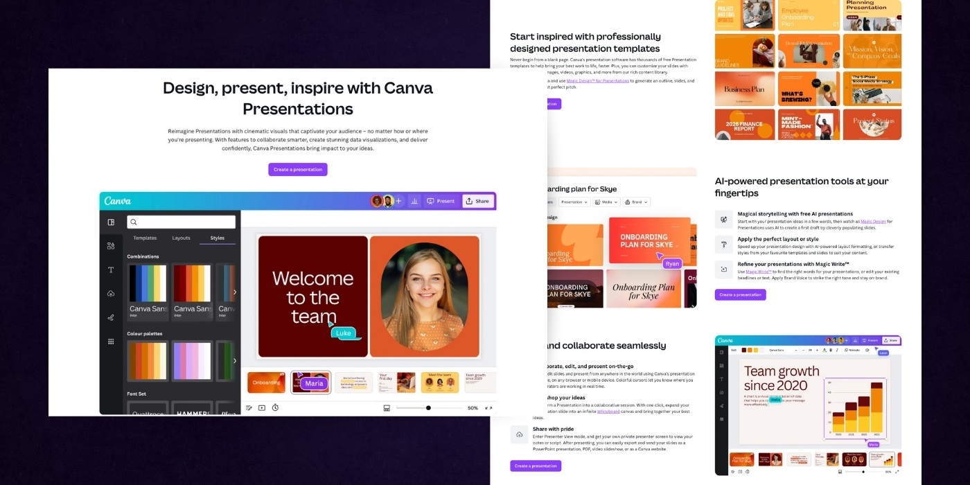
Features Page
Canva’s presentation feature page is a strong example of how to blend inspiration with practical utility.
It opens with a confident headline that invites users to not just create slides, but to engage and impress their audience. The hero section showcases a real product preview that instantly demonstrates ease of use and visual impact.
As you scroll, the layout alternates between use cases, templates, and features, each paired with short, clear explanations and calls to action.
The variety of designs on display highlights flexibility without overwhelming the viewer. Every section reinforces a message of empowerment, making it feel like anyone can create professional-quality presentations without design experience.
Helpful touches like FAQs, integrations, and collaboration tools round out the offer. This page doesn’t just sell a product; it builds confidence in the user’s ability to create something great.
ClickUp
ClickUp is an all-in-one productivity platform that helps teams manage tasks, docs, goals, and workflows in a single, customizable workspace. Heres why their SaaS website is great:

Homepage Design
ClickUp’s homepage delivers a bold promise and backs it up with clarity and confidence.
The headline immediately positions the product as the AI workspace where all your work gets done, offering both ambition and practicality. The hero section features smart product visuals and strong CTAs that invite exploration.
Throughout the page, content is organized to highlight both pain points and solutions, with direct messaging like “Work is broken. Let’s fix it.” helping users feel seen.
Feature blocks, customer stories, and partner logos create a strong foundation of trust, while subtle motion and clean visuals keep the experience modern and engaging.
The layout is highly modular, making a complex product feel accessible without watering it down. From workflows to integrations, everything is presented as purposeful and easy to adopt.
This is a homepage built to convert teams that want to move faster without sacrificing clarity or control.
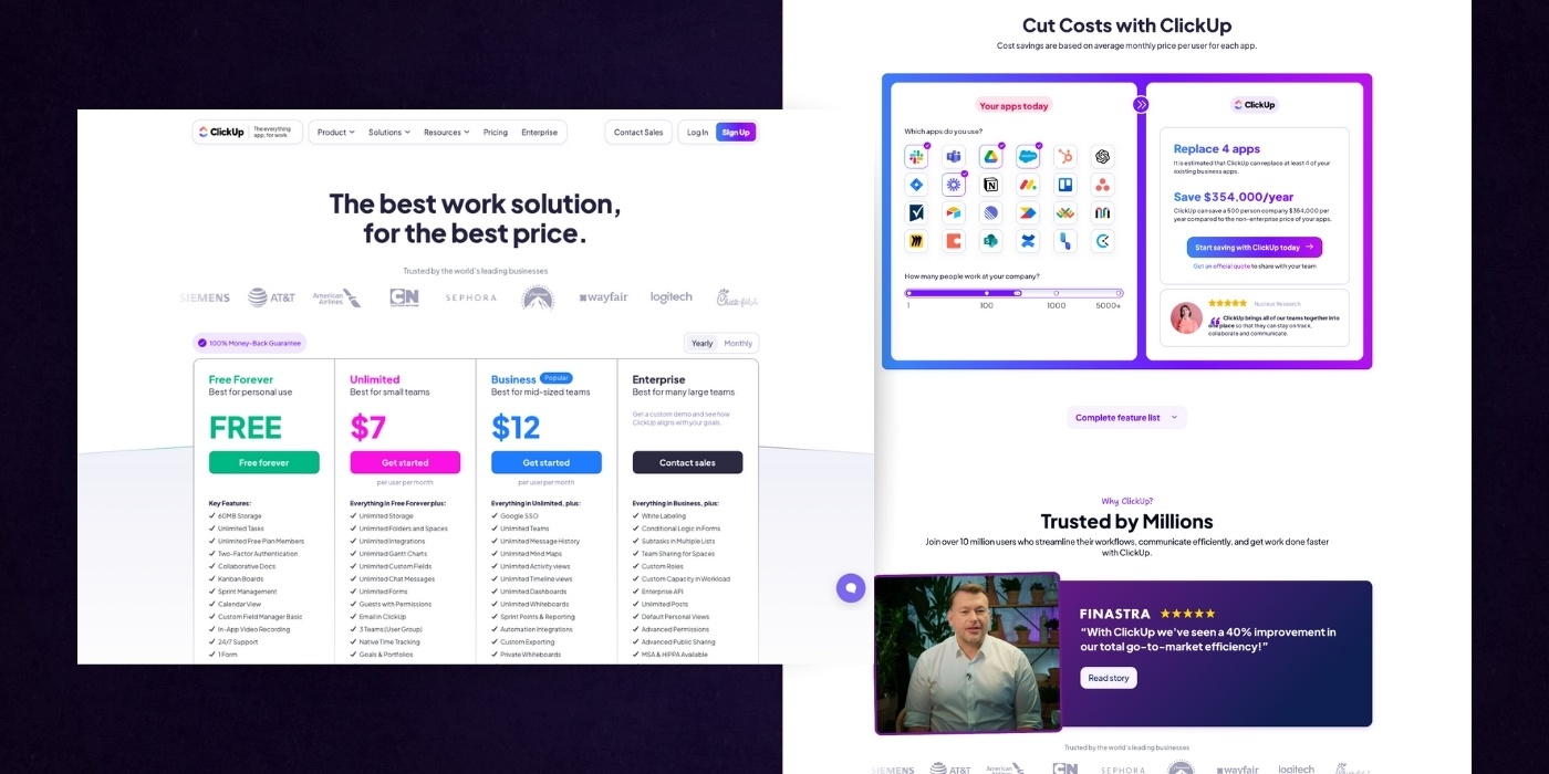
Pricing Page
ClickUp’s pricing page is structured to make the decision process feel easy and logical. The headline clearly frames the product as both high-performing and affordable.
Four well-defined pricing tiers, Free, Unlimited, Business, and Enterprise, are presented with consistent formatting. Checklists and feature comparisons emphasize value. Monthly and yearly toggles provide flexibility, while buttons like “Get started” and “Contact sales” stand out for quick conversion.
Further down, the page highlights ClickUp’s AI features, consolidated app savings, and customer success stories. These additions reinforce the pricing value with tangible outcomes, such as cost reduction and increased productivity. A final FAQ section anticipates and addresses objections directly.
Overall, the tone is confident and practical. The layout and messaging focus on delivering clarity, with every section reinforcing the value of choosing ClickUp.
Notion
Notion is a connected workspace that combines notes, docs, wikis, and project management to help teams stay organized and aligned. Here’s where their website shines:
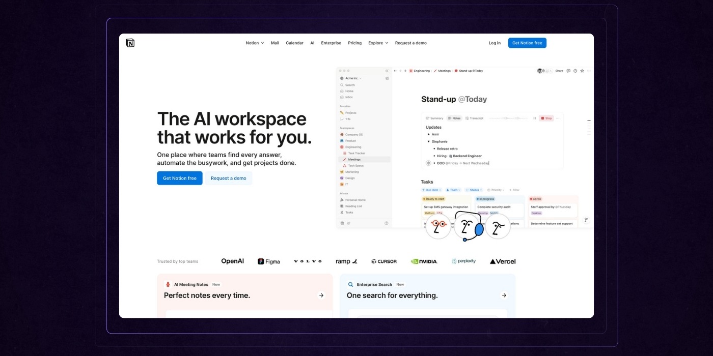
Homepage Design
Notion’s homepage positions it as the intelligent workspace where teams can organize everything in one place. The messaging is concise, promising streamlined project management and time-saving automation. A clean, minimalist layout supports this positioning visually.
Key sections emphasize functionality: AI-generated meeting notes, universal search, integrated tasks, and company-wide roadmaps. The “More productivity. Fewer tools.” line simplifies its value proposition, showing how Notion can replace several apps. Customer logos and quotes serve as social proof, and pricing examples offer transparency on cost efficiency.
The tone is polished and confident, with emphasis on clarity and usefulness. Every block on the page is crafted to demonstrate how Notion helps teams work better together.

This Notion demo contact page is designed to convert interest into leads. It clearly invites users to connect with sales for tailored support, whether for pricing, demos, or use case exploration.
The layout splits into two key areas:
- Left side: Features strong social proof. Logos of high-profile customers (like OpenAI, Amazon, and Figma) lend instant credibility. Below that, impactful testimonials from industry leaders reinforce trust and Notion's practical value in workflow optimization.
- Right side: A streamlined lead capture form collects essential information including company size, job title, and reason for contact. It also allows for contextual messaging, helping the sales team qualify and respond more effectively.
The page’s overall tone is professional, clear, and confidence-building. It presents Notion as a high-trust partner, not just a productivity tool.
Fintech SaaS Website Examples
Cursor
Cursor is an AI-first code editor that helps developers build software faster by integrating intelligent autocomplete, code explanations, and debugging tools directly into their workflow. Heres where their website excels:
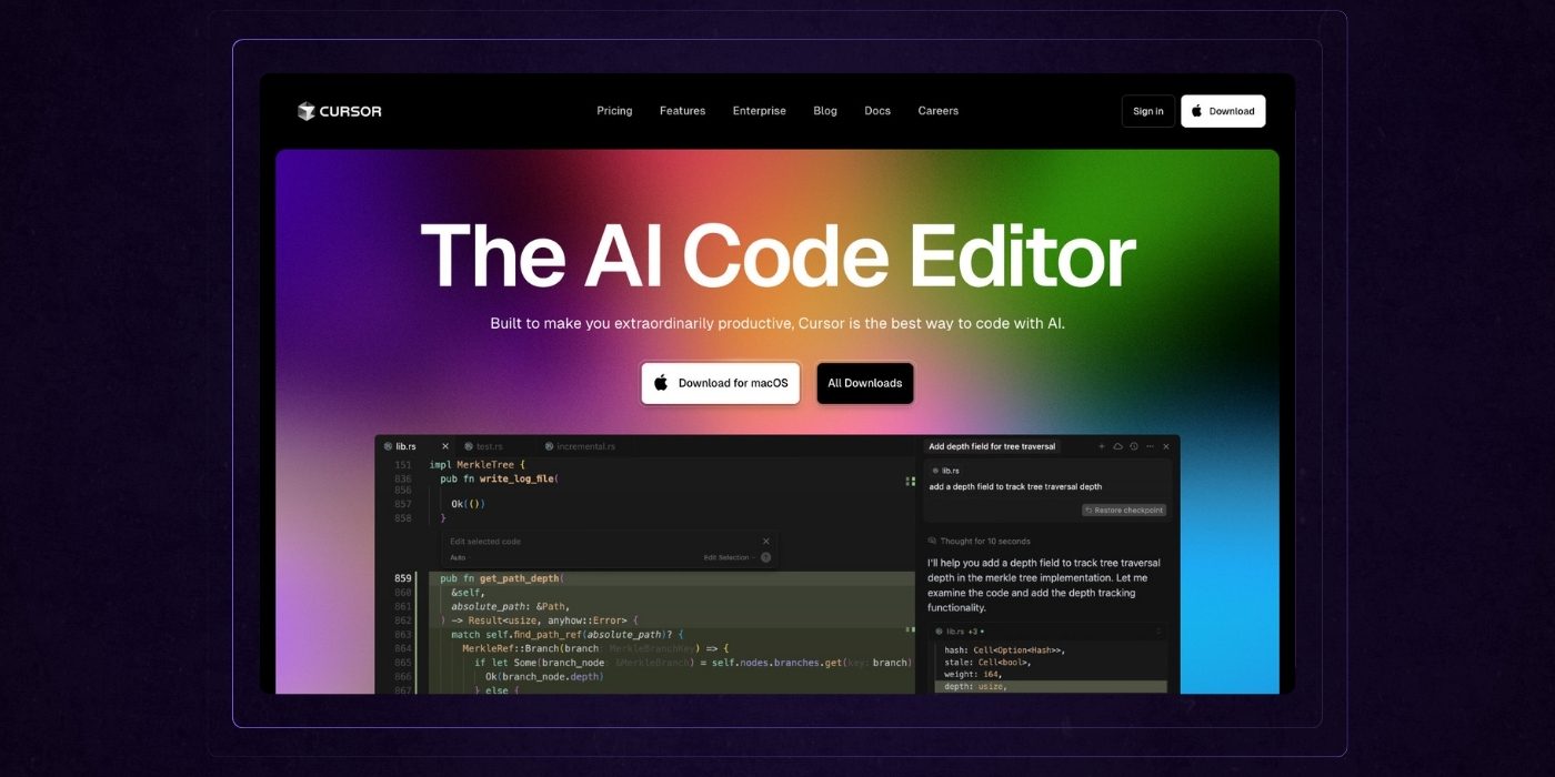
Homepage Design:
This page from Cursor is a strong example of design and messaging working in sync to build instant clarity and trust.
The bold gradient visuals give the brand a modern, memorable identity, while the headline makes the product offering unmistakably clear: “The AI Code Editor”.
High-visibility calls-to-action are placed early to encourage engagement right away. The layout is streamlined and intuitive, with each section flowing smoothly into the next.
Feature highlights like “Tab, tab, tab” and “Knows your codebase” are short, benefit-focused, and supported by clean visuals that reinforce functionality.
Well-placed logos and testimonials provide social proof without clutter. Altogether, the page delivers a compelling story in a concise, conversion-focused package.
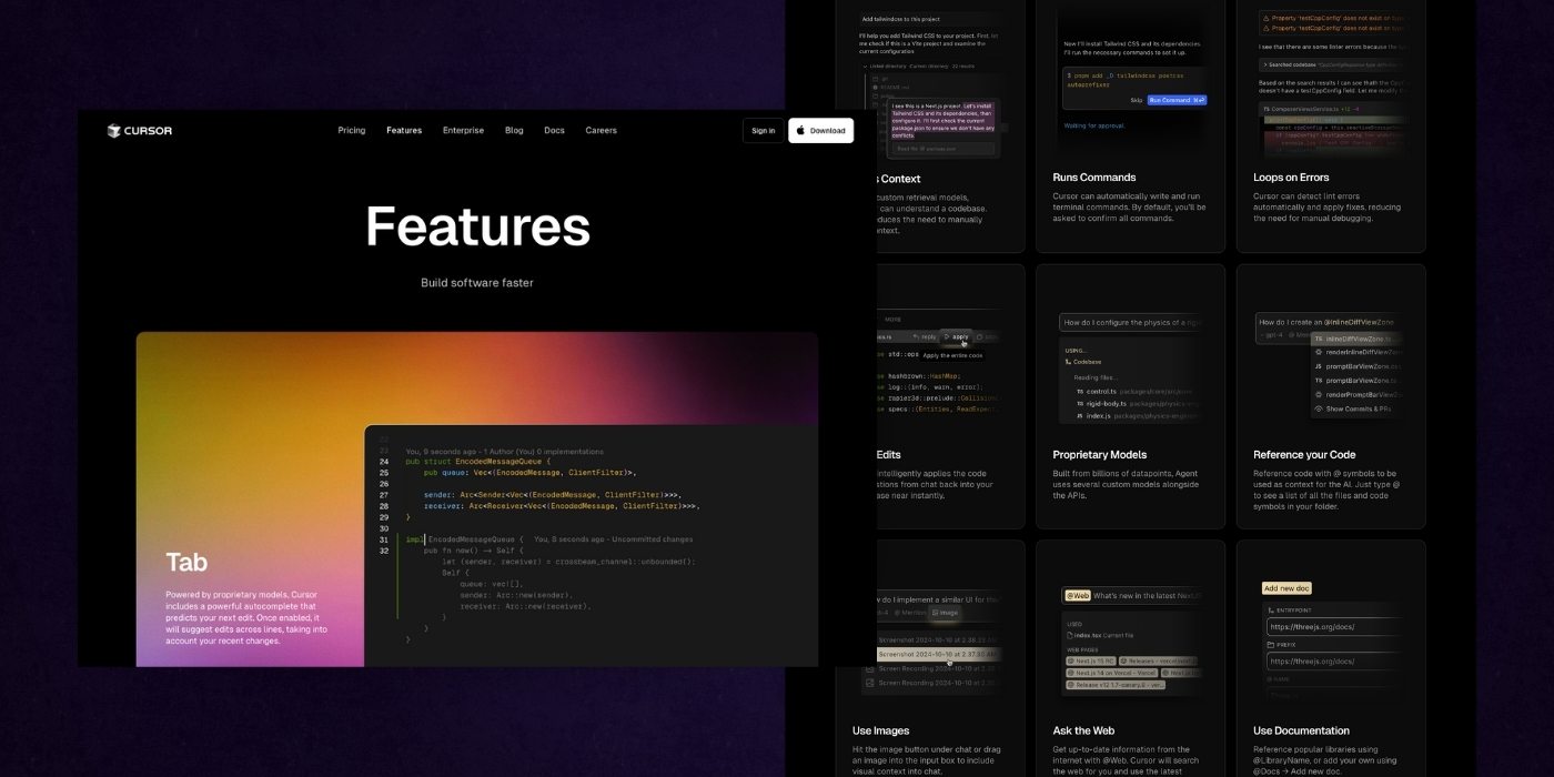
Features Page:
Cursor’s Features page does a stellar job translating complex AI capabilities into benefits developers can quickly grasp. It opens with a clear value prop, “Build software faster”, and then breaks down functionality with thoughtful hierarchy and visuals.
Each section, from “Tab” to “Agent” to “Inline Edit,” pairs punchy descriptions with animated code previews that reinforce value without requiring heavy explanation.
The modular layout makes scanning effortless, while consistent styling builds trust through predictability. Features like “Smart Rewrites” and “Ask the Web” speak directly to real developer pain points.
Overall, this page is product-led storytelling done right. It feels engineered not just to inform, but to inspire action.
Spline
Spline is a 3D design tool that makes it easy for designers to create, collaborate on, and publish interactive 3D experiences for the web. Here's what they get right:
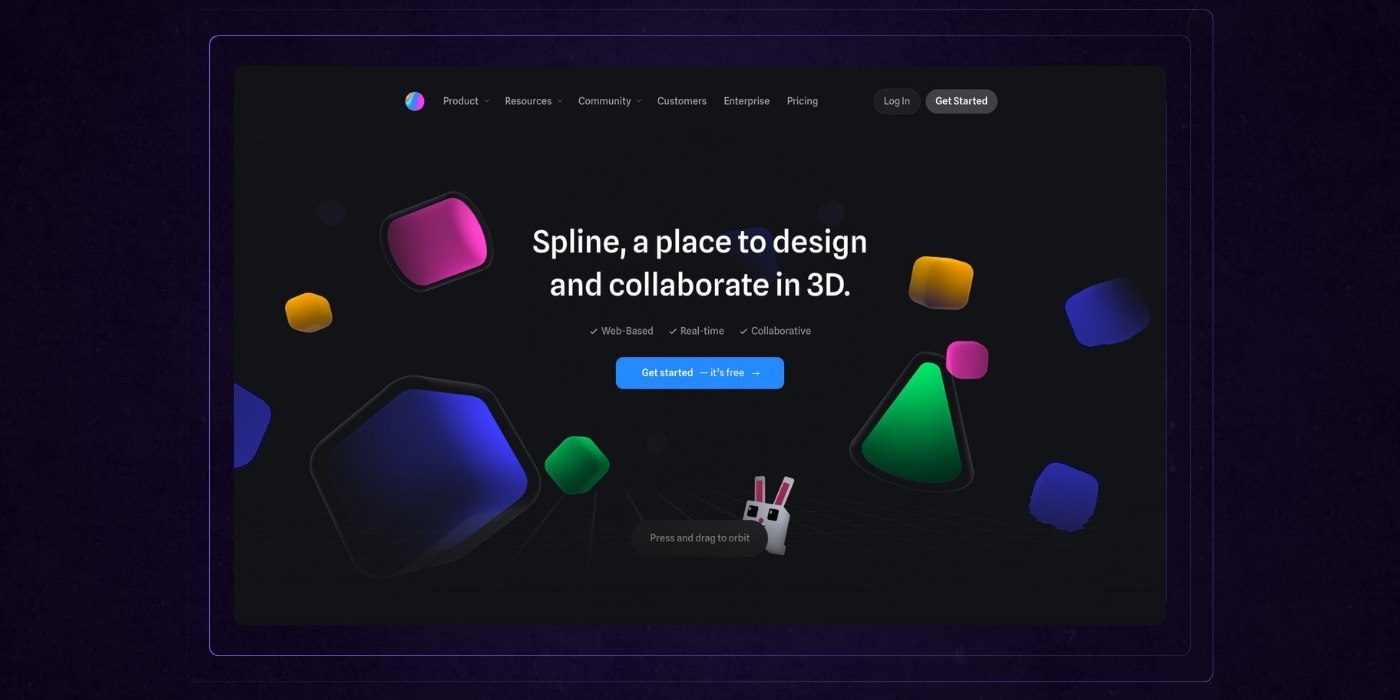
Homepage Design
Spline’s homepage is a visual masterclass in product immersion. Right from the first screen, interactive animated elements highlight the core value of real-time 3D design in a way that feels immediate and intuitive. The hero section communicates the value proposition clearly, with a strong call to action that invites users to dive in.
As you scroll, the page maintains a steady rhythm by pairing vibrant visuals with short, benefit-focused copy. Each feature is introduced in a way that feels creative yet practical, making complex tools feel user-friendly.
The inclusion of well-known logos and testimonials builds credibility, while the collaboration demo provides a clear look at real-world functionality.
This isn’t just a product page—it’s an experience that makes the value of Spline instantly tangible.

Showcase Page
Spline’s showcase page is a strong example of how to turn inspiration into activation. The headline is direct and motivating, encouraging users to explore and replicate real 3D scenes.
The grid layout is clean and visually engaging, allowing the work to speak for itself without unnecessary distraction. Each project thumbnail is vibrant, clickable, and clearly labeled, making browsing easy by interest or style.
The call-to-action is repeated at the top and bottom, giving users multiple entry points into the app. By balancing creativity with usability, this page does more than show off what’s possible; it invites users to jump in and start building.
Webflow
Webflow is a visual development platform that lets designers build custom, responsive websites without writing code. Heres why their SaaS website is a best of example:
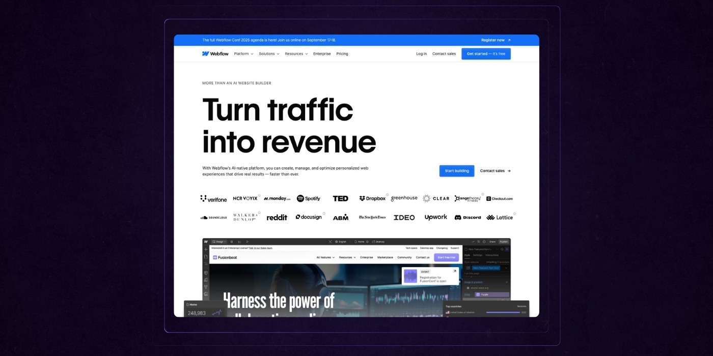
Homepage Design
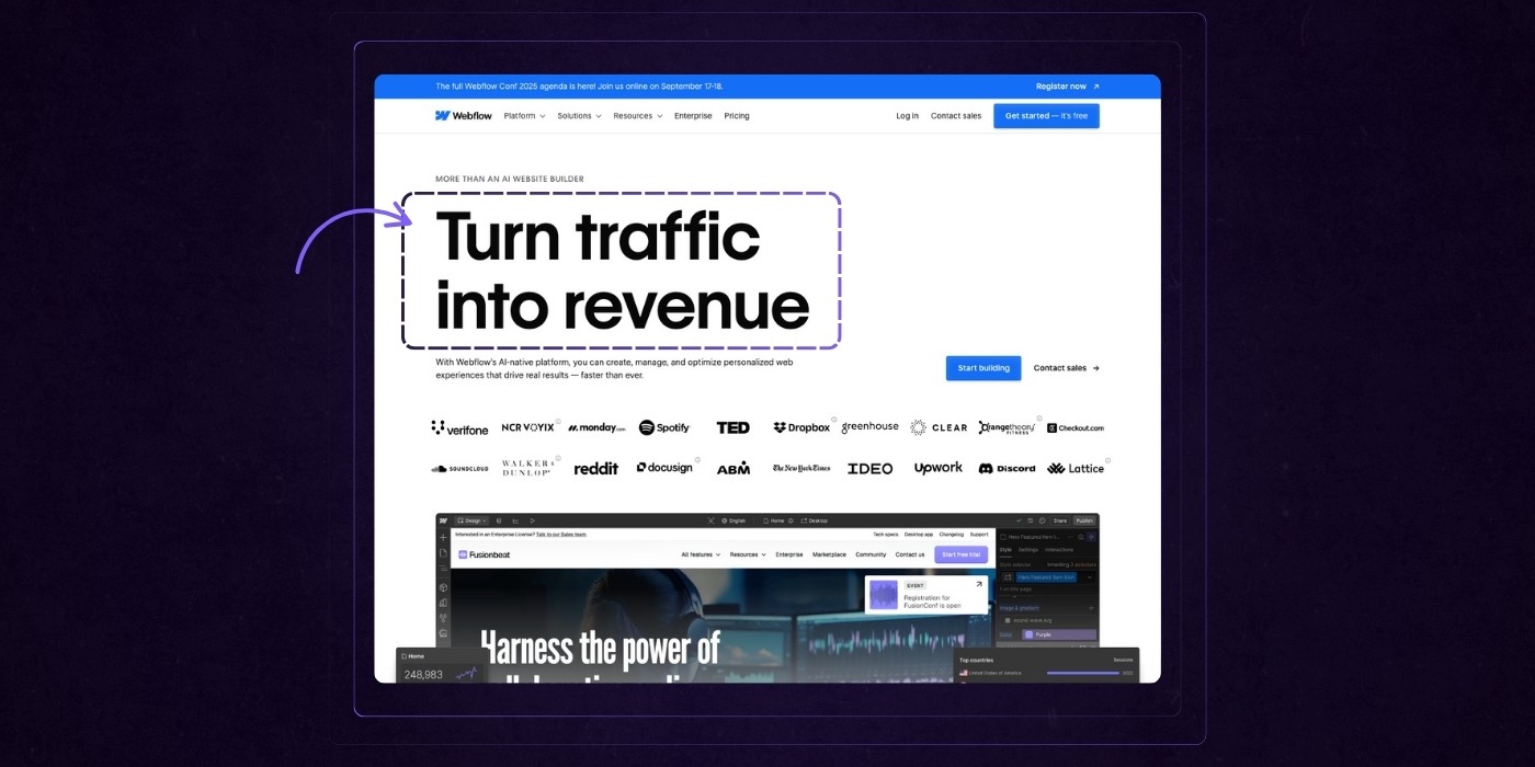
Webflow’s homepage strikes a smart balance between clarity and capability. It opens with a clear promise: “Turn traffic into revenue”, supported by trusted brand logos, sharp product visuals, and concise benefit statements.
Each section adds depth, moving from aspirational outcomes to practical examples and customer proof.
The layout follows a clean, grid-based structure that makes content easy to scan and digest. Messaging stays focused on what matters most: business results, not technical jargon.
Interactive elements like video demos and micro-animations add a layer of sophistication without pulling attention away from the message.
The result is a page that builds trust quickly and makes a strong case for choosing Webflow. Webflow is widely considered the best platform for building SaaS websites because of its ease of use, design flexibility, strong SEO capabilities, and effectiveness in creating visually appealing, high-converting sites.
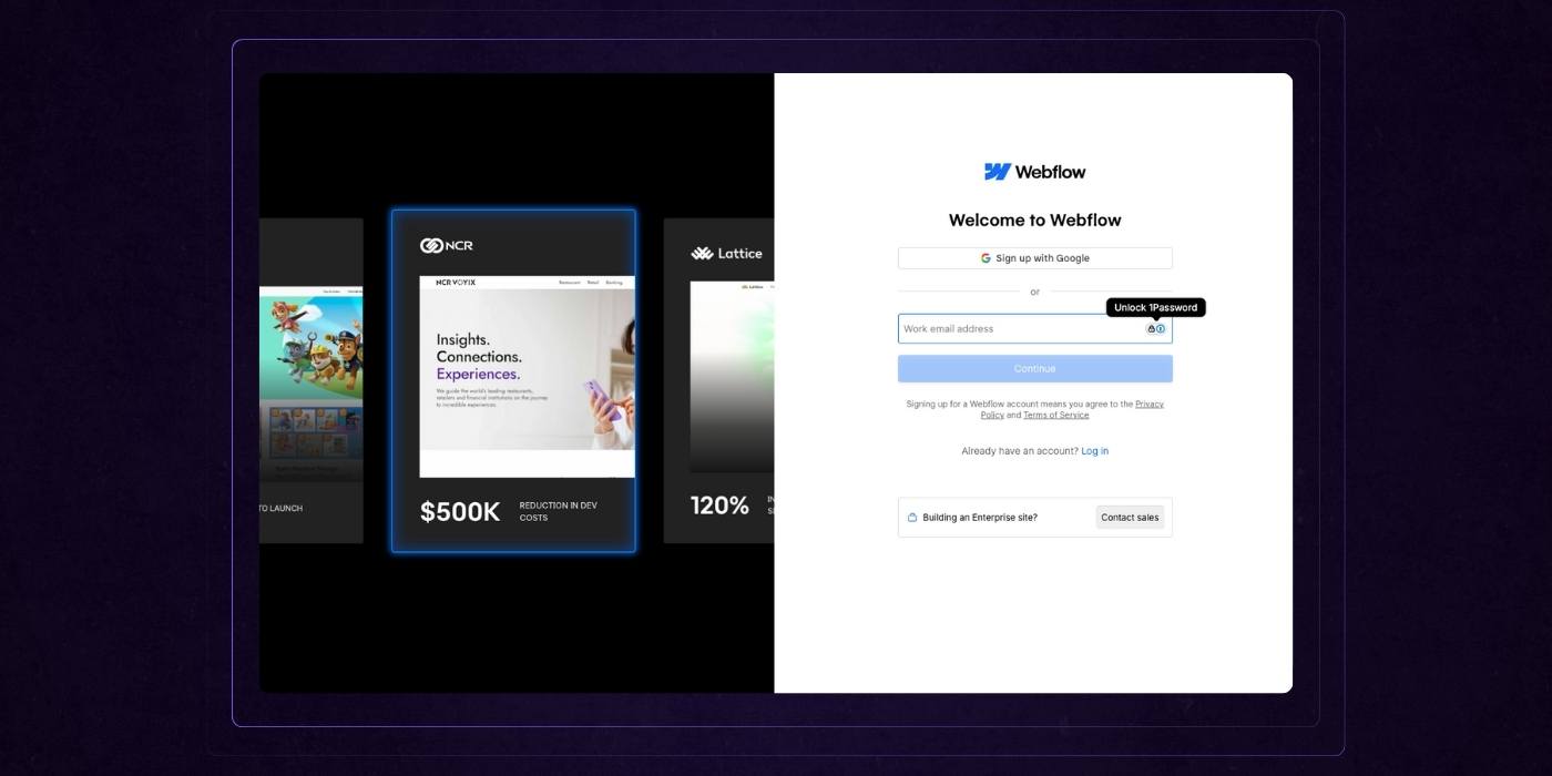
Signup Page
This signup experience from Webflow is clean, modern, and friction-free. The split-screen layout does two jobs at once: it reinforces value through a carousel of real customer outcomes on the left, and offers a focused, minimal form on the right.
The interface feels familiar and trustworthy, with single sign-on options and subtle UX details like password managers baked in. Everything here is designed to reduce hesitation, whether you’re a new user signing up or an enterprise lead considering a conversation. It’s a simple but effective moment that keeps momentum high.
Protip: Want examples of killer SaaS websites we've built? Check out our case studies section for breakdowns on clients like ABC Fitness, Bizrate Insights, and Mdisrupt.
The 10 Things Top SaaS Websites Get Right (Focus On These To Win)
Now that we've covered a masterclass in SaaS web design from some of the biggest players in the business, it's time to reflect on what we've observed.
Here are the key things they're doing to win, and what you should be doing too.
1. Lead With Value From the First Second
Most SaaS websites waste their most valuable real estate: the hero section. Instead of making a clear case for why someone should care, they open with vague statements or laundry lists of features. The best websites take a different route. They get right to the point.
Outcomes First, Always
Your headline isn’t a product overview. It’s a promise. Top SaaS websites lead with the result customers can expect. Think “Cut onboarding time in half,” not “Powerful automation platform.” People don’t care what your product does until they understand what it will do for them.
If your headline could appear on a competitor’s site without raising an eyebrow, it’s too generic. Great headlines describe the transformation. They are specific, benefit-driven, and fast to digest.
The Value Proposition Takes Center Stage
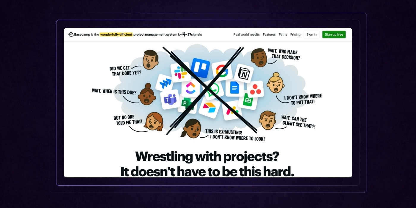
Within the first scroll, visitors should understand what you offer, how it solves their problem, and why it’s worth their time. The strongest SaaS websites deliver this through a tight value prop that leaves no room for confusion.
One to two lines of copy is usually enough. The goal is clarity, not creativity. Pair it with a subhead that adds context, answers key questions, and preempts hesitation. Make sure to include clear calls to action that stand out visually and guide users toward the next step.
This is also where visuals earn their keep. Product shots, micro-interactions, or demo loops shouldn’t just show off design. They should reinforce the outcome. Use visuals to paint a before-and-after picture of your customer’s world.
CTAs That Invite Action
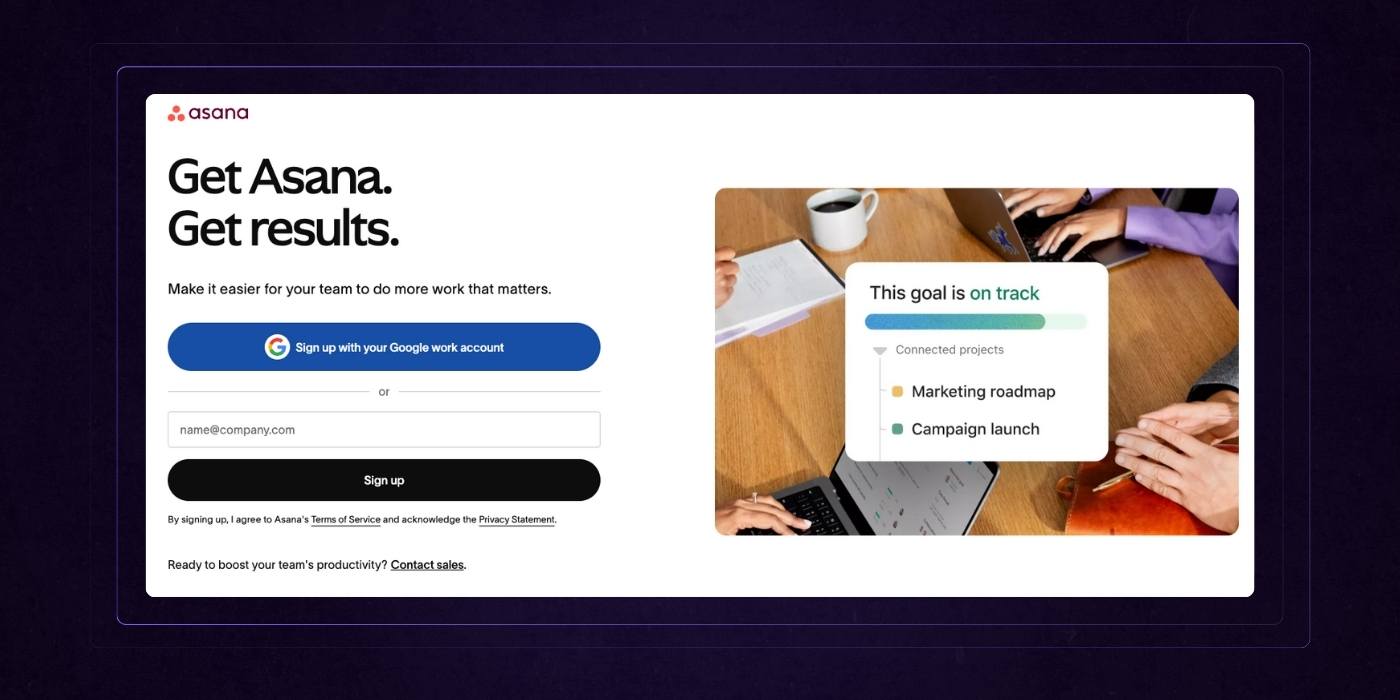
Don’t make people scroll to figure out what to do next. The best SaaS websites place CTAs where attention is highest — right after the value is delivered.
But placement alone isn’t enough. The CTA must be specific and actionable. Buttons like “Get Started,” “Watch the Demo,” or “See It in Action” give users a clear path forward. Vague prompts like “Learn More” don’t drive clicks.
Strong CTAs are often paired with product visuals or interactive previews. This builds confidence and makes the next step feel like a low-risk, high-reward move. For even better results, repeat your CTA in multiple formats, such as a sticky nav or a floating action card.
2. Build Instant Credibility
Trust is not earned at the end of a SaaS landing page. It is earned in the first few seconds of interaction. High-performing SaaS websites understand that credibility is a conversion lever, not just a nice-to-have. And they don’t wait to prove it.
Lead With Real-World Proof
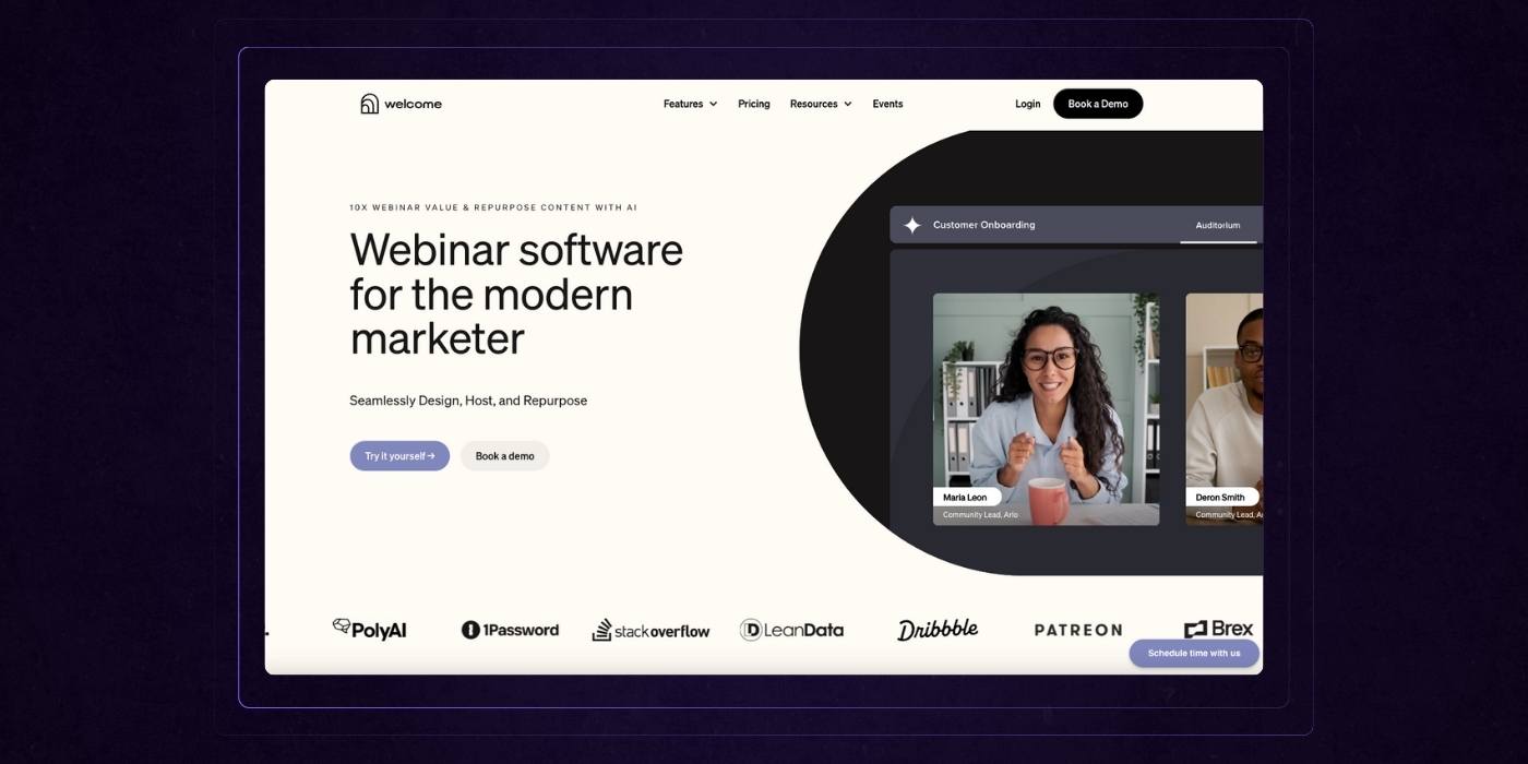
The strongest SaaS brands showcase evidence of success right out of the gate. Not just a logo farm slapped in the footer, but customer logos positioned near the hero section, immediately signaling social validation. Better yet, they include microtestimonials or success snapshots directly under or beside those logos to reinforce what those logos mean in practice.
Instead of asking the visitor to believe, top websites show them that others already do.
Case studies also deserve more than a buried link in the navigation. Great SaaS pages tease case studies as part of the flow, offering bite-sized wins from real customers with tangible outcomes. For example, “How Acme reduced churn by 40 percent in 60 days” gives instant credibility and invites further exploration.
Earn Trust From Enterprises, Not Just Startups
Enterprise buyers are risk-averse by default. They are looking for red flags, not just green lights. That means trust signals need to go beyond testimonials and happy customer logos.
Security credentials, compliance badges, and third-party verification offer reassurance that your product is battle-tested. ISO certifications, SOC 2 compliance, GDPR readiness, and verified reviews from platforms like G2 or TrustRadius help build the case for due diligence. Awards and recognitions also play a role, especially when from industry-recognized sources.
Even a single security credential placed early on can reduce friction with technical stakeholders and procurement teams.
Spread Proof Throughout the Experience
Most SaaS sites concentrate trust signals in a single section, often near the footer. The problem is that many visitors never get that far. The best websites treat credibility like a narrative element, not a checklist item.
They weave it throughout the page — a testimonial beneath a feature block, a stat next to a demo callout, a client quote as part of the hero flow. This layered approach means validation is always within reach, no matter where the user is on the page.
The result is a site experience that feels consistent, confident, and trustworthy. You’re not begging users to believe. You’re making it obvious why they should.
3. Make It Easy to Digest, Easy to Act
Clarity is a competitive advantage. For SaaS companies with complex offerings, the ability to communicate clearly is often what separates a high-converting site from one that gets bounced in under ten seconds. The best SaaS websites embrace structure, hierarchy, and simplicity without sacrificing substance.
Grid Systems That Guide, Not Just Decorate

The strongest SaaS websites use grid-based or modular layouts to create a sense of order. These aren’t just design trends — they are frameworks that help users scan, compare, and retain information. A well-structured grid guides the eye, supports visual hierarchy, and prevents cognitive overload.
Each block of content should serve a single purpose. A benefit. A feature. A testimonial. A CTA. Avoid combining too much into a single section. When done right, a modular design creates a natural rhythm and flow that keeps visitors engaged and moving forward.
Use Design to Punctuate, Not Distract
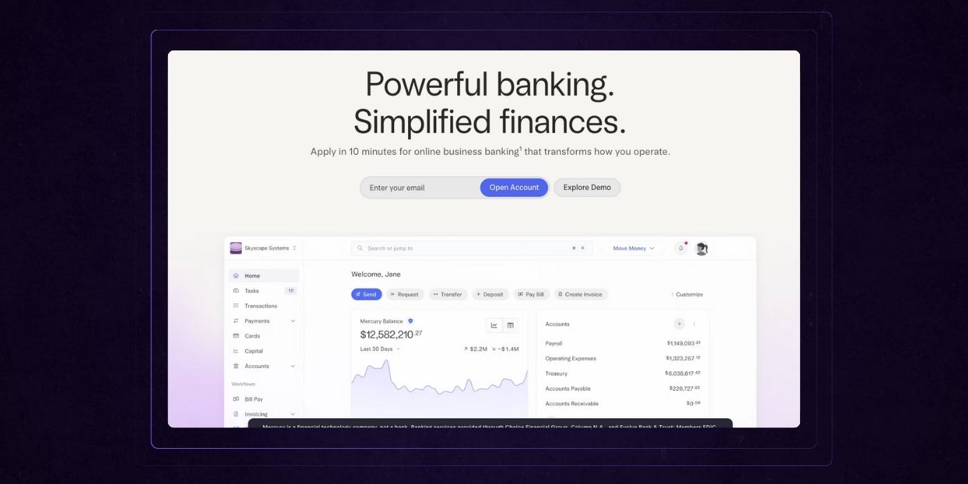
Alternating background colors or segmented blocks are not just about aesthetics. They help establish visual breaks between concepts, making content easier to scan and understand. This pattern creates moments of pause and reorientation, especially helpful on longer pages or multi-feature layouts.
These visual cues act like chapter markers in a book. Visitors intuitively know when they are entering a new section, which allows them to self-navigate without feeling lost or overwhelmed.
Contrast matters here. A soft background shift can differentiate content types, but bold alternations are often used to draw attention to key actions or differentiators. Bold colors are frequently used to highlight important actions or unique features, making them stand out and reinforcing brand identity. This is especially effective when transitioning from information to conversion prompts.
Use Design to Punctuate, Not Distract
Dense walls of jargon are conversion killers. Top-performing SaaS websites write like real people talking to smart professionals. They avoid technical jargon unless it's truly necessary and instead focus on delivering information in a way that is easy to absorb on first read.
Headlines are short and direct. Supporting copy is tight, scannable, and free of filler. Bullet points, collapsible sections, and iconography are all used strategically to support skimming without losing the core message.
And while the copy is simple, it never talks down to the reader. The tone is confident and helpful, not robotic or overly casual. This balance builds trust, especially with buyers who value clarity over cleverness.
4. Speak the Language of Results
SaaS buyers are not interested in features for the sake of features. They care about outcomes. The best SaaS websites know this and bake results-driven messaging into every layer of their content. It's not just about what the product does, but what the user gets out of it.
Business Value Comes First
Top-performing websites lead with the metrics that matter. That means calling out the impact your product has on efficiency, revenue growth, compliance standards, or cost savings. These aren’t buried in long paragraphs. They’re upfront, repeated often, and tied directly to the user’s pain points.
"Cut support tickets by 32 percent."
"Slash month-end reporting time from days to hours."
"Boost conversion rates without hiring another rep."
These are the kinds of statements that speak to results. They give decision-makers something they can quantify, repeat to stakeholders, and rally behind.
Features Serve the Story, Not the Other Way Around
Too many SaaS websites default to listing features as isolated bullet points. That approach fails to answer the most important question every buyer is silently asking: how does this help me?
High-performing sites connect the dots between features and real-world use cases, which is especially important for SaaS products. Instead of saying “automated workflows,” they say “automate onboarding so your reps can spend more time selling.” Instead of “custom reporting dashboards,” they say “build reports your CFO actually wants to see.”
This shift from technical listing to outcome-driven storytelling transforms your site from a spec sheet into a strategic tool.
Clear, Confident, and Human
Results-driven messaging doesn't mean speaking in buzzwords or corporate lingo. The most effective SaaS websites sound like a knowledgeable partner, not a textbook. Their language is polished, confident, and easy to understand, even when describing complex capabilities.
You won’t find sentences that require re-reading. Instead, the tone is professional yet conversational. It feels like someone explaining a solution across the table, not presenting at a podium.
This balance builds trust with both decision-makers and end users. It shows that you understand their world and can help them succeed in it.
5. Make Every Scroll a Conversion Opportunity
In a high-performing SaaS website, conversion is not treated as a final destination. It’s an ongoing invitation. The best sites give users multiple, well-timed chances to take the next step — no matter where they are in the journey.
CTAs Should Never Feel Like a Hunt
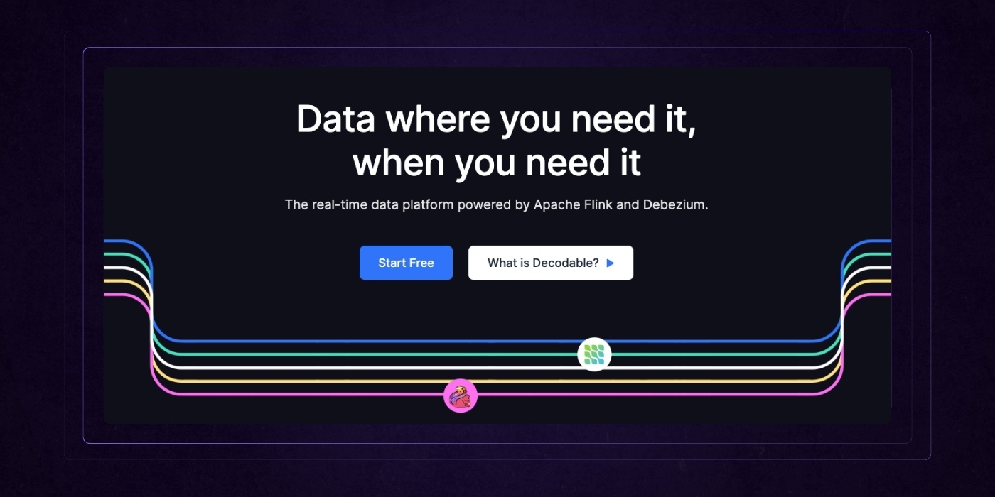
Too many SaaS websites treat their calls to action like a formality: one button in the hero, another in the footer, and that’s it. But most visitors don’t decide to convert in the first five seconds or after a long scroll. They decide in the middle, once the value becomes clear.
Strategic websites understand this and place CTAs at every point where engagement peaks. After a benefit-driven product block. Following a customer success story. Next to a video walkthrough. These are prime moments to present a relevant next step while momentum is high.
Good CTAs are contextual. They respond to the user’s likely intent. After reading a feature overview, a CTA might say “See it in action.” Following a testimonial, it might say “Start your free trial.” These aren’t distractions — they are logical extensions of the experience.
Always Accessible, Never Annoying
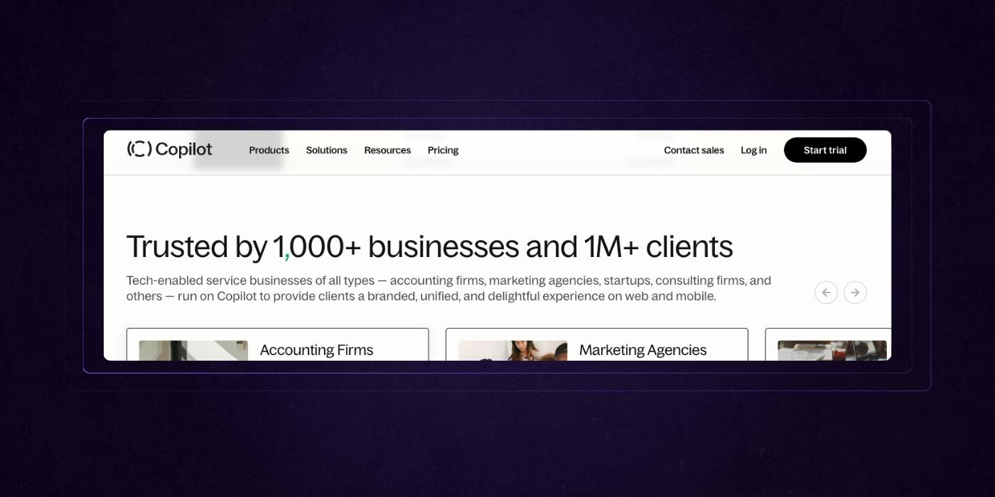
Sticky CTAs or floating action bars are subtle but powerful tools. They keep the option to convert within reach without overwhelming the content. For example, a persistent “Book a Demo” button in the corner of the screen means a user doesn’t need to scroll back up or hunt for a contact link once they’re ready.
This is especially useful on mobile, where scroll depth is high but navigation patience is low. A fixed CTA bar that respects screen space while staying visible can significantly lift engagement.
The key is to make it useful, not aggressive. It should feel like a helpful companion, not a sales pitch.
Less Form, More Flow

Every extra form field is a potential drop-off point. Top SaaS sites minimize friction by stripping forms down to the essentials — name, email, and one or two relevant qualifiers. No long questionnaires. No forced phone numbers unless absolutely necessary.
Short forms signal respect for the visitor’s time. They also increase the likelihood of completion. Once the lead is captured, further qualification can happen through automated follow-ups, personalized onboarding, or smart routing.
Some of the highest-converting SaaS sites take it even further by offering multi-step forms that feel more like conversations. Others use calendar integrations to let users book time immediately, skipping the back-and-forth entirely.
The principle is simple. Make it easy to say yes. Then remove anything that makes that yes harder.
6. Show, Don't Just Tell
SaaS websites that convert don’t rely solely on copy to carry the weight. They understand that showing the product in action builds trust faster than a paragraph ever could. When visitors can see the solution, they believe in it faster. They understand it better. And they take action with more confidence.
Product Visuals Are Not Decorative
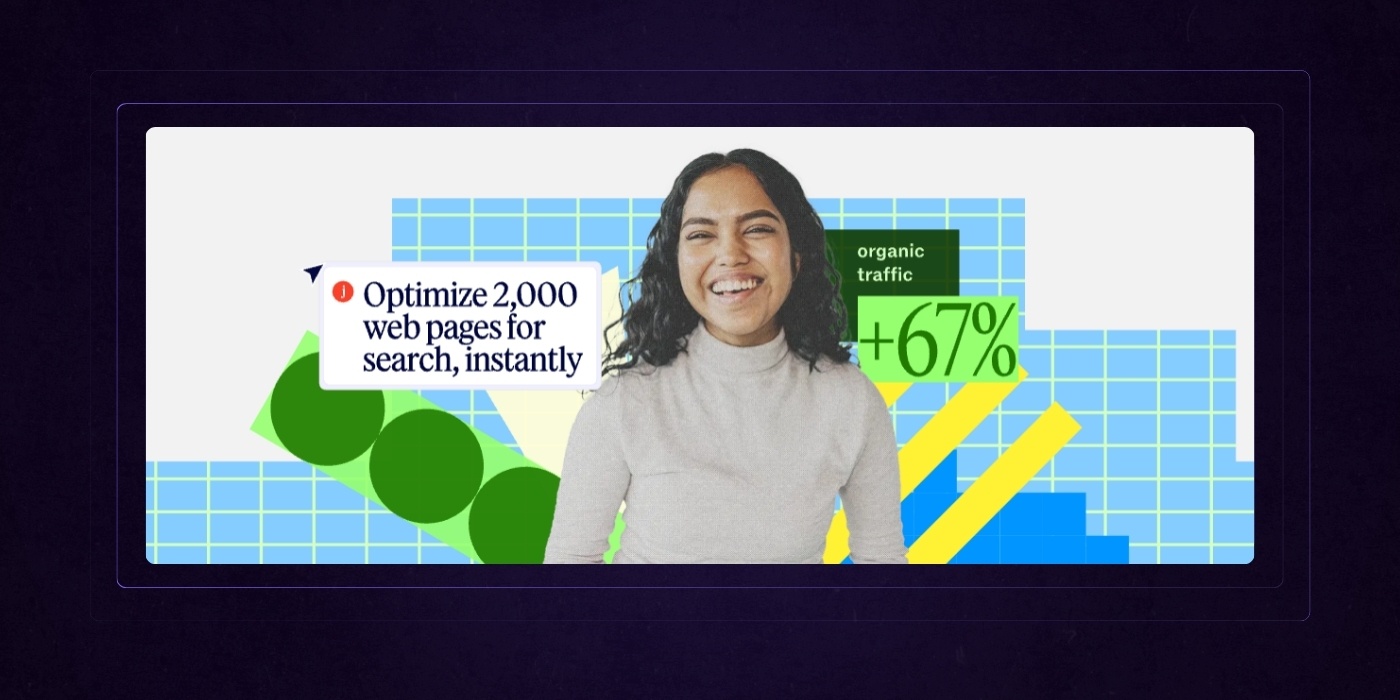
Screenshots, demo loops, and animations are not just filler. They are functional tools that build clarity and credibility. The best SaaS websites use them to show outcomes, not just interfaces.
Instead of presenting a blank dashboard or generic UI elements, strong visuals tell a story. A before-and-after comparison, a tooltip highlighting key automations, or a short clip that reveals the impact of a single feature gives visitors context they can immediately grasp. If your product removes friction for the user, your visuals should too.
Video demos, especially those under one minute, are increasingly valuable. They provide quick orientation, reduce perceived learning curves, and give teams evaluating your product a preview of what it actually feels like to use.
Interaction Drives Exploration
Static pages lead to static users. Interactive websites invite exploration. Micro-animations, hover states, and clickable prototypes create a sense of responsiveness and control. Visitors feel like they are driving the experience, not just reading about it.
For example, an interactive pricing calculator, a live product preview, or a click-to-expand feature walkthrough encourages curiosity and boosts time on page. These small moments of engagement also signal product maturity. They say, “We’ve thought this through” without needing to say it at all, and can serve as inspiration for your next design project.
The goal is to let users experience progress — even if it’s just simulated — before they commit.
Let the Visuals and Copy Work Together
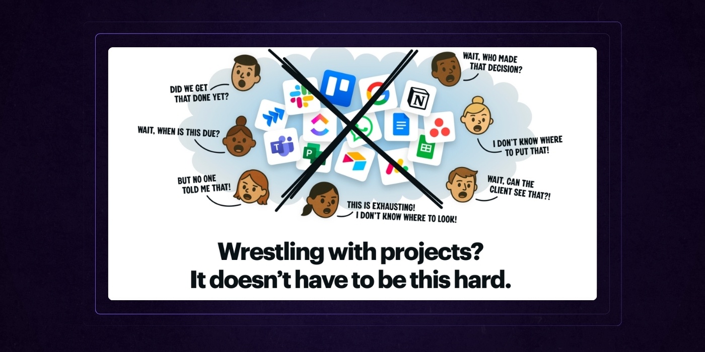
The most effective feature explanations are not paragraphs of text or isolated screenshots. They are short, benefit-driven statements paired with visuals that reinforce the message.
A line like “Track team performance in real time” means more when shown next to a live metrics dashboard. “Set up automations in minutes” lands harder with an animation of a drag-and-drop builder in use.
This pairing allows users to process information in two channels at once. The copy clarifies what’s happening. The visual proves it.
When done well, this approach reduces questions, builds momentum, and shortens the distance between understanding and conversion—this synergy is the hallmark of a successful design project.
7. Serve Every Buyer (From Clickers to Committees)
A SaaS website doesn’t have just one visitor type. It hosts a spectrum of buyers, each with different motivations, priorities, and decision-making authority. The most effective SaaS websites are built to accommodate all of them without compromising flow or clarity.
Build for Skimmers and Researchers
Not every visitor wants to spend ten minutes exploring your site. Some are fast movers. They’re looking for a quick hit of value, a clear CTA, and maybe a glance at pricing or a case study. Great SaaS sites cater to these users with lightweight storytelling, scannable sections, and action-oriented headlines that communicate outcomes in seconds.
But not everyone stops there. Enterprise evaluators, procurement teams, and technical leads need more. They look for pricing breakdowns, comparison charts, integrations, security documentation, and terms. These details can’t be an afterthought. They need to be structured, discoverable, and easy to consume without overwhelming casual visitors.
The best sites layer their content. They give fast movers a reason to click, and deeper thinkers a reason to stay.
Make Navigation Work Like a Product Tour
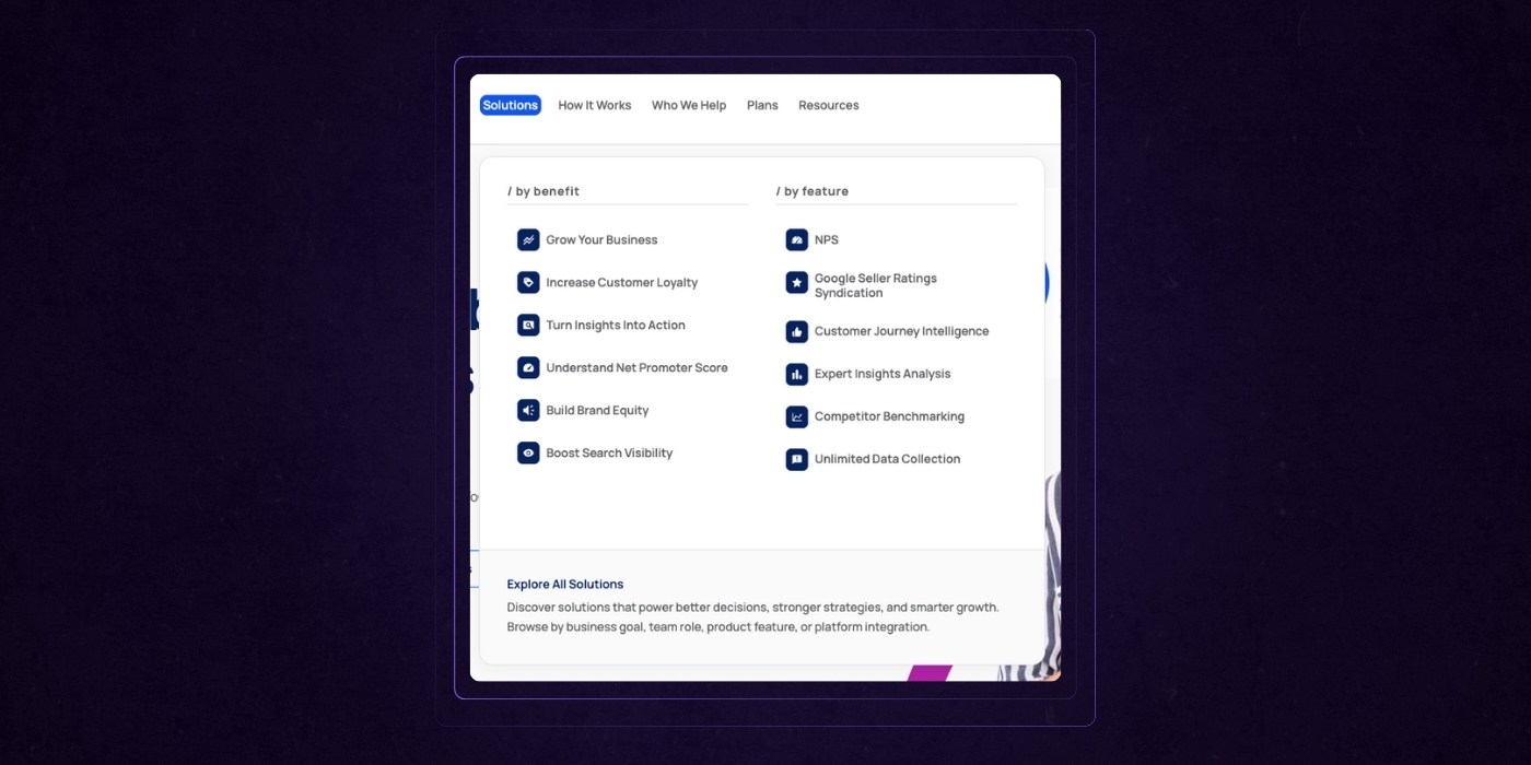
When a product suite is large or multi-faceted, navigation is not just utility. It becomes a content strategy. SaaS websites that convert well often use mega-menus or intelligent nav systems to segment content by role, use case, or product tier.
These menus serve as guided discovery tools. Instead of generic links like “Platform” or “Features,” high-performing sites use language such as “For Sales Teams,” “Marketing Automation,” or “Enterprise Security” to guide visitors directly to what they care about.
This clarity reduces bounce rates, speeds up understanding, and respects the buyer’s time.
Serve Both the Strategic and the Tactical
A CMO wants proof of ROI. A sales manager wants to know if onboarding takes two days or two weeks. A customer success lead wants to see how integrations are handled. Strong SaaS websites address all of them — not on separate domains or buried in PDFs, but within the same core experience.
This means messaging that speaks to high-level business value alongside features that show usability. It means case studies that include outcomes and also explain the implementation process. It means demo content that highlights both strategic impact and day-to-day workflow improvements.
Serving multiple audiences doesn’t require separate content. It requires layered content, structured in a way that different stakeholders can explore what matters to them without friction.
8. Educate First, Sell Second
Top SaaS websites don’t lead with a hard sell. They build trust by offering real value before asking for anything in return. The best ones position themselves as advisors first and vendors second. This mindset is baked into how they structure content, not just what they say.
Organize Resources Like a Product, Not an Afterthought
Blogs and resource centers often feel like digital junk drawers. Top-tier SaaS websites do the opposite. They curate their educational content with the same intention they apply to product pages. Categories are clearly defined by user interests or business goals, not internal jargon.
Instead of burying content under “Insights” or “Company News,” they segment it into discoverable paths like “Scaling Customer Success,” “Demand Gen Strategies,” or “Compliance Best Practices.” This allows users to explore content that matches their intent without needing to dig.
The result is more time on site, higher content consumption, and stronger brand authority.
Content That Solves Problems, Not Just Fills Space
Thought leadership is not about opinions. It’s about clarity. High-performing SaaS websites use content to answer real questions, shorten learning curves, and move prospects toward decisions. Templates, guides, checklists, calculators, and teardown-style blog posts serve a clear purpose — to educate and empower.
This kind of content builds credibility with both decision-makers and practitioners. It speaks to users who are actively searching for solutions and gives them tools they can use today, even before they become customers.
The value is in the takeaway. The reader should walk away with something they didn’t have before, whether that’s a framework, a strategy, or a shortcut.
Connect Education to Action Seamlessly
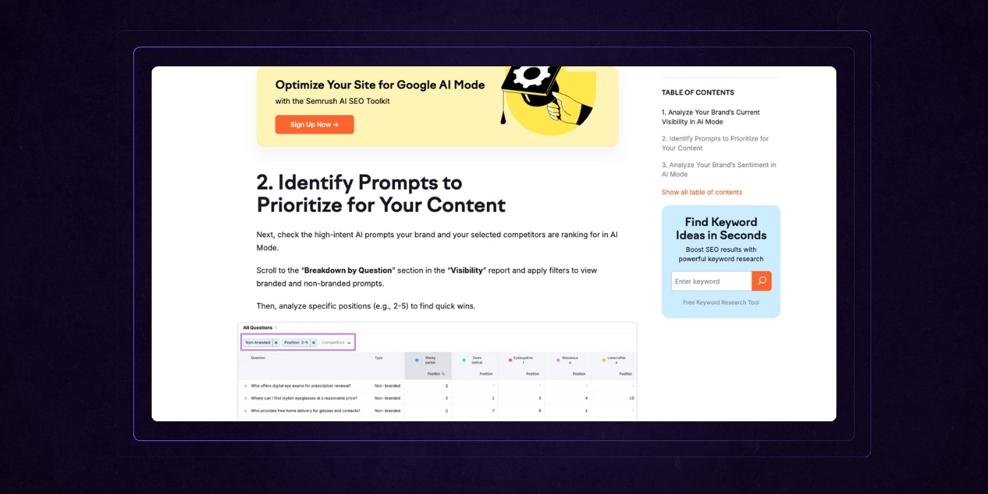
The goal of educational content is not just to inform. It is to create momentum. Great SaaS websites embed CTAs within their content experience, but they do it without breaking the flow.
This might be a contextual CTA in the middle of a guide, inviting the reader to see the solution in action. It might be a floating card that suggests a demo after someone scrolls through a thought leadership piece. Or it might be a downloadable asset that triggers a light qualification flow rather than a sales call.
The transition from education to product is subtle, logical, and always value-aligned. It feels like the next natural step, not a sudden sales pitch.
9. Put People at the Center of It All
The best SaaS websites don’t sell features. They sell better days at work. While the technology may be the product, the emotional hook comes from the people who use it and the problems they’re trying to solve. Top websites lean into this truth by crafting experiences that are not just informative, but human.
Show the Humans Behind the Screens
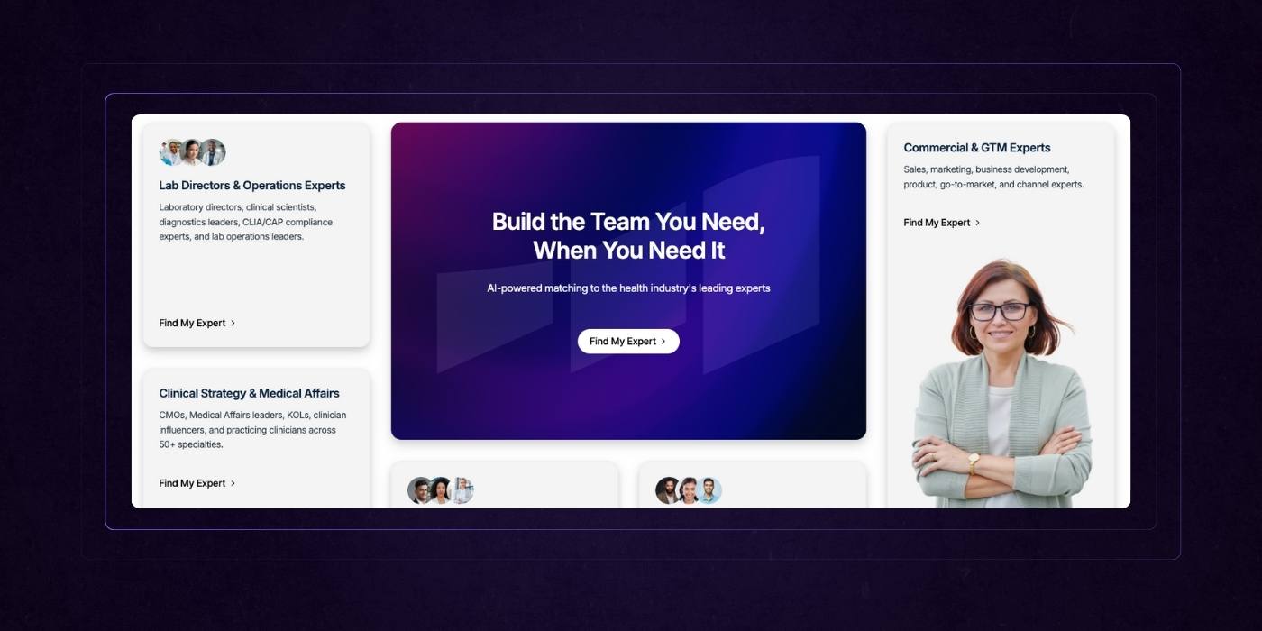
Stock photos and abstract illustrations rarely build trust. High-performing SaaS websites use real photography, authentic team stories, and customer-centric visuals to bring their product to life. Whether it’s a photo of a sales team in action or a snapshot of a product manager reviewing a dashboard, the focus is on relatable moments.
These choices create emotional proximity. Visitors don’t just see what the software does — they see themselves in the story.
Even motion assets follow this principle. Short videos or animations often showcase product benefits through the lens of day-to-day users, not faceless interfaces. They communicate transformation through human context, not just interface highlights.
Shift the Message from Product to People
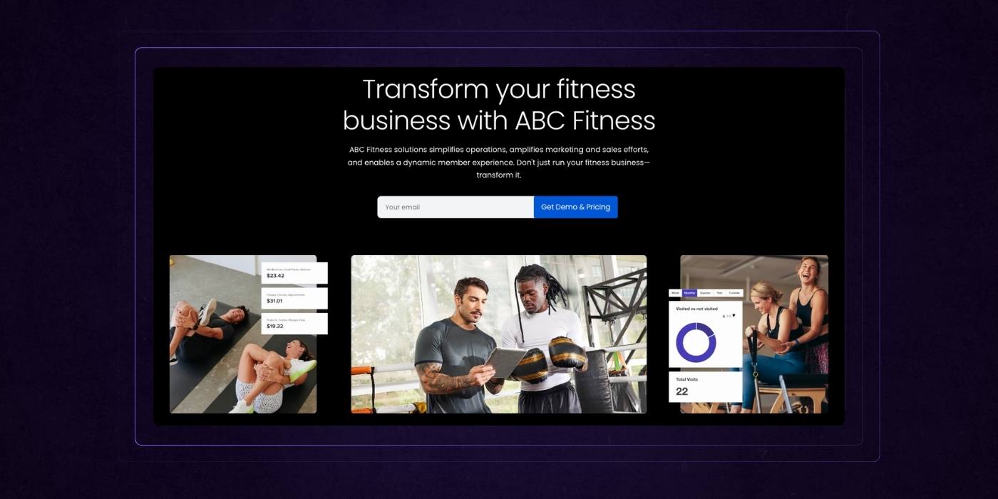
Great SaaS messaging isn't about what the tool is. It's about who it’s for and how it improves their workflow, clarity, and confidence. Top sites consistently frame their value through teams and collaboration. Instead of saying "AI-powered pipeline management," they say "Help your sales team focus on the deals that matter."
The difference is subtle but powerful. It shifts the emotional center of gravity from product features to real-world impact. Prospects feel like the software understands their challenges because it speaks their language.
This people-first narrative builds trust with both individual contributors and executive buyers. It suggests empathy, not just innovation.
Balance Authority With Empathy
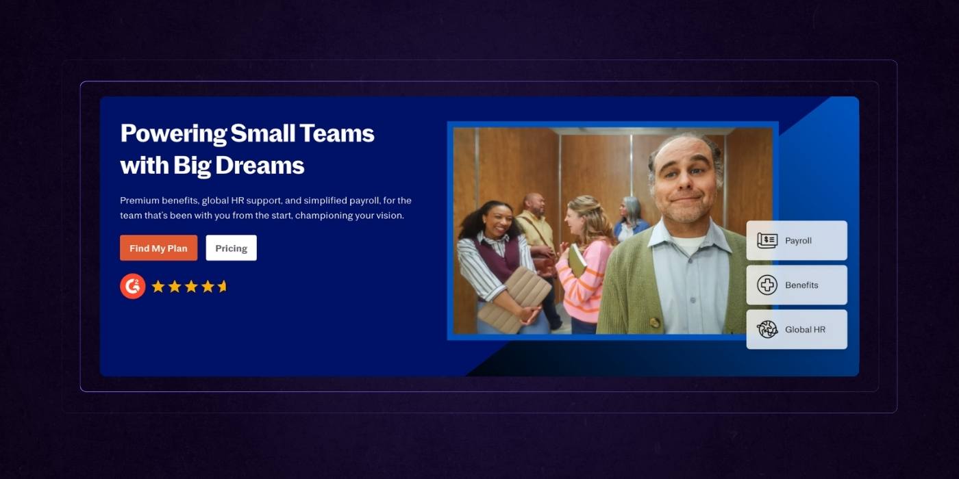
The top SaaS sites also know how to walk the line between enterprise-grade credibility and emotional resonance. It’s not enough to sound powerful — the message has to feel grounded.
They achieve this balance through a mix of sharp messaging and warm tone. Stats, security credentials, and performance metrics establish credibility. But they are delivered alongside language that feels human. Phrases like “Built for fast-moving teams” or “Loved by project managers who don’t have time to babysit software” invite relatability without diluting professionalism.
This approach is especially important for B2B SaaS, where buying decisions involve both logic and instinct. It ensures the site resonates with both the head and the heart.
10. Make Saying ‘Yes’ Effortless
Top SaaS websites understand that the final step in the buyer journey is where many prospects drop off. Not because they are unsure of the product’s value, but because the path to conversion is cluttered, confusing, or just too hard. The best websites remove that friction entirely. They make committing feel simple, low-risk, and smart.
Make Pricing Pages Easy to Compare, Not Decode
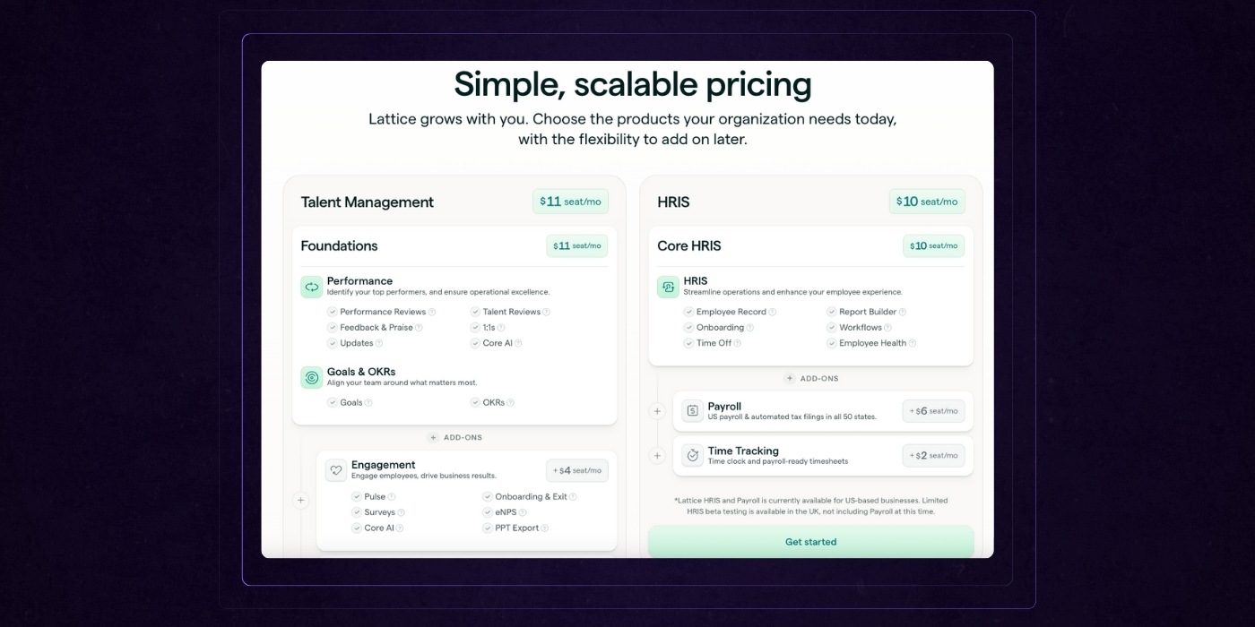
Pricing pages are often where confidence breaks down. Confusing tiers, unclear feature distinctions, and excessive fine print create doubt instead of driving decisions. Top-performing SaaS websites avoid this by laying out pricing in side-by-side comparison tables that make differences instantly clear.
Each tier speaks to a specific persona or use case, not just a list of what’s included. For example, one column might highlight "For growing sales teams" while another speaks to "Enterprise IT departments." This helps visitors self-select without needing a sales call.
Sticky navigation on pricing pages adds another layer of usability. It allows users to jump between FAQs, feature breakdowns, or support options without losing context. This structure builds trust and momentum at a moment where hesitation is most likely.
Keep Signup Pages Focused and Friction-Free

By the time a user reaches a signup page, the heavy lifting should be done. Now it’s about confirming that the next step is easy. Clean design, minimal form fields, and smart defaults are the baseline. Single sign-on with providers like Google or Microsoft makes this even easier and signals professionalism.
High-converting SaaS sites eliminate distractions on these pages. No popups. No unrelated nav items. Just a clear headline, a simple form, and a confident CTA. The user should feel like they’re seconds away from value, not entering another funnel.
When applicable, trust badges or short testimonials near the form can reduce second-guessing and increase completions. These details reinforce that others have made this decision and were glad they did.
Use Proof Where It Matters Most
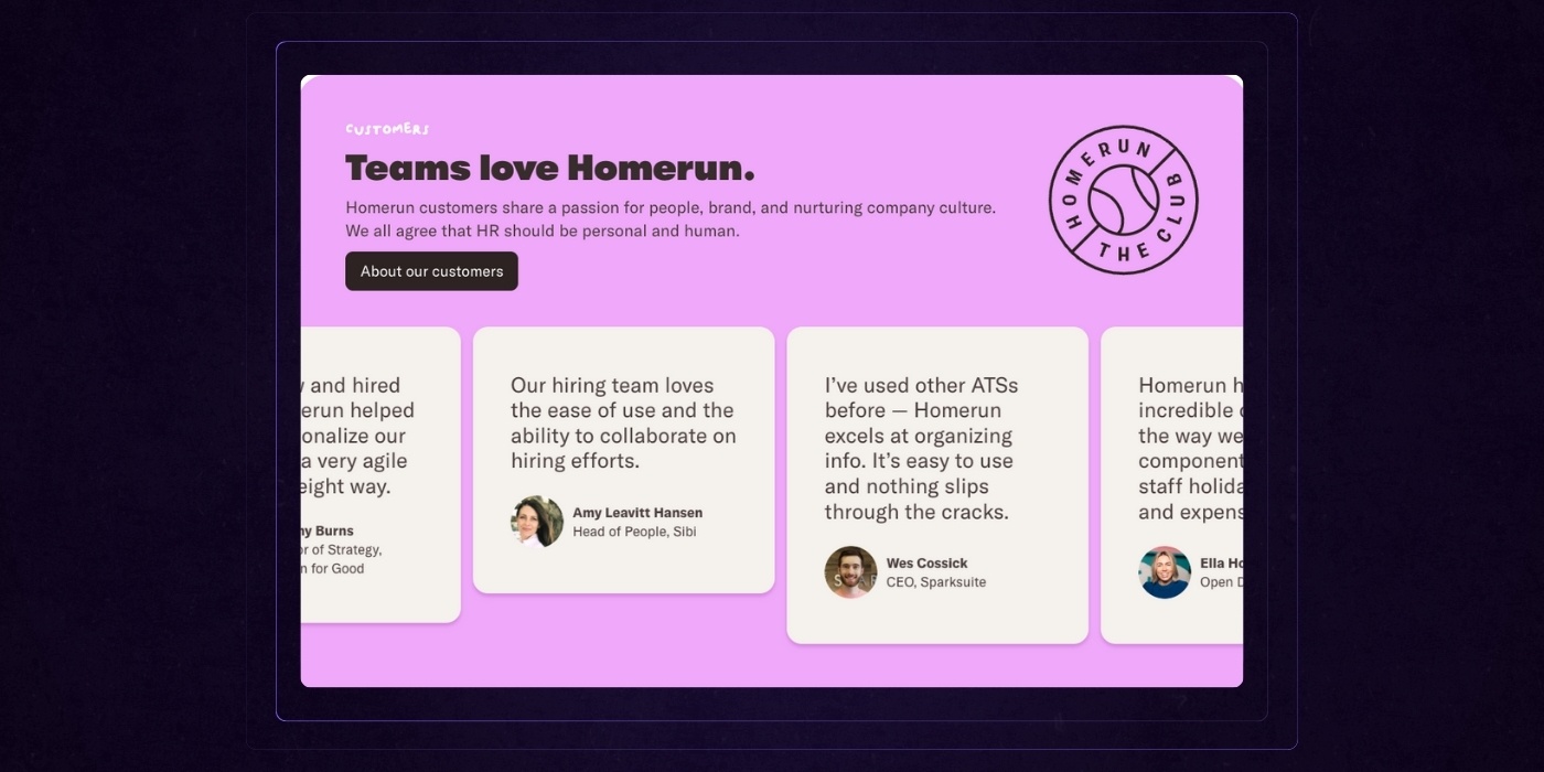
The strongest SaaS sites don't reserve social proof for the testimonials page. They strategically place customer success stories, quotes, and usage stats right next to conversion points.
On a pricing page, this might look like a customer quote under the most popular plan. On a signup page, it could be a quick stat like "Join 12,000 teams already using [Product]." These elements don't just validate the product. They validate the decision to act now.
The message is clear. People like you have made this choice and are winning because of it. That reassurance at the right moment can tip the scale from hesitation to action.
Ask The Website Experts: SaaS Edition
Final Thoughts: What Sets the Best SaaS Websites Apart
Great SaaS websites are not built by accident. They’re intentional at every level — from the way they frame outcomes in the hero section to how they earn trust with every scroll. They balance clarity with depth, personality with precision, and speed with substance.
They lead with value, not buzzwords.
They prove credibility, not just claim it.
They speak to humans, not just buyers.
The top-performing SaaS sites don’t just look good — they convert, they educate, they reassure, and they adapt to different types of decision-makers without losing focus. They show the product, tell the right story, and make the path to "yes" feel like the obvious choice.
Whether you're early-stage or scaling across markets, the same principles apply. Prioritize real outcomes, reduce friction at every step, and design an experience that reflects both the sophistication of your product and the simplicity your users crave.
Your website is not just a digital brochure. It’s your best salesperson, your most persuasive pitch deck, and your hardest-working growth engine. Build it that way.
Website Redesign Blueprint
Want the full blueprint for your next redesign?
Our website redesign blueprint gives you all the tools you need to make your next project a success. A digital guide, a full redesign checklist, agency interview cheatsheet, and website redesign RFP template.
