Visual Branding Guide
8 Signs Your Company Has Outgrown Its Visual Identity

-
Strategy
-
8 Signs Your Company Has Outgrown Its Visual Identity
Your company has changed.
Maybe you've launched new products, moved upmarket, entered new industries, or started competing for much bigger customers.
But there's a problem: Your brand still looks like the company you were five years ago.
That's more than a cosmetic issue.
Your brand's visual identity shapes how people perceive your company before they read a word of your positioning or talk to sales. When it no longer reflects the business you've become, it can make it harder to communicate your value, stand out from competitors, and earn the trust of the customers you want.
And nowhere does that disconnect become more visible than your website, where your positioning, messaging, visual identity, and customer experience all have to work together.
Before we get into the warning signs, let's clear up a few terms.
Brand identity is the bigger picture. It includes the brand's voice, positioning, personality, messaging, and visuals that shape how people recognize and understand your company.
Visual identity is the visual expression of that brand: logos, colors, typography, imagery, graphics, layouts, and digital experiences.
Visual branding is how those elements work together across your website, marketing, sales materials, social channels, and other customer touchpoints.
So, this isn't just about whether your logo looks dated.
It's about whether your visual identity accurately represents your company and its brand values, while giving you enough room to keep growing.
Here are eight signs it might not.

1. Your Visual Identity Reflects Who You Were, Not Who You Are
Your company probably isn't the same business it was five years ago.
Does it still look like it?
Maybe you started with smaller customers and now you're competing for enterprise accounts. You've launched new product lines, entered new markets, changed your positioning, or gone through a merger or acquisition.
The company evolved. The visual identity didn't.
That creates a gap between the business you've become and the business people see.
A sophisticated, high-value company can still come across as small, dated, or interchangeable if its visual identity was built for an earlier stage of growth.
That doesn't mean chasing every new design trend. A strong identity should have staying power.
But it should also tell the truth about your business today.
Ask yourself: If someone encountered our brand for the first time, would they get an accurate picture of the company we've become?
2. Your Branding Looks Too Much Like Everyone Else's
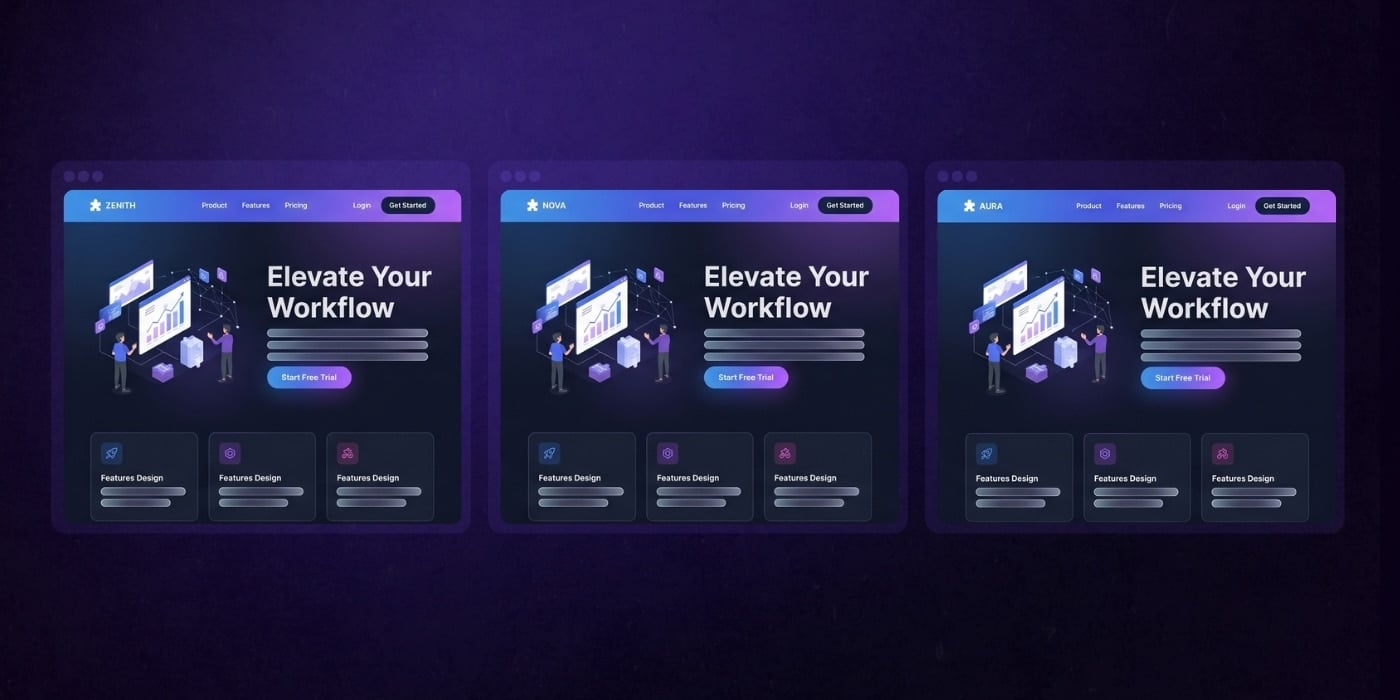
Take your logo off your website for a second.
Would someone still know it belongs to you?
In many industries, competitors use the same colors, similar typefaces, familiar stock photography, identical icon styles, and whatever design trend is having its moment.
Everything looks perfectly fine.
And, also completely interchangeable.
There's nothing wrong with using visual conventions that help customers understand your category. The problem starts when fitting in turns into disappearing.
Your colors, typography, imagery, graphics, and layouts should create a visual language people can recognize as yours.
Standing out doesn't mean being louder or weirder than everyone else.
It means being recognizable.
Try the "Swap the Logo" Test
Pull up your website and imagine replacing your logo with one of your closest competitors'.
Does everything else still work?
If the colors, imagery, typography, messaging, and overall design could just as easily belong to them, your visual identity probably isn't doing enough to differentiate you.
A strong brand shouldn't need its logo in every corner to remind people whose website they're on.

3. Your Website Doesn't Feel Like Your Brand
Your website is where your brand has to do some of its hardest work.
Messaging, visuals, content, interaction, and customer experience all have to come together in one place.
That's why a disconnected website is such a strong warning sign.
And those visuals carry a lot of weight. According to research, 94% of first impressions of a website are design-related.
Before someone digs into your messaging, explores your products, or talks to sales, your website’s design is already shaping how they perceive your business. If that experience feels dated, inconsistent, or disconnected from the company you’ve become, you may be starting the relationship with the wrong impression.
Maybe your identity was designed primarily for static applications. The logo works on a business card. The colors look good in a brochure. The typography behaves nicely in a presentation.
Then you apply the same system to a modern website and things start falling apart.
Your guidelines don't account for buttons, forms, icons, animations, responsive layouts, or other digital components. New landing pages and products require one-off solutions. Over time, your website technically uses your brand but doesn't really feel like your brand.
That's a problem when your website is one of the first places customers go to decide whether you're credible, relevant, and worth talking to.
A strong visual identity needs to work on a 6-inch screen just as well as a 60-inch trade show display.
Your website shouldn't be where your brand starts falling apart.
It should be where everything comes together.

4. Your Brand Is Inconsistent Across Channels
Your website looks polished.
Your sales deck looks like it came from another company.
Social has developed a personality of its own.
And somehow, Font #7 has entered the chat.
As companies grow, more people create more branded materials. Marketing builds campaigns. Sales makes presentations. HR creates recruiting materials. Product needs graphics.
Without clear visual rules, everyone's definition of "on brand" starts to look a little different.
You might notice:
- Colors changing between channels
- Multiple fonts and typography styles
- Photography and illustrations that don't feel related
- Logos being used differently across teams
- Departments creating their own templates
- Campaigns that barely resemble the website
One rogue PowerPoint isn't a brand crisis.
But when inconsistency shows up everywhere, you may have a system problem.
Your Colors Are Doing More Work Than You Think
Color is one of the fastest ways people recognize and form first impressions of a brand. So when your website uses one version of your palette, sales uses another, and every campaign introduces a slightly different shade, you're not just creating a design inconsistency. You're weakening one of your strongest visual signals.
Research suggests that color can account for 62% to 90% of a person's initial assessment of a product or environment. A strategic color palette can also help reinforce specific associations and emotional responses.
That's why your palette shouldn't just be a handful of hex codes in a brand guide. Your team needs clear rules for how primary, secondary, accent, and functional colors work together across different applications.
Consistent color palettes build recognition. Strategy gives those colors a purpose.
Your Team Might Not Be the Problem
It's easy to blame people for going "off brand."
Sometimes they're simply trying to do their jobs with guidelines that no longer cover what they need.
If your brand style guide explains the logo and color palette but offers little direction for campaigns, presentations, social media, video, or digital experiences, people will fill in the gaps themselves.
A strong visual branding system gives teams enough structure to stay recognizable and enough flexibility to get their work done.

5. You're Attracting the Wrong Audience
Your visual identity starts communicating before your sales team gets the chance.
Within seconds, potential customers are forming opinions.
How established is this company? Who do they normally work with? What level of expertise do they have? What kind of experience should I expect?
Your branding helps shape those answers.
And consistency matters more than you might think. A study by Harvard Business School found that 52% of consumers are willing to pay more for brands that consistently communicate their values.
That doesn’t mean better branding automatically justifies a higher price. But it does reinforce an important point: When what you say, how you look, and what you stand for all tell the same story, customers have an easier time understanding the value behind your brand.
A cohesive visual presence can reinforce professionalism and reliability. But when the signals you're sending don't match the customers you're trying to attract, that same branding can start working against you.
That becomes a problem when the signals you're sending don't match the customers you're trying to attract.
Maybe you built your identity as a scrappy startup selling to small businesses. Now you're pursuing enterprise accounts with larger budgets, longer sales cycles, and higher expectations.
If your brand identity hasn't evolved, sales may have to overcome a credibility gap before the conversation even starts.
The opposite can happen, too. An overly corporate identity can make an innovative, approachable company feel rigid and impersonal.
Typography, imagery, color, and website design can all influence perceptions of your:
- Credibility and Brand Trust
- Quality
- Pricing
- Expertise
- Company size
- Position in the market
The goal isn't to make your company look "more expensive."
It's to set the right expectations.
Your brand should look and feel aligned with the value you provide and the customers you're built to serve.
6. Your Team Is Embarrassed to Use Your Brand
Sometimes your employees spot the problem before your customers do.
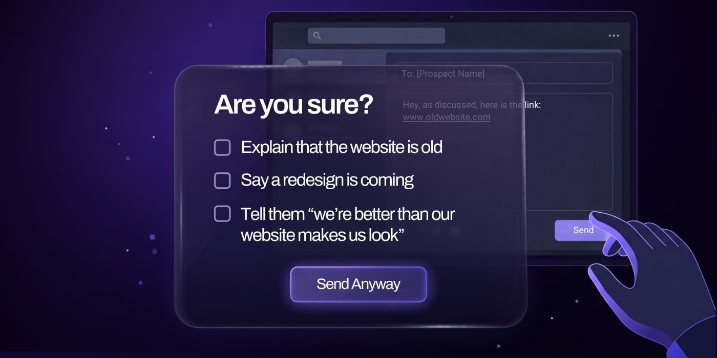
Sales quietly redesigns presentations before important pitches. Marketing bends the guidelines for every new campaign. Recruiters create their own materials. Leadership sends prospects to the website with the disclaimer, “We’re actually working on that.”
Those workarounds tell you more than a checklist ever could.
When the people who know your company best don’t trust the brand to represent it, they start compensating for it. They tweak, redesign, avoid, and apologize because what they’re putting in front of customers doesn’t match the business they know behind the scenes.
At that point, the problem isn’t a rogue sales deck or an outdated webpage. It’s that your team has lost confidence in the brand itself.
Your team knows what the company has become because they see it every day.
If they're hesitant to put the brand in front of customers, candidates, or partners, there may be a disconnect between the company they know and the company everyone else sees.
A strong visual identity should make it easier for employees to represent the business.
And ideally, make them proud to show it off.

7. Your Visual Identity Can't Scale With the Business
Your brand's visual identity worked great when you had one product, one audience, and a five-page website.
Now you have five business units, 12 products, four target audiences, and a marketing team creating another shade of blue because the existing six apparently aren't enough.
Growth exposes the limits of a visual system.
This is different from simple inconsistency.
The question isn't whether teams are following the rules. It's whether the rules can actually handle the complexity of the business.
You might see:
- Products requiring their own visual treatments
- New business units creating separate styles
- Campaigns needing assets the original guidelines never anticipated
- Digital components missing from the brand elements
- Designers repeatedly solving the same problems from scratch
Eventually, every new initiative becomes another exception.
A scalable visual identity should reduce the number of decisions your team has to reinvent as the company grows.
If every new product, audience, or campaign requires another workaround, the system probably wasn't built for the business you're running today.

8. Your Brand Is Getting in the Way of Your Next Move
Your brand doesn't have to look bad to be holding you back.
It might still be polished. Consistent. Recognizable.
But the business is about to go somewhere the existing identity wasn't built to follow.
Maybe you're:
- Moving upmarket
- Launching a major product or service
- Entering a new category
- Expanding internationally
- Preparing for an acquisition
- Bringing multiple brands together after a merger
- Repositioning against new competitors
Changes like these affect who you're talking to, what you're selling, and how you need to be perceived.
So the question changes.
It's no longer, "Does our brand still look good?"
It's, "Can our brand help us get where we're going?"
If you're moving upmarket, can it build confidence with larger buyers?
If you're launching a new product, can the brand identity system accommodate it without making it feel bolted on?
If you've merged companies, can the identity bring everything together under one clear brand story?
Sometimes the existing system just needs to evolve.
Sometimes the next stage of the business requires something bigger.
Either way, you don't have to wait until your brand looks painfully outdated.
The better time to make a change is when you can see where the company is headed and recognize that the current identity isn't built to follow.
Seeing a Pattern?
One isolated issue doesn't automatically mean you need a rebrand.
But if you're recognizing the same problems across your website, sales materials, campaigns, products, and internal teams, it's worth looking at your visual identity as a system rather than fixing each problem individually.
The question isn't how many warning signs you checked. It's whether those problems are making it harder to communicate your value, attract the right audience, support your team, or grow the business.
If they are, something probably needs to change.

Does an Outdated Visual Identity Mean You Need a Full Rebrand?
Not necessarily.
The right level of change depends on what's broken and how much the business itself has changed.
Visual refresh: Your positioning and overall brand still feel right, but the execution needs an update. That could mean refining colors, typography, imagery, or digital applications.
Visual identity redesign: The underlying brand still makes sense, but the visual system isn't distinctive, flexible, or scalable enough anymore. You may need to rethink how the pieces work together while keeping enough familiarity to remain instantly recognizable.
Full rebrand: The problem goes deeper. Your audience, positioning, messaging, core values, personality, brand architecture, or business strategy has changed significantly. Updating the visuals without addressing those issues would basically give the same old brand a nicer outfit.
The goal isn't to make the biggest change possible. It's to make the right change for the problem you actually have.
Questions to Ask Before Redesigning Your Brand Identity
Before opening Figma and trying 47 new fonts, ask:
- Has our audience changed? Are you selling to different buyers, larger organizations, or new markets?
- Has our positioning changed? Does your brand communicate the value you're selling today?
- Do we stand apart? Could your visual identity easily belong to a competitor?
- Does the identity work digitally? Can it handle your website, campaigns, social channels, and other digital experiences?
- Can our team use it? Or does every project require another workaround?
- Can it support what's next? Will the system accommodate where the company is going?
Those answers should tell you whether you're dealing with a few dated visual elements or a bigger disconnect between your brand and your business.

How to Create a Brand Identity That Can Grow With You
You can't predict every product, market, campaign, or channel your company will need five years from now.
But you can approach brand identity design with enough flexibility to make what comes next easier.
That starts with building a system that's ready to adapt.
Start With Strategy, Not Aesthetics
Before debating fonts, get clear on the business.
Who are you trying to reach? How should you be positioned? Who are you competing against? What makes you different? Where is the company headed?
Those answers give the creative work a job to do.
Build a Visual System, Not Just a Logo
A logo gives people something to recognize.
A visual system gives your team something to work with.
Define how typography, color, imagery, illustration, iconography, layouts, motion, and digital components work together.
You don't need an asset for every possible situation. You need enough building blocks that your team can create something new without creating a new brand.
Design for the Real World
Don't judge your identity only on perfect mockups.
Test it where it actually needs to perform: websites, landing pages, campaigns, presentations, social media, recruiting materials, product experiences, and events.
Can it handle a dense product page and a simple billboard?
Can sales make a presentation without going rogue?
Can marketing launch something fresh without abandoning the brand?
Better to find those limits while you're building the system than six months later.
Give Your Team Useful Guardrails
Brand guidelines should help people make good decisions, not just tell them what they're forbidden from doing.
Define typography hierarchy, color usage, imagery, layouts, motion, digital elements, and other essentials. Then give people templates and examples they can actually use with consistency.
Think guardrails, not a straitjacket.
The easier the system is to use, the more likely people are to use it correctly.

When Should You Bring in a Branding Agency?
Not every visual identity problem requires a visual branding agency.
If your strategy and positioning are solid and you need a relatively contained refresh, your creative director and the rest of the internal team may be able to handle it.
A branding agency becomes more valuable when the problem goes beyond visual execution. If you're rethinking your positioning, entering a new market, bringing multiple brands together, or building an identity around a major business change, outside perspective and specialized brand strategy and design expertise can help.
That might include:
- Repositioning or moving into a new market
- Bringing multiple brands together after a merger or acquisition
- Struggling to align leadership around the future of the brand
- Building an identity that needs to support multiple products or business units
- Lacking specialized brand strategy or design expertise internally
- Working toward a major launch or other hard deadline
- Rethinking your website and brand at the same time
Those projects aren't just about making the company look better.
They involve figuring out what the business needs to communicate, creating alignment around that direction, and building a strong brand identity system capable of supporting it.
Your internal team should still play a major role. They know the customers, products, competitors, culture, and market.
A strong outside partner brings perspective, process, and specialized expertise.
The goal is to combine both.

Your Brand Should Look Like the Company You've Become
Growth changes a company.
Eventually, the brand needs to catch up. Not because a new design trend took over LinkedIn.
Because your visual branding has a job to do.
It should communicate who you are, differentiate you from competitors, work everywhere your customers encounter you, and support where the business is going next.
If it can't do those things anymore, you've probably outgrown it.
You've put a lot of work into building the company you've become.
Make sure your brand looks like it.
Website Improvement Plan
Ready to Close the Gap Between Your Brand and Website?
If your company has evolved but your brand and website are still telling the old story, it's worth finding out where the disconnect is.
We'll help you identify what's holding your website back, what's worth keeping, and what needs to change to support where your business is headed next.
FAQs
Expert Insights Contributed By...