-
Design
-
How to Fix a Bad Website Design [Case Study & 9 Examples]
You know that feeling when you walk into a room and the wall color is so bad, you immediately want to turn around?
You probably don’t want that to happen to potential customers on your website. And yet, it often does.
A website's design creates a powerful first impression, shaping how visitors immediately perceive and trust your business.
Even a well-designed website can have a bounce rate (the portion of visitors leaving after seeing one page) of up to 40%. If your website design is not so good, watch out.
In the age of online, even the best business won’t stand out if its website is a bad design. If it does, it might not be in the way you would prefer.
Having a bad website is terrible for business. Companies, like Amazon, can lose millions if their user experience is bad for even a single day. Poor design choices can frustrate users, causing them to leave your site and never return. But it’s not an impossible thing to overcome.
Of course, you need to understand what a bad website actually is.
So, that’s what we’ll explore.
Join us for a deep dive into the elements that can turn an online presence sour, real-life bad websites examples, and a case study example of a remarkable website redesign project turnaround to undo the terrible.
What Makes a Bad Website?

Let’s start our deep dive with some ground rules.
As you might imagine, websites can be a bad design for lots of reasons, and we might spend all day digging into those.
However, those reasons are generally in one of three categories: user experience, visual website design (also known as site design), and copywriting. Each deserves further exploration regarding how it contributes to a bad web design.
A website's design plays a crucial role in shaping user experience, affecting everything from navigation to how users perceive your brand. Striving for professional design should always be the goal to ensure quality and effectiveness.
PS: Are you just here for examples of badly designed websites? Skip here.
User Experience Mistakes
It’s easy to think about bad website designs at their surface level (aesthetics), but it all begins and ends with your audience.
If the user doesn’t enjoy your site, gets lost easily, or gets frustrated, you’ve already lost the game.
Poor navigation is a common cause of users getting lost, while user friendly navigation helps guide visitors smoothly through your content.
Cluttered layouts and dense text often overwhelms visitors, making it difficult for them to engage with your site. Don’t make these bad web design mistakes.
Let's go a layer deeper.
1. Slow Website Speed
Users can get easily frustrated in any number of ways. For instance, think about what happens when your individual website pages are slow to load. It may not be a visual website design issue, but it’s certainly an example of bad website design.
Google recommends a loading speed of 3 seconds or less. Unfortunately, across the web, the average website loading speed on mobile devices is actually more than 15 seconds.
When your website doesn’t load fast enough, you get punished. Both by search engines which downgrade your quality score and search results ranking, and by users who don’t have that patience.
That’s a real problem, by the way. According to one study, every extra second it takes your site to load decreases your traffic by 11%. It’s imperative you improve your site speed to avoid this.
A fast-loading website, of course, is not the whole user experience game.
Pro Tip: Reducing the file size of images with a tool like kraken.io and re-uploading them is typically a quick and easy way to improve website speed.
1. Poorly Designed Website Navigation
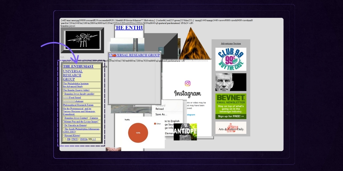
What if the user gets to your website and immediately gets confused by bad navigation?
A poorly structured website's navigation can be a major barrier to usability, making it difficult for users to find answers to their questions or locate important information.
Examples of navigation with a bad design are everywhere. It might be misleading labels for the website pages they represent, a counterintuitive placement on your landing page, or a multi-level navigation so nestled that the actual valuable information is three or four layers into the content.
Unclear navigation like this can easily confuse visitors and drive them away.
3. Broken Internal Linking
Finally, don’t underestimate the power of broken or dead links. They’re the epitome of a missed climax.
You know the feeling. You watch that great movie, finally, get to the reveal and it’s just… underwhelming. You leave with more questions than answers.
That’s what broken and dead links do. They suppress your SEO, but they also underwhelm your audience because they are essentially dead ends.
Common Website Design Mistakes
You’ve got traffic. You’ve got a solid product. But your website? It’s dropping the ball.
Most visitors won’t stick around if your design confuses them, slows them down, or buries your message. And unfortunately, even smart teams fall into the same avoidable traps.
Here are the most common website design mistakes (and what to do instead) so your site starts working for you, not against you.
1. No White Space
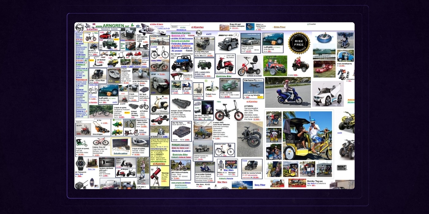
There is no white space that would focus on attention and minimize clutter. Instead, the website pages are crammed full of content in every nook and cranny, leaving no breathing room for users to easily read and navigate the site.
Don’t be afraid of white space, more often than not it will elevate your website design.
2. Poor Image Quality
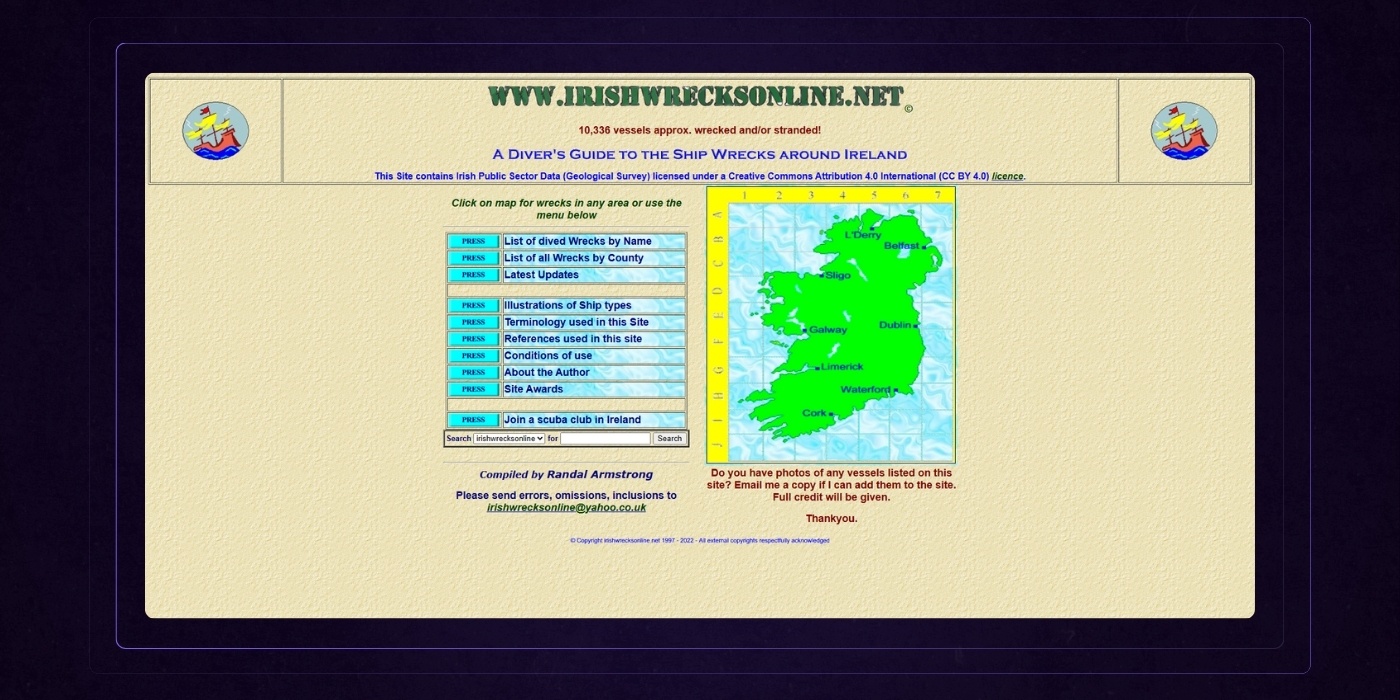
The images are pixilated or in otherwise low quality images, which is a clear example of poor visuals.
Visuals draw in your audience, but they need to be in high-def. Low quality design elements, including outdated or poorly produced visuals, make your site look unprofessional and can harm your credibility.
Using generic stock images instead of original or high-quality visuals can also make your website appear less trustworthy and diminish your brand’s professionalism.
3. Limited Contrast
There is limited contrast within the color scheme. Choosing appropriate background colors is essential for readability and visual clarity.
If text and visuals do not stand out from the background it’s not only bad for accessibility but also gives your audience a headache. Not great.
Using a dark background without sufficient contrast is a common mistake that can further reduce accessibility and make your site appear unprofessional.
4. Bad Typography
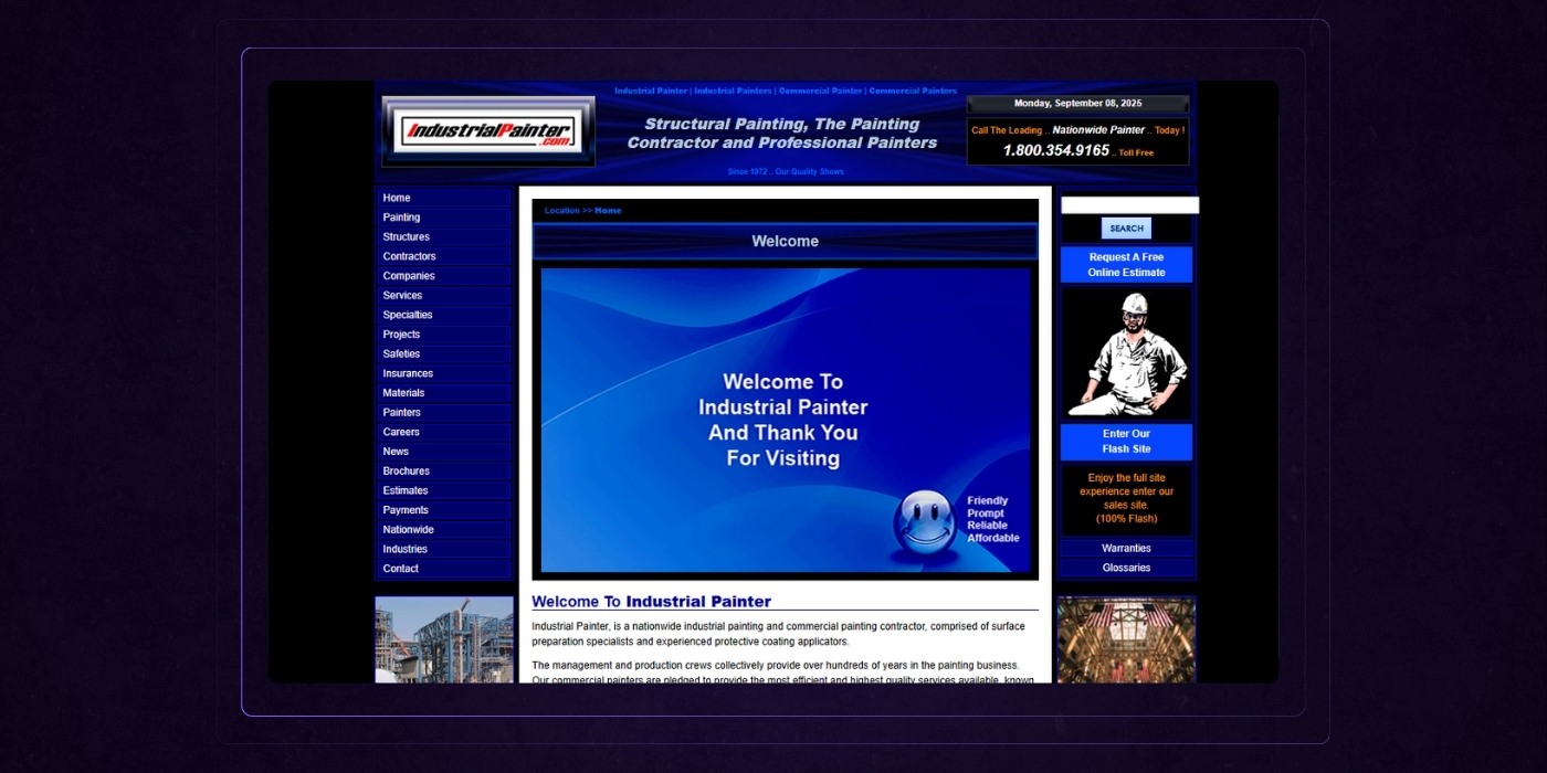
The typography is difficult to read, probably through a bad design font choice.
Remember: the text is supposed to be informative, so any choice on web design over readability is probably bad.
Additionally, a single page layout can become confusing if it lacks a clear structure, leading to decision paralysis for users.
To avoid this, ensure a clear visual hierarchy by guiding visitors through the content logically, using headings, images, and spacing to highlight important elements.
5. Confusing Layouts
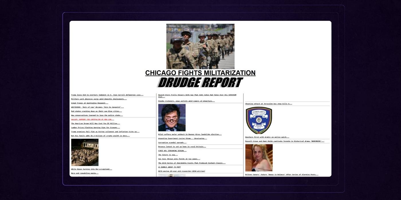
The layout is confusing. Every web page should have multiple sections. It’s the role of your layout, through grids or separating colors and visuals, to clearly distinguish these sections and build a hierarchy.
When dealing with extensive content, it is especially important to organize information with clear menus, visible search bars, and standard layout patterns to help users navigate large amounts of information effectively.
Pro Tip: We feel the need to note that these categories are interrelated. As you’ll see, an ugly website can also impact your website design user experience, and vice versa. Avoid at all costs confusing visuals, prioritizing individual fancy, or flourish over the overall aesthetics and functionality of the site as a whole.
Ineffective Copywriting
Should we really be talking about writing in a guide about design? Absolutely.
Website design is the full package. It’s everything together that makes up your online presence.
Yes, visual web design matters. But so does the text that you place on top and around that design.
1. Sloppy Editing
Your website is often your first impression—typos, poor grammar, and awkward phrasing can make it your last. Sloppy copy doesn’t just look unprofessional, it chips away at trust. If you can’t clearly communicate your value, why should a prospect believe you can deliver it?
2. Jargon Doesn’t Impress
You know your industry inside and out, but your visitors probably don’t. Filling your site with buzzwords, acronyms, or overly technical language just creates friction. People don’t want to decode your message—they want to know how you solve their problem, fast.
3. No Voice
If your website could belong to any company in your space, you’ve got a problem. A generic tone makes you forgettable. Visitors want to feel like they’ve found the one—a brand that gets them, sounds like them, and stands out.
9 Examples of Bad Websites
We’d like to preface this by saying that our examples of bad website designs chosen here are everyday websites we see breaking the rules we’ve mentioned above. This section provides bad websites examples to illustrate common mistakes and pitfalls in web design.
Many websites still suffer from poor design choices, resulting in ugly websites that are visually unappealing and difficult to use.
This is not a collection of comically bad or horribly outdated websites like some other bad design websites lists boast. Our goal here is to point out issues with bad websites that may be more relatable in an attempt to educate and improve website UI/UX design rather than hunt for the worst website out there.
Let’s get started with our evaluations.
Headhunter Hairstyling
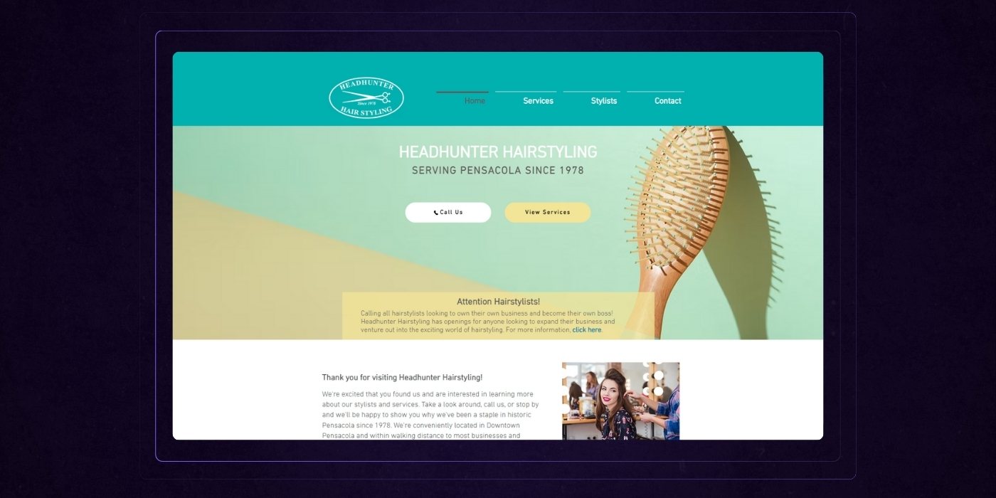
Headhunter Hairstyling is a salon located in downtown Pensacola, Florida that’s been serving the community since 1978. They offer both barber and hairstylist services for classic and fashion-forward styles, and they also have opportunities for hairstylists who want to operate more independently.
First Impressions
It’s giving "Mom & Pop meets Wix template circa 2013." You can tell there's heart here. But the site design doesn’t match the style confidence that a modern salon should project.
The Roast + Remedy
Alright, let’s talk about Headhunter Hairstyling, a site that’s clearly rooted in the community but visually stuck in the early 2000s.
Let’s respectfully roast this with love, just like we’d style an overgrown mullet: clean it up, modernize it, and let the personality shine.
1. The Hero Section: Vanilla as a Vibe
- “Serving Pensacola since 1978” is a solid credibility play, but it’s buried in a generic layout and soft gradients that say dentist office, not hair artistry.
- The hairbrush image? Functional, but uninspired. Where are the bold cuts, glowing transformations, or candid client moments?
The Fix: Lead with a bold statement of why you're the go-to salon. Something like: “Pensacola’s longest-running salon for a reason — cuts, color, and style that actually turn heads.”
2. CTAs With No Energy
- “Call Us” and “View Services” are fine, but they feel passive.
- No urgency, no hook, no personality.
The Fix: Try language like “Book Your Appointment”, “See What We Can Do for You”, and “Meet Your New Favorite Stylist” instead.
3. The Layout Feels... Blocky
- White sections. Gray dividers. Tiny type. It’s safe and sensible — but nothing about it makes you feel excited to engage.
- It reads like an info sheet, not a vibe.
The Fix: Inject energy with bolder section headers, stylized imagery (action shots, not staff lineups in front of a brick wall), testimonials, featured services, or portfolio highlights.
4. Copy = All About You
- “We’re excited that you found us…”
- “We started Headhunter Hairstyling with a single goal…”
- It’s a lot of “we,” and not enough “you.”
The Fix: Reframe the copy to speak directly to the visitor's needs: “Looking for a salon that gets your style, respects your time, and delivers consistently amazing results? That’s why Pensacola locals have trusted us since 1978.”
5. No Visual Proof of Work
Not a single before/after. No cuts. No colors. No transformations. Just a group photo and a stock image of a woman smiling near a mirror.
The Fix: Feature a rotating gallery or Instagram feed of real client results. Show the work. Sell the outcomes.
Wrapping The Review
Right now, this website feels like a nicely trimmed haircut… that still uses Aqua Net.
It’s polite, informative, and safe but it doesn’t sell the experience, the vibe, or the magic of what happens inside that salon.
With some strategic copy rewrites, modern visuals, and bolder design moves, you could transform this into a homepage that doesn’t just inform — it inspires bookings.
Toronto Cupcake
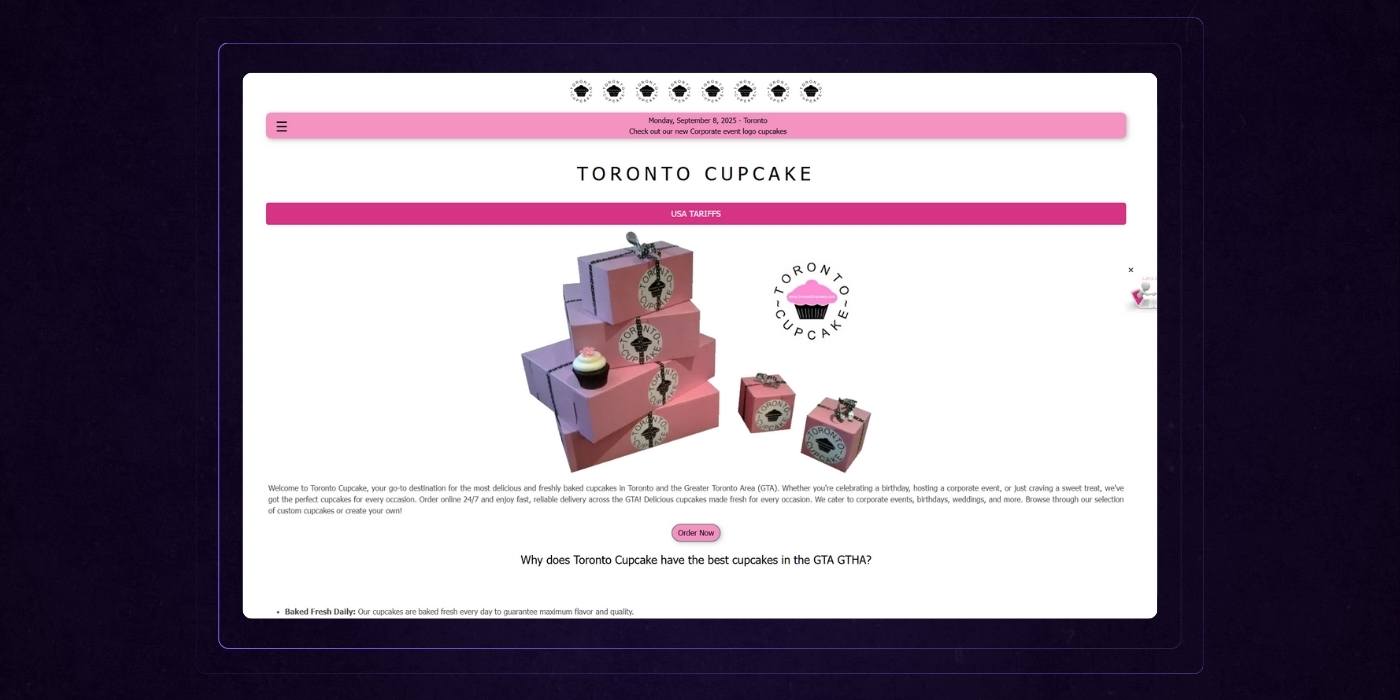
Toronto Cupcake is a bakery based in Toronto that specializes in fresh, custom-designed cupcakes for a variety of events — weddings, birthdays, corporate occasions, etc. They offer online ordering 24/7 with fast delivery across the GTA, changing flavors seasonally and accommodating custom designs.
First Impressions
It’s giving: “Blogspot template meets cupcake shop”. Pastel vibes, default fonts, and enough pink to make Barbie blink twice. A homepage that says “trust us, we bake,” but reads like a school flyer
Let’s dig in.
The Roast + Remedy
Alright, let’s respectfully roast Toronto Cupcake — a site that’s technically sweet but visually... stale.
1. Above-the-Fold = A Whole Lotta Nothing
- A logo, a giant header that says "TORONTO CUPCAKE" (again), a pink “USA TARIFFS” banner (??), and a stack of boxes.
- No headline. No hook. No flavor — figuratively and literally.
The Fix: Start with a clear, benefit-driven headline: “Toronto’s Favorite Cupcakes — Baked Fresh Daily & Delivered to Your Door”. And get that call-to-action higher up: “View Flavors” | “Start Your Order” | “Custom Logo Cupcakes”.
2. “USA TARIFFS” Banner Is Confusing AF
- Is this a bakery or a government trade site?
- It’s weirdly dominant visually and completely out of context.
The Fix: If it’s a shipping update for U.S. orders, tone it down and move it to a proper alert bar with context: “Heads up! U.S. deliveries may be affected by new shipping tariffs. [Learn more]”.
3. Copy: Informative, But Flat
- Paragraphs like: “Welcome to Toronto Cupcake, your go-to destination for the most delicious and freshly baked cupcakes…”
- That’s a lot of words to say: “We make cupcakes. You can order them.”
The Fix: Rewrite with punch, benefit, and brevity: “Craving something sweet? We bake fresh cupcakes daily and deliver them across the GTA — fast, fresh, and always in our signature pink box.”
4. No Visual Flavor
- No photos of actual cupcakes (aside from the tiny ones on the box).
- No variety shown. No seasonal highlights. No icing, no color, no fun.
The Fix: Feature hero shots of your best-selling cupcakes. Show variety. Show icing swirls. Make us hungry.
5. Call-to-Actions Feel Passive
- “Order Now” is buried in the middle.
- “Explore Cupcakes” is a footnote, not a feature.
The Fix: CTA stack should be visible and clear: “See What’s Baking”, “Design Your Own”, or “Get Cupcakes Delivered Today” are great options to consider.
Wrapping Up The Review
Right now, Toronto Cupcake’s site feels like a business that’s trying to say “modern bakery” but whispers “template from 2010.”
You clearly have:
- A unique delivery model
- Custom branding capabilities
- A loyal GTA following
But this site? Doesn’t sell it.
Tag Team Signs
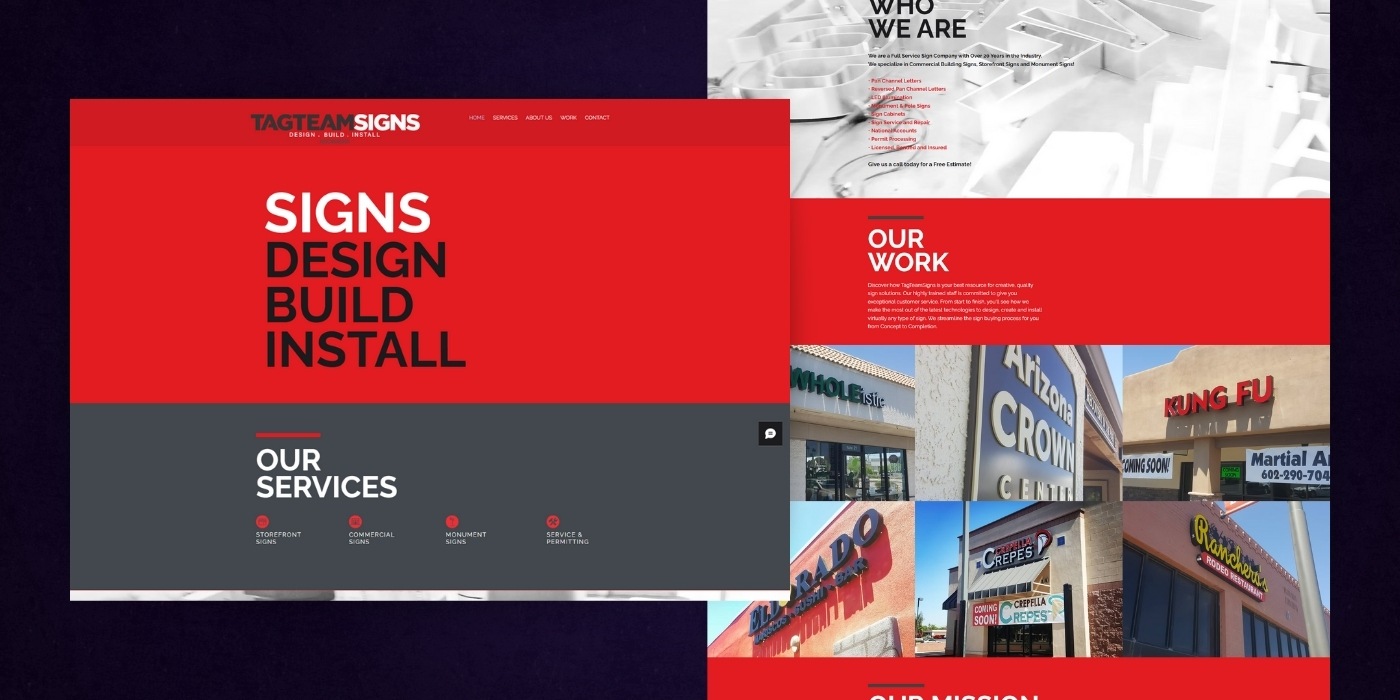
TagTeamSigns is a full-service sign company based in Arizona with over 20 years of experience. They design, build, permit, install, and repair commercial signs—everything from storefronts, monument signs, and pole signs to LED-illuminated channel letters and sign cabinets.
First Impressions
Bold colors, but not bold choices. This site screams "we build signs"—literally. But once you’re past the 72pt font yelling “SIGNS DESIGN BUILD INSTALL,” there’s not much depth or direction.
The Roast + Remedy
Alright, let’s get into this respectful roast of the Tag Team Signs homepage.
1. The Hero Section = A Missed Opportunity
- You’ve got seconds to grab attention… and this one just shouts “SIGNSSSS!” with no real value prop.
- Where’s the “why”? Where’s the differentiator? Where’s the human angle?
The Fix: Lead with how your signs help businesses stand out, convert, or grow. You're not just making signs—you’re shaping storefronts that get noticed.
2. Visual Hierarchy Breakdown
- “OUR SERVICES,” “WHO WE ARE,” “OUR WORK,” “OUR MISSION”—every section header looks like it's in competition for who can yell the loudest.
- The design feels more like a PowerPoint deck than a professional web experience. All caps + blocks of red + center-aligned text = visual fatigue.
The Fix: Use hierarchy intentionally. Let one idea lead, support with imagery, and let the eye breathe. Also: left-align your body text, please.
3. Stocky Imagery + Blurry Vibes
- The blurred background photo in “Who We Are” looks like it was filtered to hide something. It adds nothing.
- The grid of sign photos in "Our Work" is solid, but feels like a screenshot of a Google Drive folder.
The Fix: Use high-res hero imagery that showcases your most impactful signage in action—at night, lit up, busy store, etc. Show transformation, not just output.
4. Copy That’s... There
- “We are a full service sign company with over 20 years…” → Cool. So are a hundred others.
- This is a brochure website, not a selling machine.
The Fix: Flip the script. Focus less on what you do, more on what your customers get. For example: “Your business deserves signage that turns heads—and foot traffic. For 20+ years, we’ve helped Arizona brands get noticed with signage that sells.”
5. Dead-End CTAs
- “Get in Touch” is the only CTA… at the very bottom… and it’s a basic form with no hook.
- No sticky nav, no scroll prompts, no “Let’s talk signs” button. No urgency.
The Fix: Add strategic CTAs throughout the page. Something like: Let’s Make You Unmissable → [Book a Free Consultation]
Wrapping Up The Review
This site feels like a sign company designed their own website—because they did.
And here’s the hard truth: building great signs ≠ building a website that converts.
Right now, this homepage is a lot of noise with no narrative.
Yale School of Art
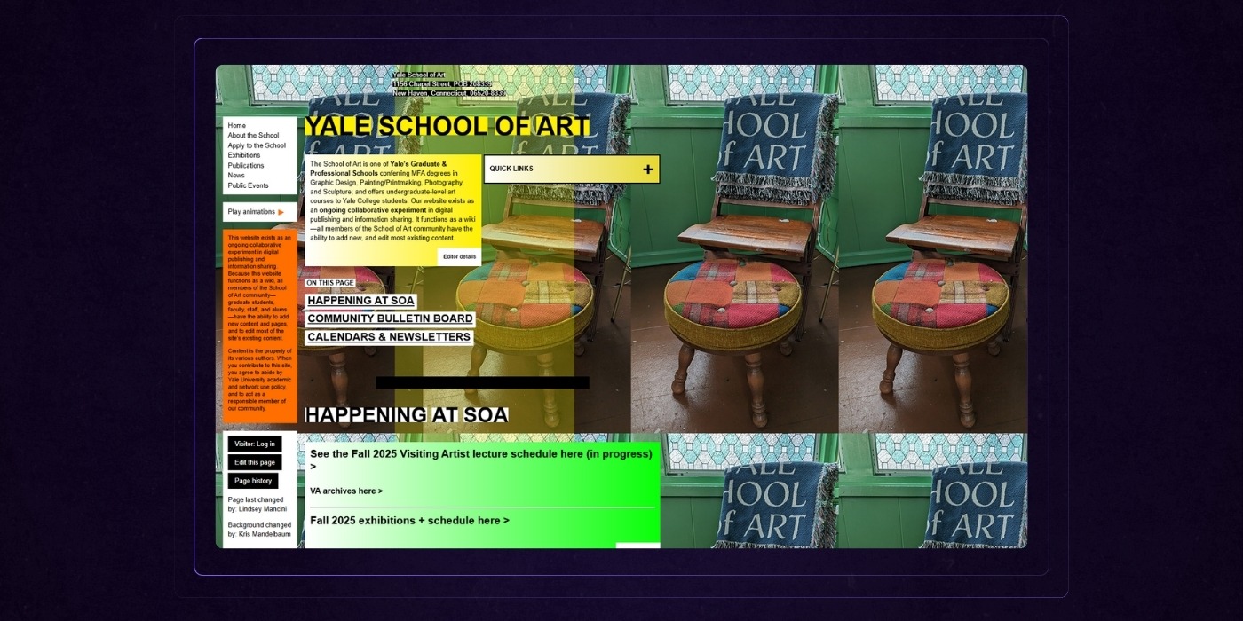
The Yale School of Art is Yale University’s graduate-level art school, offering MFA programs in Graphic Design, Painting/Printmaking, Photography, and Sculpture. Their site also serves as a collaborative wiki for students, faculty, staff, and alumni to share exhibitions, publications, courses, and events.
First Impressions
It’s giving: “Designed in Microsoft Word.”, “Every intern got to pick a background color.”, “What if the website was the bulletin board?” vibes. Also, it’s not just hard to navigate; it feels like a protest against navigation itself.
The Roast + Remedy
Ah, yes… the Yale School of Art website — where the homepage is a performance piece, and the user experience is the art you’re supposed to suffer through.
Let’s respectfully roast this avant-garde UX meltdown.
1. A UI That Thinks It’s Smarter Than You
- A rainbow of sticky notes, drop shadows, clashing fonts, overlapping modules… and a handwritten-style link that literally says “change the homepage background >>”
- Navigation? Buried. Hierarchy? Optional. Readability? Bold of you to assume that matters here.
The Fix: Respect your audience’s time. Art school ≠ permission to make your homepage feel like an experimental zine from 1998. Keep the creativity, but wrap it in clarity.
2. Background Image Chaos
- The homepage uses a tiling image of two chairs and a blanket as its background.
- Combined with translucent neon blocks on top, it's like trying to read a newsletter through a kaleidoscope.
The Fix: Backgrounds should support content, not compete with it. Stick to a simple, neutral base and let the actual art shine.
3. This Is Not How Calendars Work
- The calendar module is the most “normal” thing here, which only highlights how weird the rest is.
- But it’s oddly compressed, squished between overlapping content, and lacks any useful filtering beyond "Subscribe."
The Fix: Expand it. Give events real estate. Use filters that matter to users (by department, date, medium).
4. Bulletin Board from Hell
- Every section in the “Community Bulletin Board” feels like it’s been copy/pasted from an email chain… and then highlighted with a digital highlighter held by a cat.
- Entire paragraphs are jammed into tiny yellow blocks with 10pt fonts.
The Fix: Use modular cards with titles, 2–3 line summaries, and clear links to full posts. Keep color coding consistent and intentional, not chaotic.
5. "Quick Links" = Quick Confusion
- There’s a yellow floating box of “quick links” that has no visual hierarchy or clear grouping.
- It might be useful. But like everything else here, it’s drowning in the noise.
The Fix: Group links by user type (e.g., Current Student, Applicant, Faculty) and keep it sticky or in the nav.
Bonus WTF Moment:
You can literally edit parts of the page. "Editor details" links are sprinkled everywhere — suggesting that anyone with a login can treat this like a living Google Doc. Bold strategy.
Wrapping Up The Review
The Yale School of Art homepage is a design thesis with no advisor. It’s “form over function” in its purest, most confusing form.
If the goal is to make the user feel disoriented, uninformed, and slightly mocked... bravo.
If the goal is to actually help prospective students, parents, and faculty find anything — start over.
Blinkee
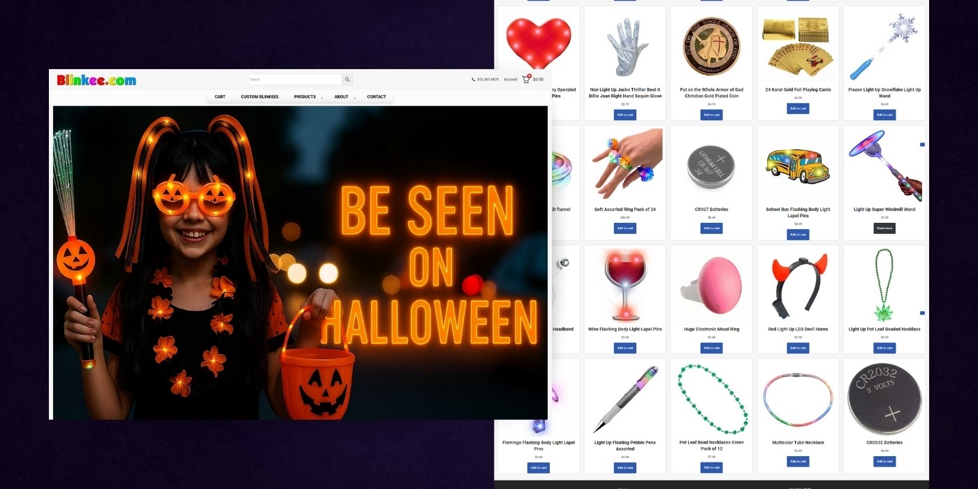
Blinkee.com is an online retailer specializing in a wide variety of novelty light-up products and party favors—LED toys, flashing jewelry, glow sticks, light-up hats, etc.
First Impressions
It’s giving: Party City’s weird cousin, Amazon search results for “light-up stuff”, and the spirit of a state fair booth trapped in web form. Honestly, it’s a VIBRANT mess. And somehow... it kind of works?
The Roast + Remedy
Oh wow. Blinkee.com really said "1999 eBay rave aesthetic" and ran with it.
Let’s respectfully roast this blinky, flashy, gloriously chaotic homepage that feels like it should come with a seizure warning.
1. No Cohesive Brand Story
- The site screams “BUY LED THINGS” — but gives zero context as to why, for whom, or what makes Blinkee better than a random Amazon seller.
- “Custom Blinkees” could be a powerful differentiator, but it's buried in the nav.
The Fix: Add a hero subhead or section that says: “The internet’s original light-up party store, trusted by schools, festivals, and party pros since [year]. Custom options? You bet.”
2. “Best Sellers” Grid = Organized Chaos
- 24 items per page. No filters. Inconsistent image sizes. A Christian gold-plated coin next to a Frozen Light-Up Wand next to disco earrings. What is happening?
The Fix: Break this into categories with actual relevance: "Halloween Must-Haves", "Party & Events", "LED Tech & Toys", and "Just for Fun" (where the disco balls and Jesus coins can live happily)
3. Design That’s One Glitch Away from a Time Machine
- Font: Generic.
- Layout: Shopify default starter kit.
- Image style: Wildly inconsistent.
- Spacing: Tight enough to stress out even a seasoned e-comm shopper.
The Fix: Use consistent product photography (or at least consistent cropping), lighten up the spacing, and upgrade the typography to feel less like a garage sale flyer.
4. CTAs: Functional But Flat
- Every product has the same “Add to cart” button.
- There’s no urgency, no upsell, no bundles or “people also bought” logic.
The Fix: Try: “Blink It Now”, “Customize Yours”, and “Party Pack Deal: Save 15%”. Also: throw in some urgency banners like “Trending This Week” or “Almost Gone!”
5. Navigation ≠ User-Friendly
- The mega-dropdown under “Products” is overwhelming.
- “Custom Blinkees” could be your core offering, but it’s hidden in a sub-link.
- There’s no easy way to browse by use case (school events, party favors, concerts, etc).
The Fix: Restructure your nav based on intent, not just product type. Use labels like: “For Parties”, “For Businesses”, “For Fundraisers”, and “Customize Your Blinkee”.
Wrapping Up The Review
Blinkee.com is the digital embodiment of your weird uncle’s rave gear drawer — chaotic, colorful, and a little overwhelming.
But underneath the glowsticks and clip-art vibes, there’s a clear business model with massive potential: Niche LED products for parties, schools, and events.
This site just needs a better structure, clearer messaging, and a little design maturity — so it can grow from fun novelty shop to category leader.
Pennyjuice
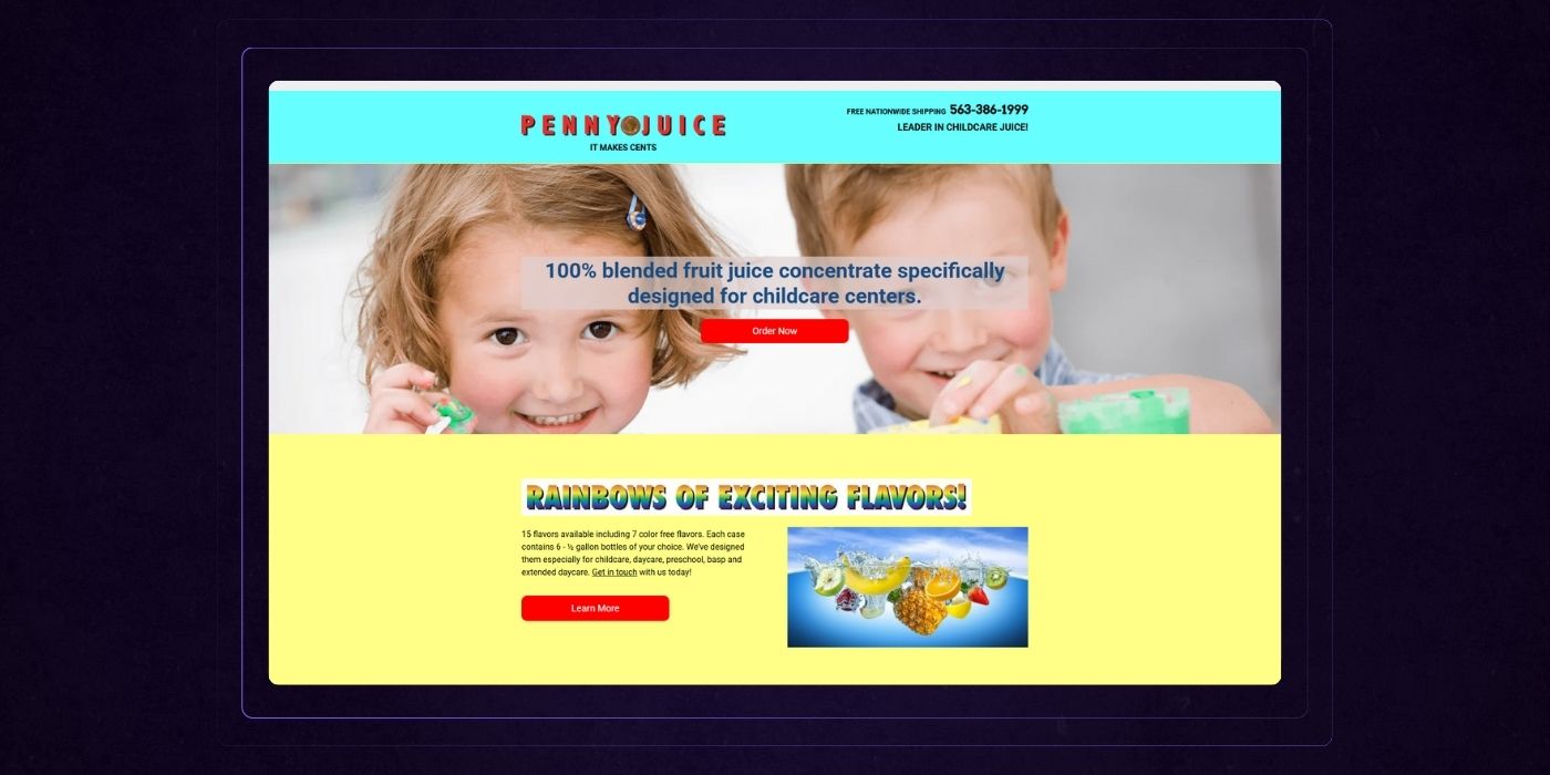
Penny Juice of America produces fruit juice concentrates designed especially for childcare centers (daycares, preschools, etc.). Their products comply with USDA/FDA nutrition guidelines, include color-free options, don’t require refrigeration before or after opening, and ship nationwide.
First Impressions
Feels less like a juice brand and more like something you’d see on a Geocities time capsule. Bright colors. Random gradients. Stock children. Comic Sans energy. But hey — at least it’s memorable. (Just... not in the good way.)
The Roast + Remedy
Let’s respectfully roast Penny Juice, the neon fever dream of the beverage world.
1. A Design Time Machine (and Not in a Cool Retro Way)
- The homepage uses four+ background colors, none of which go together.
- The primary font choice looks like it was picked by a toddler smashing a keyboard in Microsoft Word 2003.
- Layout? What layout? It’s just blocks on blocks with no structure or clear user flow.
The Fix: Choose a consistent color palette (one that doesn’t make your eyes vibrate), pair it with a modern typeface, and apply some white space. Seriously—let it breathe.
2. Messaging That Feels Like a Lemonade Stand Pitch
- "IT MAKES CENTS." Cute pun. Bad tagline.
- “Rainbows of Exciting Flavors” sounds like a sentence a unicorn would write.
- Product benefits are buried under cutesy fluff and weird formatting.
The Fix: Start with your customer’s pain point. Why does a childcare center manager need your product? Lead with: “Reliable, cost-effective juice concentrates made for childcare centers. No refrigeration. No waste. All flavor.”
3. No CTA Strategy, Just Red Buttons Everywhere
- “Order Now.” “Learn More.” “Learn More.” “Learn More.”
- It’s like someone Googled “button text” and just ctrl+c’d the first thing they saw.
The Fix: Vary your CTAs based on intent. Try: “Get a Sample Pack”, “View All Flavors”, or “See How It Works for Childcare Centers”.
4. Compliance Copy Killed the Vibe
- The FDA compliance section reads like a tax document.
- It's important info, but it feels like it was designed to be ignored.
The Fix: Turn this into a visual block with icons.
5. Social Feeds... From the Stone Age
- Facebook posts are a year old and say things like “has got juice, have you?”
- Twitter feed is just dead space. And why is the footer background electric blue?
The Fix: Either update your social presence or don’t feature it. A stale feed does more harm than good.
Wrapping Up The Review
Penny Juice is clearly trying to appeal to kids, but its customers are adults running businesses. This site doesn’t sell confidence. It sells chaos... in fruit flavor.
If you want schools and daycares to trust you with their beverage decisions, the site needs to:
- Look professional
- Communicate value fast
- Create a clear conversion path
Vedder Price
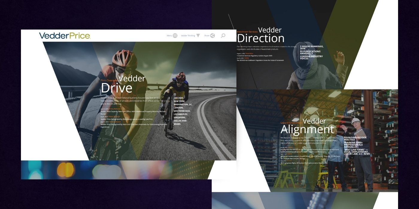
Vedder Price is a global business-focused law firm with offices across the U.S., the U.K., and Asia. They specialize in services like finance & transactions, labor & employment law, litigation, transportation finance, and regulatory work.
First Impressions
It’s giving PowerPoint-on-rollerblades. Every section is a diagonal wedge. Every word is “Vedder + abstract noun.” And the user journey? More like a visual scavenger hunt through a branding workshop.
The Roast + Remedy
Ah yes, Vedder Price — a global law firm homepage that’s trying so hard to be visually clever, it forgot to be usable.
Let’s respectfully roast this angular avalanche of vague buzzwords and disorienting layouts.
1. Form Over Function… Way Over
- Those aggressive triangle slices? Cool in theory. Brutal in practice.
- They create a jarring scroll rhythm, break content flow, and kill visual hierarchy.
- It’s like watching a law firm try to cosplay as an energy drink ad.
The Fix: Use angular elements sparingly — as accents, not full content containers. Prioritize readability and flow.
2. "Vedder + Noun" Is Not Messaging
- Vedder Drive. Vedder Deals. Vedder Powered. Vedder Direction. Vedder Alignment. Vedder Precision.
- This isn’t branding. It’s corporate poetry slam night.
The Fix: Say what you actually do. Imagine you're talking to a time-strapped executive looking for legal support. They don’t want wordplay. They want: “International law firm helping high-growth businesses close complex deals faster, with less risk.”
3. The Text Is Drowning in Design
- Backgrounds range from motion blur bokeh to industrial close-ups to… cyclists?
- That makes already-dense copy hard to read — especially with small fonts and white-on-transparency text.
The Fix: Increase contrast, cut fluff, and use clean text blocks. You’re selling trust and clarity, not abstract art.
4. The Imagery Feels… Confused
- Cyclists, sparks, factory workers, fishing rods?
- What industry is this? Sportswear? Aerospace? Biotech?
The Fix: Use imagery that directly reflects the clients you serve or outcomes you deliver — not metaphorical stock visuals.
5. CTA? What CTA?
- There is no obvious call to action anywhere.
- Want me to contact you? Download a capabilities sheet? Book a consultation? Couldn’t tell you.
The Fix: Add persistent CTAs like: “Find an Attorney”, “Explore Services”, and “Talk to a Legal Expert”. Put them in the nav, in each section, and as a sticky footer if needed.
Wrapping Up The Review
This homepage is a graphic designer’s dream and a prospective client’s nightmare.
It looks sleek but tells you very little — and worse, makes you work for every ounce of clarity.
You don’t need to throw out the creativity. You just need to redirect it to do its job:
Earn trust. Communicate value. Drive action.
Wow Butter
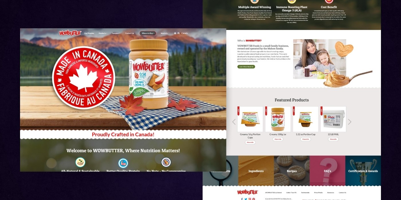
WowButter is a food brand offering a peanut-free and tree-nut-free spread made with whole toasted soy, pressed soy oil, cane sugar, palm oil, and salt. It’s made in a dedicated nut-free facility, aims to closely mimic peanut butter’s taste and texture, and is designed to be safe for schools and people with nut allergies.
First Impressions
Wholesome family vibes… wrapped in chaos. The product? Actually seems solid. The website? Feels like a flyer from the school PTA got turned into HTML.
The Roast + Remedy
Ah yes, WOWBUTTER — the site that looks like it was built by someone who just discovered drop shadows and clip art in the same afternoon.
Let’s respectfully roast this peanut-free peanut butter alternative that somehow manages to feel both overdesigned and under-thought at the same time.
1. A Brand Identity Crisis
- Are you a science-backed nutrition brand?
- A family-run farm operation?
- A peanut-free school-safe product?
- A Canadian patriotism poster?
- Right now, the site is trying to be all of them at once. The result? Cluttered storytelling.
The Fix: Pick a lane for your homepage. Lead with the biggest pain point you solve: “A better-tasting, allergy-safe peanut butter alternative. Same taste, zero nuts, 100% school safe.” Everything else can flow beneath that.
2. Visual Design: Clip Art Fever Dream
- That wavy section divider? Cute, in a 2012 WordPress theme kind of way.
- The testimonial block? Giant speech bubble with stock shadows.
- The “Proudly Crafted in Canada!” red banner? Feels like it was added in MS Paint.
The Fix: Strip away the decorative fluff. Let the brand breathe. Clean typography, a modern icon set, and fewer textures would make this way more credible.
3. The “Wall of Icons” Issue
- The nutrition benefit section drops six badges/icons with lengthy microcopy.
- Each reads like a press release from 2016.
The Fix: Break it into digestible value props:
- ✳️ Better Than PB (show the side-by-side comparison)
- 🌱 Allergy-Free & School Safe
- 🏆 Award-Winning Canadian Quality
Focus on benefits, not just facts.
4. Product Carousel = E-Commerce Lite
- The product images are decent but the “More Info” buttons feel underwhelming.
- Also: why is “Creamy 2kg Jar” shown twice? That’s a jar, not a feature.
The Fix: Add CTAs like: “Shop Now,” “Add to Cart,” or “Find Near You”, and include stars, reviews, and use-case badges (e.g., “Lunchbox Favorite”)
5. Footer Overload
- Five panels.
- Ten links.
- A magnifying glass.
- Cheese slices.
- A question mark.
- A trophy.
- ...What are we doing here?
The Fix: Consolidate into 3 primary categories: Product Info, Where to Buy, and Why WOWBUTTER. Everything else can go into subpages.
Wrapping Up The Review
Right now, WOWBUTTER’s site feels like it was built with love but without a plan.
And that’s a shame — because the product itself? Sounds awesome.
This brand deserves a website that:
- Leads with its biggest differentiator
- Uses clean design that builds trust
- Speaks clearly to its two core audiences: parents & schools
Icenhower Oil & Gas
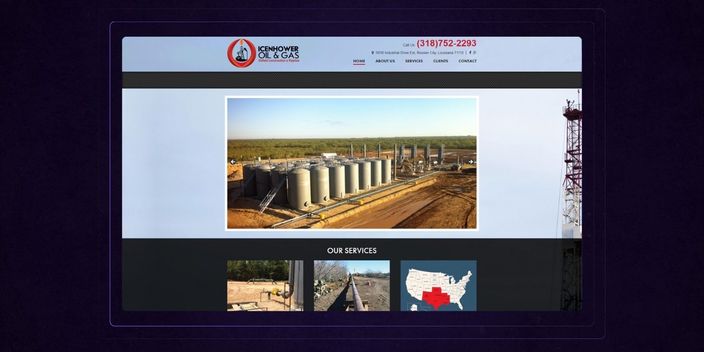
Icenhower Oil & Gas, Inc., founded in 1994 by Tim Icenhower, is an oil-field construction and pipeline company based in Bossier City, Louisiana. They offer services such as facility construction and pipeline installation and operate with dozens of crews across several states.
First Impressions
Industrial. Straightforward. A little too... fossilized. For a company that’s been “instrumental in pipeline process improvements,” this site still feels stuck in the Dreamweaver era.
The Roast + Remedy
Alright, it’s time to respectfully fire up the drill and roast the Icenhower Oil & Gas homepage — because right now, the only thing flowing through this website is 2007 corporate vibes and missed opportunity.
1. Above the Fold = Above Nobody’s Expectations
- Hero image slider? Check.
- Stock-looking facility photos? Check.
- Zero messaging or value prop in sight? Unfortunately, also check.
The Fix: Replace the photo slider with a strong, clear headline and subhead. For example: “Trusted Pipeline Construction Since 1994 — Delivering Safe, Scalable Energy Infrastructure Across 7 States.”
Then, hit them with a bold CTA: “View Our Capabilities →”
2. The “Our Services” Section = Just Enough to Confuse Everyone
- The cards look okay visually but the copy gets vague fast: “Our business is more than just putting pipe in the ground...” ← Okay, then say what it actually is.
- “Where We Operate” uses a red-highlighted U.S. map that could’ve been ripped from a PowerPoint deck.
The Fix: Get more specific. Speak in benefits, for example: “Safer installs. Faster timelines. Lower environmental impact.” or “We build systems that last — backed by 30 years of field-proven expertise.”
3. Company History = Wall of Text
- Paragraph format, dry as the Texas plains.
- There’s no human story. Just a guy named Tim and some dates.
The Fix: Break it up visually and narratively. Add photos, a quote from leadership, and tell the story in 3 bullets:
- Founded in ‘94 to serve Louisiana’s growing oilfield market.
- Expanded to 7 states, 80+ service crews.
- Built a rep for safety-first pipeline construction.
4. Calls to Action That Don’t Call Anyone to Act
- “What We Offer”
- “Learn About Us”
- “Ask A Question”
These sound like dropdowns, not actual invitations to engage.
The Fix: Use conversion-focused language:
- “Explore Our Services”
- “Why Clients Trust Us”
- “Talk to a Project Lead”
5. Visual Design = Safe But Stale
- Black gradients, center-aligned text, faded photo overlays… it’s functional, but it’s not inspiring trust at a glance.
- And why is the header text squeezed into the tiniest column above the nav?
The Fix: Modernize the layout:
Full-width hero with high-res drone shots. Sectioned grids with whitespace. Text that's actually readable on mobile.
Wrapping Up The Review
Icenhower’s site does the job — like a basic wrench.
But you're in the energy business. You build multi-million-dollar infrastructure. Your website should feel as solid and capable as the work you deliver.
Right now? It’s the digital equivalent of leaving your tools out in the rain.
A Real-Life Bad Website Turned Good
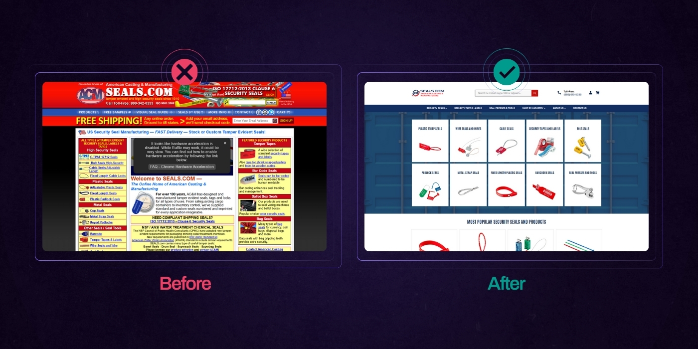
We were approached by seals.com (American Casting), an industrial manufacturing company, to help them with their website redesign project. They wanted to expand their direct to consumer and wholesale business, but it was impossible with the state of their current website. This is what their website looked like at the time:
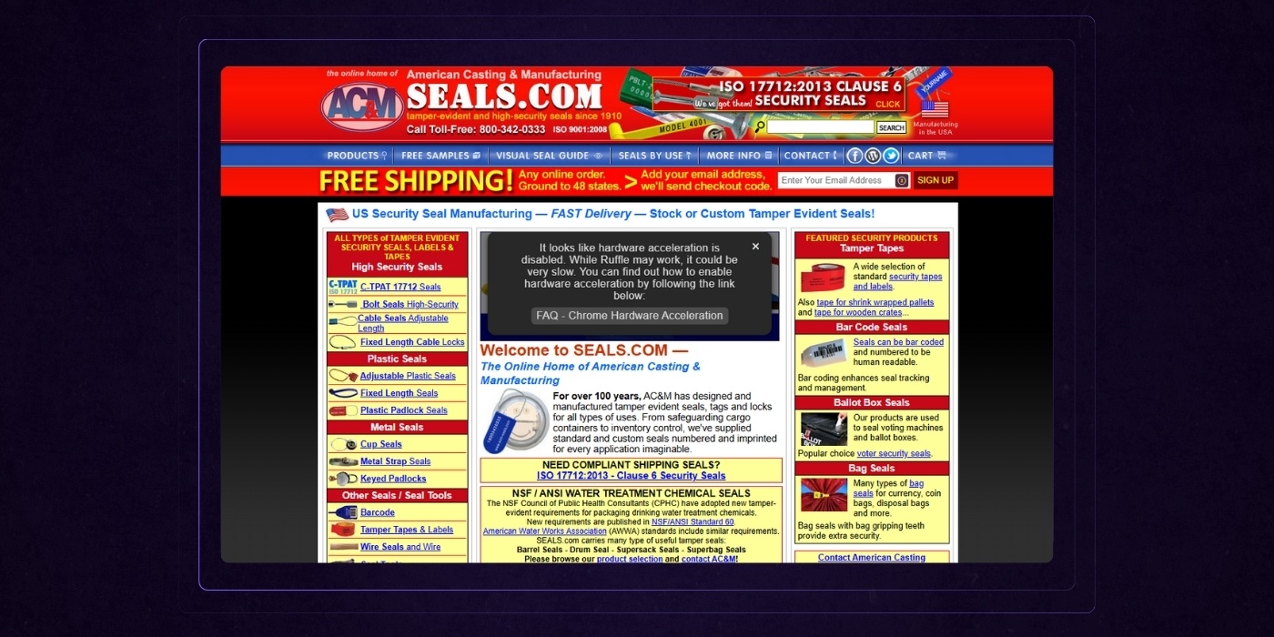
We’ve worked with over a hundred companies over the past 14+ years, but this by far was the worst website starting point we’ve had. Their website had a staggering amount of technical and design mistakes. Here were some of the bigger ones:
- The website wasn’t mobile friendly for the user and did not include a responsive design.
- It was built with no back-end and was just a series of static HTML pages.
- That inherently isn’t horrible for small websites, but when you’re managing a website with more than 1,000 active pages, it’s a pretty big problem.
- The URL structure was completely flat (no parent pages), the website didn’t have the ability to rank for topics easily.
- Everything was an individual product, even if it was just a small variation of a core product. This made navigating the product library clumsy and cumbersome.
- The layouts were cramped and cluttered.
For us, the surface level user experience improvements were pretty obvious.
What we spent the majority of our time understanding up front was the client’s business and products. Clearly presenting company details is essential to establish legitimacy and build trust with visitors. Making contact details easily accessible throughout the site was also a priority to enhance user trust and engagement.
After a tour of the facility, combing through old product manuals, and multiple face-to-face meetings with the owners and senior staff we were able to start to devise a plan for how the website should be structured and how products should be presented to make the most out of the customers’ experience. We focused on highlighting the services offered and ensuring they were easy to find.
Here are some of the highlights and elements of making this a good website:
URL structure / SEO
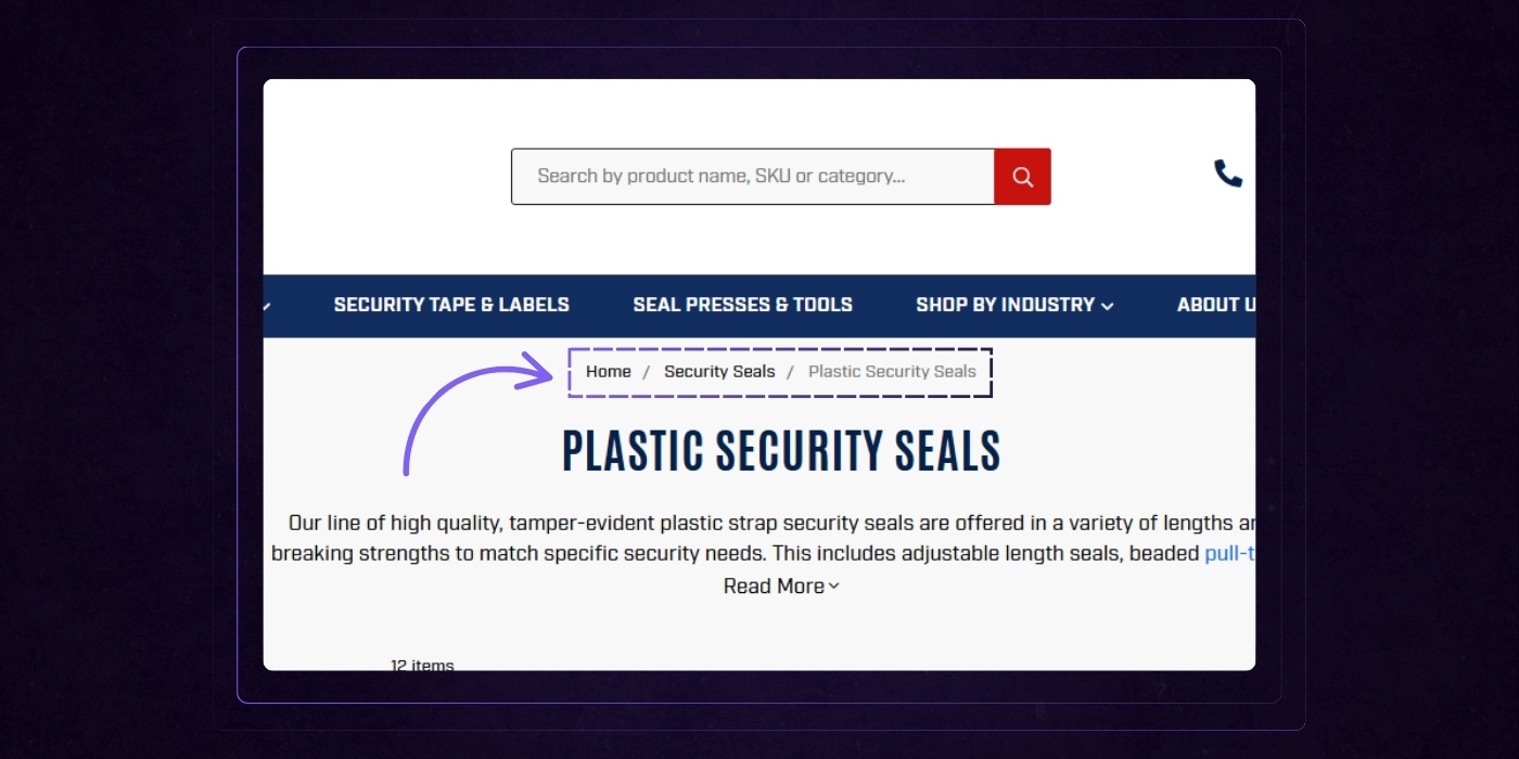
The flat structure had to go. It was doing them no favors with search engines. Instead, we took an approach where we built out category pages as pillar pages and linked all of the appropriate products to those website pages.
The web design for the pages were simple but effective. Bread crumbs present on each category website page helped link authority between pages together and a small description at the top of each category page helped add keyword-rich content to the website pages.
The Results:
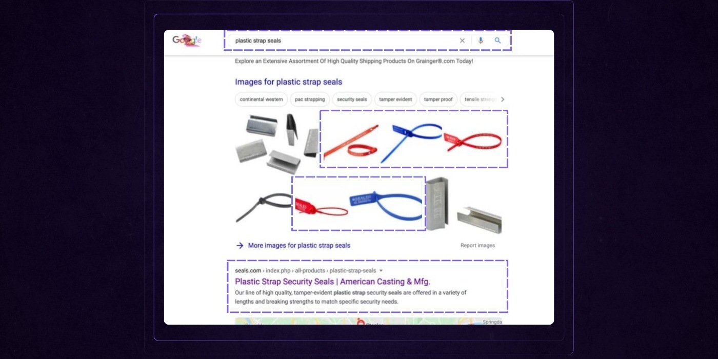
- After 3 months search results traffic overall had increased by 25%.
- After 6 months seals.com began locking in top 3 (in many cases, #1) results for key terms.
To this day, they still hold the #1 position for terms like “Plastic Strap Seals”.
User Experience / Visual Design
What we found out when learning about Seals is that they had the largest variety of colors, sizes, and options on the market.
However, it was almost impossible for visitors to understand this with the way their site was structured and designed.
We knew that this differentiator would help set them apart from everyone else if done right, so we made it a focal point of the web design.
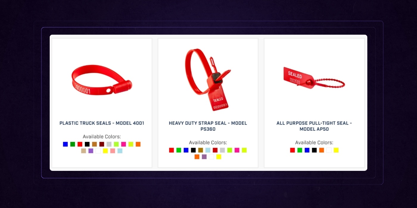
When a user lands on a product category website page they’re immediately presented with filterable options on the left hand side.
Product thumbnails then highlight what colors are available for direct purchase on the website vs a custom phone order.
The user immediately now has a sense of how vast their optionality is, but has the tools they need to quickly drill down to what they’re interested in.
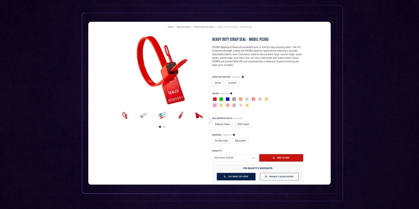
Another big challenge we had to conquer was allowing customers to quickly toggle through options on individual product website pages. At the product level we provided the users with the ability to easily toggle between models and configurations without ever having to reload.
The Results:
- Add to cart rates increased by over 400%.
- Overall conversion rates increased to over 5%.
- Within the first 3 months online sales tripled without investing more in digital ads.
- After the initial jump, sales continued to steadily increase month over month for the entirety of the first year.
Beyond Design, What Makes A Website Good?
Great design gets attention. But it’s not the whole picture.
A good website isn’t just visually appealing; it’s accessible, tested, and backed by data.
The Importance of Accessibility
When it comes to website design, accessibility isn’t just a nice-to-have—it’s essential. A poorly designed website that overlooks accessibility can leave a significant portion of your audience completely lost or frustrated, resulting in a poor user experience and even potential legal trouble. Website owners need to ensure that everyone, including users with disabilities, can easily navigate and understand their content.
Take the Internet Archive Wayback Machine, for example. While it’s a treasure trove for accessing archived websites, its cluttered layout and lack of white space can make it tough for users to find relevant information. This is a classic case of a poorly designed site that doesn’t prioritize accessibility, making the user experience less than ideal.
To avoid these pitfalls, website owners should follow the Web Content Accessibility Guidelines (WCAG 2.1 AA). This means adding alt text to images so screen readers can describe visuals, using clear and consistent navigation, and choosing font sizes that are easy to read. By making accessibility a core part of your website design, you’re not just ticking a box—you’re creating a more user friendly and inclusive experience for everyone who visits your site.
The Role of Testing in Website Design
No matter how beautiful your website looks, if you don’t test it, you’re flying blind. Testing is a critical step in the website design process that helps website owners catch issues before they frustrate real users. From broken links to confusing navigation, a lack of testing can turn even the most promising site into one of the worst websites out there.
User testing, in particular, is invaluable. It helps ensure your site is user friendly, mobile friendly, and accessible to everyone. Tools like Hotjar and Crazy Egg let you see exactly where users get stuck or drop off, so you can fix pain points before they become deal-breakers.
Consider a car leasing company like Ling’s Cars. Their site is infamous for overwhelming visitors with too much content and chaotic navigation. With proper testing and iteration, website owners can streamline navigation, clarify calls to action, and make the entire website more enjoyable for potential clients.
In short, don’t skip the testing phase. By gathering feedback and making improvements, you’ll create a website design that truly meets your audience’s needs and delivers a positive user experience.
The Role of Analytics in Website Design
Analytics are the secret weapon behind every high-performing website. By tracking how users interact with your site, website owners can make smart, data-driven decisions that improve everything from site speed to mobile responsiveness.
Tools like Google Analytics provide a wealth of information—think bounce rates, page load times, and user engagement metrics. For example, if a site like Penny Juice notices slow site speed and poor mobile responsiveness in their analytics dashboard, they can prioritize speed optimization and responsive design to enhance the user experience.
Analytics also help you spot trends and identify which pages or features are working—and which are not. This means you can continually refine your website design, making it more user friendly and effective at converting visitors into customers.
In the end, leveraging analytics isn’t just about numbers. It’s about understanding your audience and using those insights to create a website that’s fast, mobile friendly, and a pleasure to use.
The Importance of Maintenance
A great website isn’t a “set it and forget it” project. Ongoing maintenance is key to keeping your site secure, up-to-date, and user friendly. Website owners who neglect maintenance risk ending up with one of the worst websites on the internet—think the infamous Big Ugly Website, which is a masterclass in outdated design and broken functionality.
Regular maintenance means updating content, fixing broken links, and ensuring your site works smoothly on all browsers and devices. For example, Toronto Cupcake could benefit from routine updates to refresh its design and improve the search bar, making it easier for customers to find what they need.
Ignoring maintenance can lead to an ugly website that frustrates users and loses potential customers. But by staying on top of updates and repairs, website owners can inspire confidence, improve search engine rankings, and provide a consistently good user experience.
Don’t let your site become a cautionary tale. Prioritize maintenance, and your website will remain relevant, effective, and far from the world’s worst.
Wrapping Up: A Bad Website Isn't A Lost Cause
Notorious examples of the world's worst website design include infamous sites like the one page website for Tag Team Signs, the minimalist interface of Hacker News, the unconventional Yale University School of Art site, the outdated Pacific Northwest X-Ray homepage, and other tag team signs websites criticized for poor usability and unprofessional appearance. But not all bad websites are that dramatically bad.
In most causes, like the examples we highlighted today, it's a culmination of bad choices that lead to poor results.
Bad website design can be devastating, but it’s far from the end. It’s just the starting point of turning it all around and making it great.
How do you do it?
By building memorable websites instead. Websites that offer visual appeal, a positive and streamlined user experience, and plenty of good and easy-to-digest information.
It’s not an easy task. But it’s far from impossible.
Website Improvement Plan
Want a free, customized roadmap of website improvements?
Want to know exactly what should be improved on your website before you embark in your next redesign? Request a session with one of our experts below (totally free, no strings attached)
