Design
16 minute read
Design Category Pages That Drive Conversions.
LAST UPDATED:
April 8, 2024


Ecommerce category pages are a critical component of good web design.
Unfortunately, many ecommerce website designs don’t pay sufficient attention to them. Category pages allow you to sort products in a logical way that corresponds to customer interest and create a better user experience.
In addition to providing a better ecommerce experience, they also happen to be SEO powerhouses.
The difference between a poorly designed category page and a well-organized one can be tremendous.
A high-performing ecommerce category page sends online shoppers exactly where they want to go—maximizing conversion rates and sales along the way.
In this guide, you’ll learn exactly how to design a category page that converts like magic on both mobile and desktop computer screens.
Keep reading.

What is your category page for?
The category page is a waystation. It’s a checkpoint where you send shoppers in the right direction.
It’s not the final goal, but it’s a crucial step to getting there.
Ecommerce Category Pages Designs must be Clear
The best category pages allow users to quickly pick an option and go to the product page and then ultimately, enter into your checkout flow.
How can you do that?
Simple: make the category page clear.
Make sure it shows relevant product information.
Every choice should stand out through its differences and unique features.
Don’t try to be fancy—unless you really know what you’re doing. Clarity on this page matters more than anything else.
The Role of the Category Page in the Sales Journey
A sales journey outlines the transformation from “shopper” to “buyer.” The category page is part of that transformation.
Shoppers who land on category pages are researching. They’re looking for options. They might not know what you offer. Maybe they’re looking for a specific product.
That makes your goal clear: give them the information they need to move from “research” to “purchase” and give them an amazing digital experience along the way.
What do they need to know about this category of products that will bring them closer to making a purchasing decision?
That’s exactly what the next chapter is about.
Sorting your products into broad categories seems easy. But if you’re not careful, you might ignore the way your audience actually thinks about your products.
This chapter shows how to choose categories and subcategories that make sense to your shoppers so that they can quickly narrow down their preferred choice.
The more intuitive you make your categories, the more easily shoppers can get to the right product page.
In essence, you need to get out of their way.
Use Card Sorting
Card sorting is a UX exercise where you ask your customers to sort your online store’s products and then the UX team uses the results to develop a category structure.
This step helps you remove the guesswork. You don’t operate based on hunches, but let your customers do the talking. The resulting data is invaluable.
But card sorting has its downsides. It can be time-consuming and expensive. You have to do it right to be confident in the results.
There are plenty of online tools to help you with this exercise. We like Optimal Sort, which helps even first-timers build some easy sorting exercises. It also comes with a full analytics suite to interpret the results of the sorting options.
Keyword Research to Choose Categories
Keyword research can teach you what terminology your loyal customers are using. By understanding what terms they are searching, you can gain insight into how they categorize your offerings.
If your goal is to create a primary navigation and categorization structure that makes sense to your customer, it helps to speak their language.
Not only does this improve organic search performance for your website, but it makes it super easy for customers to find what they’re looking for because your language matches their language.
Consider this scenario:
You’re limited on time searching for dog food. You visit two different websites.
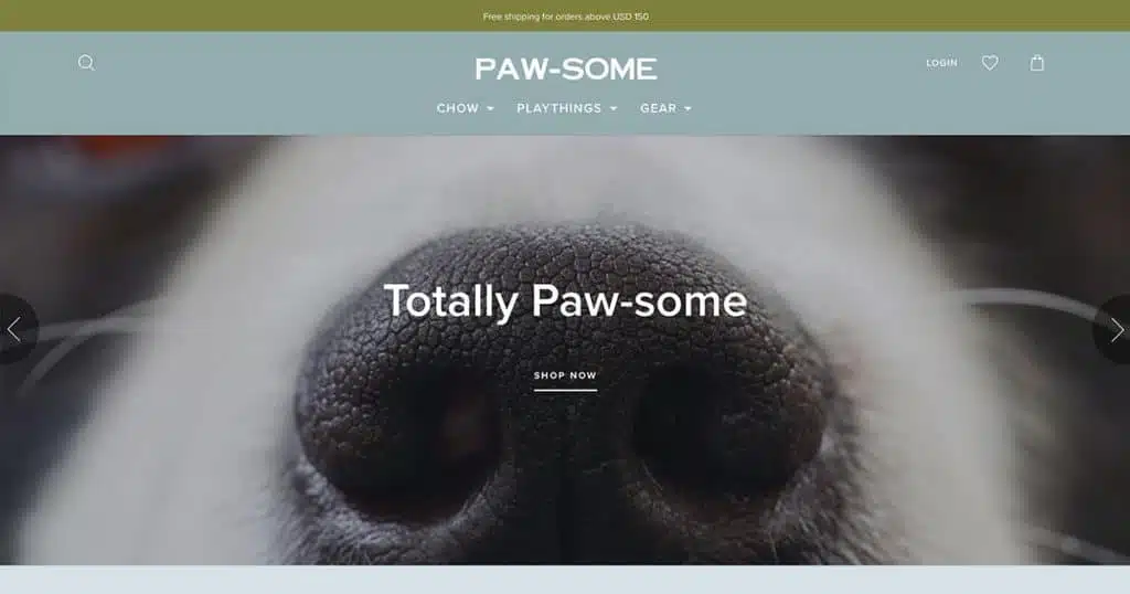
vs
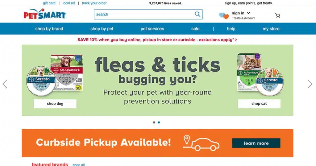
Does one feel like its categorization is more obvious to you?
Categories like “chow,” “playthings,” and “gear” are fun, but is it clear enough to you that you understand what they contain before navigating there?
The answer is, probably not.
That doubt will affect conversion rates and sales.
Why?
People don’t like to think more than they have to. Especially when they’re short on time, and especially when it’s a mundane task like purchasing dog food.
Injecting personality into your ecommerce or B2B website can be a great way to bring brand appeal online, but in general, users prefer direct and obvious language when dealing with information architecture.
Here’s how to do keyword research:
1. Choose a tool like Keyword Explorer.
2. Look for the keywords your audience uses in the specific category you’re building. SEO audits can also be helpful in this process, as they can help you identify which keywords are most important for each individual page on your website.
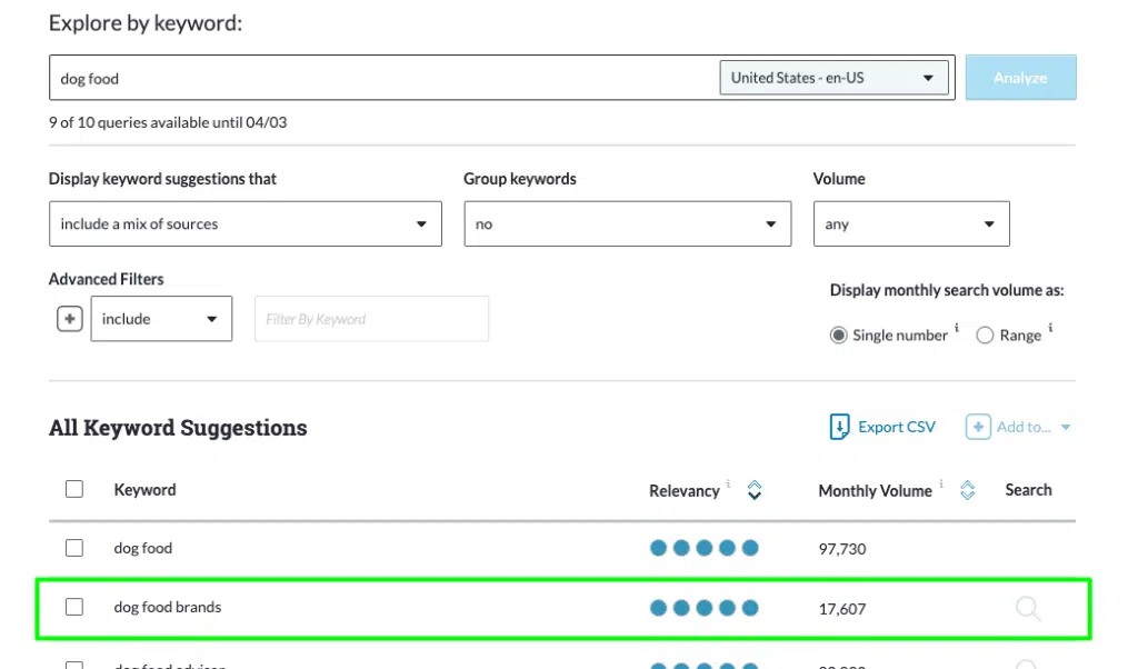
3. Refine your category based on how they search and the language they use.
If you’ve done your research and the type of products seem obvious then you’re on the right track to having categories organized in a way where they resonate with your customer.
You’ve set your categories. Let’s get specific.
It’s time to talk about the elements that make up your category page design.
In this chapter, we’re focusing on the seven most important ones.
1. The Category Name
It’s worth mentioning again: your category name should use your audience’s language. Read chapter one again to learn how you can discover it.
In general, you should follow these quick tips:
- Brand names that are obscure will not work.
- They need to be simple.
- Clarity is the biggest priority.
- Don’t be afraid of using boring, as long as it’s descriptive.
- The more recognizable and obvious, the better.
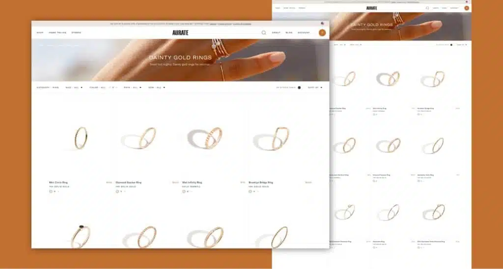
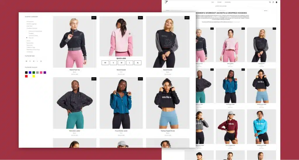
2. The Category and Product Images
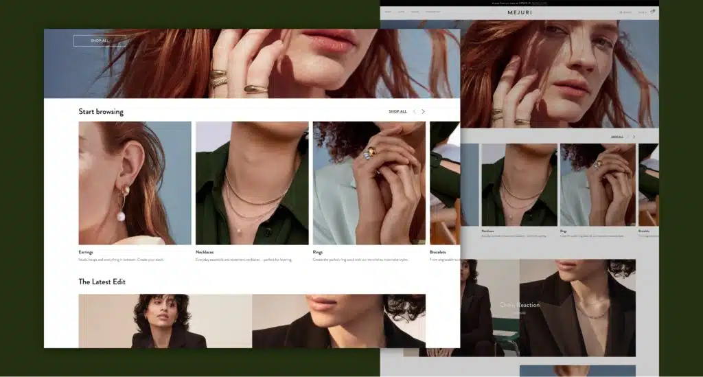
Use top-level (not too specific) product images on your category page that make the category immediately obvious. Don’t let the images overpower the page or distract from the product search. Use them to explain what the category is about.
Individual product images typically show as tiles on this page. Follow a few specific rules. All product based images should be:
- high-quality
- descriptive
- show the actual product where possible
- consistent with each other: same size, background, whitespace, angle, lighting, etc.
Inconsistent product images introduce cognitive dissonance. Your audience will hone in on the differences and become less likely to choose any one of them.
3. Product Information
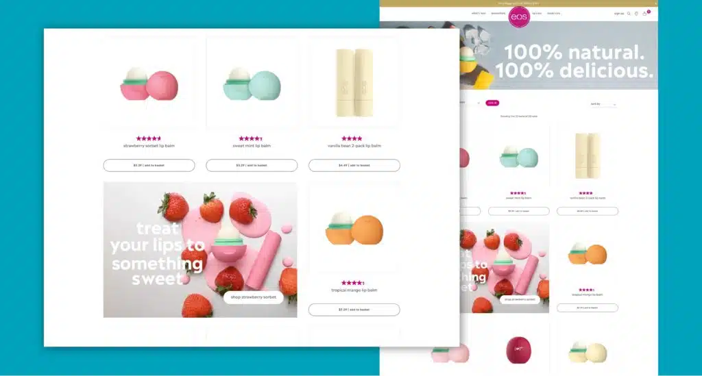
Obviously, you need to include your actual products on your category page.
All the basic information should be there, including:
- Product name
- Price
- CTA
- Short description (quick view is optional but recommended)
- Social proof/reviews
4. Category Price Range
Never use price to mislead your customers. The goal of the page is informational, and the price may be the most important piece of information on it.
Try listing the general price range of each category. It prevents disappointment from your audience, which might make them less likely to buy.
Remember: more informed potential customers will become more satisfied customers.
5. Featured Items
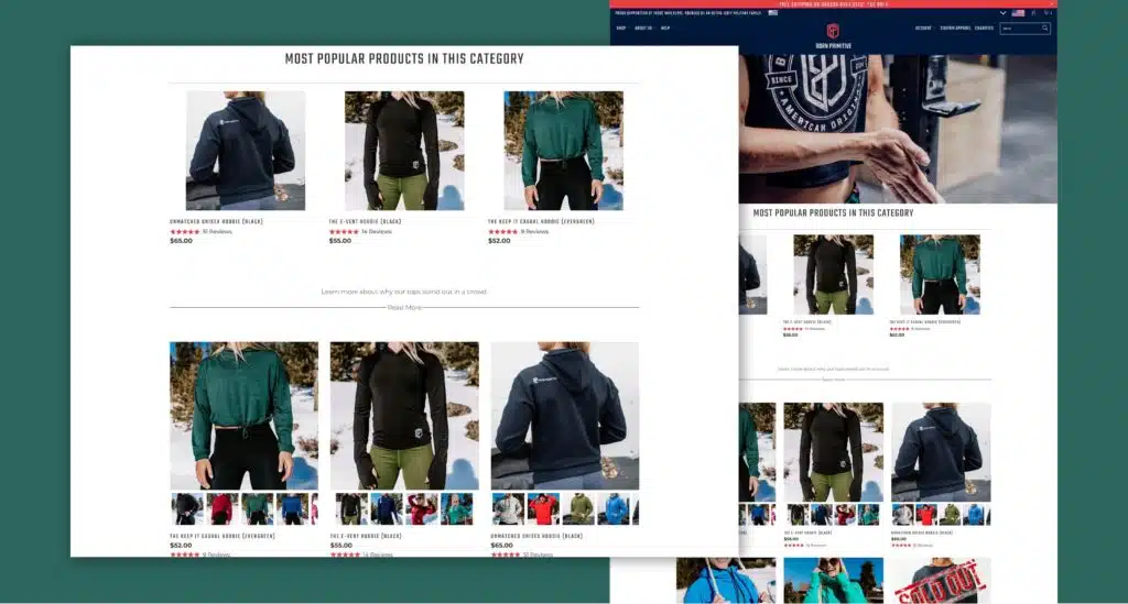
You don’t need to list your items alphabetically. Play around with the format a little to make the shopping experience more intuitive.
Use featured items to make suggestions. These suggestions draw eyeballs and increase conversion rates and sales for popular items.
You can go deeper, too.
Take an example from ecommerce brands like Amazon. Feature subcategories like bestsellers, related products, “people also liked” items, and so on.
To further boost conversions, you can also feature special offers. Showcase current sales to emphasize how much the customer will save.
One more option: consider a “What’s new” subcategory or filter. It’s especially relevant for industries with high degrees of return customers or seasonal product selections.
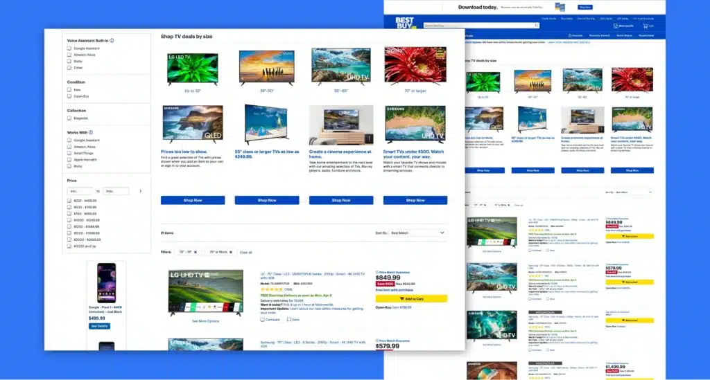
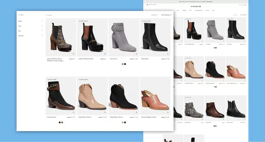
6. An Optimized Navigation and Filtering System
The goal of good category page design is to help your audience find the products they’re looking for quickly. It helps them in comparing products and making a purchasing decision.
That’s only possible with the right navigation and filtering system.
Faceted navigation is key here.
It’s a filtering system that allows your audience to browse products using factors like price, product type, ratings, and more.
Card sorting experiments as discussed in chapter 2 can help you define the right factors. Build the structure based on what your audience is looking for.
You also need a search box. It should be big enough for your audience to easily find and use for complex terms.
Silo the search results. That way, you can avoid getting results from section B when filtering in section A, etc.
7. Introduce Urgency & Clear Next Steps
The more obvious, the better. In this step, you should use different digital marketing techniques to lead your audience through the funnel.
Use an urgent call to action message. Terms like ‘limited supply’, or ‘only X items left’, typically increase clicks.
You don’t have to force your audience to go to the product page. Some quick buttons by each product allow shoppers to add products directly to their wish list or shopping cart.
The more steps and friction you reduce here, the better.
You don’t just need the right elements. You also need to make sure that your audience can use it.
That’s the UX portion of the ecommerce category page.
UX Navigation Practices in Ecommerce
UX on the category page begins and ends with the navigation.
Where space allows, navigation always needs to show the exact product categories.
Each parent category should be selectable and linked to a specific page.
The less your audience has to think, and the more options they have, the better.
When your visitors don’t find what they want, they assume you don’t offer it. That’s the biggest red flag you’ll want to avoid.
Consider implementing a polyhierarchy that goes beyond linear displays. Items in this hierarchy exist in more than one parent category so they’re easier to find.
Navigation Display and Breadcrumb Best Practices
Don’t just tell them through your navigation labels. Show them the way through breadcrumbs.
Breadcrumbs live at the top of the category page. They show the way if you use them right:
- Show the whole path leading to the current landing page, separated with a “>” symbol.
- Use a different font for pages at a different spot in the hierarchy.
- Change the color or remove the hyperlink of the current page’s breadcrumb to differentiate it.
- Use exact page titles where possible to avoid confusion.
An Optimized Search Functionality
Go beyond the basic search box.
For larger stores, consider offering an advanced search with multiple filter tools.
Avoid returning no results. Instead, show alternative or substitute products to move the user forward.
Feature autocorrect to prevent typos from becoming serious obstacles. The more dynamic the function becomes, the better.
Minimizing Clutter on Category Pages
The products are the heroes. Good UX removes the clutter that prevents them from being the focus.
How do you minimize clutter?
- Use smaller SKUs.
- Feature more straightforward categories.
- Only include filtering options that are actually relevant.
- Emphasize quality over quantity.
More features or filters don’t always increase revenue. Card sorting exercises like the above can help you find what matters.
Don’t go too simple, though. You can use a table of contents. Your visitors expect product listings that show differences and unique features. That helps them decide whether and where to click.
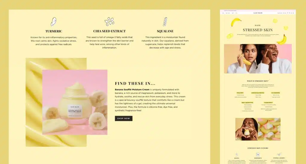
Balancing Product Details on Category Pages
Focus on the information your audience needs, but stay concise. Include product characteristics in the name. Use descriptive photos. Make a quick note of colors and styles, as well as price.
The rest of the information is optional. Customer ratings can help, as can current availability and alternative images.
One way to reduce clutter: link product images to quick-view tools or lightboxes for more information and details that make product discovery easier. The information stays off the category page but doesn’t require the commitment of the product page.
Building Hybrid Product/Collection Pages
You can also reduce clicks in other ways. Place products on landing pages that show a list of alternatives and options.
Filters can help your audience narrow that selection.
This view should highlight subcategories separately from other filters. That encourages your shoppers to get more specific but still limits their choices.
Category pages are landing pages specifically optimized for targeted keywords. In other words, they deserve special SEO attention.
The Customized Heading Tag
On your category page, headings have two basic purposes:
- They confirm to the visitor that the page matches their needs.
- They encourage them to stick around and keep browsing.
The first is descriptive. The second is strategic.
“Apartments in Pittsburgh” is a local SEO query that matches the first purpose. “Affordable Apartments in Pittsburgh” goes further. It keys into audience needs and prompts them to keep browsing.
Don’t rely on intuition. Measure your heading strength through KPIs like low bounce rates and high click-through rates.
Optimizing Your Category Content
Your category page content is just like the stuff you see in a museum: you go for the exhibit (products), but the context (the category) matters.
It might be less sexy, but you still need to try to optimize your efforts.
Everything beyond the actual products should add context to the products and category.
A few content marketing best practices can help you improve future category content strategies:
- Add custom sales copy. Stay away from manufacturer copy. Plenty of other stores do that, so you won’t be unique. Plus, it might be bad. Instead, add your own copy. Use the intro to describe the category and supporting copy for individual sections. This is also a prime keyword opportunity.
- Match search intent. Don’t make the customer search for too long. Answer their questions directly in the copy you write. Match their intent and guide them to the solution.
- Build on-command content. Don’t let your content overwhelm the products. Stick with single, short paragraphs. Where needed, you can hide more in-depth text behind a button or accordion. But keep your most important SEO in that intro paragraph; search engines tend to devalue hidden content.
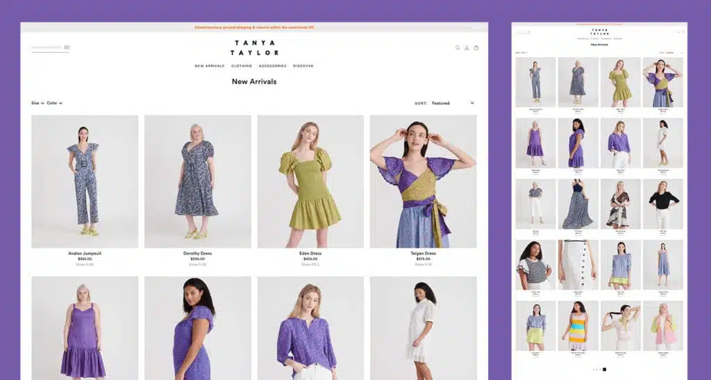
How Many Products Should You Display?
Don’t trust conventional wisdom.
Ecommerce merchants used to limit the number of products per page to reduce load times. But that doesn’t actually help your audience.
They now have to click more just to see all the products. Items beyond the first page also receive less search engine weight.
Instead, push all products in a category onto a single page.
Maximize usability and use the page speed optimization techniques: lazy load and filters.
- Lazy load means products only load when they’re needed. It decreases load times but still allows for all products to live on a single page.
- Filters help your audience remove products that don’t interest them. That narrows results on demand instead of by force or accident.
One final note: unless your entire ecommerce business model depends on discounted products, don’t target your sales with a dedicated/generic category page.
That’s not how your audience searches, and will likely hurt your UX.
Sharing Authority with Internal Linking
This last tip probably goes overlooked the most.
Each one of your pages carries a certain level of SEO authority. Linking them together helps those pages share authority with one another.
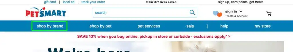
Here’s a quick example from Macy’s on their Leather Handbag category page:
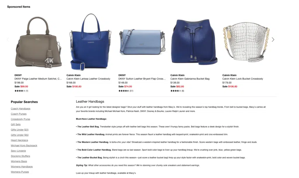
As you scroll to the bottom of their leather bag category page you’ll see this ‘Popular Searches’ list with a number of links to other categories on their site.
Take note of these two category pages:
- Coach Handbags
- Coach Purses
This is great link building for a couple of reasons:
- Coach is a popular manufacturer of leather goods, specifically renowned for their handbags
- By linking to another handbag page they further strengthen their authority around the core topic of handbags
- Purses are another popular leather good connected to handbags and help further the points mention above
SEO Checklist for Ecommerce Category Pages
This checklist helps to make sure you hit the basics of category page SEO:
- Build permalinks for each category page that don’t change over time. That consistency can significantly improve SEO.
- Include your focus keyword in the page title.
- Include your focus keyword on the H1 Header at the top of your page.
- Include your focus keyword and secondary keyword in the page meta description.
- Include your focus keyword and secondary keyword in image alt tags and file names.
- Include LSI keywords in your content. They add context and increase credibility for search engines.
Building a great category page design is not easy. But if you’ve gotten this far, you’re pretty close.
Over to you: was this helpful?
Do you have any items that still need clarification? How are you using your category pages to improve your ecommerce presence?
Write a comment below to let us know. We’ll get back to you to keep the conversation going.
Here are some best practices and further info on category page design, web development and website design in general. If you have further questions don’t hesitate to reach out.
Category Page Design FAQ
Questions about how to design category pages that convert? We try to answer them here.
How do you write for category pages?
An important part of both national and international SEO is writing clear and concise category descriptions. Here are a few tips to keep in mind when writing category descriptions:
- Keep it short and sweet: category descriptions should be brief, yet informative.
- Focus on the benefits: what can customers expect to find in this category?
- Use keywords wisely: include relevant keywords, but don’t stuff the description with them.
- Write for your audience: keep your target audience in mind when writing the description.
By following these tips, you can write category descriptions that are both informative and keyword-rich, helping your website to rank higher in search engine results pages.
What makes a good category page?
A category page is a page on a website that groups together similar items or topics. Category pages are often used on ecommerce sites to help shoppers find what they’re looking for. They can also be used on news sites to group together articles on similar topics. So, what makes a good category page?
There are a few things that all good category pages have in common.
First, they are well organized and easy to navigate. Visitors should be able to quickly find the items they’re looking for without having to search through a long list of unrelated items. Category pages can also include search filters to help visitors find what they are looking for.
Second, category pages should be kept up-to-date. If a category page is outdated, it can confuse visitors and make it difficult for them to find what they’re looking for.
Finally, category pages should be designed with SEO in mind. Using keywords strategically can help to ensure that category pages show up in search results and drive traffic to a website.
By following these guidelines, category pages can be an effective way to improve the user experience on a website.
What is an ecommerce category page?
Ecommerce category pages are the pages on an ecommerce website that list all the products in a particular category.They provide a convenient way to browse through a store’s inventory and find items that are of interest.
Ecommerce category pages are typically organized by product type but may also include filters that allow customers to narrow down the list of products by size, color, price, etc.
Category pages usually include product descriptions, customer reviews, and related products which can be used to cross-sell and upsell products.
Ecommerce category pages are an important part of any online store and can help to increase conversion rates and boost sales. In order for an ecommerce website to be successful, it is important to have well-designed ecommerce category pages that are easy to navigate and provide relevant information to customers.
What are the categories on a website called?
When you visit a website, you’ll notice that the content is organized into categories.
For example, a news website might have categories for national news, international news, and opinion pieces. A retail website might have categories for women’s clothing, men’s clothing styles like semi-formal attire, and children’s clothing.
Categories help visitors to find the type of content they’re looking for. They also help to keep a website organized and easy to navigate.
Categories can be called different things on different websites. For example, they might be called “sections,” “channels,” or “tabs.” But no matter what they’re called, they serve the same purpose: to help visitors find the content they’re looking for.
On a Shopify website, category pages are called “collections,” for example, but they are category pages nonetheless.
Further Reading On Website Design and Development.
Looking for web development and design inspiration? These articles should help.
- How Much Does It Cost to Build a Website?
- A Step-by-Step Website Redesign Project Plan
- Our Approach to Startup Web Design
- How to Build a Web Design System
- WooCommerce Web Design with Huemor
- WooCommerce vs Shopify: Who Comes Out as a Winner?
- Our Approach to WordPress Web Design
- Choosing the Right Product Metrics Using UX Research Process
- Our Top Retail Website Examples
- Understanding Web Design and Web Development
- Our Top Beauty Website Examples
- Our Shopify Speed Guide Checklist
- Guide to Optimizing Shopify Image sizes
- Our Service Page Layout Examples
- Best SaaS Websites of 2022
- Our Approach to HubSpot Website Design
- New Website SEO Foundations
- Our Approach to Startup Website Design and Development
- WordPress Performance Optimization Best Practices
- 100 Ecommerce Website Design Tips
Get Memorable Insights.
Sign up to receive actionable web design advice directly in your inbox monthly.
Get Memorable Insights.
Sign up to receive actionable web design advice directly in your inbox monthly.

Jeff Gapinski
President of Huemor
Jeff Gapinski is the President of Huemor where he helps plan the long-term strategic growth of the agency. Jeff is passionate about UI/UX, demand generation, and digital strategy.
What Do You Think?
Have feedback? Maybe some questions? Whatever it is, we'd love to hear from you.
Leave a Comment
![Website Design Standards We Follow [That You Should Too!]](https://huemordev.b-cdn.net/wp-content/uploads/2021/12/2023.04.04.Website-Design-Standards-We-Follow-That-You-Should-Too.jpg.webp)

No comments found