-
Design
-
Contact Us Page Best Practices & 7 Real-World Example Pages
Let’s talk about the workhorse of your website.
Not your homepage. Not your flashy product page.
We’re talking about the Contact Us page, the page most companies treat like an afterthought when it should be a closer.
In B2B, this page doesn’t just collect messages. It wins deals. It bridges the gap between “interested visitor” and “qualified lead.” It’s where intent becomes action. And when it’s done right, it can outperform your other conversion points. A successful contact page leads to better engagement and results by making it easy for customers to reach out and fostering trust.
Here’s the kicker: according to a study by KoMarketing, 64% of B2B buyers say they won’t submit a form if they don’t get the information they need first. That means the design, content, and UX of your Contact Us page directly impact whether or not someone raises their hand to work with you.
So why do so many businesses still settle for a generic form and a “we’ll be in touch” message?
We’re about to change that.
This ultimate contact guide will show you how to transform your Contact Us page from a dusty form into a high-performing asset that builds trust, qualifies leads, and shortens sales cycles.
Rather watch than read? No problem, we got you.
What Makes a Great B2B Contact Us Page?
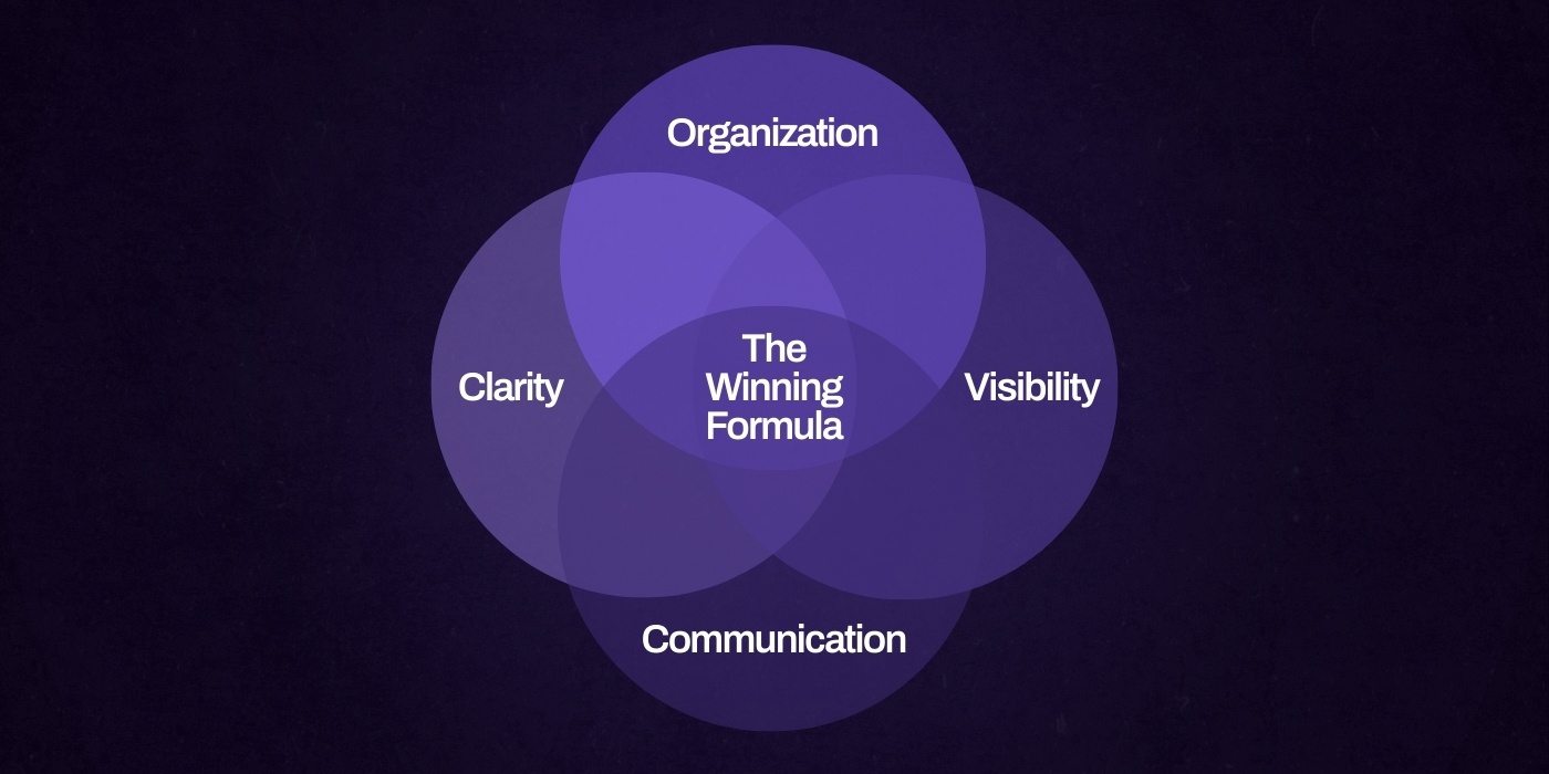
Let’s set the record straight. A great B2B Contact Us page is not about clever copy or slick animations. It’s about removing friction, building trust, and guiding serious buyers to the next step.
An easy to navigate contact page is essential, ensuring customers can quickly find the support or information they need.
If you’re treating this page like a glorified inbox, you’re missing its true potential.
Clarity > Creativity (Especially in B2B)
Unlike e-commerce or B2C audiences, B2B visitors aren’t window shopping. They’re coming in with intent and usually a deadline.
This isn’t the place for mystery or marketing fluff. Your contact page needs to answer three questions immediately:
- Am I in the right place?
- How do I get in touch?
- What happens after I reach out?
Clear, specific headlines help direct users to the appropriate section or team, ensuring they quickly find the right contact option for their inquiry.
Drop the “Let’s Chat!” headline.
Go with something more functional like “Get in Touch with Our Sales Team” or “Request a Consultation.”
If you serve multiple industries or services, clarify that upfront. For example...
Instead of a vague headline like:
"Let’s Talk"
Use
“Talk to a Manufacturing UX Expert”
With a dropdown that pre-qualifies the inquiry by vertical.
Make It Easy to Reach the Right People
Generic forms are a barrier.
When users don’t know where their message is going or how long it’ll take to get a reply, trust drops fast.
Smart Contact Us pages segment by intent or department. This improves internal workflows, builds confidence for the visitor, and helps manage customer inquiries efficiently.
Include tabs or dropdowns like:
- “I want to talk to Sales”
- “I need Product Support”
- “I’m interested in Partnership Opportunities”
- “Contact Support” for users needing assistance
Route each one to the correct internal team and tailor follow-up responses accordingly. This isn’t just better UX, it shows you respect their time.
Show You’re Listening Before They Hit ‘Submit’
If you want people to fill out a form, give them a reason to believe someone’s on the other side. Trust elements matter. That can look like:
- Stating your average response time or hours of operation
- Including an SLA (“We reply to all inquiries within 24 hours”)
- Offering a brief outline of next steps (“Once you submit, here’s what happens…”)
- Adding a personal touch, such as team photos, headshots of real employees, or a personalized message from your support team to make the interaction feel more human and trustworthy
Protip: Add a short section under the form that says, You’ll hear from a member of our sales team within one business day. If your inquiry is urgent, call us directly at [phone number].
Optimize for Search and Visibility
Yes, your Contact page should rank. Too many B2B sites noindex this page or leave it too thin to be useful. Don’t make that mistake.
Here’s how to get it right:
- Include a short block of copy with relevant keywords (e.g. “Get in touch with our B2B SaaS website experts”)
- Add structured data using Schema.org‘s ContactPage and Organization markup to improve rich result eligibility
- Consolidate all contact information on one page, including multiple contact methods, hours, and closure dates, to enhance user experience and make it easier for search engines to understand your business details.
- Make sure your name, address, and phone (NAP) data is consistent with your Google Business Profile if you’re serving a specific region
- Use canonical URLs to avoid duplicate content if the page appears in multiple places
Protip: Include a real person’s name and photo in the confirmation message or follow-up email. It turns a faceless interaction into a relationship and dramatically increases response rates.
Core Elements Every B2B Contact Page Needs
A high-performing B2B Contact Us page isn’t just about giving people a way to reach you, it’s about removing uncertainty, signaling professionalism, and accelerating the sales cycle.
By providing multiple contact options to suit different preferences, you ensure that every visitor can connect in the way that works best for them. When done right, this page does more than capture leads. It builds trust and qualifies them before they even hit submit.
Offering a variety of support options, such as phone, live chat, email, and self-service resources, caters to different user needs and demonstrates your commitment to accessible customer support.
Here’s what your Contact Us page needs to deliver all of that:
A Headline That Says More Than “Get in Touch”
If your headline could appear on any site in your industry, it’s not doing enough. Replace generic phrases with value-driven copy that speaks to what your visitor is trying to achieve.
Example:
- "You're 1 Step Away From Smoother Operations"
- "Let’s Build Your Vision Into Reality"
- "Your Next Step Toward Smarter, More Connected Care Starts Here"
Specificity shows clarity of purpose. It positions you as a partner, not just a vendor.
A Smart, Optimized Submission Form
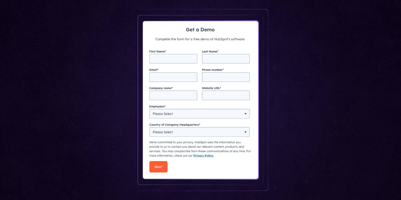
The goal isn’t to collect as much info as possible up front.
It’s to collect the right info that lets your team respond with relevance.
Use smart fields with conditional logic so that follow-up questions appear based on the user’s intent. A concise form improves user experience by making it quick and easy for visitors to submit their information.
Best practices include:
- Name and business email (not personal)
- Role and company size
- Budget range or project timeline (optional but useful for routing)
- Intent-based dropdown (“I need a redesign” vs. “I want to optimize conversion rates”)
- Use a simple contact form with only essential fields to reduce friction and encourage more submissions.
Tools like HubSpot or Marketo make it easy to incorporate progressive profiling, so returning visitors aren’t asked the same questions twice.
When customizing your us form, focus on clear design and usability to build trust and facilitate effective communication.
Department and Inquiry Routing
Not every message should go to your sales inbox.
Use dropdowns or segmented forms to route inquiries to the right team automatically. This creates a smoother experience for users and reduces lead time internally.
Consider providing dedicated corporate contacts for specific business-related inquiries, such as press, social media, or partnerships.
Your dropdown might include:
- Sales Inquiry
- Technical Support
- Media Inquiries
- Career Opportunities
- Vendor / Partnership Inquiry
Protip: Create conditional success messages or confirmation emails based on their selection. A support ticket shouldn’t get the same email as a sales lead.
Explain What Happens After Submission
This is one of the most overlooked elements. Users want to know what’s going to happen next. A short, clear explanation goes a long way in reducing drop-off.
Try something like...
"Once you submit this form, someone from our team will review your inquiry and provide a quick answer, typically within 1 business day. For urgent requests, give us a call at [number]."
Transparency builds confidence. People aren’t just contacting you; they trust you with their time.
Social Proof That Reinforces Credibility

If someone is visiting your Contact page, they’re already interested. Reinforce that interest with trust-building elements.
Ideas include:
- Logos of notable clients in a grayscale row
- A short testimonial or quote about responsiveness or experience
- Awards or certifications if applicable
Add an FAQ Section That Handles Common Objections

This isn’t just for SEO, it’s practical. Use this space to preemptively answer key questions that can delay outreach, and consider linking to a dedicated faq page for more information.
Include questions like...
- What’s your typical project budget range?
- What industries do you specialize in?
- Where are you located?
- How long do your projects take?
These examples help users find answers quickly to their most common questions.
Keep answers short, but informative. Link to deeper resources when needed, and provide helpful articles and helpful resources for users seeking more detailed information.
Offer Alternative Contact Options
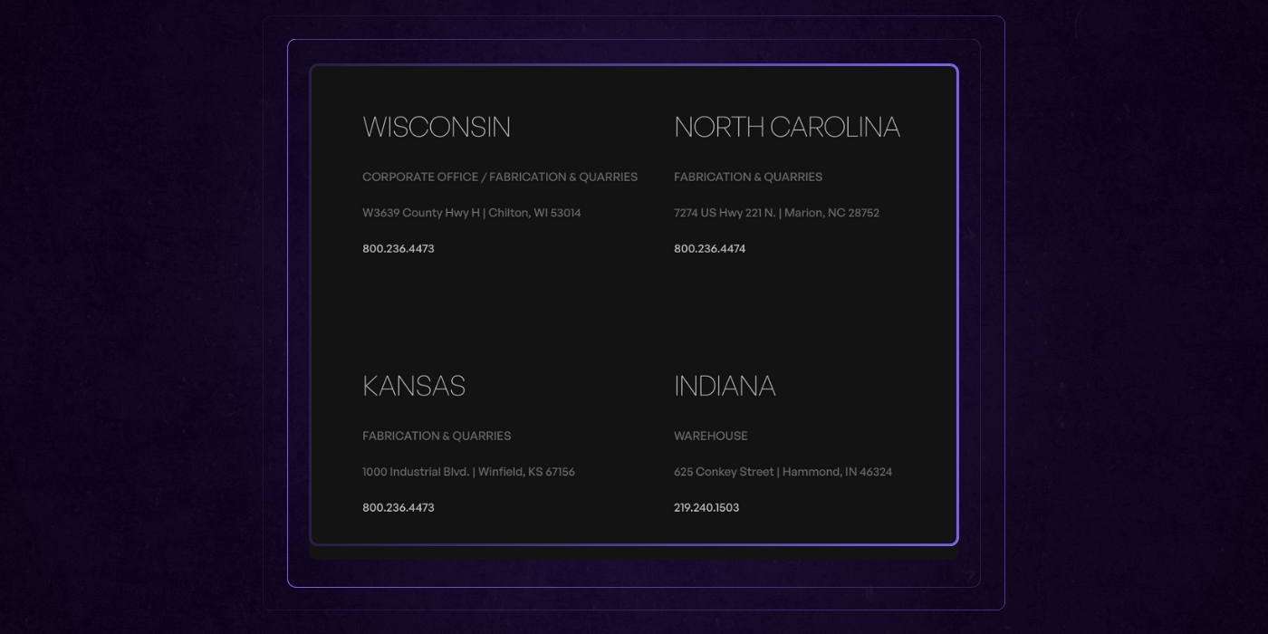
Forms aren’t for everyone. Some users prefer a direct line, such as phone calls or phone support. Offering multiple options increases your chance of a response and lets users choose their preferred method of contact.
Include as needed:
- Direct emails for sales/support
- Phone number with timezone/hours (for phone calls and phone support)
- Scheduling link for demos or consultations
- Live chat (great for high-intent users)
- Feedback forms to gather user input and improve engagement
Handle Compliance and Accessibility Like a Pro
If your form isn’t accessible or legally compliant, it’s working against you. Ensure it meets ADA and GDPR standards.
Use this simple checklist:
- All form fields are keyboard navigable
- Labels and inputs are screen-reader friendly
- Include a GDPR-compliant consent checkbox (with a link to your privacy policy)
- Explain how data will be stored and used
Advanced Conversion Features for B2B
If your Contact Us page is already checking the basics, it’s time to take it a step further.
Advanced conversion features can turn passive interest into active pipeline. These aren’t bells and whistles; they’re strategic tools designed to reduce friction, build confidence, and meet buyers where they are in their journey.
Incorporating options that provide immediate answers, such as AI chatbots or clear messaging, ensures users get the information they need right away, enhancing their experience.
Here’s how to level up your Contact page for serious B2B performance, including tools for further assistance beyond the initial contact:
Add a Calendar Integration for Instant Booking

Waiting around for a reply kills momentum. Embedding a tool like HubSpot Meetings or Calendly directly into your Contact Us page lets qualified leads book a time that works for them, instantly. No back-and-forth. No delays.
This works especially well for high-intent visitors and is ideal for SaaS companies offering demos or consultations.
Embed Case Studies or Testimonials as On-Page Validation

Right when a visitor is deciding whether to contact you, show them proof that others have made the same choice and won. Instead of linking away from the page, embed a short testimonial carousel or a compact case study summary directly below the form.
You can even pair each quote with a logo and a one-line stat for credibility without clutter.
Guide “Not Ready Yet” Visitors with Smart CTAs
Not everyone on your Contact page is ready to talk. Don’t lose those visitors. Use smart, low-commitment CTAs that direct them toward helpful next steps.
Passive CTAs like:
- “Still exploring? Download our Website Redesign Guide.”
- “Not ready to chat? Sign up for monthly B2B growth insights.”
- “See how we helped a company like yours—read the case study.”
This keeps mid-funnel traffic engaged and lets you nurture them through email or remarketing later. Use tools like HubSpot Smart Content to show these dynamically based on lifecycle stage or previous activity.
Personalize Based on Visitor Data
This is where the Contact page starts working like a sales tool. Using IP-based intelligence or marketing automation platforms, you can personalize content based on industry, company size, or even target account status.
You can do things like:
- If a visitor is from a SaaS company, change the headline to “Talk to Our SaaS Web Strategy Team” and display SaaS-specific case studies
- If the visitor is a known ABM target, pre-fill form fields and use copy that reflects their unique pain points or goals
- Show different CTAs based on behavior, like displaying a whitepaper for repeat visitors or a scheduling link for return traffic that previously bounced from the demo page
Platforms like Clearbit Reveal, Mutiny, and HubSpot can help power this type of dynamic content.
Protip: Run A/B tests on advanced elements just like you would on landing pages. Test whether an embedded calendar performs better than a plain form. Measure the lift from adding testimonials or industry-specific personalization. Then keep what converts and optimize the rest. Small upgrades compound when every click counts.
B2B Contact Us Page Design Best Practices

Designing a high-performing Contact Us page isn’t just about aesthetics. It’s about removing friction, guiding intent, and quietly proving that your business is credible, capable, and easy to work with. A user-friendly design leads to better conversions, ensuring that every element is intuitive and serves a clear purpose.
Here’s how to design a Contact page that delivers on all fronts:
Keep the Form Above the Fold

B2B users are busy. They don’t want to scroll to find your form.
Make sure the primary action, whether it's a contact form or calendar embed, is immediately visible on desktop and mobile. This reinforces intent and speeds up action.
Balance Brevity and Detail in Your Form
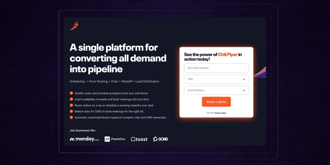
Too short, and you’ll spend time qualifying leads manually. Too long, and people bounce. Find the middle ground that gives your team what it needs without overwhelming the user.
Best practices to follow:
- Keep it to 4–6 fields for first-touch inquiries
- Use dropdowns or radio buttons instead of open-ended questions when possible
- Add optional fields for deeper context like budget or timeline
- Use conditional logic to reveal additional fields only when relevant
Layer in Trust Signals
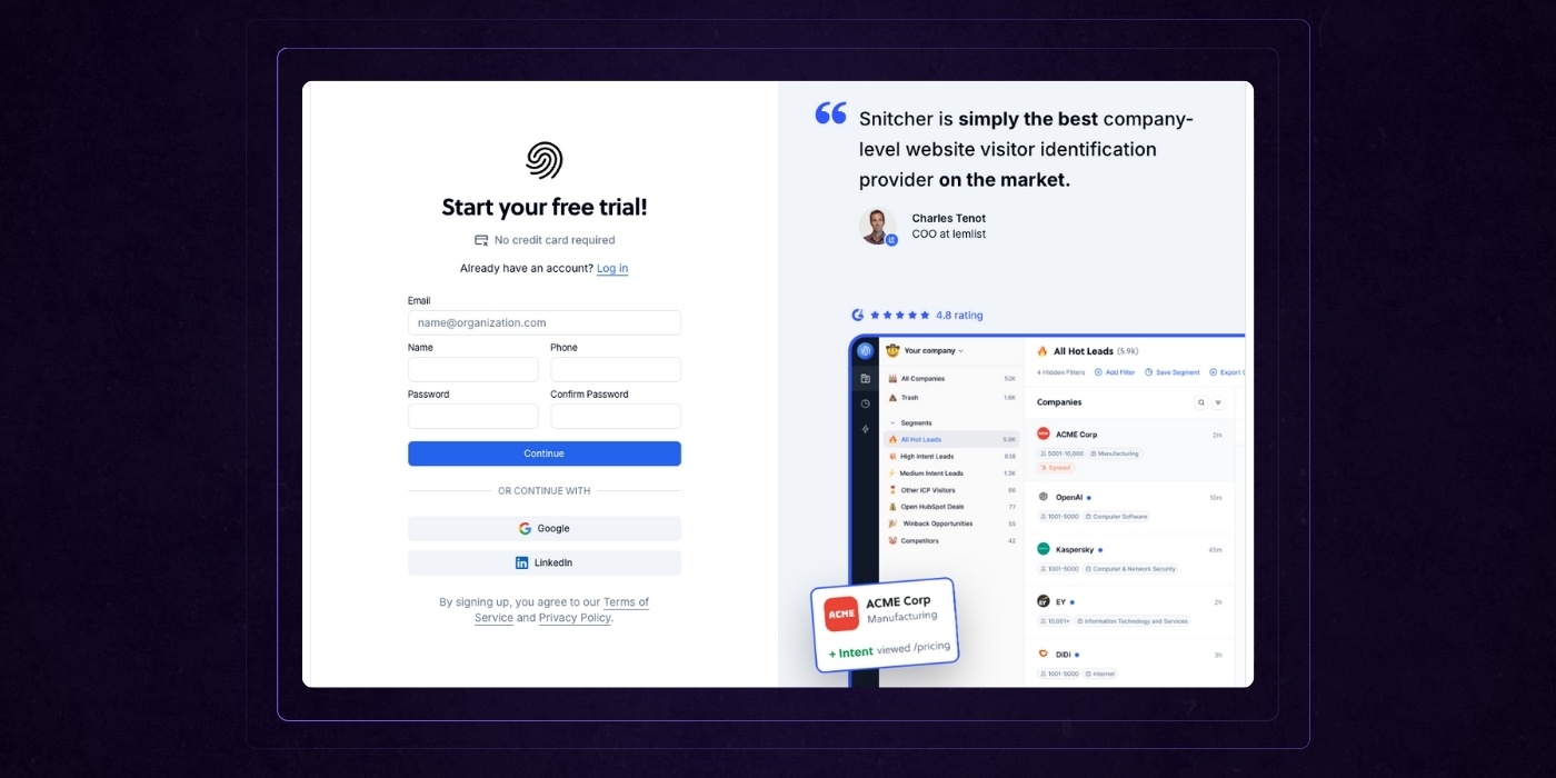
Visual cues can lower friction and increase completion rates. The goal is to make visitors feel confident that their inquiry will be handled professionally.
Add elements like:
- Security/privacy badges (especially if asking for business emails)
- Response time or SLA: We reply within one business day
- Office locations with links to Google Maps (especially helpful for companies with regional teams)
- Mailing address and physical address details to establish credibility and make it easy for visitors to reach you in person or by mail
- Physical addresses for all branches, especially if your business operates from multiple locations, to help visitors find the nearest office and enhance trust
- A friendly photo and name from your support or sales rep
Design for Accessibility and Flawless UX
Even small accessibility issues can tank conversions. Design with inclusivity in mind and ensure the experience is smooth across all devices and inputs.
Follow this checklist:
- High contrast between text and background
- Large, tappable form fields on mobile
- Keyboard navigable form fields and dropdowns
- Use ARIA labels and field descriptors for screen readers
- Error messages that are clear, persistent, and easy to resolve
Measure What Actually Matters
You can’t improve what you don’t track. Use behavior analytics to understand how people are interacting with your Contact page and where they’re falling off.
Some tools we'd recommend trying:
- Heatmaps (Hotjar, Crazy Egg) to track scroll depth and engagement
- Click tracking to monitor CTA effectiveness and form field interactions
- Form analytics (Zuko, HubSpot, or Google Tag Manager) to pinpoint where users abandon the form
For example, if heatmaps show that 80% of users don’t scroll past your testimonial block, but conversions remain low, the testimonial choice may not resonate with your audience and could be swapped.
7 B2B Contact Us Page Examples (With Takeaways)
Boston Dynamics
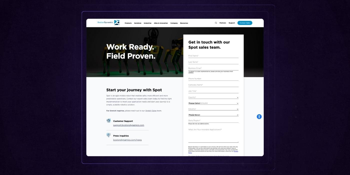
Boston Dynamics’ Spot contact page is a strong blend of brand personality and clear conversion intent.
The bold headline, "Work Ready. Field Proven.", sets the tone immediately and reinforces product confidence without needing fluff.
The left side delivers just enough context about Spot to engage interest, while the right side prioritizes action with a straightforward, easy-to-skim form.
Field labels are clear, validation is helpful, and dropdowns reduce friction for enterprise buyers. Supporting links to customer support and press inquiries are smartly placed for secondary needs.
This page respects the visitor’s time while making the next step feel both practical and purposeful.
Asana
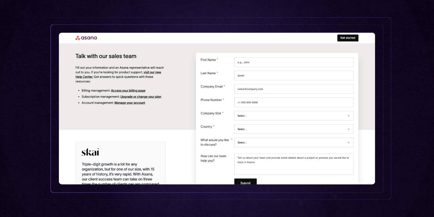
Asana’s sales contact page is a great example of reducing friction while still providing clarity.
The left column does some light qualification by directing users with product support needs elsewhere, keeping the sales team focused. Key links to billing, subscription, and account management are presented clearly and help prevent misrouted inquiries.
The form itself is intuitive and compact, with helpful placeholder text and logical field grouping.
Logos from well-known clients and a strong testimonial from Skai add trust without overwhelming the experience.
Overall, it’s a page designed to get the right conversations started quickly and efficiently.
Skyline
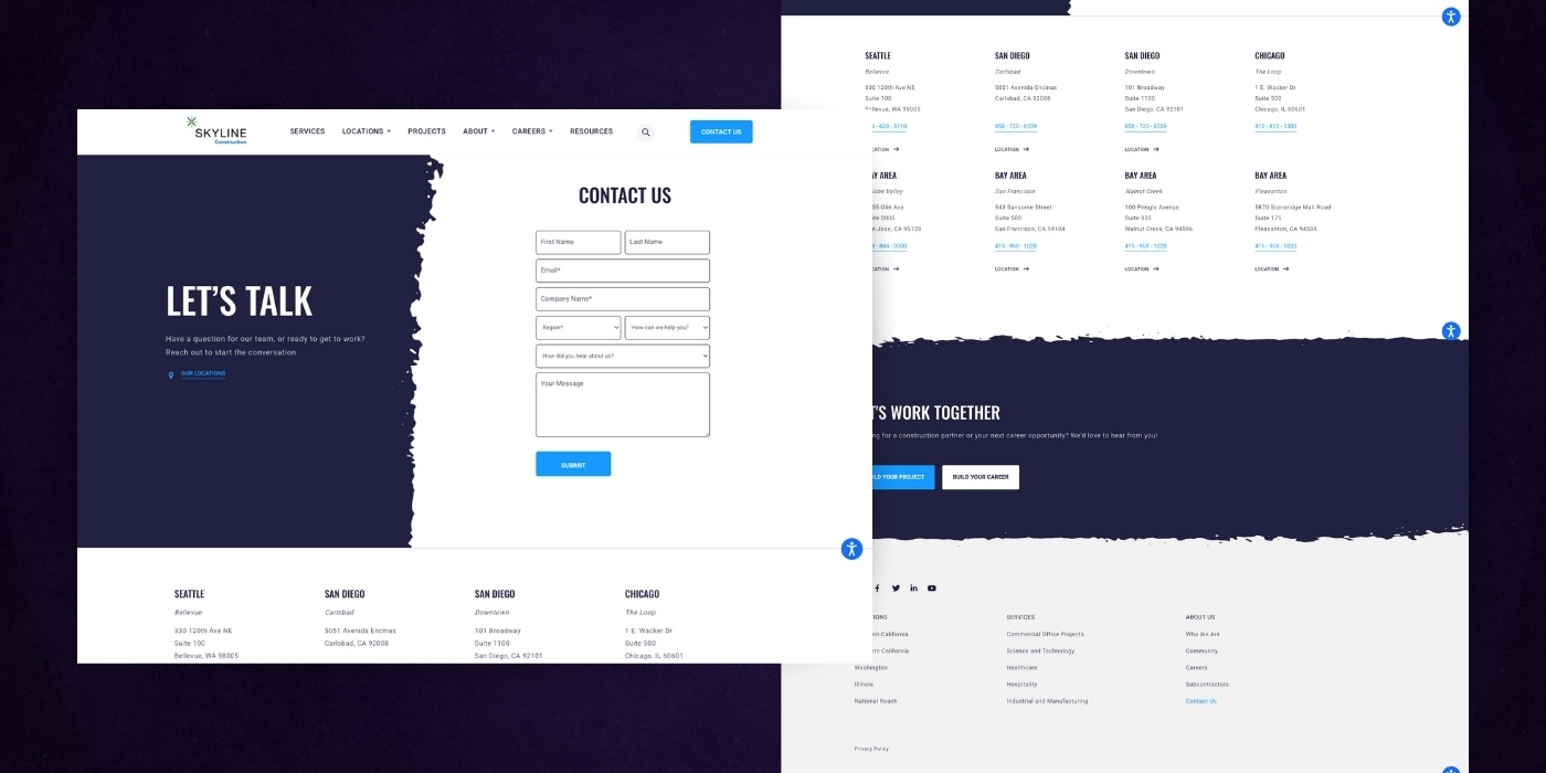
Skyline Construction’s contact page is clean, confident, and well-organized.
The bold “Let’s Talk” header sets an approachable tone, while the split layout balances personality on the left with a no-friction form on the right.
The form fields are simple and purposeful, and the dropdowns help guide the inquiry toward the right team. Below, regional office locations are clearly listed with direct contact info and easy navigation links, giving the page both utility and transparency.
The follow-up call-to-action, “Let’s Work Together,” adds a nice close, offering two clear next steps. It’s a page that respects the visitor’s time while keeping the door open to meaningful collaboration.
Huemor (Oh hey, that's us)
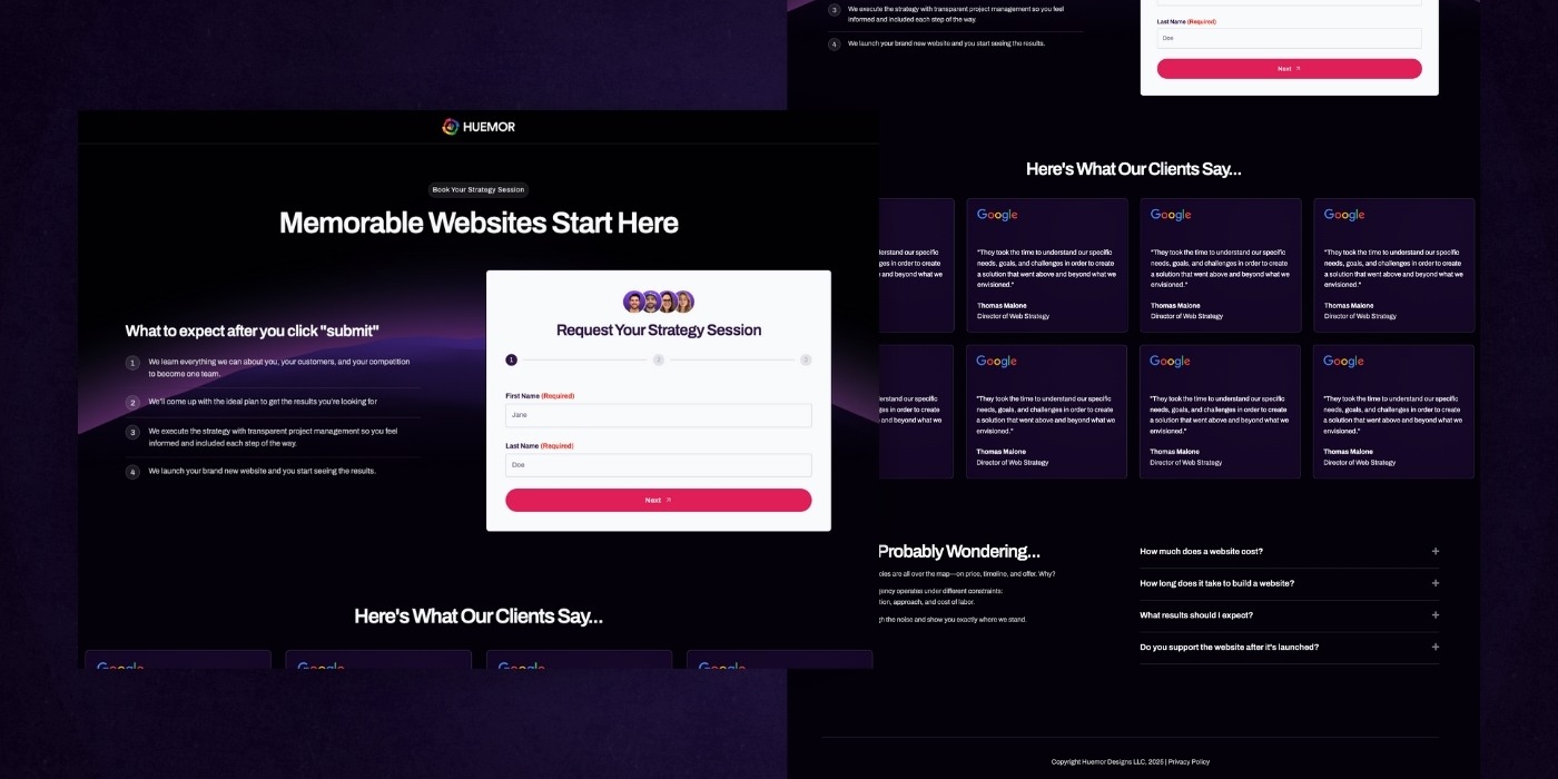
Huemor’s contact page delivers a confident, well-structured experience that mirrors the agency’s promise: clarity, results, and a process that feels guided.
The headline, "Memorable Websites Start Here", immediately sets the right tone.
The left side outlines what happens after submission with a step-by-step breakdown that adds transparency and builds trust. The multi-step form on the right feels light and approachable, encouraging completion without pressure.
Client testimonials add credibility, though some visual variation would strengthen the impact.
The FAQ section at the bottom smartly preempts common objections, reinforcing Huemor’s clarity-focused approach.
Altogether, the page balances reassurance with forward momentum.
Bizrate Insights
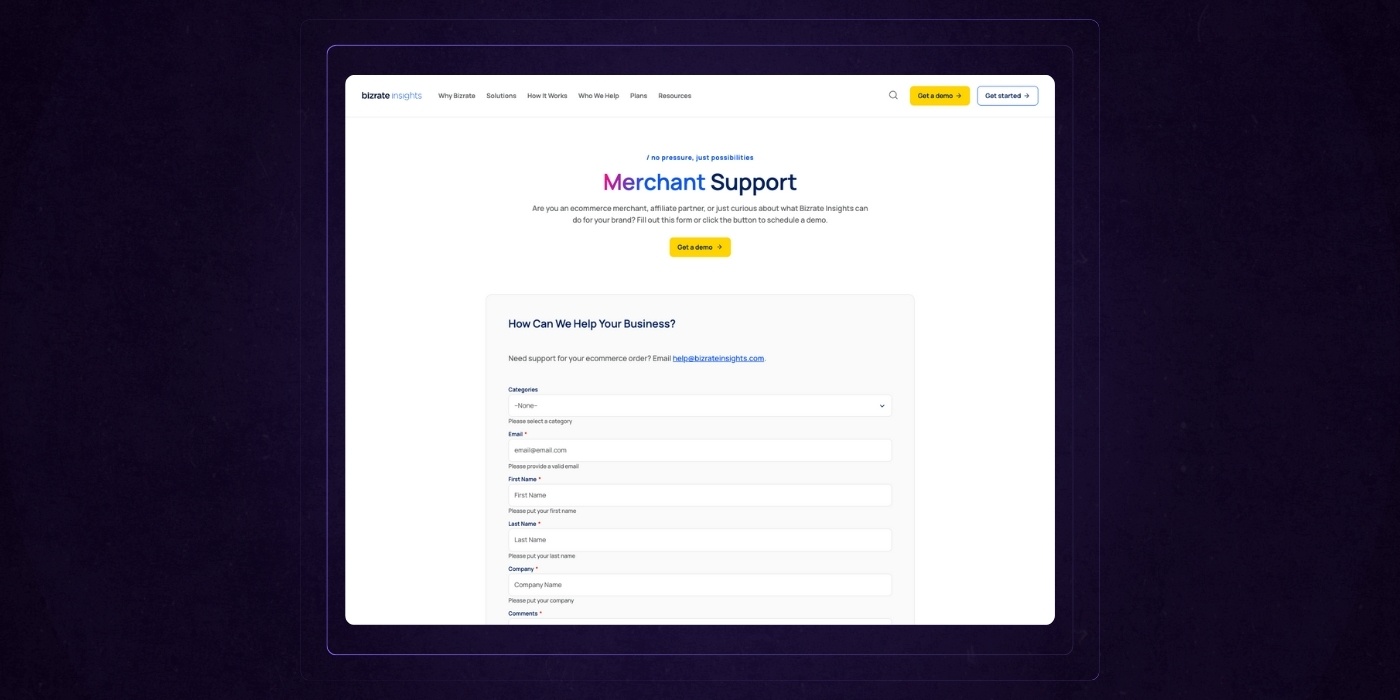
Bizrate Insights’ support page keeps things simple, approachable, and focused on action. The headline sets a friendly tone, and the subtext provides helpful context without overwhelming the user.
The bright “Get a demo” button offers a clear alternative for prospects not just looking for support.
The form itself is straightforward and well-labeled, with all required fields clearly marked to avoid confusion.
It’s designed for speed and clarity, ideal for users who want answers without friction. The added email link is a nice touch for those who prefer direct outreach. Altogether, it’s a no-nonsense page that puts the user’s needs front and center.
Hubspot
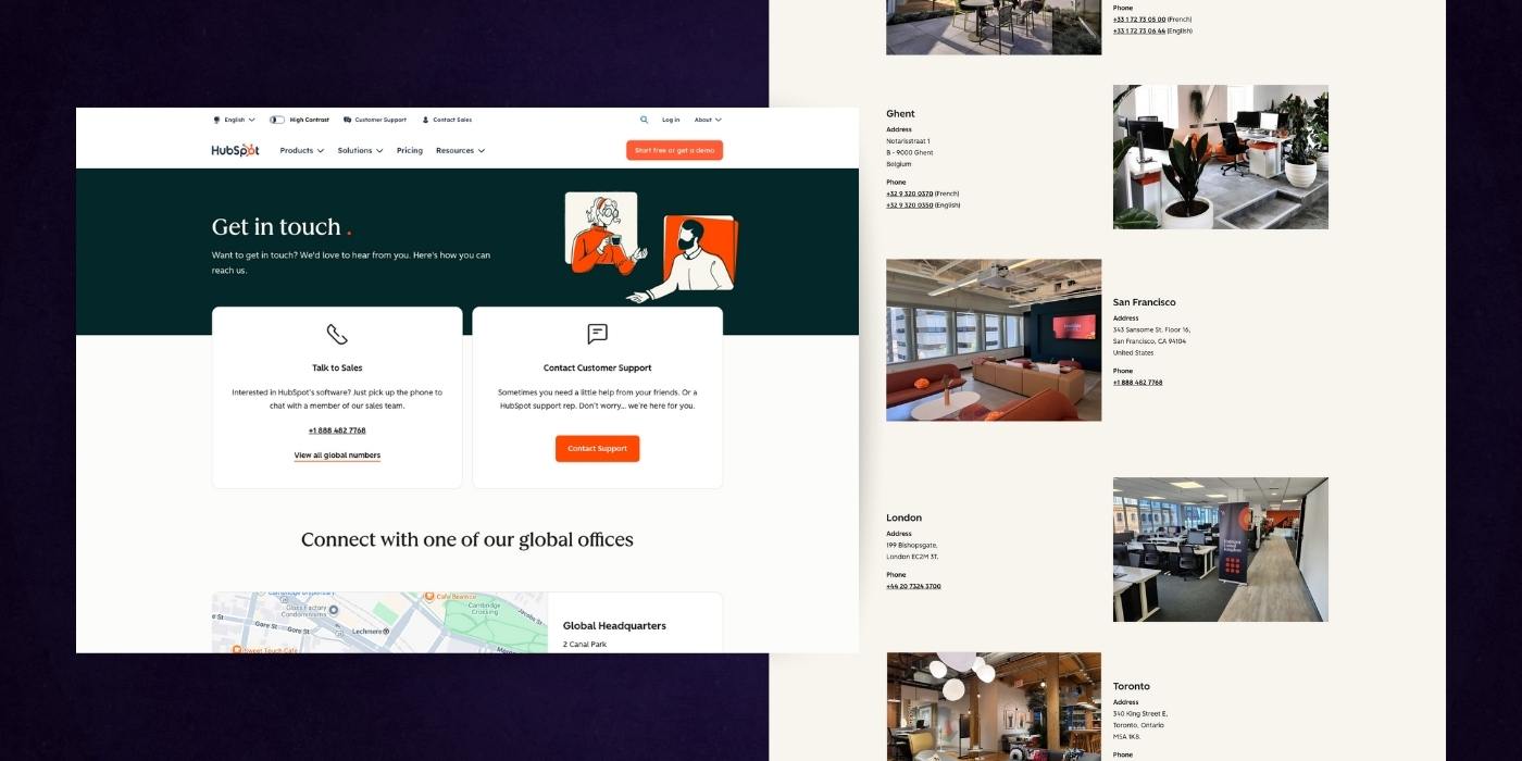
HubSpot’s contact page blends personality with global accessibility in a way that feels both friendly and operationally robust.
The header immediately invites users to connect, reinforced by simple, well-labeled options for sales or general support. The clean visual layout and warm illustrations give the page a human touch, while the embedded map and detailed office list create a strong sense of scale and transparency.
Each location block includes relevant contact info and high-quality images that make the spaces feel real and approachable.
The addition of local phone numbers at the bottom adds convenience for enterprise buyers. It’s a well-executed page that makes a large company feel close and responsive.
Aerotech
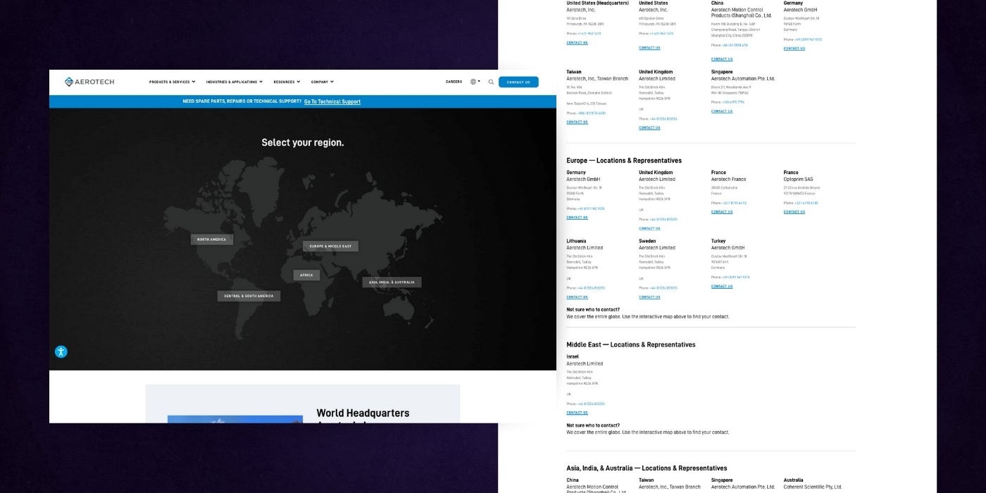
Aerotech’s contact page is a well-executed example of global accessibility paired with regional clarity.
The interactive map is a smart entry point, guiding users based on geography and reducing decision fatigue. Each section below is neatly grouped by region and presents contact information in a way that’s easy to scan and act on.
The design maintains consistency while still feeling local, with direct phone numbers, office details, and relevant links.
The technical support callout near the bottom is both clear and action-oriented, giving users a fast lane for urgent needs. It’s a highly functional page that respects complexity without making it feel complicated.
A Step-by-Step Guide For Building (or Redesigning) Your Contact Us Page
A high-performing B2B Contact Us page doesn’t happen by accident.
Whether you’re starting from scratch or reworking a clunky version, the process needs to be intentional.
Every step—from content to backend integration—should remove friction, support business goals, and speak directly to your audience’s needs. Showcasing your customer service team on the page is also essential for building trust and making your business feel more accessible.
Here’s a step-by-step guide to building a Contact Us page that actually works:
1. Audit Your Current Page
Start by assessing what’s working and what’s not. Pull together data from Google Analytics, heatmaps, CRM, and session recordings.
Look for:
- Traffic volume and bounce rates
- Form conversion rate (vs. pageviews)
- Drop-off points in multi-step or long forms
- Device behavior (Does mobile convert better or worse?)
- Time to response after submission
For example, if traffic is high but conversions are low, UX friction or unclear messaging could be to blame. If form starts are strong but completions fall off, the form length or required fields need adjustment.
2. Define User Intent by Audience Type
One form can’t serve every audience the same way. Break your visitors into buckets and define what they want.
Key groups might include:
- Prospects: Want to discuss pricing, capabilities, or request a proposal
- Sales leads: Interested in expressing interest, requesting information, or generating business inquiries
- Existing clients: Need help with support or account management
- Partners/Vendors: Looking to collaborate or pitch services
- Job seekers: Hunting for open roles or application status
Build routes or smart content around these intents to reduce noise and get people where they need to go faster.
3. Draft Content: Headline, Microcopy, and FAQs
Now it’s time to write. Keep it simple, specific, and helpful.
Headlines
Like we've mentioned earlier, your headline should say more than just "Let's Chat". Keep it specific and sell the value and outcome whenever you can. Try headlines like...
- "Start Your Next Project With Confidence"
- "Need Help? Get a Fast Response from Our Team"
- "Partner With Experts in B2B Website Strategy"
Microcopy
Deals are won with details, and the right microcopy can be the final nudge a B2B customer needs to reach out. Focus on...
- Use inline hints like We’ll never share your info below email fields
- Show form error states with clear, actionable text
- On the submit button, try Talk to Our Team or Send My Message, not Submit
- Let users know they have more than one contact option, such as phone, email, or a contact form
FAQs
Use your FAQs to address potential objections head-on. Those questions you often get in the sales process are the perfect addition for your Contact Us page.
- “What’s your average project size?”
- “Do you work with companies outside the US?”
- “How quickly will someone respond?”
- “What contact options are available to reach your team?”
4. Design & Layout: Wireframe Best Practices
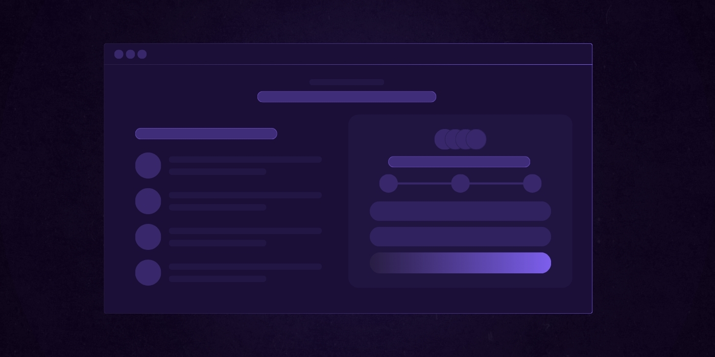
Now translate the content into a layout that guides action.
Best practices:
- Form or CTA block above the fold
- Use a single-column layout on mobile
- Group related form fields visually
- Add collapsible or accordion-style FAQs to reduce clutter
- Use whitespace strategically to prevent overwhelm
5. Implement Form Routing and CRM Integrations
Behind-the-scenes setup is where the magic happens.
Any modern B2B company should have:
- Routing logic based on form dropdowns or tags (e.g. sales, support, careers)
- Auto-response emails that confirm receipt and next steps
- CRM integration (HubSpot, Salesforce, etc.) that tags and assigns leads properly
- Optional: Add Zapier or webhook triggers for Slack alerts or task creation
For example, you may create a setup where:
- Sales inquiries go directly to the assigned rep in Salesforce with a tag.
- Support tickets route to Zendesk.
- Partnership forms trigger a Slack ping in a dedicated channel.
6. Add Trust, Compliance, and Accessibility Layers
Now add credibility and cover your legal bases. Make sure you...
- SSL certificate and visible security badge
- ADA compliance: contrast, keyboard nav, screen reader support
- GDPR checkbox with link to privacy policy
- Statement on how data is handled (short and human, not legalese)
- Add human elements: photos, team names, local office info
7. Test and Optimize Continuously
Once live, don’t set it and forget it. A/B test key components and use analytics to guide improvements.
Test ideas:
- Short form vs. multi-step form
- Button placement: right below vs. mid-scroll
- CTA variations: Get in Touch vs. Start My Project
- Headline clarity vs. creativity
- Testimonials above vs. below the form
Use tools like:
- Google Optimize or VWO for A/B testing
- Hotjar for heatmaps and scroll tracking
- HubSpot or Zuko for form analytics
Protip: After launching, run a post-conversion survey on the thank-you page. Ask one simple question: "What made you decide to reach out today?" Use those responses to refine your messaging and align it even closer to buyer intent.
Common B2B Contact Us Page Mistakes To Avoid
Even with good intentions, B2B companies often sabotage their own Contact Us pages by making avoidable mistakes.
These errors don’t just hurt UX; they create doubt, slow down your pipeline, and cost you real opportunities. If your page feels like an afterthought, prospects will treat it that way too.
Here’s what to look out for:
Using a Generic “Contact Us” With No Context
Slapping “Contact Us” on a page and calling it a day is a missed opportunity.
B2B buyers need context. They want to know who they’ll be talking to, what they’re contacting you about, and what value they’ll get from reaching out.
Want to fix it? Use a headline that speaks to intent or outcome.
- Bad: Contact Us
- Better: Talk to Our Sales Team About Your Redesign
- Best: Start a Conversation About Turning Your Website Into a Lead Machine
Pair the headline with a short paragraph or bullet list that sets the stage and reassures the visitor they’re in the right place.
Overloading the Form With Too Many Fields
Asking for too much information too early is one of the fastest ways to kill conversions. You don’t need their life story, just enough to start a conversation.
Want to fix it? Keep forms short by default. Use smart fields or progressive profiling to collect more over time. Reserve budget questions or project timelines for a second step if the lead is warm.
Start with:
- Full name
- Business email
- Company name
- Inquiry type (dropdown)
Then add conditional fields if they select "New Project" or "Sales Inquiry."
Hiding Contact Info in the Footer
If someone wants to reach out fast, don't make them scroll or dig through the site. Burying phone numbers or emails in the footer signals that you're hard to reach—and in B2B, that’s a dealbreaker.
Fix it by listing direct contact methods above or near the form. Include a phone number, support email, and calendar scheduling link where appropriate.
Bonus points if you add hours of availability or time zone to manage expectations and improve response quality.
Not Setting Expectations About What Happens Next
When a user hits "Submit" and sees a generic thank-you message, the experience ends in a question mark. That silence creates doubt and slows momentum.
Fix it by adding a confirmation message or follow-up email that clearly outlines the next steps.
For Example:
"Thanks! A member of our sales team will reach out within 1 business day. In the meantime, check out how we helped other B2B companies like yours."
This keeps the user engaged and reassures them that your process is proactive.
Treating the Page Like a Throwaway
Too many B2B sites treat the Contact Us page as an afterthought.
It’s often the last page to be designed, barely optimized, and left untouched during redesigns. That’s a problem, especially when it’s one of the most visited pages on the site.
Fix it by treating your Contact page like any other core conversion page. Apply UX best practices, run A/B tests, track performance, and iterate regularly. Measure form completion rate, CTA clicks, and response timelines just like you would for a landing page.
Optimizing for Performance and SEO
Your Contact Us page isn’t just a lead capture tool.
It’s also a strategic SEO and performance asset that plays a role in discoverability, conversion tracking, and customer trust.
Too often, companies leave this page under-optimized, making it harder to measure effectiveness or appear in relevant search results.
Here’s how to fine-tune it for both visibility and conversion:
Use Schema Markup to Help Search Engines Understand the Page
Search engines can’t interpret form fields or contact details without some help.
Schema.org markup gives them the context they need to display rich results and improve your visibility in branded and local searches.
What to implement:
- Organization schema to define your company name, logo, and website
- ContactPoint schema to list phone numbers, departments, service areas, and response hours
Here's An Example:
{
"@context": "https://schema.org",
"@type": "Organization",
"name": "Huemor",
"url": "https://huemor.rocks",
"contactPoint": {
"@type": "ContactPoint",
"telephone": "+1-631-393-6116",
"contactType": "Sales",
"areaServed": "US",
"availableLanguage": "English"
}
}
This helps Google surface your contact info directly in search and improves credibility with users.
Set Up a Thank-You Page for Conversion Tracking
Redirecting users to a dedicated thank-you page after form submission isn’t just polite, it’s powerful. It gives you a reliable way to track conversions and start downstream workflows in your CRM or automation platform.
Why it matters:
- Easier to configure Google Ads, GA4, and LinkedIn tracking pixels
- Enables retargeting of high-intent users who submitted forms
- Lets you deliver tailored next steps like scheduling links or gated content
Use Analytics to Monitor Form Completion and Drop-Offs
Don’t assume your form is working just because it loads. Use form analytics to measure how many users start filling it out, where they hesitate, and what fields cause abandonment.
Tools to consider:
- Google Tag Manager for event tracking
- Zuko or Formisimo for deep form analytics
- Hotjar or Clarity for scroll maps and session replays
Metrics to watch:
- Field-level abandonment rate
- Average time to submit
- Scroll depth before form interaction
- Click-to-submit ratio
For example, if you find that users drop off at the “project budget” question, try rephrasing it or making it optional. Small changes can create significant lifts in completion rate.
Monitor Response Time SLAs and Hold Teams Accountable
Trust doesn’t start after a conversation; it starts the moment a user submits a form. The longer it takes your team to respond, the more trust you lose.
Set internal standards like:
- Responding to all sales inquiries within 24 hours
- Clearly displaying customer service hours on your contact page
- Flagging urgent requests with email or Slack alerts
- Logging average response time in your CRM or helpdesk platform
For example in your CRM you can set up a workflow that assigns a lead, notifies the rep, and starts a timer. If there’s no activity within 8 hours, escalate it to a manager.
The burning questions most B2B companies ask about contact pages (answered)
You’ve got the strategy and the design in place, but questions still come up when fine-tuning your B2B Contact Us page.
Here are some of the most common ones we hear and exactly how to handle them.
For additional help or more detailed resources, be sure to visit our support page, which offers FAQs, quick links, guides, and multiple ways to get assistance.
Your Contact Page Deserves Better
Your Contact Us page is not just a form at the end of your site. It’s a conversion tool, a trust builder, and in many cases, the digital handshake that kicks off your next big deal. If you’re treating it like an afterthought, you're leaving real opportunities on the table.
You now have the blueprint to fix that.
From optimized form fields and smart routing to personalized CTAs and performance tracking, the details matter. The right Contact page doesn't just collect messages, it qualifies leads, sets expectations, and starts relationships on the right foot.
Now’s the time to take a hard look at yours.
Audit it. Optimize it. Then watch how much more it contributes to your pipeline.
Website Improvement Plan
Want a free, customized roadmap of website improvements?
Want to know exactly what should be improved on your website before you embark in your next redesign? Request a session with one of our experts below (totally free, no strings attached)
