Conversion Optimization
23 minute read
How To Make Contact Forms That Convert.
LAST UPDATED:
April 10, 2024


If you have a B2B website, contact forms are absolutely critical for your inbound marketing and lead generation efforts.
They’re what translates your hard work generating traffic into business opportunities.
So why do so many companies settle for underperforming contact forms?
A nice-looking, well-performing contact form is a critical part of web design.
Yet, many marketers for B2B businesses often overlook the importance of both the contents and style of their contact forms.
They assume that if someone is interested enough in the offer they’ll fill out anything. That is simply not true.
Just think about it — how many times have you abandoned a bad contact form? Most likely too many to count.
Contact forms that…
- Ask too many questions
- Don’t make it obvious what’s required
- Don’t make it obvious when you’ve completed something
These poor decisions with contact forms hurt your business more than you’re probably even aware of.
If you’re a marketer tasked with improving lead quality or volume for your business, improving your contact forms should be your first main objective.
Even small changes can have a huge impact on both the volume of inquiries you’ll receive and the quality of those opportunities.
In this article, we’ll be sharing research-backed conversion tips on how to improve your contact forms.
We’ll also discuss more advanced ideas that B2B businesses can take advantage of to reduce the need for certain fields while still getting all the information you need from a prospect.
Ready to take your contact forms to the next level? Let’s dive in.

Before we dive into the more advanced conversion tips, let’s cover some general contact form best practices from a user experience perspective.
These tips are easy to understand and implement and are an effective way to improve your website without a full redesign.
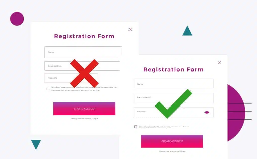
Keep Your Forms Short
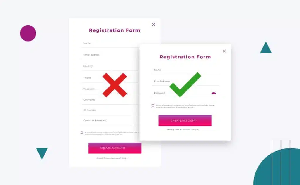
Attention spans around the world are decreasing with every passing year, so the pressure is on your contact form to keep them engaged. The most straightforward way to accomplish this is to keep your form structure short.
By limiting the number of fields the user has to fill out upfront, the likelihood of form completion goes up by as much as 50%, as verified by a study from Hubspot that tested the effect of reducing the number of fields from 4 to 3.
In addition, Quickspot found that the conversion rate with only 3 fields was 25%, compared to 20% for 3-5 fields and 16% for 6+ fields.
Keep in mind, however, that indiscriminately deleting fields might hurt your conversion rate instead — you need to know what fields your users want to fill out.
Make Sure Fields Are Consistently Sized
Our eyes follow the motion of our reading, so if your fields are inconsistently sized or unnecessarily long, it makes the experience of filling out your form less user-friendly.
Making sure your form fields are presented with a consistent size is part of form best practices. This improves the rhythm in which the user can easily read, understand, and progress through your forms.
Your site visitors and potential customers are not super likely to complete any long forms and this will decrease your conversion rate.
Having optional fields can help lessen the intensity of a form’s appearance.
Users Can Tab Through Fields
Being able to easily tab through contact form fields in their intended order is incredibly helpful for your desktop users. This improves the speed at which they can complete your form.
This way potential customers and qualified leads can lead the conversation to only what fits them and what they want to get out of filling out your form.
This can make things quicker for users who do not have to fill out unnecessary form fields and shorten the overall form.
Keep Labels Visible

If you’re trying to project a sleek, minimalist image on your business website, you may be tempted to remove labels in favor of just keeping placeholder text for form fields.
Don’t do this — it hurts the user experience when they forget what field they’re filling out. It adds friction to the process when they have to erase their answers to verify they’re filling out the right field.
According to this study from Google, the most usable web forms have field labels above the corresponding input fields for quick reference.
Use Placeholder Text Effectively
Instead of using the placeholder text to repeat the label name, you should instead use it to present ideal formatting clues. This will ensure that the data entered in the fields better matches your ideal, making it easier for you to sort the information you’ve gathered.
This is especially relevant for fields that deal with information that can be formatted in many different ways, such as dates. Do you want them to enter January 3, 2022, 01/03/22, 03/01/2022, or 01-03-2022?
Alternatively, you can also utilize dropdown menus to lessen confusion over formatting.
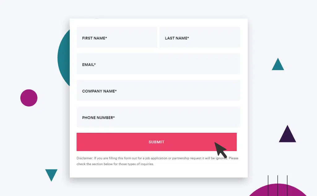
Have Clear Active States
When your user is actively editing a form field, make sure there are clear visual cues for them to know what they’re editing.
You can accomplish this by highlighting the current field in a different color, making the lines more prominent, etc.
Have Clear Error States
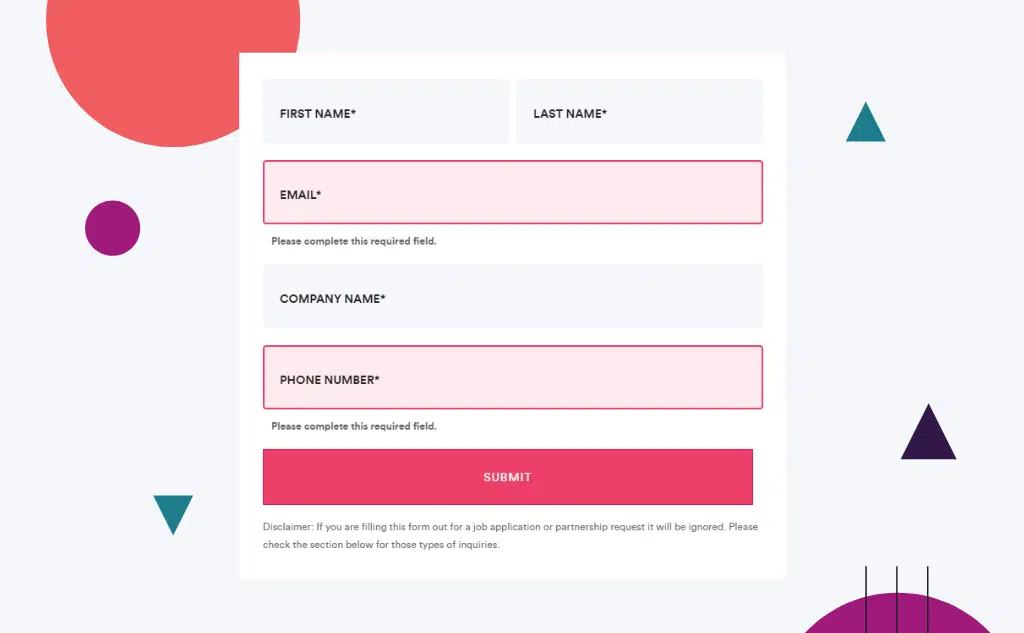
If your user makes a mistake while filling out the form, make sure they know right away and it’s clear what the error is.
For example, if you are asking for their email address and they messed up the domain name, your error message can say “Please use standard domain format, e.g. [email protected]” rather than “Invalid email address.”
Users tend to get frustrated from unclear error messages so creating a clear and direct error message will lessen the headache for you and your customers.
The Button Must Stand Out
If the dominant color on your webpage is green, what should the color of your “submit” button be? If you think it should be green to match the rest of the page, then stop right there.
The best color for a call-to-action button, as reviewed by OptinMonster, is one that stands out from the rest of the page.
In our previous example, the best color would be red, as it’s the complementary color on the opposite side of the color wheel. This helps draw attention and make the button obvious and visible to your users.
You should also ensure that the button has clear states for hover and click for even more visibility.
An additional tip for increasing the effectiveness of your call-to-action button is adding a testimonial within the page.
A good testimonial might just be the final push for someone to make that click as social proof can boost the number of sign-ups your form gets (and your sales team will thank you later!)
Optimize Your Fields for Mobile
In 2020, 68% of global website visits came from mobile instead of desktop. This means that when you want to make a truly great B2B website, you need to make sure it looks good on a mobile device.
A responsive contact form is one that adapts to the user’s device and presents the form fields in an order that makes sense for the size of the screen.
For example, on a desktop computer, it might be helpful to have the form fields appear in a single column so that the user can tab through them easily.
On a mobile phone, however, it might make more sense to have the form fields appear in a vertical stack so that the user can scroll through them.
By being responsive, your contact form can provide an optimal experience for all users, regardless of their device. This can help to improve the speed at which users can complete your form, as well as the overall conversion rate.
Make sure your contact forms are optimized and you’re taking advantage of the right mobile keyboard functions per field and a user can easily cycle through the fields on their device.
Since to make your short-form mobile friendly you have to find out how mobile responsive your form is, due to this you might need to create a mobile version of your form that allows mobile users ease of use when they are answering your form.
This may end up differing from the desktop version of your web form.
Make Sure There’s a Clear Confirmation
It’s frustrating when you click submit on a contact form and the website doesn’t tell you whether or not it worked. Should you wait and see if it gives you any confirmation? Should you fill it in again?
When your user completes the form, it should be obvious to them.
An entirely separate “thank you” page is the most preferable option as well as one of the form design best practices for form completion.
Now that we’re done with the general conversion tips, you might be thinking “Everyone says ‘make your form shorter,’ but what fields do I actually need to keep?”
Let’s start with what people don’t like filling out:
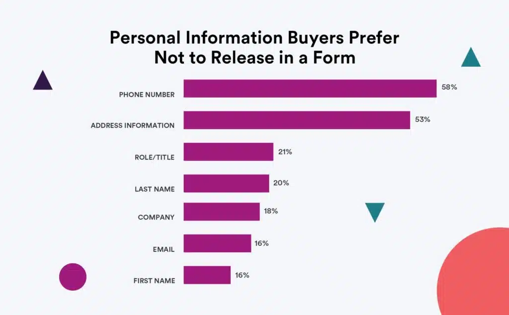
In the era of data privacy concerns, people are more and more hesitant to give out information like phone numbers and address information.
Even if you leave a note that says “We value your privacy. Your information is safe and will never be shared,” the person filling out your form has to take that promise at face value because you haven’t earned their trust yet.
If your contact form is currently asking for personal data, you’re likely putting yourself at a disadvantage. Asking for this information runs the risk of scaring off your users but it remains a common website mistake.
In reality, most B2B contact forms only need the following information:
- Name
- Email Address
Seriously, that’s it.
If that doesn’t feel like enough information, let’s talk about how you can gain more while still keeping your form as short as possible.
So, you now have a name and an email address. That’s plenty of information to start with — provided you use the correct tools.
Use Email Automation To Further Qualify
Getting people to fill in your contact form is the initial goal, but your overall goal is to nurture your leads and eventually convince them to buy your product or service. The first step to getting more information out of an email address is setting up email automation.
By using email automation to follow up on form submissions, you immediately accomplish two things: you ensure that the email address they submitted is valid and you begin the sales process.
A crucial component of the latter objective is sending a personalized email instead of a dry general email. This immediately starts building trust and starts increasing conversions. You can even use it to ask 3-5 additional questions you may need to know to qualify the prospect.
Here’s an example of an e-mail we automatically send after someone fills out a form:
Hi First_Name,
To make sure we understand what you’re looking for, please share some information about your project:
- Are you looking for a single project or ongoing work? Or both?
- What are the biggest challenges/obstacles with your current website?
- What’s the project timeline/level of urgency?
- How much are you looking to invest in this project/engagement?
If you’ve already prepared some useful information, such as an RFP or scope of work, please feel free to attach it to your reply, we’d love to see it.
Looking forward to your response!
Cheers!
Jack Morrin
Sales Coordinator
This simple touchpoint allows us to quickly create an additional touchpoint with the prospect and ask a few additional qualifying questions that are super important for our sales team.
Protip
Review the email follow-up questions above. Would you answer those if it was part of the initial form? Probably not. Keep the initial experience concise and engage more after the form has been submitted.
Use 3rd Party Tools To Augment Data
You can use an email address for more than just sending emails — it’s 2022, technology is available to help you get data on prospects even if they didn’t personally submit that data to you. You can integrate a tool like ClearBit with your CRM to automatically pull information based on an email address, such as insights like their full name, job title, and company demographic information.

“It’s 2022, you shouldn’t need to ask people in your form where they came from. Use analytics for attribution and tools like Clearbit to know both more about where they came from and who they are.”
– Jeff Gapinski, Co-Founder
So, as we’ve previously established, you should be keeping your contact forms as short as possible and to roughly one page.
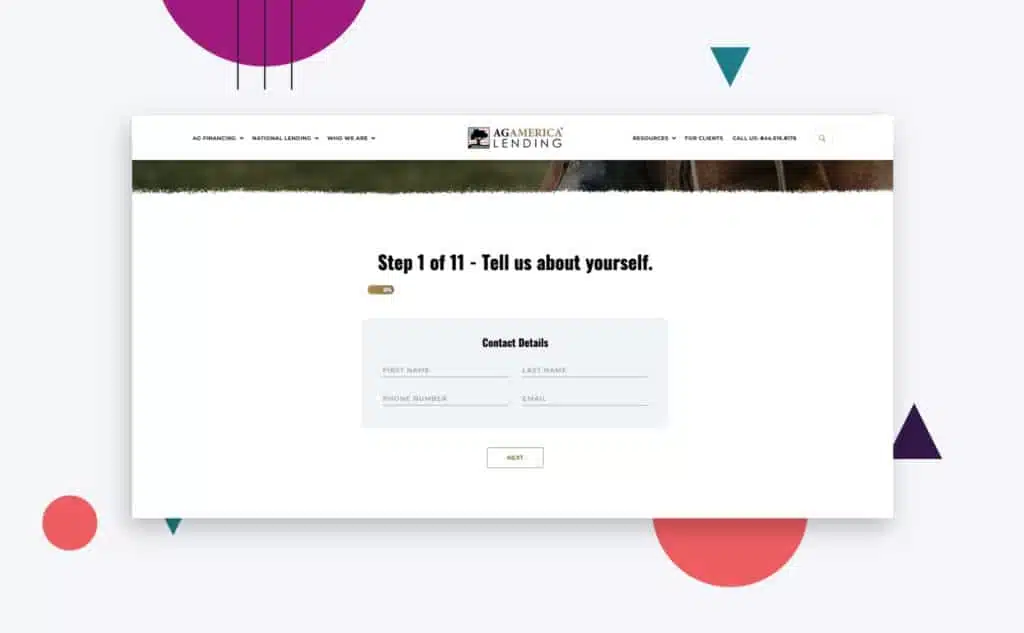
However, what if you absolutely need that data? Applying contact form best practices to a form that requires more than 10 entries requires the use of multi-step forms with multiple fields.
After being told that you only truly need a name and an email address on the contact form, you might be confused as to why you would ever need a form long enough that it requires multiple steps. The reasoning is simple — it depends heavily on the purpose of your contact form.
Imagine that you’re shopping around for an estimate on the value of your house. You see a real estate agency that promises a free online estimate, but the only thing their form asks is a name and an email address. What insight could they possibly offer you with only that information?
Multiple contact forms are amazing solutions for longer forms, such as an application or registration form. They’re also a good way to get more information from your leads — starting with “low-friction” or “low-threat” (e.g. what service are you looking for?) fields.
These can engage them and allow you to ask more sensitive questions near the end when it’s less likely for them to back out because they’ve already invested time and effort.
Multi-step forms that include a progress bar are also effective at getting users to complete forms, due to the “endowed progress effect.”
When making a multi-step form, the same conversion tips apply. You should keep each batch of fields short so you don’t overwhelm the user.
A case study from Venture Harbour saw a 53% increase in conversion rate when they formatted 30+ questions in a four-step form.
Data from Formstack backs this up — multi-step forms have a completion rate of 13.85%, compared to 4.53% on a single long form.
Many businesses keep separate service pages and contact form pages. However, forms that are directly embedded in landing pages tend to outperform CTAs to open a separate contact form page. The reasoning is, as always, convenience.
Whenever you can, you should try and incorporate a simple contact form directly on key landing pages, ideally above the fold of the page and again at the bottom of the landing page.
It should also stand out from the rest of the web page elements so your user can find it easily.
If you’re following the previously highlighted conversion tips (i.e. keeping forms concise), then this should be relatively easy to accomplish from a design perspective.
On paper, Completely Automated Public Turing test to tell Computers and Humans Apart or CAPTCHAs are a great way to reduce spam and ensure you’re getting quality information from your form, but did you know that visible CAPTCHAs actually hurt conversion rates?
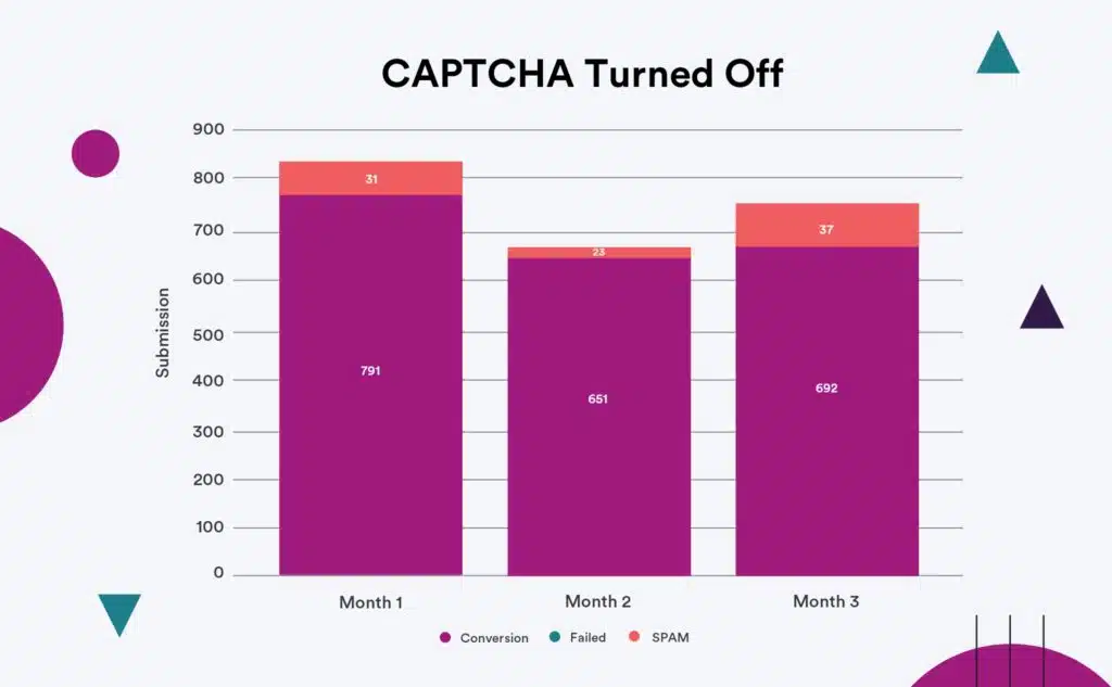
According to this case study from Moz, having CAPTCHA on reduced the amount of spam conversions by 4.1% but companies could actually lose out on 3.2% of genuine conversions.
This is likely because CAPTCHA has become too difficult and confusing, in an effort to combat the increasing sophistication of spambots.
It simply isn’t user-friendly — who wants to take the time to puzzle over a distorted set of letters or numbers and painstakingly type them out?
Instead of using CAPTCHA, you can look to alternatives that are convenient or invisible to the front-end user but still keep spam and brute force attacks at bay.
One such example is Google’s reCAPTCHA, which can be as simple as clicking a checkbox.
Whenever you make any type of changes to your contact forms, it is downright impossible to truly understand their impact without tracking performance.
Here are three key tests and methods you should be using to track improvements:
Set Up Goals
Using Google Analytics (or your preferred analytics tool), make sure each form on your website has a unique goal attached to it for completion. This will give you a better understanding of the success rate of filling out these forms.
Use Behavior Tracking
Using tools like Hotjar or LuckyOrange will provide you with a better understanding of how people are interacting with your contact forms in real-time. This could help you identify drop-off points or even bugs within the forms themselves.
Split Test
Tools like Optimizely, VWO, and Convert allow you to easily and effectively set up split tests. In these scenarios, you can run variations of form configurations side by side and understand how they truly are performing.
Split tests can help you pinpoint which elements of your contact forms help or harm your form conversion rate. The more tests you perform, the better optimized your form will be by the end.
That finishes our rundown of contact form best practices. Contact forms are one of the biggest opportunities for businesses to improve both the quality and quantity of leads, so make sure you never neglect to optimize them.
Pay attention to contact forms as an integral component of any web development effort, and always keep these three conversion tips in mind:
- Keep them as concise as possible.
- Use other methods to get the additional info you need.
- Test and monitor all of your improvements to maximize your results.
Remember, at the end of the day a beautiful contact form is one that provides a pleasant user experience, and you can’t have that with clunky fields or long pages.
We hope this article helped you learn some great ways to improve your contact forms and generate more conversions.
For more in-depth articles on the ins and outs of digital marketing, check out other posts on our blog.
Here are some best practices and further info on website contact forms, web development and website design in general. If you have further questions, don’t hesitate to reach out.
Website Contact Forms Design FAQ
Questions about how to optimize your website contact forms? We try to answer them here.
What is a website contact form?
A contact form is a web-based form that allows visitors to your website to send you a message. It’s an easy way for people to get in touch with you without having to give out your email address or phone number.
Contact forms can be used for a variety of purposes, such as requesting more information about your product or service, registering for an event, or even just asking a question.
When creating a contact form on your website, you’ll need to decide what information you want to collect from your visitors. The most common fields include name, email address, and message. You can also add custom fields to collect additional information, such as phone number or company name.
Once you’ve created your form, you’ll need to add it to your website. This can be done by adding a link to the form on your site’s navigation menu or by embedding the form directly into your website’s HTML code.
How do I create a contact form for my website?
A contact form is a great way to give your website visitors the opportunity to get in touch with you. There are a variety of ways to create a simple contact form, but the most important thing is to make sure that it is easy to use and that it captures the information you need.
To get started, you will need to choose a method for collecting information from your website visitors. You can use a simple online form builder, or you can code the form yourself using HTML.
Once you have chosen a method, you will need to decide what contact details you want to include in the form. The most basic contact forms will ask for a name and an email address, but you may also want to include space for a message or additional questions.
Once you have decided on the information you want to include, you can start building your form. If you are using an online form builder, this process will be relatively simple.
However, if you are coding the form yourself, you will need to have some knowledge of HTML. If you’re not comfortable dealing with code, there are also a number of WordPress plugin contact forms that you can easily add to your site.
Once your form is complete, be sure to test it out to make sure that it is working correctly. You can also add additional features, such as CAPTCHA, to help prevent spam submissions. Then, add the form to your website and wait for visitors to get in touch!
Whether you have a Shopify store, a Webflow website, a WooCommerce website, a Drupal site, or are on some other platform, these tips apply equally.
What are the types of forms on websites?
There are many different types of forms that businesses use to collect information from customers, employees, and other stakeholders.
Contact us forms, feedback forms, event forms, live chat, satisfaction surveys, marketing surveys, and job application forms are all common examples.
Each type of form serves a different purpose, but all of them can be used to collect valuable data.
- A contact us form is a type of feedback form that helps businesses to stay in touch with their customers. It typically includes fields for name, email address, and comments or questions. Customers can use online contact forms to request more information about a product or service, make suggestions, or ask for help with a problem. Businesses can use a contact us form template that can provide a starting point for the contact form design which can be customized to fit the needs of the business.
- An application form is a type of online contact form that is used to gather information from applicants. It usually includes fields for personal information, educational background, work history, and references. This type of online form helps businesses to screen candidates and select the best qualified individuals for open positions. Management software can be used to help with this process. This type of software can automate the gathering and sorting of data from application forms. It can also help businesses to keep track of applicants and compare them side-by-side. As a result, using an application form and management software can help businesses to streamline the hiring process and make it more efficient.
- A registration form is an essential tool for businesses that want to collect information from individuals who want to register for an event or sign up for a newsletter. A registration form typically includes fields for name, email address, and mailing address. This information helps businesses keep track of their customers and ensure that they receive the latest information about upcoming events. There are a variety of registration form templates available online, and businesses can easily customize these forms to fit their specific needs.
- Event forms help businesses to keep track of event attendees and collect information about their preferences. By collecting contacts’ names, email addresses, and phone numbers, businesses can easily follow up with attendees after the event.
- Live chat provides a conversational form of communication that is well-suited for the digital age. By using a live chat tool, businesses can upload a form on their website that allows customers to ask questions and get answers in real time.
- Satisfaction surveys are an important tool for businesses to track customer satisfaction levels over time. By monitoring customer engagement, businesses can identify issues early on and make changes to improve the customer experience.
- Marketing surveys help businesses to understand customer needs and preferences. These surveys can help content marketers understand how customers consume content and how they make decisions about what to buy. By understanding these things, content marketers can create more effective content marketing strategies that deliver better results. Affiliate marketers can use surveys to track the results of their marketing campaigns. By understanding what works and what doesn’t, they can adjust their marketing strategy accordingly and continue to improve the reach and effectiveness of their marketing. Marketing software platforms like SurveyMonkey offers easy-to-use tools for creating marketing surveys.
- Booking forms help people to schedule appointments or services. Oftentimes, these need to be filled out in advance in order to secure a spot.
- Request forms help people to request services or information. This might be something as simple as requesting a quote for a service or more information about a product.
- Evaluation forms help people to evaluate their satisfaction with a service or product. This is important feedback that can help businesses to improve their offerings. Google Sheets is a powerful tool that can help businesses to collect and track customer feedback.
- Sign up forms help people to sign up for things like newsletters, email lists, or membership programs.This is a way to ensure that people are getting the information they want and need. With options such as WordPress plugin contact forms or Shopify apps, you can easily add a signup form to your website without any coding required.
Collecting data through these various types of business forms is an essential part of running a successful business.
How do I create a working contact form in HTML?
A contact form is a great way to give your website visitors the ability to get in touch with you without having to share your personal contact information.
However, creating a contact form can be a bit tricky if you’re not familiar with HTML. The good news is that there are plenty of application form templates, tutorials and examples online that can help you get started.
To create a contact form, you’ll need to use the ” tag, which defines a form element.
Within the ” tag, you’ll need to include various ” tags that will allow the user to enter their name, email address, and message.
Once you have all of the necessary input fields, you’ll need to add a ” that will submit the form data.
Finally, you’ll need to add a bit of code to process the form data and send it to your email address. With a little bit of effort, you can easily create a working contact form for your website.
Is there free HTML contact form code?
There are a few ways to create a contact form using HTML. One approach is to use a pre-made contact form template. Many websites offer free HTML contact form code that you can copy and paste into your own website.
With just a few clicks, you can add a responsive contact form to your site. And if you want to get more creative, there are also dozens of code snippets that offer more advanced features, such as file uploads and dropdown menus.
Another option is to use a drag and drop online form builder tool. These tools usually have a free trial or low-cost monthly subscription.
How do I create a bootstrap contact form?
In order to create a bootstrap contact form, you will need to use the Bootstrap framework and CSS. Bootstrap is a front-end web development framework that provides a number of helpful CSS classes for creating forms. Once you have imported the Bootstrap CSS file into your project, you can begin creating your form.
First, you will need to create a element and add the appropriate attributes. Then, you will need to add a series of
elements with the class “form-group” in order to structure your form. Within each
element, you will need to add a element and an element. The element will contain the text for each field, and the element will contain the actual input field.
Finally, you will need to add a submit button. Once you have added all of these elements, your form should be fully functional.
Do people use contact forms on websites?
While there are many ways for website visitors to get in touch with a business or individual, contact forms remain one of the most popular options. There are a number of reasons for this.
- First, contact forms are easy to use. Visitors simply fill out the form and submit it, and their message is sent directly to the desired recipient.
- Secondly, contact forms help to ensure that messages are delivered correctly. With email, there is always a risk that messages will be sent to the wrong address or that they will be caught by spam filters. Contact forms help to avoid these problems by routing messages directly to the intended recipient.
- Finally, contact forms can help businesses to quickly gather information from customers or prospects. By including questions on the form, businesses can collect data that can be used to improve their products or services.
For all these reasons, contact forms continue to be a popular way for people to get in touch with businesses and individuals online.
Does Google Sites have a contact form?
In Google Sites, you can add in a Google form to act as a contact form. The process is simple and only takes a few minutes to set up.
First, create a page on your site for the contact form.
Then, add a “Contact Form” gadget to the page. This will provide you with a basic form that includes fields for the visitor’s name, email address, and message.
You can then customize the form to include additional fields, such as phone number or company name.
Once you are finished, save the form and publish your site. The contact form will then be live and available for visitors to use.
Which is better, WooCommerce or Shopify?
When comparing WooCommerce vs Shopify, there is no clear winner. Each platform has pros and cons, and it comes down to what matters most to you and what you are trying to do with your store.
Whether you have a B2B ecommerce website or a beauty brand, you’ll need to dig in deep to understand each ecommerce platform and what it offers. Our article comparing WooCommerce and Shopify is a good place to start.
Can you redesign my website, including the checkout page?
Yes, website redesign is one of our primary specialties. No matter which ecommerce site you’re on, we can redesign your entire site, including the about us page, checkout page, product pages, category pages, and blog.
FREE ANALYSIS
Request Your FREE Website Analysis
Further Reading On Website Design and Development.
Looking for web development and design inspiration? These articles should help.
- How Much Does It Cost to Build a Website?
- A Step-by-Step Website Redesign Project Plan
- How to Build a Web Design System
- Our Approach to WordPress Web Design
- Choosing the Right Product Metrics Using UX Research Process
- Our Top Retail Website Examples
- Understanding Web Design vs Web Development
- Our Top Beauty Website Examples
- Our Shopify Speed Guide Checklist
- Guide to Optimizing Shopify Image sizes
- Our Service Page Layout Examples
- Best SaaS Websites of 2022
- Our Approach to HubSpot Website Design
- New Website SEO Foundations
- Our Approach to Startup Website Design and Development
- WordPress Performance Optimization Best Practices
- 100 Ecommerce Website Design Tips
- How to Use Dynamic Website Content
- All About SaaS Website Design
- How We Approach Drupal Website Design and Development
Get Memorable Insights.
Sign up to receive actionable web design advice directly in your inbox monthly.
Get Memorable Insights.
Sign up to receive actionable web design advice directly in your inbox monthly.

Jeff Gapinski
President of Huemor
Jeff Gapinski is the President of Huemor where he helps plan the long-term strategic growth of the agency. Jeff is passionate about UI/UX, demand generation, and digital strategy.
What Do You Think?
Have feedback? Maybe some questions? Whatever it is, we'd love to hear from you.
Leave a Comment
![Website Design Standards We Follow [That You Should Too!]](https://huemordev.b-cdn.net/wp-content/uploads/2021/12/2023.04.04.Website-Design-Standards-We-Follow-That-You-Should-Too.jpg.webp)


No comments found