Design
18 minute read
Careers Page Design: How to Attract Top Talent.
LAST UPDATED:
February 1, 2024


Business is as competitive as ever, which means acquiring top talent is more difficult than ever.
Companies are experiencing a “talent vacuum”.
There are tons of available jobs – but seemingly, no qualified applicants.
So that begs the question, how can we attract candidates to apply?
Your website design should create a feeling that customers and future employees love.
Many companies struggle with the first, and many more struggle with the second.

A well-designed careers page can be a powerful tool for attracting top talent to your company. And when it comes to designing an effective careers page, there are two key elements to keep in mind: UX design and UI design.
Career Page UX Design
To create a positive UX, start by making sure your careers page is easy to navigate and provides all the information a potential candidate might be looking for. Include clear calls to action, and make it easy for candidates to submit their resumes or applications. You should also design your careers page with mobile users in mind. According to recent studies, more than 60% of job seekers use their smartphones to search for open positions.
Career Page UI Design
When it comes to UI design, the goal is to create a visually-appealing page that makes a good first impression. Use high-quality images and videos, and make sure the overall design is consistent with your company’s brand. Pay attention to the finer details, like typography and whitespace. Small tweaks in your UI design can make a big difference in how your careers page is received by potential candidates.
Creating a company’s career page on your website could be the key to attract candidates that will help your brand flourish.
So how do you create an effective career page? We’ve compiled some amazing tips and examples right here in this article. Let’s get started.
Your career listing pages are the first thing that potential applicants will see when they’re considering whether they want to work with you.
That’s why you need a career page design that is straightforward and complete, but interesting enough to make them want to read more about your individual job listings.
Demonstrate Who You Are
Your career page must describe who you are as a brand.
Your referral program should be designed to attract the attention of employment seekers who are already familiar with your brand. Start by teaching them about your brand’s core values with a brief description of how it came to be.
Talk about when it started, how it was founded, the team behind your business, and who is currently working with you.
Consider your tone and language when writing blog posts and other content for your page to make sure that it matches the overarching voice you want your brand to be known for. Doing so will help ensure that referral program participants are more likely to be engaged with your brand and refer others who are a good fit for your company.
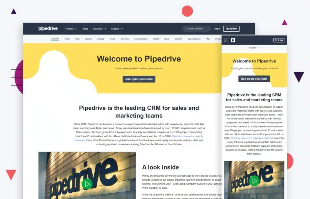
Take the Pipedrive website above as an example of great SaaS website design, especially in the career page department. The interface for their website and career page is neat, simple, and readily contains all of the information that prospective candidates need to know about the brand’s core values and its history.
Employee engagement is a huge part of employer branding, and Pipedrive does a great job of sharing its team’s story on its website and career page. The included pictures of their team are a nice touch, as they help applicants become more familiar with the people behind the business. Locations are also clearly stated at the top.
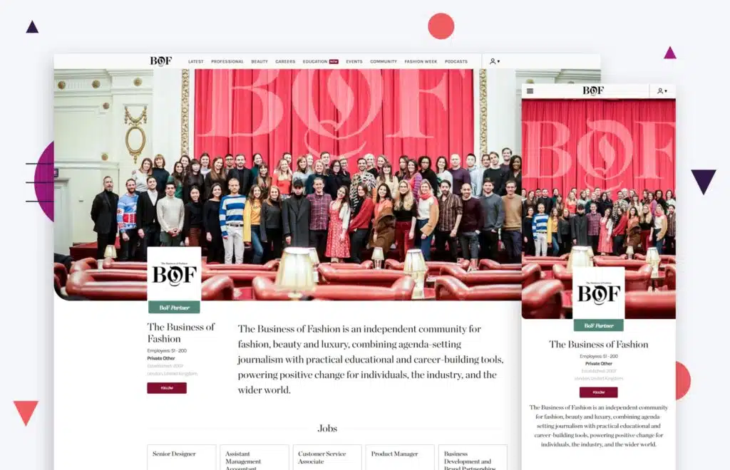
Another good example is the website for Business of Fashion. They get right down to business and open the website with a description of their organization. The design of the page is sleek and minimal, but it still showcases their biggest achievements and provides a detailed description of their brand’s core values and what they’re like as a company.
They also include a complete list of key people within their organization, which can help new hires get their bearings in the company faster.
Show What You Stand For
Emphasizing your core values should also be the top priority in designing a career page. You want to find employees that are compatible with your company.
Skills are a priority, but ultimately, if your employees don’t agree with your brand’s values and mission or vice versa, then the working relationship isn’t built to last. Putting your company’s core values on your page filters through applicants, leaving only the most suitable candidates.
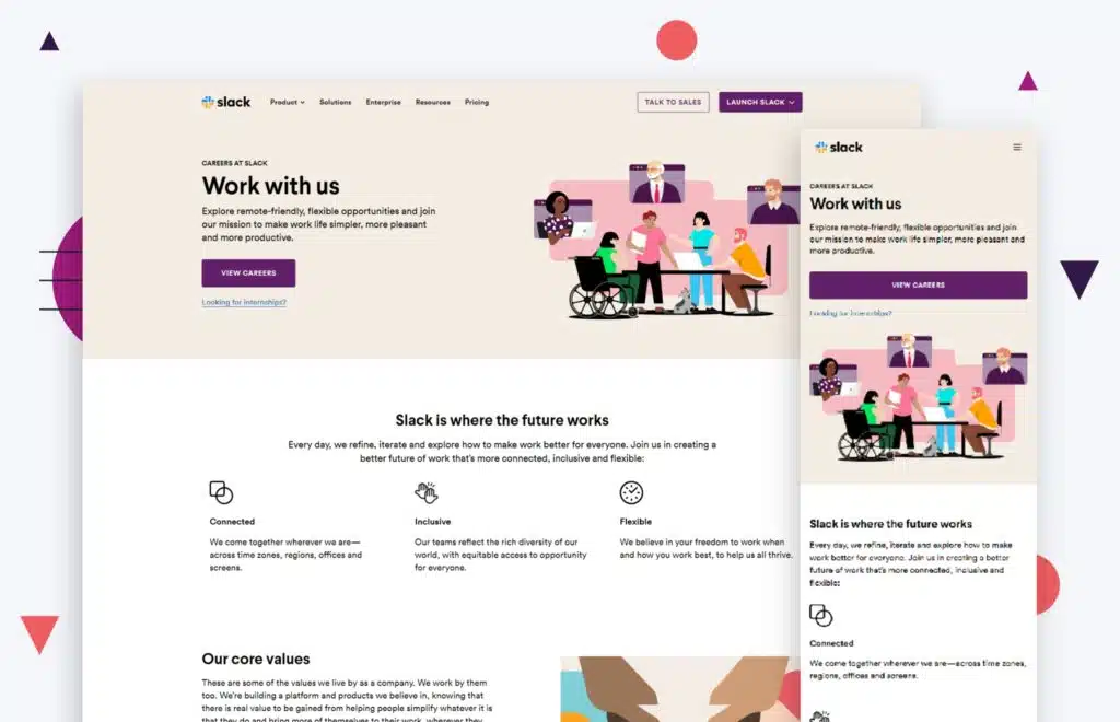
A great example of showing what you stand for can be seen with Slack’s career page. From the moment you enter the page, you can see which core values the business revolves around.
They use their graphics wisely, emphasizing their inclusivity with the headlining image at the top of the page. They also highlight this throughout the page, as seen in their values and other descriptions.
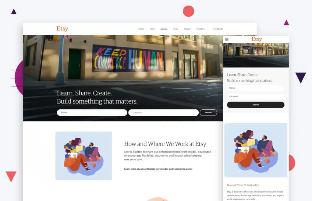
Like Slack, Etsy’s career page also showcases its values through lovely images and nicely worded descriptions. The section dedicated to their mission and core values is one of the first and longest parts of the page, efficiently getting the message across even as employment seekers scroll past it. We love this example of eCommerce website design applied to a careers page.
Show What It’s Like to Work There
Give your prospective candidate an idea of what it’s like to work in your company. This helps them ease into the idea of being a part of your workplace and know what to expect.
Going for a professional look is okay, but ultimately, adding some candid shots of your employees and workplace will make your company look more authentic and inviting.
These pictures could include shots of your team during work at the office or in a meeting. You could also add some photos of events, like team-building trips or office parties.
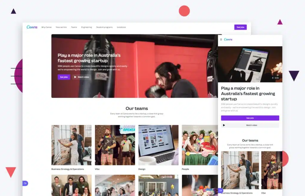
You can see this on Canva’s website. They’ve got a whole section dedicated to pictures of their employees. They have also organized their job postings into categories and added pictures for each one.
Aside from demonstrating the job opportunities they have for applicants, they also show what it’s like to work in that specific division of their company.
Namely is another good example. Their career page takes on an employee-centered approach, expressing that their employees are the heart of their business through a brief opening description. This is accompanied by some candid pictures of their employees. They’re able to achieve an authentic look with fewer pictures than Canva has used.
Use Social Proof
Social proof is always an effective way of letting a prospective candidate know what life is like at your workplace. Ask your existing employees to give some feedback about their experience at your company. This could either be blogs or short videos, structured like a vlog or an interview.
Try to feature some employee-centered awards on the career page as well, such as best workplace awards, since they add to your credibility as an employer. You could also feature employee success stories as articles on your career page.
You could also feature successful customer stories as articles on your career page. This would show prospective employees that you are not only concerned with making money, but also with making sure your customers are happy.
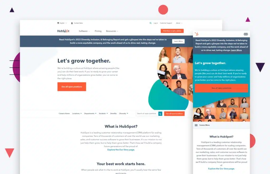
An effective example of using social proof can be seen on HubSpot’s career page. They have their employee-centered awards and ratings at the bottom of their page. Their employee testimonials are structured as a pop-up window that stays on the side of the page.
It flips through the testimonials like videos on a phone, which is a cool and unique touch. Once you click on the pop-up, you’ll see short videos of employees from different divisions talking about their experience at HubSpot.
Protip
As a content marketer, I know the importance of social proof. Use social proof (testimonials) from your employees on the careers listing page and individual job posts. You do it when you’re trying to acquire new customers, why not use it to attract new talented prospective candidates?alent?
Fidelity’s career page shows something similar. They have their awards laid out clearly near the bottom of the page. Rather than writing them out, they’re shown as logos so employees can clearly see that they’ve been awarded by reputable names in the industry, such as Forbes and Glassdoor. They also have content from their employees in the form of blogs and video testimonials.
High-quality tech companies will have comprehensive and engaging career description pages that contain all of the information that an applicant would be looking for.
Many job seekers spend hours combing through job boards, reading job descriptions, and submitting applications. However, job seekers often overlook one important aspect of the job search process: the career description page on a company’s website.
It’s important to highlight your business as a high-quality company, but be sure not to oversell your brand; leave room for the basics. The basic information should be easily accessible and found right away.
Salary and Benefits are Important
This is one of the biggest factors that could persuade a prospective candidate to apply for your company. Applicants are faced with an endless pool of job openings that match their skillset, so at the end of the day, the company benefits you provide might be the most effective way to convince them to give your brand a chance.
Employee benefits should be clearly stated on your career page. Try to present them in a way that could make employment seekers want to know more.
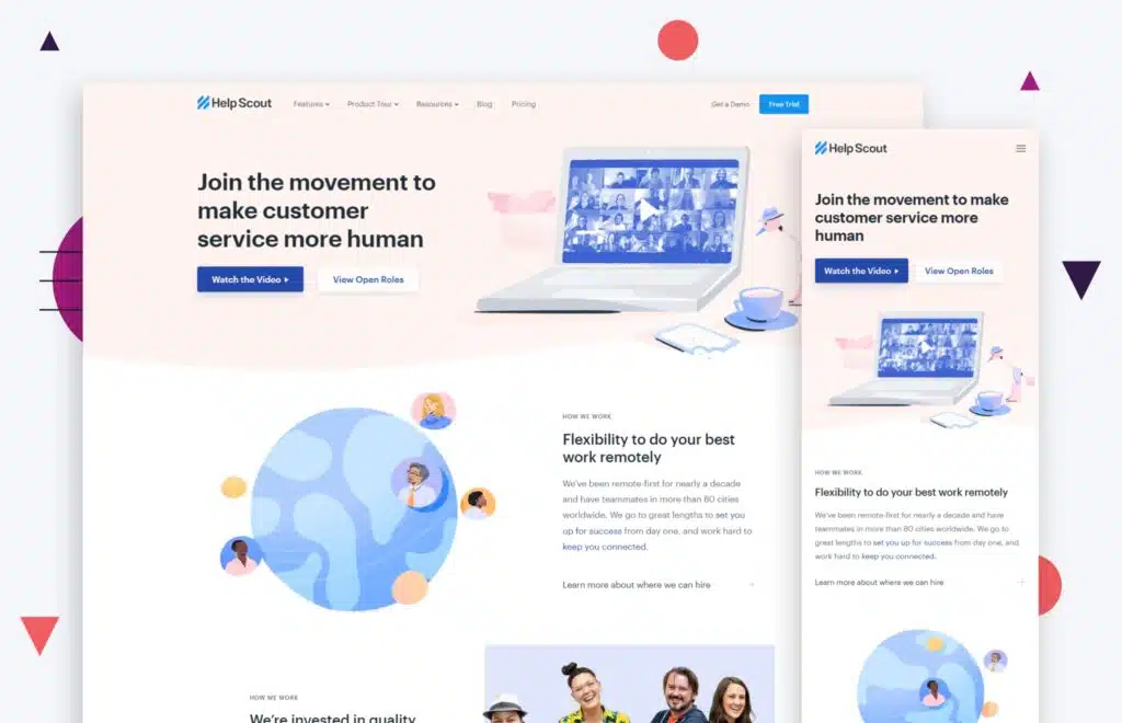
The HelpScout career page uses this efficiently. On their career page, they have a section dedicated to the salary and benefits they offer to all of their current and future employees.
It’s a brief overview of their benefits, but it reveals enough information to give their potential applicants an idea of what they can enjoy when working for the company. They also link to a salary calculator so employment seekers can determine how their salaries came to be and how they will fare over time.
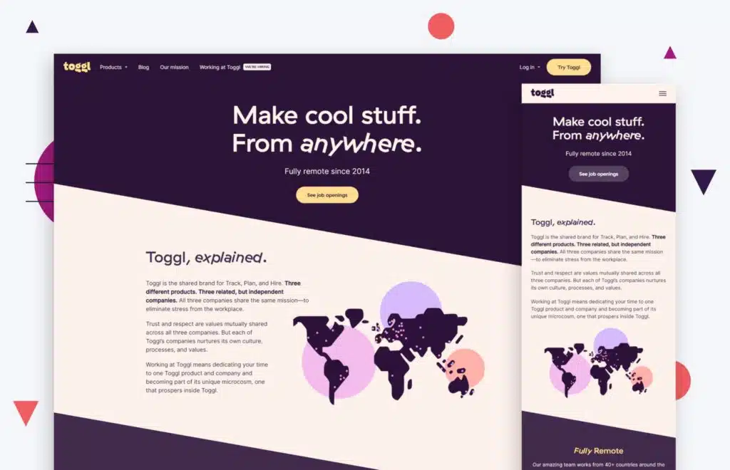
On the other hand, Toggl takes on a more detailed approach to its career descriptions. They have a wide variety of career options listed on their landing page.
You have a brief description of each job as you scroll through the page, but you can see the full requirements and benefits once you click on the link. Salary is visible right away on the career page.
Toggl also gives employment seekers a rundown of what their two-step hiring process is like, which is convenient.
Be Descriptive About the Job
The job search process can be long and frustrating, with dozens of job postings and even more resumes to sift through. However, there are a few things you can do to make the process easier for both you and your potential employees. One of the most important things is to give them a glimpse of what their day-to-day life would be like in the role they’re applying for.
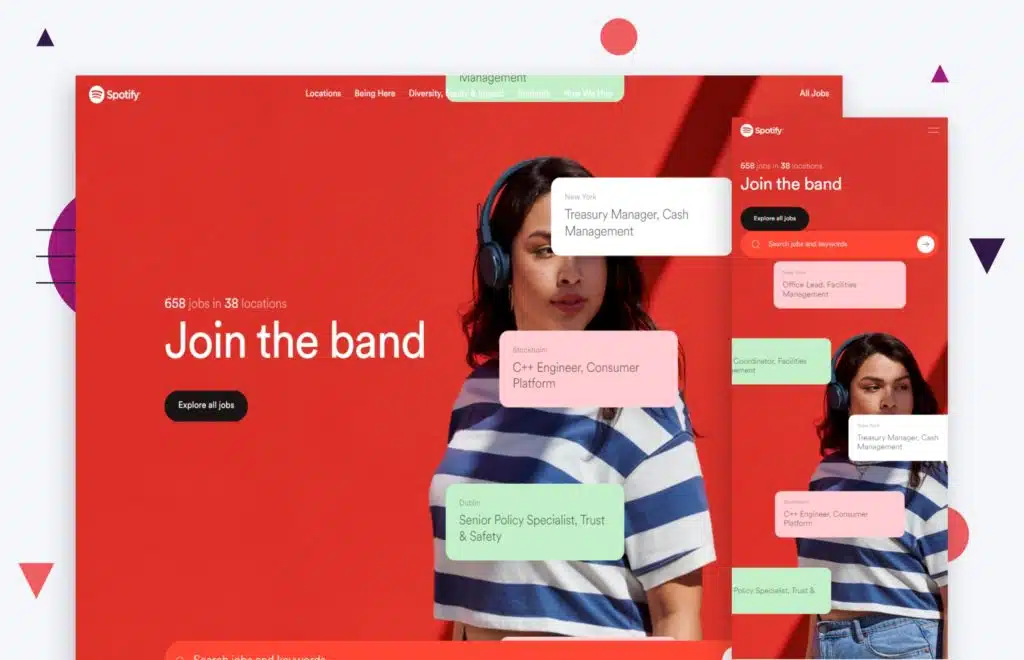
Spotify does a great job with this aspect of its job descriptions on their career pages. First of all, their career landing page is cool and modern. Job openings scroll slowly over the screen as message bubbles, which creates a nifty effect. Once you click on a job opening, you’ll be redirected to a separate page with all of the details about the position.
Spotify included an overview of the job, the responsibilities included, and the benefits of taking the job. It also includes where the job is located since some positions are selective to some of Spotify’s global offices.

“Make the most of your website as a recruiting tool and do these things: clearly define your mission, make benefits, perks, and compensation obvious on your careers listing page, and highlight real photos of people within your company enjoying working there.”
– Jeff Gapinski, Co-Founder
is also a good example if you’re looking for some inspiration. When you click on one of their job openings, you will be greeted by an overview of the job descriptions at the top. Right below, the day-to-day responsibilities of the jobs are listed, so any prospective candidate will know right away what their range of tasks will be like once they start working for the company.
It is descriptive and direct, exactly what a job description should be like.
Be Direct About Who You’re Looking For
The job search process can be time-consuming and frustrating, but taking the time to carefully consider the candidate’s experience can save a lot of effort in the long run. List every necessary skill that comes to mind. Jot down all the soft skills, hard skills, and other factors that you need to take into account when you’re hiring new employees.
It saves time and effort on both ends, effectively sorting through the applicant pool and receiving only those who are truly qualified and an ideal fit for the job.
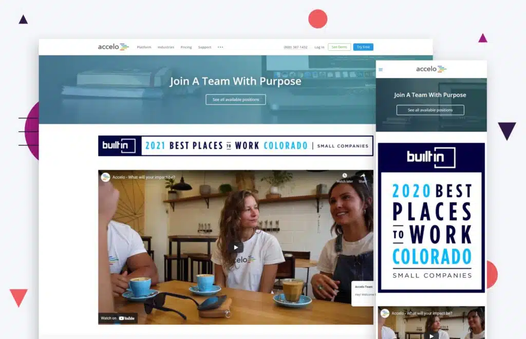
Accelo’s job description pages give an extensive description of what they’re looking for in an employee. They give specific details about the tasks and what responsibilities they’d have to fulfill while working for the company.
They also list down all the technical requirements needed for the position, such as the expertise needed for certain programs and applications. All programs are listed in the description, so employment seekers can look through them and identify which ones fall under their skillset. Accelo’s careers page is a great example of good B2B website design.
First, what is an applicant tracking system?
An Applicant Tracking System (ATS) can be a useful asset to companies that are looking to hire more talent for their team. It is software that promotes maximum productivity and organization by sorting through job applications and publishing jobs. A recruitment software like ATS can save businesses time and money while streamlining the recruiting process.
ATS can be fully accessed by all of your employees, making it easier to monitor and manage the application process. Having access to cutting-edge HR software can lessen the burden on your team. It requires less time and effort to manage, allowing you and your team to delegate tasks and focus on other requirements.
A Central Hub for Job Posts
Managing your job posts can be difficult, given the large number of job boards available for employment seekers. Manually posting your openings on each one and managing the independent pools of applicants causes issues with organization and efficiency.
A hiring platform allows you to post your job openings and manage interview scheduling from a single, centralized system. This makes it easy to keep track of who you’ve contacted and who still needs to be followed up with. It also allows you to quickly identify any patterns or commonalities among the candidates.
There are a number of apps that can help to streamline the process of posting job openings and managing applicants. Web apps can allow you to post your openings to multiple job boards with just a few clicks, and they also provide a central location for tracking all of your applications.
Candidate sourcing is one of the most important aspects of recruiting .A recruitment management system can help you develop and optimize your recruitment strategy so you can target the right candidates more effectively.
Having an ATS allows you to do all of this from one spot, saving time and allowing your team to focus on more important matters throughout the hiring process.
Automation and Efficiency
Automation is every company’s saving grace when they’re in the process of hiring new talents. First of all, it requires less manpower compared to manual tasks.
The process of using an ATS is quick and seamless. You can save job listings, set up automated responses to applicants, and manage, organize, and notate the upgrades with a few simple clicks. An ATS can also help you track your recruitment marketing efforts and measure your ROI.
Protip
There are a lot of different applicant tracking software solutions out there to improve your careers page. A mobile app can be particularly useful if you want to post job openings on your website or blog, as it makes it easy for applicants to apply right from their mobile device. The one we love at Huemor is called JazzHR.
Wrap Up!
Now you have a career page that draws in the talent you need! Continue to monitor and make updates with new job listings as well as to tell your company’s continuing story.
Here are some best practices and further info on careers page design, web development and website design in general. If you have further questions, don’t hesitate to reach out.
Careers Page Design FAQ
Questions about how to optimize your careers page design? We try to answer them here.
How do I create a career page?
Creating an effective career page is a vital part of attracting top talent to your company. A career page should be more than just a list of open positions; it should be a comprehensive overview of what your company has to offer potential employees. Here are some tips for creating an effective career page:
First, make sure that your career page is easy to find and navigate. Include clear links on your website’s homepage and other relevant pages.
Secondly, use compelling copy and imagery to sell potential employees on the benefits of working for your company. What makes your company culture unique? What kinds of opportunities are available for professional growth? Be sure to highlight these points in an engaging way.
Finally, include detailed information about each open position, including job descriptions, qualifications, and compensation packages. By taking the time to create a well-rounded and informative career page, you’ll be more likely to attract top talent to your company.
Whether you have a HubSpot, WordPress, or WooCommerce website—or are on a different platform entirely—these tips apply equally.
What are career options in design?
A career in design can encompass a wide range of activities, from crafting individual products to planning entire buildings or landscapes.
Designers often specialize in a particular type of design, such as fashion, graphic, or interior design. Others may choose to focus on a specific industry, such as healthcare or hospitality.
In addition to traditional design jobs, there is also a growing demand for designers who are skilled in new technologies, such as user experience (UX) design and 3D printing.
No matter what their specialty, all designers share a creative vision and an eye for detail. If you are interested in pursuing a career in design, there are many options available to you. With hard work and dedication, you can find the perfect job to match your skills and interests.
Which is the best career site?
Career sites provide a wealth of information on a variety of topics, from exploring different career options to finding job openings in your area. They can also be a great way to learn about salary negotiation skills or get tips on writing a resume.
When choosing a career site, it is important to find one that offers the resources you need. For example, if you are looking for information on specific careers, you will want to find a site that offers detailed career profiles.
On the other hand, if you are simply looking for job postings, a site that aggregates listings from multiple job boards may be more useful. Ultimately, the best career site is the one that meets your needs and helps you achieve your goals.
Which are the 10 best career page design examples?
Choosing a career is one of the most important decisions you will make in your life. With so many options available, it can be difficult to know where to start. However, looking at examples of successful career pages can give you some ideas about what works and what doesn’t. Here are 10 of the best career page examples:
- Hotjar: Hotjar’s career page is simple and to the point. It features a clean design and easy-to-navigate sections that highlight the company values and mission.
- Nuuvem: Nuuvem’s career page is colorful and fun, while also being informative. It includes detailed descriptions of open positions, as well as information about the company’s culture.
- Sympa: Sympa’s career page is sleek and modern, with a focus on highlighting the company’s unique selling points. It includes testimonials from employees, as well as an overview of benefits and perks.
- Single Quantum: Single Quantum’s career page is simple but stylish, with a strong focus on the company’s values. It includes a short video that gives an overview of the company, as well as descriptions of open positions.
- Betty Blocks: Betty Blocks’ career page is creative and stylish, with a focus on the company’s culture. It includes a range of videos that showcase the work environment and employee testimonials.
- Swapfiets: Swapfiets’ career page is straightforward and informative, with a section dedicated to explaining the company’s mission. It also includes information about benefits and open positions.
- The Student Hotel: The Student Hotel’s career page is modern and trendy, with a focus on providing information about the company’s culture. It includes videos that showcase the work environment and employee testimonials.
- Slack: Slack’s career page is simple but effective, with a focus on highlighting the company’s values. It includes a short video that explains what Slack is all about, as well as information about open positions.
- Virtue: Virtue’s career page is minimalistic but stylish, with a focus on showcasing the company’s products. It includes videos that give an overview of the company and its products, as well as information about open positions.
- Teamleader: Teamleader’s Career Page features an elegant design that showcases the company’s products front-and-center. It also includes information about open positions and benefits, as well as employee testimonials.
What is a career website?
A career website is a website that helps people to find jobs. It usually includes a database of job openings, as well as information about how to apply for the jobs.
Some career websites also provide other resources, such as resume-writing tips and interview advice.
Many companies have their own career webpages, which are a good place to start looking for a job. However, there are also many general-purpose career websites that can be useful for job seekers. These websites can be a great way to learn about different types of jobs and to find out about job openings that you might not otherwise hear about.
Whether you’re just starting your job search or you’re looking for a new opportunity, a career website can be a valuable resource.
Which is better, WooCommerce or Shopify?
When comparing WooCommerce vs Shopify, there is no clear winner. Each platform has pros and cons, and it comes down to what matters most to you and what you are trying to do with your store. Whether you have a B2B ecommerce website or a beauty brand, you’ll need to dig in deep to understand each ecommerce platform and what it offers. Our article comparing WooCommerce and Shopify is a good place to start.
Can you redesign my website, including the checkout page?
Yes, website redesign is one of our primary specialties. No matter which ecommerce site you’re on, we can redesign your entire site, including the about us page, checkout page, product pages, category pages, and blog.
Further Reading On Website Design and Development.
Looking for web development and design inspiration? These articles should help.
- How Much Does It Cost to Build a Website?
- A Step-by-Step Website Redesign Project Plan
- How to Build a Web Design System
- Our Approach to WordPress Web Design
- Choosing the Right Product Metrics Using UX Research Process
- Our Top Retail Website Examples
- Understanding Web Design vs Web Development
- Our Top Beauty Website Examples
- Our Shopify Speed Guide Checklist
- Guide to Optimizing Shopify Image sizes
- Our Service Page Layout Examples
- Best SaaS Websites of 2022
- Our Approach to HubSpot Website Design
- New Website SEO Foundations
- Our Approach to Startup Website Design and Development
- WordPress Performance Optimization Best Practices
- 100 Ecommerce Website Design Tips
- How to Use Dynamic Website Content
- All About SaaS Website Design
- How We Approach Drupal Website Design and Development
Get Memorable Insights.
Sign up to receive actionable web design advice directly in your inbox monthly.
Get Memorable Insights.
Sign up to receive actionable web design advice directly in your inbox monthly.

Jeff Gapinski
President of Huemor
Jeff Gapinski is the President of Huemor where he helps plan the long-term strategic growth of the agency. Jeff is passionate about UI/UX, demand generation, and digital strategy.
What Do You Think?
Have feedback? Maybe some questions? Whatever it is, we'd love to hear from you.
Leave a Comment
![Website Design Standards We Follow [That You Should Too!]](https://huemordev.b-cdn.net/wp-content/uploads/2021/12/2023.04.04.Website-Design-Standards-We-Follow-That-You-Should-Too.jpg.webp)
No comments found