Design
7 minute read
An Eye for Design: The Best Interior Design Websites and 7 Examples.
LAST UPDATED:
June 27, 2023


Interior design websites showcase the work of interior designers, provide inspiration for home decorating, and offer advice on home improvement projects.
They can also be used to find a qualified interior designer or to hire a contractor.
Some interior design websites also sell products, such as furniture, flooring, and window treatments.
The purpose of an interior design website is to give people a place to start if they’re interested in redesigning their homes.
A well-designed website will have inspirational photos, videos of completed projects, and tips and advice from experts in the field.
It should also be simple to navigate so that visitors can find the information they need quickly and easily.
Some interior design websites are for business-to-business (B2B) purposes, while others are eCommerce sites.
Interior decorators use B2B websites to showcase their work, inspire people who are redesigning their homes, or generate leads from other businesses.
On the other hand, eCommerce websites focus on selling products that can be used to create beautiful homes.
This article will provide tips for creating a successful interior design website and review some of the best examples of interior design websites.

Creating an engaging and well-designed interior design website requires time and effort, but it can be a great way to connect with potential clients or customers.
Here are some tips to help you get started!
Be Clear, Be Concise
No website user wants to feel like they are struggling to figure out where they are supposed to go or what they are supposed to do.
That is why your website must be designed to be easy to navigate, with clear and concise copy.
Protip
Check out our other article Copywriting Best Practices for additional information on how to write clear copy on your website!
Your visitors should be able to quickly understand your site and find the information they are looking for without any difficulty.
In addition, the design of your website should be an accurate reflection of the quality of your work.
If your site looks cheap or poorly put together, potential clients will likely assume that your work is similar.
On the other hand, a well-designed website instills confidence in potential clients and tells them that you are knowledgeable and professional.
Therefore, ensuring that your site is clear, concise, and visually appealing is essential if you want to attract and retain customers.
Aesthetically Pleasing Websites, Please!

There’s nothing worse than coming across a poorly designed website. It’s like visiting someone’s home and seeing that they have no sense of style.
You want to leave immediately! Just as you wouldn’t want your home to be ugly, you don’t want your website to be either.
Aesthetically pleasing websites are essential for several reasons.
First of all, they reflect well on you and your business.
If your website looks like it was designed by an amateur, potential customers will often assume that your business is unprofessional and not worth their time.
Secondly, aesthetically pleasing websites are more enjoyable to visit. People like to spend time looking at visually-pleasing things.
Not only is it essential to make sure your website looks good, but it’s also important to make sure it reflects your interior design style.
White Space Is Your Best Friend
If you’re in the business of interior design, then you know that first impressions are everything.
When it comes to your website, the design is key to making a good impression. White space, or negative space, is the area of your design that is left blank.
It’s the space between your page’s images, text, and other elements.
While at first, it can seem like wasted space, it’s integral to creating a practical, seamless, and visually appealing design.
White space helps break up information, making it easier for visitors to digest. It also helps to emphasize critical details and calls to action.
Stand Out and Shine
Any good website needs to be visually appealing, but sometimes it can be difficult to make your content stand out.
With so much competition, you need to find ways to make your work shine.
One way to do this is to add visually appealing, informative elements.
Graphics, photos, and videos are all great ways to catch the eye of your audience and help them understand your message and the value of your work.
Another way to make things stand out is to use typography to emphasize important points.
Bold or italicized text can help draw attention to critical parts of your message, making it easier for readers to digest.
Looking for some inspiration when it comes to designing your interior design website?
Here are seven outstanding examples of websites that exude style and sophistication:
1. LCM Design
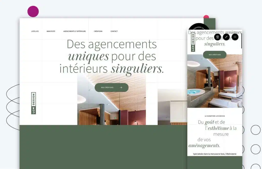
LCM Design has a unique website layout that is both attractive and effective.
The background grid layout helps keep the website organized, while the earthy green tone of the typography ensures that users can read the website’s content easily.
The scroll effect also allows for a smooth user experience, and the website’s overall design makes it feel like you are reading a scrapbook or journal.
This is an excellent example of how an effective website design can help engage users and keep them returning for more.
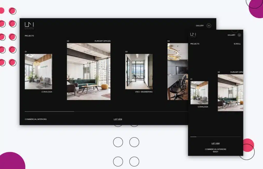
2. Lironmoran Interieur

Lironmoran Interieur is a simple and clean website. Its straightforward, asymmetric layout has minimal animations or scroll effects, providing a calming effect.
There is no use of bold typography — everything is small and neat.
The use of the san serif font also makes it different from other sites and provides a smooth, clean effect.
There is a lot of negative space around the site, keeping it clean and concise. The overall site has a white background which works with the integrated colorful imagery.
All in all, it’s a well-designed website that is easy to navigate and doesn’t overwhelm you with too much information.
3. Remer Interieur
The Remer Interieur website has a luxurious, premium feel.
Even though they went with a minimalistic look, there is a good use of bold typography around the site.
The website’s navigation is hidden and interactive to further enhance the affluent effect.
Overall, the site has a unique touch, from the black-and-white hover effect to the captivating nature of the imagery.
Everything comes together to create a sleek and stylish site that makes the viewer want to work with the company.
4. Waypoint
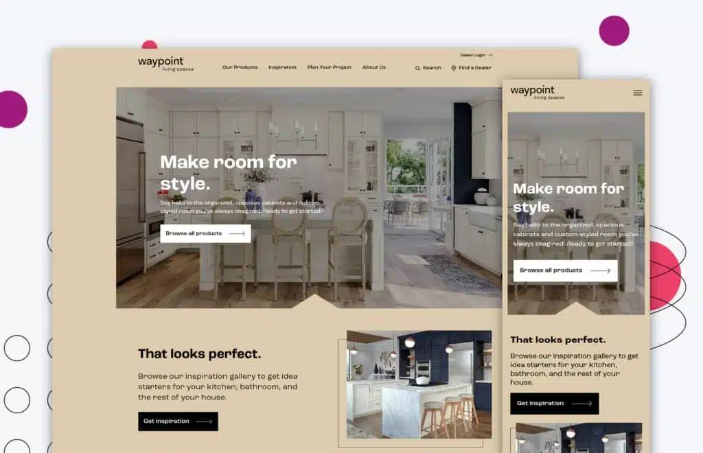
Waypoint is an excellent website for people looking for visual references for their living spaces.
The site has a polished, modern design and is easy to navigate.
It also has a great selection of inspiration pages to browse through.
One standout feature is the interactive element for people planning projects.
A checklist on the site allows people to see where they are at the point of their project.
Overall, Waypoint is an excellent resource for people looking to update their living spaces — presented cleanly and aesthetically.
5. Margaret Winter Interiors
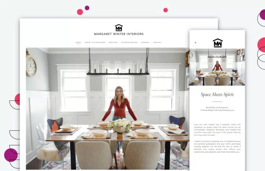
As soon as you enter the website for Margaret Winter Interiors, you’re met with a clean and inviting design.
Navigation is easy, so you can quickly find the information you’re looking for.
The imagery is thoughtful and enhances the copy written about the company.
The color palette is calming and makes you feel welcome.
All these factors combined create a website that is enjoyable to browse and provides all the information you need about the company.
6. Apartment Therapy
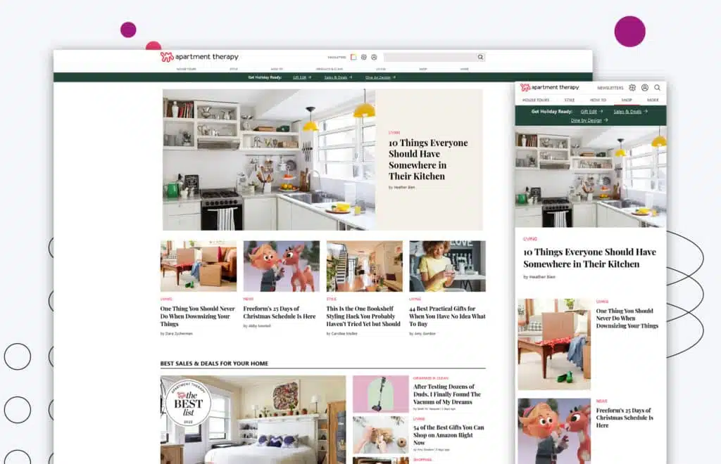
Most people think of interior design and picture grand houses with beautiful decorations. But what about apartments?
They need to be decorated well too! That’s where Apartment Therapy comes in.
This interior design website offers inspiration for visitors with resources that help guide them in the process.
The design scheme is consistent throughout the website, which is key to helping guide users through the different sections.
Plus, there are tons of photos and examples to help inspire.
So if you’re ever feeling stuck on how to decorate your apartment, be sure to check out Apartment Therapy.
7. Studio Bramble
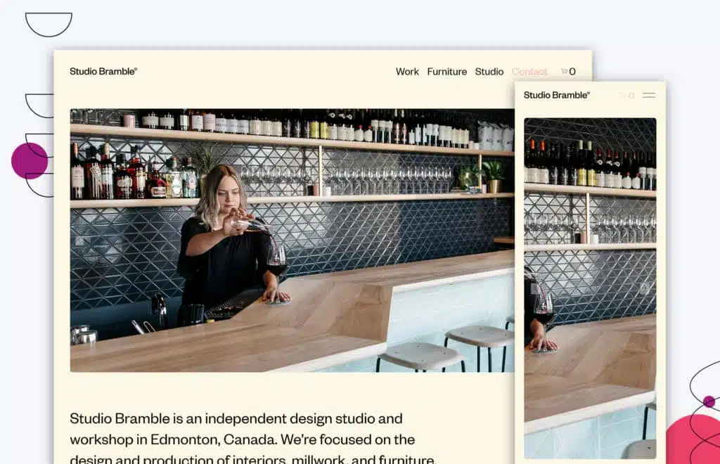
We love the design of Studio Bramble’s website.
The simplicity of the design is what gives this website a spot on our list of examples.
While they don’t use actual white space — but rather a sandy color for their blank space — the design choice works to create a simple design that still has everything a visitor would expect on their website.
The imagery used on this website also helps to further their design expertise.
When it comes to website design, first impressions are everything.
In this day and age, potential customers will research your company online before ever stepping foot in your store or office.
As a result, the design of your website is one of the most critical aspects of your business.
If your website is poorly designed, potential customers will likely move on to one of your competitors.
This is especially true for interior design businesses.
After all, if potential customers can’t get a flattering sense of your style and taste from your website, they’re not likely to hire you to design their home or office.
Consequently, interior design websites must be carefully designed to reflect the style and sensibility of the business.
Interior design websites can make a lasting impression on potential customers by paying close attention to detail.
If you’re looking for an interior design website partner to rethink your online approach, we at Huemor can help.
We have redesigned hundreds of websites and know how to make yours stand out. Contact us today to get started!
Get Memorable Insights.
Sign up to receive actionable web design advice directly in your inbox monthly.
Get Memorable Insights.
Sign up to receive actionable web design advice directly in your inbox monthly.

Jeff Gapinski
President of Huemor
Jeff Gapinski is the President of Huemor where he helps plan the long-term strategic growth of the agency. Jeff is passionate about UI/UX, demand generation, and digital strategy.
What Do You Think?
Have feedback? Maybe some questions? Whatever it is, we'd love to hear from you.
Leave a Comment
![Website Design Standards We Follow [That You Should Too!]](https://huemordev.b-cdn.net/wp-content/uploads/2021/12/2023.04.04.Website-Design-Standards-We-Follow-That-You-Should-Too.jpg.webp)

No comments found