Development
16 minute read
The 15 Best Agency Website Designs.
LAST UPDATED:
February 15, 2024


Agency websites promote an agency’s work and attract new clients.
If they’re challenging to navigate, have outdated information, or look plain old, it can negatively affect your agency. And what happens when a potential client searches up your agency name and lands on a bad website? You lose them!
That’s how crucial it is to have a well-designed, up-to-date, creative agency website.
Businesses rely on agencies for their marketing, advertising, and branding needs, so agencies need to make sure their own website is up to par.
As an agency ourselves, we’ve rounded up 15 of the best agency websites to give you some inspiration.
These great agency websites make a clean sweep in various categories essential for a strong creative agency’s site!
From the incredible website design to dynamic web content, user experience, and overall creativity, these websites have it all.

1. Lilac James
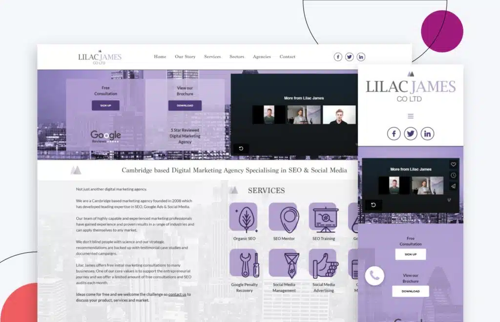
This digital marketing agency’s website is soothing with the use of lilac purple as part of its brand identity. The design choices for this colorful website were made with the user experience in mind. The use of color is perfect for promoting the brand and the website’s overall aesthetic!
The video embedded in the hero header to highlight achievements and previous clients is also an excellent way to establish credibility.
The services are also listed right on the homepage, making it easy for users to find what they’re looking for!
Lastly, potential customers can easily get in touch with the agency through the website’s call to action (CTA).
Lilac James is straightforward, consistent, and has excellent attention to detail.
2. Creative Theory
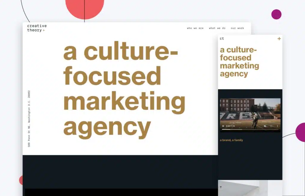
A modern feel with a basic aesthetic? Creative Theory blends both in their web agency design! When you visit the website, a mouse effect follows your cursor around the page for a bonus touch.
Moreover, what words can’t fully describe, the agency’s images and videos do an excellent job of summing up what they’re all about. Head over to its pages, and you’ll find various images to scroll over for extra effect making this website design an engaging website design.
Creative Theory’s top web design envelops the user in digital experiences that are both visually stimulating and easy to navigate.
3. Hire Influence
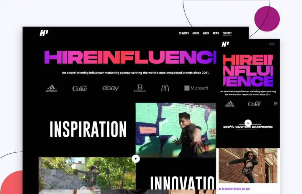
Perfect for the product and target audience, Hire Influence‘s website is very modern without too many bells and whistles. Their branded colors pop, giving the website a fun and young feel!
Hire Influence’s website is the perfect example of how interaction design can be used to create a website that is both visually appealing and easy to use. The website has quick animations that grab users’ attention quickly.
The UI/UX designs are clean and clutter-free, with simple interfaces, making it easy to navigate.
Everything about this website is on point for the agency, from the design to the user experience making Hire Influence an awesome website design.
4. Top Hat
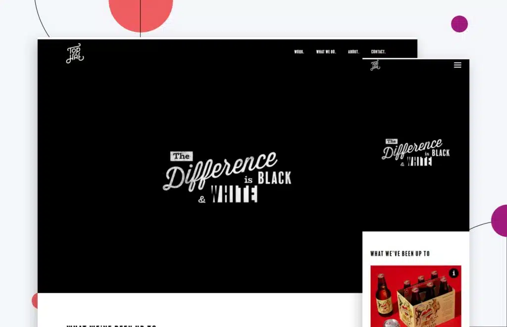
When you land on Top Hat‘s agency web, you’re greeted with an awesome hero header video that doesn’t start or even appears if you don’t have your cursor over it.
When it comes to UX designs, Top Hat implements popular design trends on their website, which makes the site feel very modern.
Their case studies are a part of their homepage content, so you immediately see what they know. Their case study or work page has an interesting set-up; a grid format but also slightly off an exact grid, such as on Instagram.
The website of this web design and development agency includes a ton of animated images rather than static ones. Also, their “about” page proves that you can introduce your team in a fun way!
Overall, Top Hat’s website is a great example of a fun yet professional agency website.
5. Chemistry
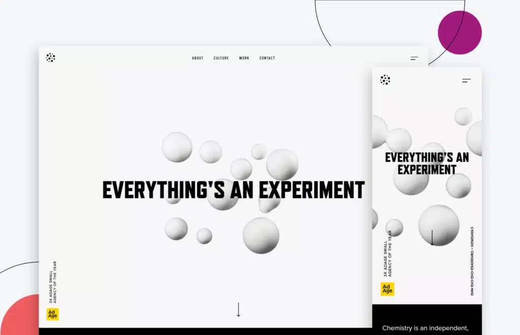
is a Pittsburgh company, and the black and gold theme works well based on location. The minimal use of yellow in their palette aids well, drawing attention to specific sections without being glaring.
Using large text on their site also allows for easy skimming and digesting of content! The animation on their homepage is fun and interesting to look at.
Overall, their website doesn’t feel cluttered. Every element, from the copy to the imagery to the animations, has a purpose and contributes to the overall design of the site. This focus on marketing resources makes Chemistry’s website an effective marketing tool for their business..
Chemistry isn’t scared to have blank white space on its website. They’re easy on the eyes, immediately making you wonder if you do have chemistry with the agency!
6. The Future Forward
page is a nice touch. It makes the website feel interactive. The navigation starting at the bottom of the page and then moving up with scroll works well for this digital agency website. The detail might not work for a non-agency, but it looks cool in this instance.
The Future Forward has its case studies and works as a highlighting touch point to prospective clients right there on their homepage. The website uses bright white color, giving off a bright brand design feel. It’s one of the more unique things that work for them!
7. Beans
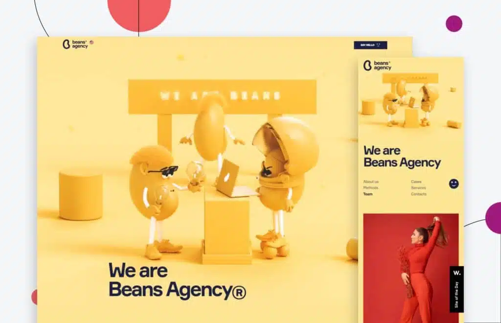
website, it’s “Cool beans!” The homepage includes animated beans working (in a meeting, driving a car, and partying!) and following throughout the website as a piece of creative storytelling of their digital agency.
The bright colors make the website visually engaging, and it’s easy how the homepage scrolls down to display various subsections making for an easy-to-navigate user experience. Their case studies are hidden until clicked on, saving room with the major scroll they have going on. Definitely cool beans!
8. Green Studio
The Green Studio website uses a neutral color palette and minimalistic design that invites visitors and potential clients alike to stick around and explore. The website’s grid layout is visually appealing, making the overall tone relaxed.
Green Studio’s digital strategies are evident from the moment you land on their website. Leaves are animated to come in behind images to give movement to the website. Images of actual clients and people are used along with testimonials for social proof.
Their overall content is well-written and organized. As a result, Green Studio’s minimalistic website design and content marketing strategy work together to create an inviting space that encourages exploration.
9. Huemor
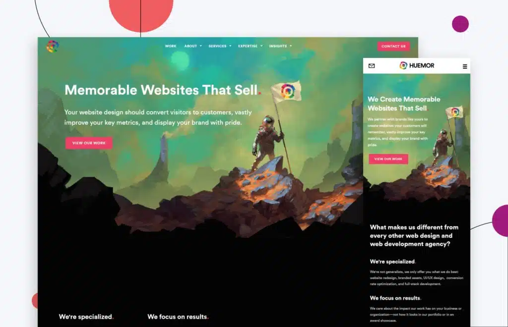
This is a little biased, but we believe our website is one of the best out there! With over a decade of experience in web design and web development, Huemor’s use of color and page transitions are very enticing, giving users an enjoyable user experience.
Our website is easy to navigate and well-optimized, too (especially considering the amount of content we have!). We use testimonials and real client experiences to emphasize a knowledgeable company.
Each page leads directly to the next, so we can take you everywhere you need to be. The homepage leads to the About page, which leads to the Services page, which leads to the work examples page with our website case studies and then leads to the Contact Us page.
You just can’t help but stick around and explore more of Huemor!
Shameless plug: Our own website design goes to show what we can do for your website!

For those of you who may own, or work for an agency reading this, invest heavily in your website. It’s a critical piece of owned media, and it’s likely the majority of your audiences first touch with you. Our website remains our biggest driver of opportunity not by chance, but because we constantly invest in it.
Jeff Gapinski, Co-Founder
10. Concealed
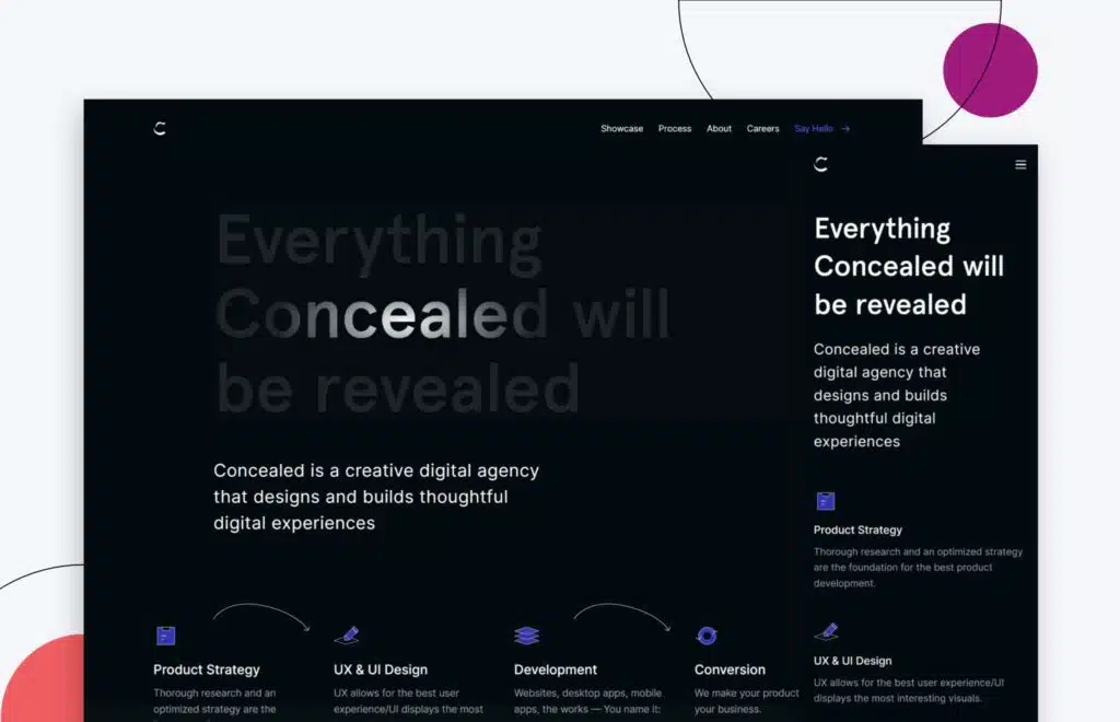
Graphic design is all about visual communication. The use of dark backgrounds and slight animations around the website create a unique user experience.
You can also see the ‘before and after’ by simply dragging the cursor in either direction. The mouse hover effects are critical on this website, highlighting and revealing new sections on each web page and calling out certain features on each web page.
Their project Inner pages are also fascinating with a clean and concise layout. Concealed is overall very professional with a hint of playful elements.
11. Neverland Agency
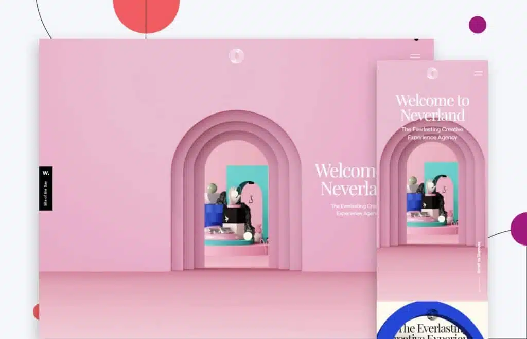
The playful nature of the website emphasizes the company’s name “Neverland,” along with subtle touches and nods to the storybook location of Neverland. Building blocks stacked to look like a pirate ship, a figure of a crocodile, and Tinkerbell? You are in Neverland!
The overall website has 3D illustrations with animations as you scroll through the site. The scrolling effect makes you feel like you are actually entering the website. It’s very colorful, and the use of serif fonts for headings gives it a premium look and feel. There’s a good balance of negative space around the site.
All in all, it’s a clean, playful website with some amazing and attractive visuals that are fun and pleasing to the eye!
12. SayHey
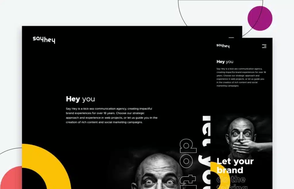
An attractive homepage invites you to explore more of the website with an exciting use of the scroll-down slider to view more projects.
The other pages use a light background compared to the homepage, giving the website a clean minimal look and feel. It’s not cluttered at all!
Even their Case Study pages are clean, organized, and easy to follow.
SayHey has an excellent, alluring website design.
13. CoCollective
The color blocking on CoCollective‘s website is perfect for breaking up sections on the homepage. It’s easier for users to track down the specific information they want.
The navigation is straightforward, where users discover more information as they scroll down the various pages. This is good because it makes the web page and copy less cluttered.
For more information, we wrote a case study on the creation of this website!
14. Mozaik
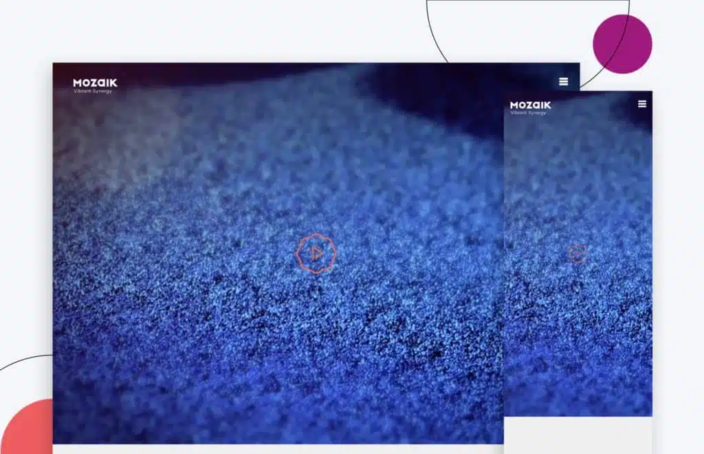
Greek for “mosaic,” Mozaik‘s website is much like a mosaic. What a way to reflect branding on the website!
Their hero header has an animated video depicting their philosophy for creating things.
The website is filled with various nifty, engaging little animations. Their contact form is interesting as it is not a typical contact form but a short questionnaire (Mad-Lips type).
Mozaik’s work examples page has everything staggered, which is also visually appealing.
15. Square Dot
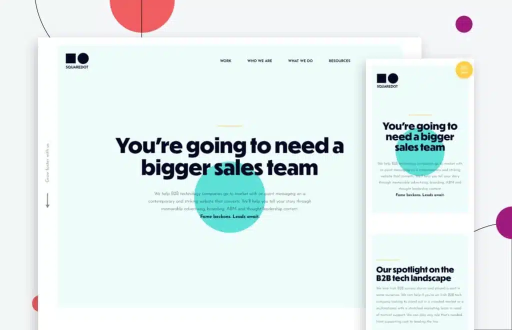
Using animation up front to capitalize on their name? Square Dot mastered it! The animation seems to enhance the experience rather than get in the way of it.
Their copywriting is strong, clear, and concise.
Overall, the website’s visual design is bright and fun but still professional.
It’s all about having an agency website design that integrates creativity, functionality, and a great user experience.
Creative agencies’ websites find your potential clients’ sweet spots and drive conversions.
Treat every section, from your hero header design down to your website footer design, as your chance to shine and close the deal!
It’s always a good idea to create and improve your website to stay ahead of the competition.
So, if you’re working on your agency website or planning on redesigning it, keep these best 15 agency websites in mind for inspiration!
Here are some best practices and further info on agency website design, web development and web design in general. If you have further questions, don’t hesitate to reach out.
Agency Website Design FAQ
Questions about how to optimize your agency website? We try to answer them here.
What is the best website design company?
There are countless website design companies out there, all promising to create a unique and professional website for your business. But with so many options to choose from, how can you know which one is right for you?
The best way to find a reputable website design company is to ask around for recommendations. Talk to other businesses in your industry and see who they used to create their website. Once you have a few names, you can start doing your own research. Look at each company’s portfolio and read customer reviews. This should give you a good idea of the quality of their work and whether or not they’re a good fit for your needs. With so many website design companies to choose from, taking the time to find the right one will be well worth it in the end.
With that in mind, here are some of the best website design companies we like: SPINX Digital, Blue Fountain Media, Eight25Media, Jordan Crown, Publicis.Sapient, Conversant Media, Ruckus, Kobe Digital. And, of course, us. Huemor.
Each of these companies has a team of experienced designers who will work with you to create a website that meets your specific needs and goals. So if you’re looking for the best of the best when it comes to website design, look no further than this list.
What are the top 10 creative agency websites?
A well-designed website is essential for any creative agency that wants to stand out from the competition. A good website will show off the agency’s unique style and give prospective clients a taste of what it would be like to work with them.
Here are 10 of the most creatively designed agency websites:
- Eat Sleep Breathe: full service digital agency specializing in brand marketing, marketing strategy, design, and app development
- CemtrexLabs: digital marketing agency specializing in web and mobile app development
- Black and White: media management agency with a reputation of driving digital marketing excellence for B2B brands in the technology and manufacturing sector
- Isadora Agency: award winning digital marketing agency specializing in website development, conversion rate optimization, SEO, product design branding, video production, ADA site compliance and CGI animation
- Akins Parker: brand and design company specializing in media planning and purchasing, social media management, advertising management, custom packaging design, and project management
- Major Tom: full service marketing agency specialized in content management systems, HubSpot consulting, content marketing, UX/UI design, WordPress theme development, marketing automation, social media advertising management, and Web3
What are some agency website examples?
From small businesses to big enterprises, websites can be a powerful tool for businesses of all sizes. In addition to providing information about your company and its products or services, a website can also be a great way to connect with customers and clients. By creating a user friendly website, you can provide an enjoyable customer experience that will keep visitors coming back.
For some businesses, a simple one-page website may suffice. Others may need a more complex site with multiple pages and features.
Regardless of your needs, there are a few key elements that all successful websites share. These include:
- Well-written content
- A clean and user-friendly design
- A contact information that is easy to find
Etch is a design agency that specializes in branding and web design. Their agency website is clean and minimalist, with bold headings and plenty of white space. The focus is on the work, which is showcased in an attractive portfolio section. Contact information is easy to find, and there is also a link to the agency’s blog posts, which features articles on design and branding.
Are there free creative agency website templates?
While you can find free creative agency website templates, they will never match a custom, professionally-designed website from a top-tier design agency.
If you’re a small agency on a tight budget, a free creative agency website template can get you by until you can afford a nicer site.
What are some of the best marketing agency websites?
The best marketing agency websites are those that are sleek, modern, and easy to navigate. They should also be packed with information about the agency’s services and past work.
With so much competition out there, it’s important for marketing agencies to have a strong online presence. That’s why the best ones make sure their websites are up-to-date and full of useful information. Mosaic and Kota are two examples of marketing agencies with great websites.
Both sites are well-designed and offer plenty of information about the agencies’ services and portfolios. If you’re looking for a marketing agency that can help your business grow, you can’t go wrong with either of these two.
What should be included in an agency website?
When designing a website for your agency, it is important to consider what content will be most useful for your target audience. An about us page is essential for providing potential clients with information about your team and your company’s history. You should also showcase examples of your work in a portfolio or gallery, and include any relevant case studies. A blog can be a great way to share industry news and insights, and the contact section should include clear information on how to get in touch with you. By including these key components, you can create a website that will effectively promote your agency’s services.
What is agency web design?
Agency web design refers to the process of designing and developing websites for businesses or other organizations. The term “agency” can refer to a variety of different organizations, including advertising agencies, web design companies, and even in-house teams at larger businesses. When it comes to agency web design, there are a few key considerations that need to be kept in mind.
- The client’s goals and objectives must be clearly defined
- The target audience must be taken into account
- The overall message that the website is trying to communicate must be carefully crafted
By taking all of these factors into consideration, agency web designers can create websites that are not only visually appealing but also effective in achieving the client’s desired objectives.
What is an agency website?
An agency website is a website created by or on behalf of an advertising agency. The site may showcase the work of the agency, provide information about services offered, or feature stories and news about the agency.
Many creative web design agencies include a portfolio of the agency’s work on their websites, as well as contact information and a way to get in touch with the agency.
While some digital marketing agency websites are designed for potential clients, others are more geared toward industry professionals or those interested in learning more about the inner workings of an ad agency.
What are the best design agency websites in 2022?
A prospective client’s first impression of a creative web design agency is often formed based on its business website, so it’s important to make sure that the site is not only visually appealing but also user-friendly and informative. With that in mind, here are three of the best design agency websites for 2022:
- Instrument is a Portland-based design agency that has built a reputation for crafting beautiful, intuitive and minimalist websites. Their portfolio is filled with examples of their stunning work, and their website is no different. The site is clean and minimal, with bold typography and ample white space. It’s easy to navigate, and it makes it clear that Instrument is a serious design firm to be reckoned with.
- Huge is a global web design agency with offices in New York, Los Angeles, London, and Barcelona. Their website reflects their international scope, with an interactive map that allows visitors to explore their work around the world. Huge has an impressive portfolio of clients, and their website does an excellent job of highlighting their diverse range of work.
- Work&Co is a Brooklyn-based creative brand design agency that specializes in digital product design. Their website is clean and straightforward, with clear navigation and beautiful imagery. Work&Co has worked with some of the biggest names in the tech industry, and their website does a great job of showcasing their impressive body of work.
What is a government agency website?
A government agency website is an online resource that provides information about a government agency and its programs. The website may also include links to other government resources, such as databases or forms. Government agency websites are typically created and maintained by the agency itself, and they may be subject to federal laws and regulations regarding content and security. In addition to providing information about the agency, these websites may also offer online services, such as filing taxes or applying for benefits. By using a government agency website, citizens can access government services and information from the comfort of their own homes.
Which is better, WooCommerce or Shopify?
When comparing WooCommerce vs Shopify, there is no clear winner. Each platform has pros and cons, and it comes down to what matters most to you and what you are trying to do with your store. Whether you have a B2B eCommerce website or a beauty brand, you’ll need to dig in deep to understand each eCommerce platform and what it offers. Our guide comparing WooCommerce to Shopify is a good place to start.
Can you redesign my website, including the checkout page?
Yes, website redesign is one of our primary specialties. No matter which eCommerce site you’re on, we can redesign your entire site, including the about us page, checkout page, product pages, category pages, and blog.
Further Reading On Website Design and Development.
Looking for web development and design inspiration? These articles should help.
- How Much Does It Cost to Build a Website?
- How to Build a Web Design System
- Choosing the Right UX Research Process
- Our Top Retail Website Examples
- Understanding Web Design vs Web Development
- Our Top Beauty Website Examples
- Our Shopify Speed Guide Checklist
- Guide to Optimizing Shopify Image sizes
- Our Service Page Layout Examples
- Best SaaS Websites of 2022
- New Website SEO Foundations
- 7 Signs That Show It Is Time to Change Agency
- Our Approach to Startup Website Design and Development
- How To Switch To New Design Agency
- WordPress Performance Optimization Best Practices
- 100 eCommerce Website Design Tips
- How to Use Dynamic Website Content
- All About SaaS Website Design
- How We Approach Drupal Website Design and Development
Get Memorable Insights.
Sign up to receive actionable web design advice directly in your inbox monthly.
Get Memorable Insights.
Sign up to receive actionable web design advice directly in your inbox monthly.

Jeff Gapinski
President of Huemor
Jeff Gapinski is the President of Huemor where he helps plan the long-term strategic growth of the agency. Jeff is passionate about UI/UX, demand generation, and digital strategy.
What Do You Think?
Have feedback? Maybe some questions? Whatever it is, we'd love to hear from you.
Leave a Comment
![Website Design Standards We Follow [That You Should Too!]](https://huemordev.b-cdn.net/wp-content/uploads/2021/12/2023.04.04.Website-Design-Standards-We-Follow-That-You-Should-Too.jpg.webp)
No comments found